While there are many basic principles of design — rhythm, proportion, emphasis, unity, and more — balance is vital.
Whether you’re taking a photo, creating a painting, or designing a webpage or graphic, the layout is key. How you arrange and position different elements has a big impact on the final outcome. And balance is what governs this aspect of your design.
Now, two of the prominent approaches used to create this balance are symmetrical design and asymmetrical design. In this post, we’ll help you understand asymmetrical balance, along with some examples of how you can use it to make your work stand out.
What is asymmetrical balance?
Think of what would happen if a design or photograph was cut into two equal parts. If both parts are different from each other, yet maintain a sense of balance, that means the designer has used asymmetric composition to create visual tension.
In other words, asymmetrical balance comes into play when you have inequality between two sides of a picture, but the image still looks complete and sensible. The two parts are balancing each other.
For example, Van Gogh’s The Starry Night is an excellent demonstration of leveraging asymmetrical balance. Van Gogh has used very different shapes and objects on either side of his work. Yet he manages to provide a sense of balance by playing with the size and color of these elements.

As you can see, it’s not just asymmetric design but balance also that determines if the design is using asymmetrical balance.
Any image with a lack of symmetry cannot be considered asymmetrically balanced. If the two halves have shapes or objects placed haphazardly around the page, then it won’t be a balanced composition.
Symmetrical vs. asymmetrical balance
As we discussed, when you achieve balance with dissimilar halves, you’re using asymmetrical balance. But asymmetrical composition is not the only approach to having a balanced composition.
Symmetrical balance is the exact opposite. It occurs when the two sides of your design are identical. In fact, they are almost like mirror reflections of each other. And in doing so, they give the viewer a sense of structure and formality.
There are many examples of symmetrical balance in both man-made art and works of nature, such as a flower.

The shapes of the several kinds of flowers, specifically sunflowers, and daisies, have attributes that make them appealing. And one such attribute is symmetrical balance.
What is balance? (And why it’s important?)
While we’ve used the concept of balance to explain asymmetric and symmetric balance, there’s more to it than that.
To understand balance, think of each element in your design as having a visual weight. Each aspect of your design — tone, object, shape, and color — has a different capacity to attract the attention of the viewer. And this capacity is referred to as visual weight.
Visual weight is affected by different parameters such as the size of elements (larger objects might weigh more than smaller objects), colors, and more. When the distribution of visual weight in your work is in a state of equilibrium, it is called balanced.
Balance means the two sides of your page should be designed with respect to how they impact each other. Balance doesn’t depend on whether the elements on both sides of your design are the same or different. What matters is whether both sides have equal or unequal visual weight.
When the two halves of your design have equal visual weight, they both grab adequate attention. And your design is balanced.
Visual balance is desirable because it helps your image look definitive. Your designs come across as professional, engaging, and clean. On the other hand, an unbalanced image makes the viewer feel uncomfortable. It invokes a nagging feeling that something is missing.
While designers in the past believed that balance is possible only with symmetry, the new standards have refuted this notion. Designs that lack symmetry can and should still be balanced.
Of course, it’s easier to create balance in a symmetrical layout than asymmetrical design. All it takes is putting the same objects on both sides of the image. But symmetrical balance is also less creative and exciting than asymmetric balance.
Asymmetrical balance may take more thought and effort, but the payoff is better in the end, as evident from Van Gogh’s The Starry Night — the painting that we saw above. The design is more unique and engaging.
Asymmetrical balance examples
Take inspiration for the following asymmetrical balance examples:
Strategic composition by Michelangelo
If you pay attention to this popular artwork by Michelangelo, you will see that it’s asymmetrical in design. Imagine bisecting it with an imaginary axis, and each side would appear different.
However, when you try to take it all on, your eye will move from one part (Adam) to the other (God) in a structured manner, creating a sense of balance. Michelangelo draws your focus strategically and uses asymmetrical balance to tell a story.
He could have used symmetry – made characters more similar and had them face each other from a similar position. But instead, he chose asymmetry to make his work even better.
Literal asymmetric balance
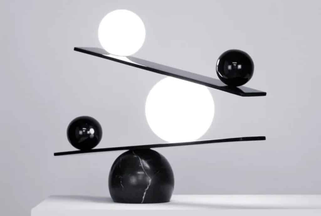
This picture isn’t just a great example, but it also literally explains the concept of asymmetrical balance. Look at the two weighing scales stacked on top of an object. There is an object on each side of each scale. Now notice the visual weights:
- Black has more weight than white
- Bigger objects are heavier than smaller objects
Keeping these factors in mind, the objects are placed on the scales in a way that they balance each other out due to their size and color. There is no symmetry in either scale, yet the design looks clean and complete.
You can apply the same concept to have balanced asymmetry in your work. Even if you have a single main object with a specific visual weight, you can use smaller objects, light, or lines to make the two sides of your art balanced.
Rule of thirds

Have you ever seen a grid that divides the canvas into nine equal boxes when taking, designing, or editing a picture? And then used this grid to adjust the spacing between different elements?
If the answer is yes, you’ve already used the rule of thirds, without even knowing it. It divides the frame by tracing two horizontal and two vertical lines. It helps you create asymmetrical balance by eliminating the urge to place your main object in the center. And this image is a perfect example of creating asymmetrical balance using the rule of thirds.
Contrasting elements

This screenshot from the Alan Turing Institute is another great example of asymmetrical balance. As you can see, the left part of the page has more elements than the right side. But it still managed to create balance by embedding contrasting objects on the right part of the design.
Foreground and background
What you choose to show in the foreground and slightly hide in the background also impacts asymmetrical balance. For example, if you’re putting your primary object in the front, you can provide asymmetrical balance by blurring the rest of your objects in the background. And this is depicted in the image above.
Forced perspective

Take this example featuring massive mountains that have a lot of visual weight. If you’d have captured just the lake and the mountains, the visual weight of mountains will make the image unbalanced.
Alternatively, if you show the reflection of the mountains in the lake, you can have balance but it would be symmetrical balance. So by introducing a rowboat closer to the eye instead, we have something that can counter the visual weight of the mountains and bring asymmetry at the same time. The rowboat is forcing our perspective, leading to a balanced asymmetry balanced picture.
Adjusting visual weight with colors

We touched on this briefly before — each color has a unique visual weight. For example, colors such as Red or Orange capture our attention more than Blue or Brown. And that’s how this image is achieving visual balance. One red boat, using a heavy color, is being countered by four boats with a neutral color blue.
Conclusion
So, that was it. As you can see, symmetry is not necessary to achieve balance, and asymmetry doesn’t always suggest a lack of balance. By using the principles outlined in any of these examples, you can place objects of unequal weight on each side of your design, and still make it balanced and engaging.
Remember: Symmetrical balance may feel more structured and comfortable. And it may be easier to master. But at the end of the day, it’s the asymmetrical balance that brings out true excitement in your work and in your audience. Master this and you’ll find yourself having larger freedom of expression.
