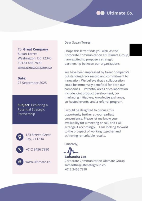
When we think of branding, we often focus on the logo, image, and voice. However, we may overlook the importance of a professional business letterhead.
Along with the graphics, imagery, and other visual elements you use, a business letterhead impacts how customers and business partners perceive your brand. In this article, we go through what a letterhead is and why you should use one. We also take you step-by-step on how to easily create a professional business letterhead on Piktochart.
Why Use a Letterhead?
A business letterhead is a stationery used for business correspondence. It contains basic business information, including the company logo, name, address, and phone number. It may also include the company’s mission statement or its tagline.
Today, we also commonly see business websites, email addresses, and social media accounts on business letterheads. They’re pretty much like business cards – only in full paper size and with space for business communications.
Are letterheads still relevant in our digital world today?
In short, yes – business letterheads are still relevant today.
Unless you’re running a ghost company–a business that only exists on paper and does not have significant business operations, it’s unlikely that you wouldn’t have any business-related communications.
You probably send letters, minutes of the meeting, reports, invoices, press releases, memorandums, newsletters, or official announcements to employees, partners, vendors, customers, or other stakeholders. Using a company letterhead for business communications can help professionalize the way messages are disseminated.
Why do companies still use one?
With so many ways to do branding and an increasing move towards digital paperwork, you might be wondering why business letterheads are still a thing.
Here are just several reasons you ought to have your own letterhead:
- Whoever gets your letter can contact you faster. A business letterhead enhances written communication by making it easy to identify the sender and get their contact details.
- You gain more credibility as a legitimate business. Having all your basic business information on the letterhead enhances your reputation. It can build trust among customers, business partners, or investors, especially in the early stages of reaching out to them.
- Company culture gets a boost. Your letterhead isn’t just for customers. It’s also used by employees for internal communications. When you have a letterhead that reflects your brand image, your employees feel more connected to the company. It can give them a sense of pride and foster loyalty within the company.
- A letterhead is a powerful marketing tool. It creates a positive perception of your brand and drives brand awareness. With an impactful design, it can bolster brand recognition.
Why shouldn’t you make a letterhead in Word?
In the past, when there weren’t that many design apps and tools available, most people would just create or insert their letterhead in Microsoft Word.Word has a present template for crafting business correspondences, so it’s quite easy to make a letterhead using the platform. While Word is a great text editor and having a ready-to-use template saved is convenient, its limited tools can make designing a professional-looking letterhead very cumbersome.
Moreover, formatting can get messed up when users switch devices or use different versions of the app. If you have multiple people using the letterhead, you risk having varying formats in your business communications.
So, where should you make your letterhead?
Short answer: on an intuitive design platform. We’re in the digital age, and you’re creating a digital design. So, what better tool to use than advanced software backed by the latest design technologies?
Is Photoshop too complicated for you? Use Piktochart instead. This AI-powered graphic design tool has a simple interface and easy-to-use drag-and-drop editor that’s great for design newbies.
Since it’s cloud-based, you can access Piktochart anywhere you are. You can also collaborate with your team in designing high-resolution graphics for your marketing materials, business presentations, corporate reports, and, of course, letterheads.
How To Make a Letterhead in 5 Minutes
With Piktochart, you don’t need any background in graphic design to create a letterhead that looks stunning, eye-catching, and professional. You also won’t need to spend hours trying to make sense of complex design tools and measurements; you can create your letterhead in just five minutes.
Here’s how:
1. Pick a letterhead template.
Piktochart has thousands of customizable templates. Log in to your Piktochart account to select a template that aligns with your needs.
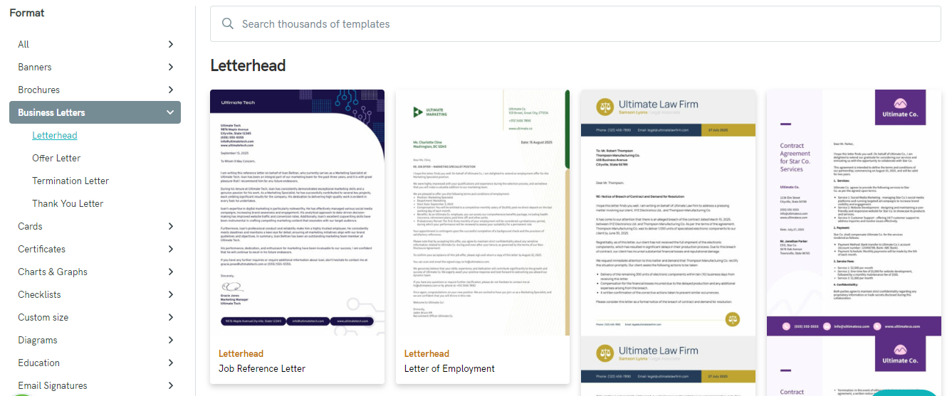
- Scroll through the templates list on your Visual Dashboard.
- Click on Business Letters.
- Select Letterhead Templates and browse through the selections.
- Click Preview to look at a template more closely.
- Click Edit Template to customize.
You can also use the search bar to look for a specific theme or style. Type the name of the theme or keywords related to your business and choose from the search results.
If you already have an existing letterhead you wish to update, you can upload your brand letterhead in PNG JPG format. You can copy and paste elements from your old file to your new template.
2. Use a solid background color for your business letters
Piktochart letterhead templates come with preset color schemes, but you can customize them to match your preferences.
- Go to Styles and choose from the existing color schemes.
- Click on a color in the palette to change it or adjust its tone.
- Rename the customized color scheme for use in other design projects.
If you’re starting from scratch, consider choosing three colors only to serve as your base in building your palette. Use the primary color as the main background and the other two as accents. A solid background color for your letterhead will make it more distinguishable from the rest of the document.
3. Add your company’s brand and contact information
The most common information included on a letterhead is the company name, address, phone number, and email address. You may also include your website and social media addresses. If you have a catchy slogan or a short mission statement, you can also include them. Just be careful not to make the letterhead look too cluttered.
To add your information to the template, double-click on the text box and type your details. You can also add more text boxes if necessary.
4. Change your font to company brand guidelines.
Piktochart templates are designed by expert artists. All elements in the font styles have been carefully put together to achieve a certain style. However, you can still change the fonts to adhere to your brand guidelines if you need to tweak a template that you like. Here’s how to upload your brand kit with Piktochart.
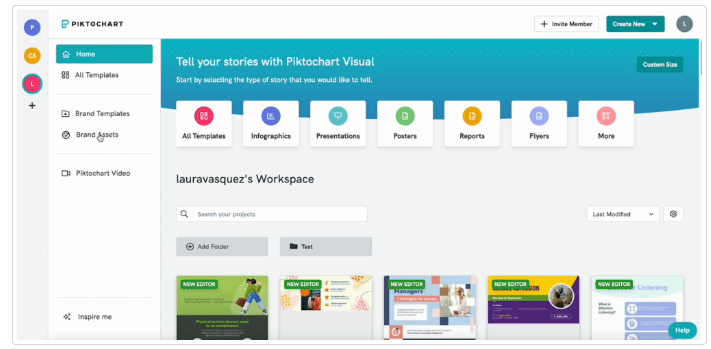
- Go to Profile Settings.
- Click on Brand Assets.
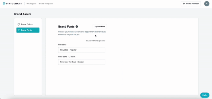
- Select Brand Fonts and click on Upload New on the upper right tab.
- Select the font file you want to import into your account.
- Import your font file.
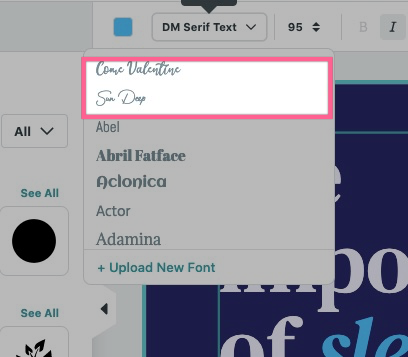
When you customize a template on Editor, you’ll find your custom font at the top of the font list.
Piktochart PRO users can add only a maximum of ten font families. With no cap for this feature, Business users can add unlimited font styles. Keep in mind, though, that you must confirm that you own the rights to the font you are uploading.
Once you create your letterhead template, you can easily access it from your workspace on your Piktochart dashboard. You can save it as a PDF or PNG file and share it with your team. You can also send it to professional printers to be printed in bulk on high-quality specialty paper.
5 Tips on Designing Letterheads
Using Piktochart, it’s easy to create a letterhead yourself – but you still need to make a bit of an effort to customize the template designs. Here are a few things you can try to jazz up your letterhead.
1. Align your letterhead with your brand
Your goal is to get instant recognition. When someone sees your letterhead, they should think, “Yep, that’s definitely them!” Refer to your brand guidelines for the approved colors, fonts, and tone. Then, ensure all letterheads on any comms match.
Remember, consistency is key—your letterhead should fit snugly into your overall brand ecosystem. So, keep it cohesive with your other branding materials.
2. Enhance your letterhead with graphics
Graphics can turn a good letterhead into a great one. Deciding which ones to add requires careful thought and planning, though.
Your logo? Non-negotiable. They MUST be on your letterhead. According to a survey by Renderforest, people recognize logos the most (75%), followed by visual style (60%), then brand color (45%). To reinforce your brand identity, incorporate these into your letterhead design.
To give your letterhead some depth, a well-placed photo can add layers of interest. Think landscapes, product shots, or subtle patterns—nothing too flashy.
Play with transparency to create a sophisticated look. Experiment with modern geometric backgrounds or a subtle, classy background photo. But a word of caution: don’t let the graphics steal the spotlight from your message. They should complement, not compete.
3. Choose the right layout for your letterhead
The layout is the backbone of your letterhead. Consider different options: full border, graphic border, or maybe a sleek header/footer combination. Want to maximize space? Opt for a spine column layout. While the layout matters; the heart of your letter is still the content. So keep the star of the show (the letter content) in mind when designing your letterhead.
And here’s a pro tip: if you’re short on time, Piktochart offers customizable templates that are a lifesaver. Simply choose one with a layout that matches the structure you need for your business correspondence.
4. Pick easy-to-read fonts
For readability, use sans-serif fonts in your letterhead. They’re clean, modern, and easy to read, especially at smaller sizes. Unlike serif fonts that have those little tails like the ones in Times New Roman, sans-serif fonts are sleek and straight (think Arial).
You might be tempted to use a script font, which exudes class and status. While script fonts like Vivaldi and Lucida Calligraphy are elegant, and display fonts are attention-grabbers, they should be kept to formal invites, poster headlines, and other marketing paraphernalia. There’s no place for them on professional letterheads, as they might convey the wrong tone or level of formality.
5. Less is more for colors
Choosing the color palette is one of the main challenges in creating a business letterhead. If you check out the latest trends, you’ll also see that brands are using different techniques. Some are leaning towards a minimalist approach with simple and clean aesthetics, while others are going the opposite way with bold colors and character-rich designs. Whichever you choose, consider limiting the colors you use on your letterhead to two for a professional look.
Too many colors can be distracting and overwhelming. If you want varied tones, use gradients instead. This will add more depth and character to your design without screaming for attention.
Examples of Effective Letterheads
Need inspiration? Here are a few examples of successful letterhead designs that stand out from the competition.
Simple Yet Sleek
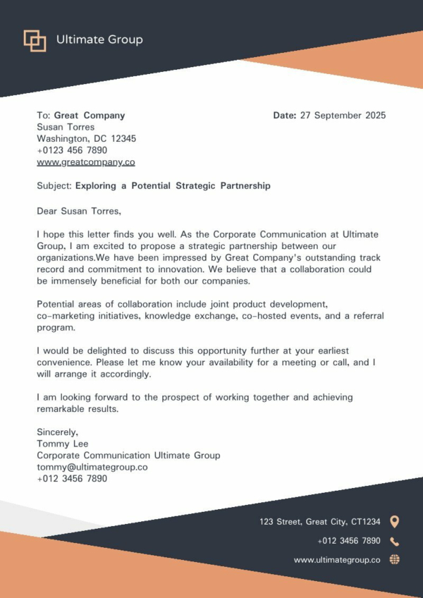
Here’s a business letterhead example that shows how a minimalist design can have maximum impact. The use of contrasting colors at the top and bottom borders instantly commands attention. The sleek lines and sharp edges give off a serious, no-nonsense vibe. This clean and modern layout makes it clear that this company means business.
Green Means Go
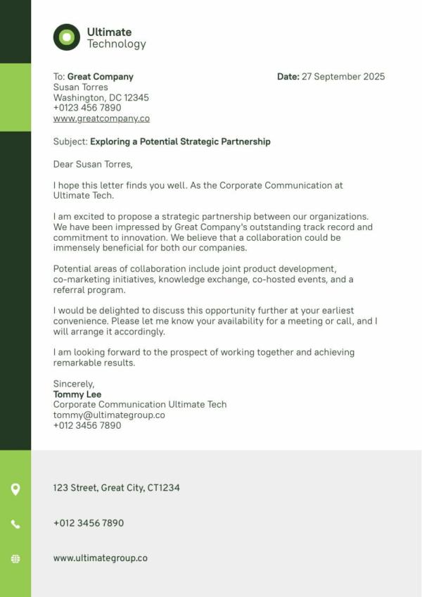
This business letterhead gives the green go signal to bold borders. But instead of the typical top and bottom borders, it keeps to one side. What’s great about this border is that it also serves as a visual cue that guides readers as they go through the content. Notice how each color block subtly separates each section? That makes this design as cool as a green cucumber.
Modern Minimalist
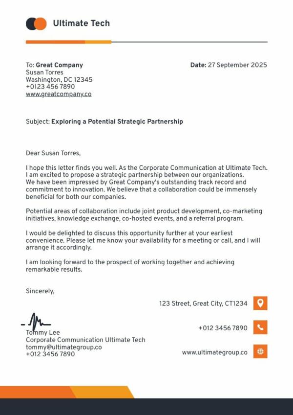
Want a traditional-looking letterhead but with a more up-to-date vibe? Here’s a simple example of a company letterhead that balances conventional and contemporary styles. While the design is kept simple, the use of orange tones and jet black commands attention. The clear placement of icons also clearly marks the contact details.
Go Bold With A Splash of Red
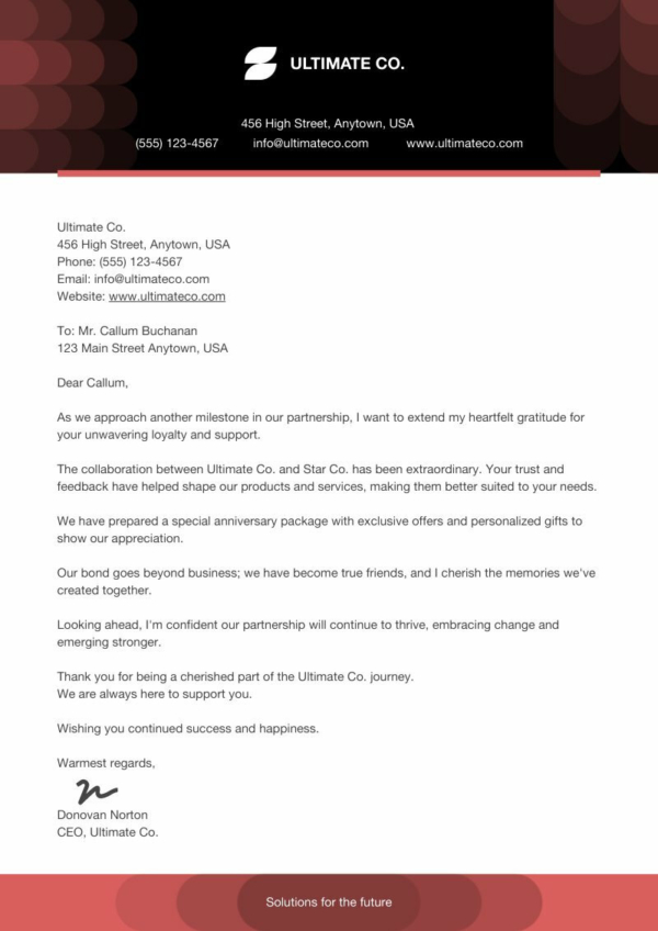
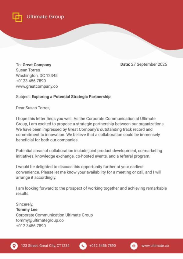
Red gets noticed! This more elaborate example of a business letterhead will undoubtedly make heads turn with its sophisticated header design. Vibrant red captures attention, while soft curves and gray tones soften the look and create balance. The matching color block at the footer delineates important business information. With all contact details placed at the footer, the brand name takes the spotlight in the header.
Colorful and Playful
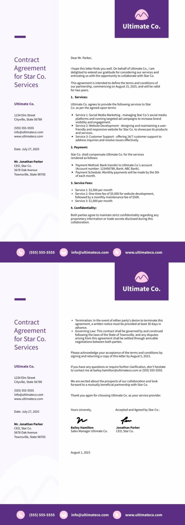
Here’s a letterhead design that’s suitable for creative brands. Purple and pink hues give it a playful vibe, along with the use of roundish geometric shapes. The color blocks in alternating ligh and dark tones effectively separate business info. The two-column layout also gives the document a clean and organized look. Meanwhile, the use of icons adds a whimsical touch and draws focus to the contact details.
A Touch of Class
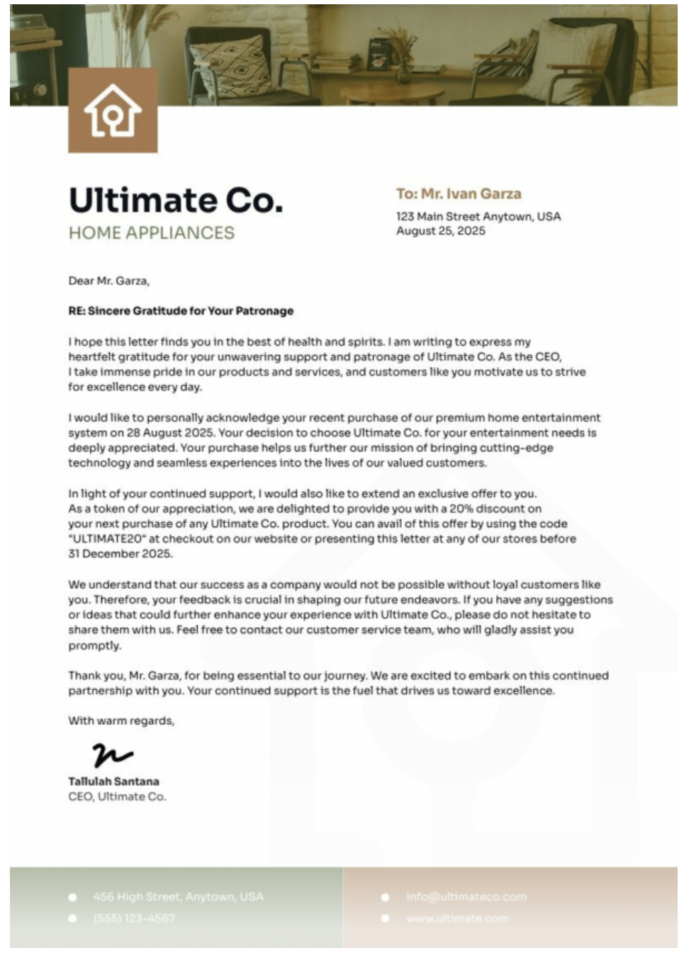
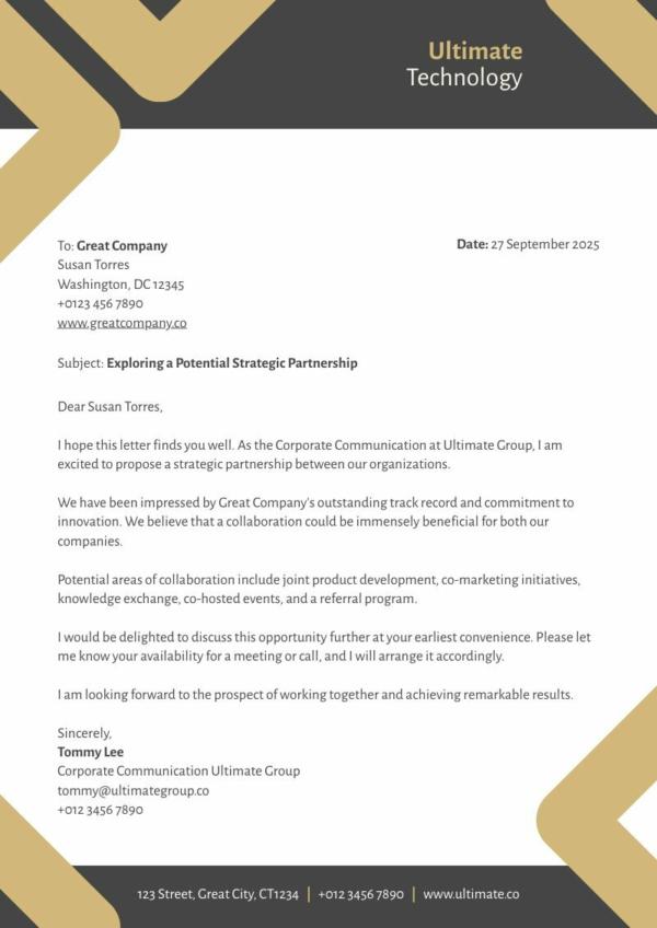
Can a letterhead be both professional and creative? Yes, it can. This design shows a more creative corporate letterhead that still exudes a distinguished air. The use of neutral colors, brown and black, gives it a serious feel, while the geometric designs provide a hint of artistry.
Final Thoughts
There you go! That’s everything you need to create a business letterhead. Keep in mind that a professional-looking letterhead can strengthen credibility and recognition for your brand, so make sure you create one that lets your business stand out.
For impactful designs, use Piktochart. With thousands of free templates you can customize, your possibilities for creation are limitless. Moreover, Piktochart goes beyond letterheads – use it to create marketing materials, interactive content for social media, infographics, flyers, and more. With all your customized templates, graphics, and brand design elements in one platform, you can maintain consistency across your marketing materials and brand assets.
Designing your creatives doesn’t have to take so much of your time and energy. Leverage online design tools like Piktochart so you can focus on growing your business.
