Events. The gathering of like-minded people, and also folks from different walks of life. There are events of many stripes, running the gamut of evening workshops and mini-networking events to large-scale conferences that run for several days.
Despite covering a myriad of topics and industries, these events all have something in common – they are fulfilling the very important purpose of bringing people together.
And that’s where your clever visual communication skills will come in, drawing future attendees in with your design prowess. Depending on the colors, layout, and typography that you use for your promotional poster, it conveys a very different mood – a mood that should be akin to your event.
To this end, we’ve put together a comprehensive list of poster design ideas to inspire you, which also includes templates that you’ll be able to start using straight away. You can jump right into designing different types of posters by creating a free account.
Let’s get going!
Gradients
This popular design element allows for the smooth fading transition between one color to another, often times creating a sunset-like effect. Gradients are colorful, playful, and can make the difference between making a visual look realistic and modern.
01.
02.
Image Overlay
Visuals with image overlays provide a spark of color, and also alludes to the theme that you’re trying to present for your event. The images, paired with text boxes of varying opacity, are both informative and attention grabbing and are useful for posters that require a bit of a more text-heavy set up.
01.

02.
03.
04.
05.
Art Deco
Also called ‘style modern,’ art deco was an arts movement from the 1920’s that was emblematic of the sleek, and wealthy lifestyle of western Europe and the United States. Angular and modern, taking the art deco approach with your posters works if you’re trying to present an elegant front.
01.

02.

Typography
Think a text-filled poster is boring? With the right combination of color and typography, your event poster will be as attention grabbing as the next image-packed one. Typography is, of course, the art of arranging type to make it not just legible – but appealing. We wrote an article on typography use – read up here.
01.

02.

03.

04.
05.
Feeling inspired yet? Explore our template gallery to create a poster within minutes- no experience required. Get started for free.
Shapes
Whether you’re in a square, triangular, or circular mood – shapes are some of the most versatile design elements that you can use in a poster. Plus they’re extra handy in drawing the eye towards key event information. Shapes also work well in conveying the mood of your poster – squares may feel more no-nonsense in comparison to the bubbly circle.
01.

02.
03.
04.
05.

Blocks
Using a blocky layout lets you artfully mash together a handful of different colors and images to create a mosaic-like affect. It also helps draw the eye towards key poster information – such as the time and date that your gathering will take place. It looks structured, stylish, and lets you use more than one image at one time.
01.

02.
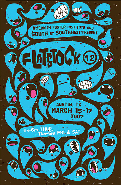
Cartoony
If you have a hip event coming up that caters to the younger crowd (think Millennials), you might want to consider taking the cartoony design approach. You could be a bit minimalist and go black and white with a splash of color, select an eye-catching color scheme, or go full-on assault on the spectrum.
01.

02.
03.

Sketched
The artist’s definitive marker or splash of a paintbrush can create a certain mood for your poster if you are promoting an event that is arts and crafts related. A hand-drawn image can create the feeling of something that is carefully-crafted and customized, which works if that is the theme at hand. And not to mention it looks great with a splash of watercolor.
01.

02.
Vector Graphics
This design element, a digitally-created illustration, is crafted usually by the likes of Adobe Illustrator. Shapes and curves are created by arranging and connecting points and axes to form images of all stripes. The vector graphic is versatile and works well for posters that have a more imaginative theme behind it.
01.

02.

03.

04.

Bonus Round
Our design team has been very busy churning out a variety of event poster templates – bright and cheery, sleek and professional, as well as hip and eye-catching. Whatever event you’re planning, we have you covered.
Besides the design elements we’ve introduced above and its relevant templates, here are an additional batch as a bonus round, all fresh off the design press.
01.
02.
03.
04.
05.
06.
With Piktochart, you can create posters, presentations, infographics, reports, flyers, and social media graphics. Create engaging visuals through collaboration features, customize templates, create brand assets, and more! Get started for free.
Learn more tips on how to make a poster in our guide. Wishing you all the success in your event planning. Happy Piktochart-ing!


 03.
03.


