With easy access to different tools on the market, anyone can make a brochure these days. But not everyone can design a brochure that stands out, gets noticed, and persuades people to learn more about a product or service.
Whether you’re a small business owner, a marketer, or simply someone looking to create stunning brochures for a personal project, this guide on how to make a brochure in 2024 is for you.
You can follow along by creating a free account. Select a template to get started.
How to make a custom brochure
In this guide, you’ll learn easy-to-follow steps to help you create a brochure that will leave a lasting impression on your audience. You’ll also discover design tips relevant for 2024 and professional brochure templates you can edit, download, and print with Piktochart’s free brochure maker.
Let’s get into it!
Step 1: Identify the purpose of your brochure and know your potential customers
This first step is key to creating a brochure that will hook your target audience’s attention and effectively communicate your message.
Consider these three important things for this initial step:
Do in-depth research about your audience
Before starting with brochure design, you must know and understand your audience.
Why? Because you don’t want to waste all your time creating brochures that don’t move the needle for your target readers.
Ask yourself the following questions before getting started with your brochure:
- Who is your target audience?
- What are their interests, preferences, and needs?
- What kind of language and tone is your audience receptive to?
- Do they even read brochures?
- Which areas or venues are they likely to pick or come across your brochure?
- Are these people receptive to online brochures?
Knowing your audience is crucial in making brochures that resonate with them. For example, if you’re targeting Gen Z readers, use a more casual tone and vibrant colors. On the other hand, if you’re after senior-level executives, a more formal tone and sleek design in your business brochure may be more appropriate.
Define the purpose
Defining your purpose will help you focus on the key messages you want to highlight in your brochure. Use these questions as guidelines:
- What do you want to achieve with your brochure? Is it to promote a service? Or introduce customers to a product’s new features?
- Do you want to provide information about your business or organization? Or do you want to invite people to an event?
Outline your brochure
Once you clearly understand your audience and purpose, it’s time to outline your brochure.
An outline will help you organize your content, choose the right format, and ensure your content resonates with your audience. Your outline should include the following:
- Sections or topics you want to cover
- Main points you’d like to make
- Any images or graphics you’re planning to include
- A call to action statement (CTA)
With an outline, you’ll have a clear roadmap to follow as you create your brochure copy and design, which takes us to the next step.
Step 2: Write your brochure copy
Compelling copy is key to a brochure that connects with your audience and motivates them to take action.
In terms of content, great brochures should include:
- A clear and concise section that describes the benefits of your product or service and how it can help address your target customer’s pain points
- Information about your company, including your mission statement, values, and history
- Real-life examples or case studies that illustrate how your product or service has helped others. This will show readers how your product or service can benefit them. Customer testimonials or success stories from satisfied customers are also a great way to showcase the value you offer.
- Your company’s primary contact information, including your website, phone number, and relevant social media handles
- Any relevant statistics, awards, or industry recognition differentiates you from competitors.
- A section that addresses common questions or concerns your target audience may have
- A strong call to action that tells readers what action to take next. Your CTA could be to save the date, call now, visit your website, follow you on social media, schedule an appointment, or order today. Be clear and concise with your CTA, and make sure it stands out from the copy (more on this in the next steps below).
Now that you already know what to include, here are a few ideas and best practices to make your own content stand out:
- Break your copy into smaller paragraphs. Large blocks of text can intimidate readers and cause them to lose interest. Breaking up your copy will improve the flow and make the content more engaging for the reader.
- Use active voice. Writing in active voice instead of passive voice makes your copy more engaging and easier to read.
- Address the reader. Use second-person pronouns like ‘you’ to address the reader directly. This helps make your brochure more personal.
- Keep it concise. Be clear and brief when communicating. Share the most important information and avoid unnecessary details.
Step 3: Plan for the visuals and graphic elements
Our brains are hardwired to be more attentive to visuals. For this reason, you can add images and graphics to brochures to make them more engaging and easy to remember. They can also help illustrate your message and break up long texts or paragraphs.
If possible, incorporate these visuals into your brochure design:
- Logo: Your logo is one of the critical visuals to help build brand recognition with your customers. Highlight it prominently in your design. Use its colors and stunning design elements throughout the brochure for consistency.
- Photos: Avoid free stock images, or use different images than your competitors to stand out. Consider hiring a professional photographer to use your own images or choose high-resolution images from stock photo libraries.
- Custom illustrations: These can be an effective way to convey complex ideas or messages, and they can help your brochure stand out from competitors. Consider working with a professional illustrator or designer to create custom illustrations tailored to your brand and messaging.
Piktochart’s brochure maker also offers access to thousands of icons, a stock image library, custom illustrations, and more to help you create.
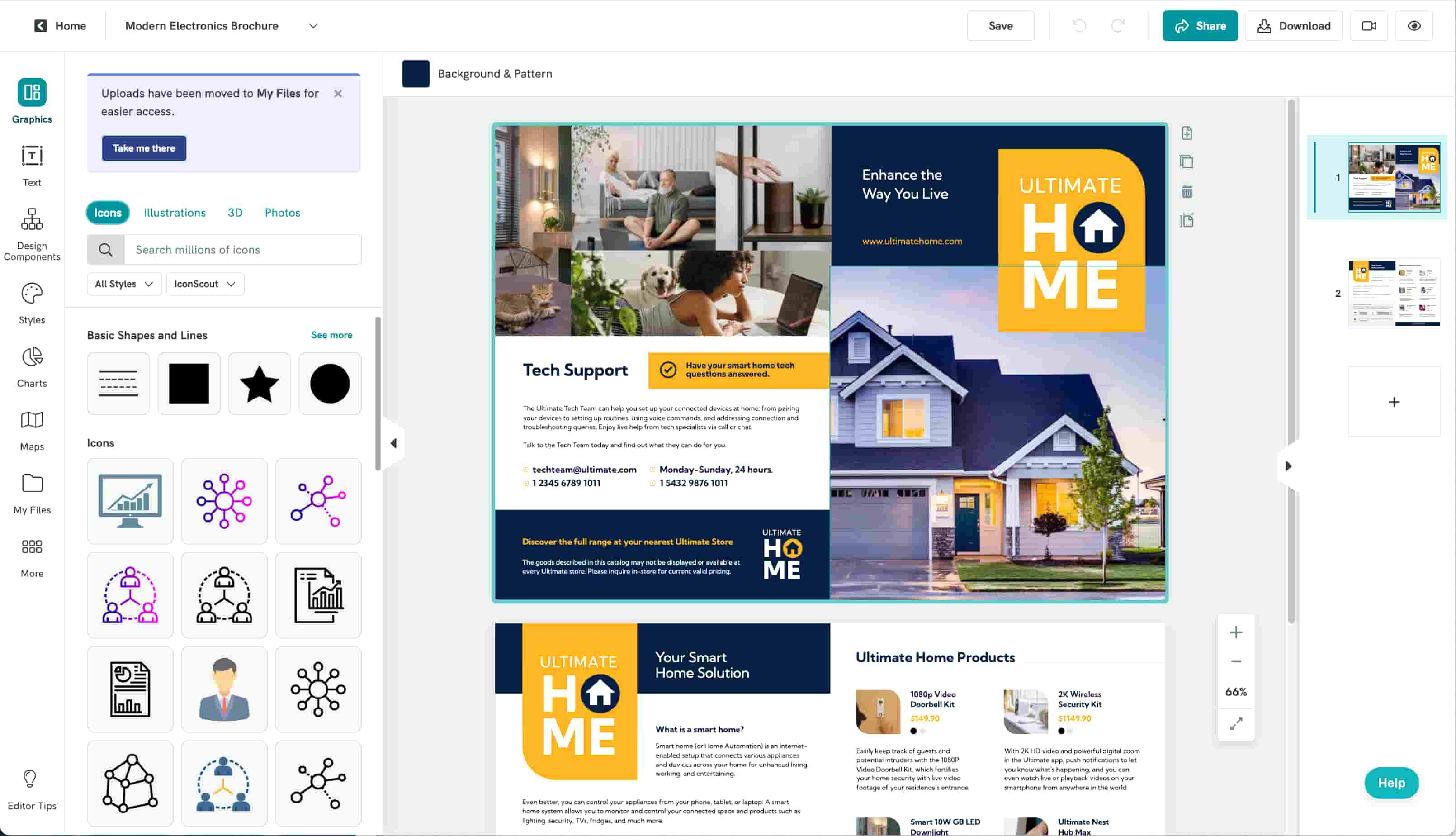
Important: As you add your own images and pick visuals for your brochure, use these questions as guidelines:
- Does this image provide value to the reader?
- Is it relevant to the message you’re trying to convey?
- Does it complement the text, or is it just there for decoration?
Step 4: Decide on the brochure fold
You have your brochure copy and visuals sorted out. What’s next?
It’s time to select the format and fold that will work best for your brochure. You can choose from the following popular brochure folds.
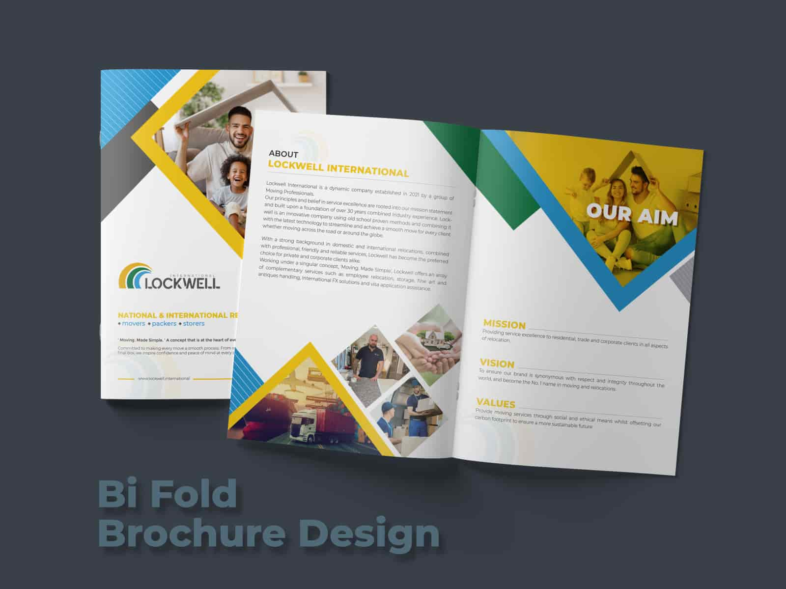
Bi-fold brochure format
A bi-fold brochure is best for simple and concise messages or for sharing limited content. It’s also a good option to create a more formal or professional look with a second page. Create your own brochure in bifold format using the template below.
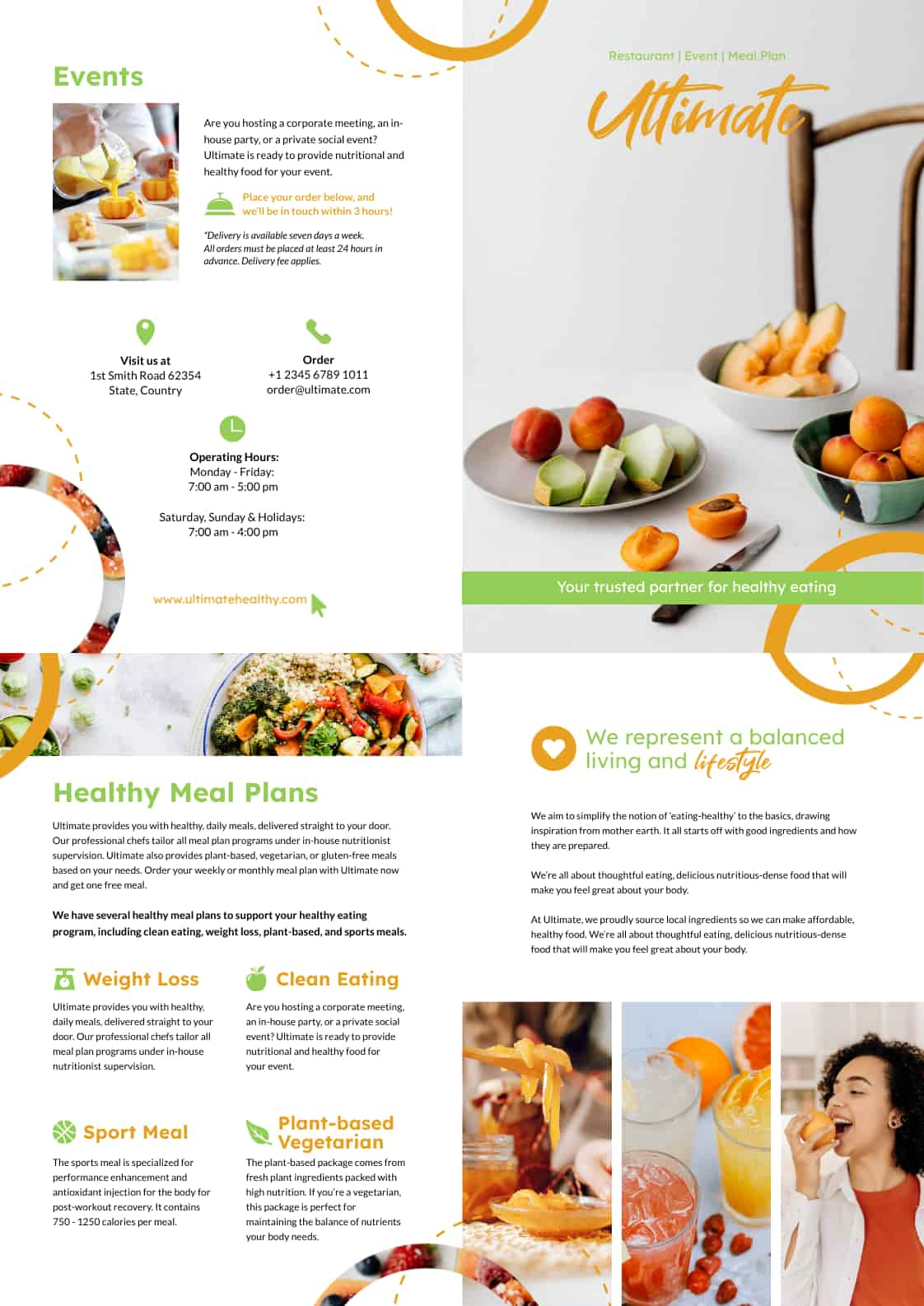
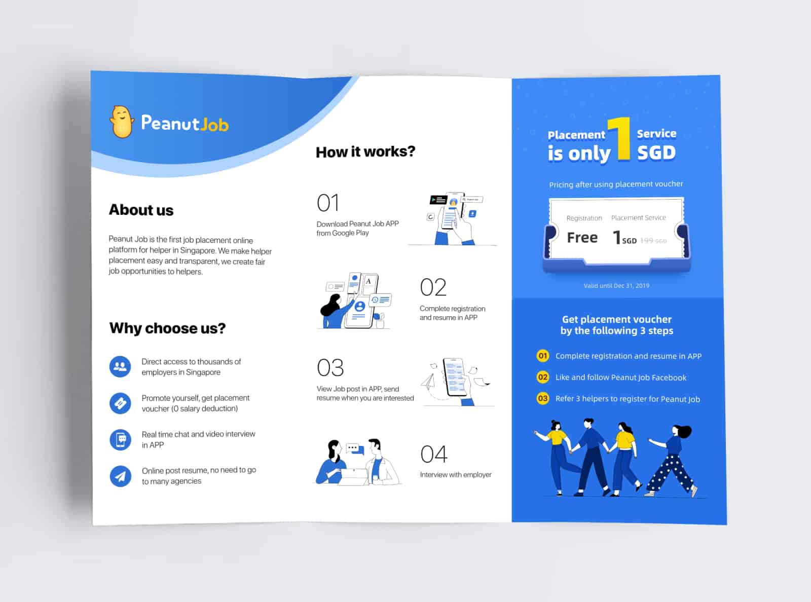
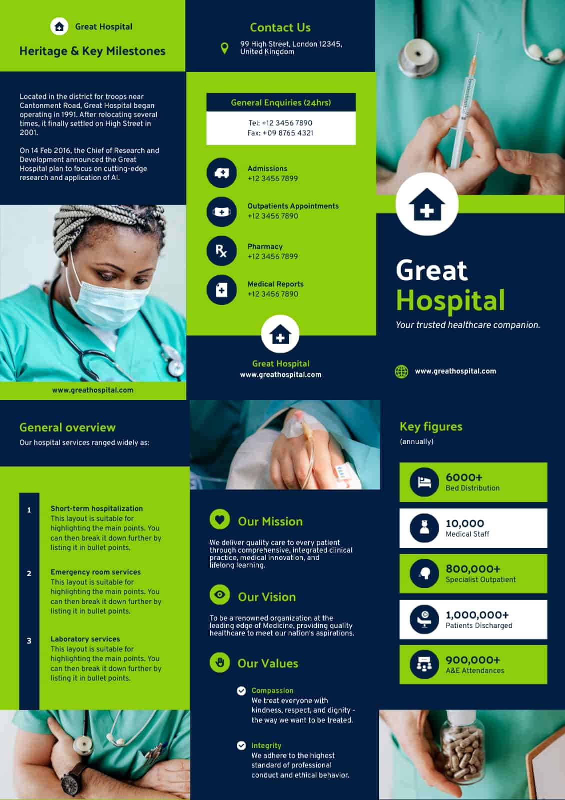
Tri-fold brochure format
The tri-fold brochure format is a popular and versatile fold because the three columns are ideal for presenting more detailed information in a compact format. Use this page orientation in the brochure for menus, event programs, and informational materials. Create your own brochure in a tri-fold format using the template below.
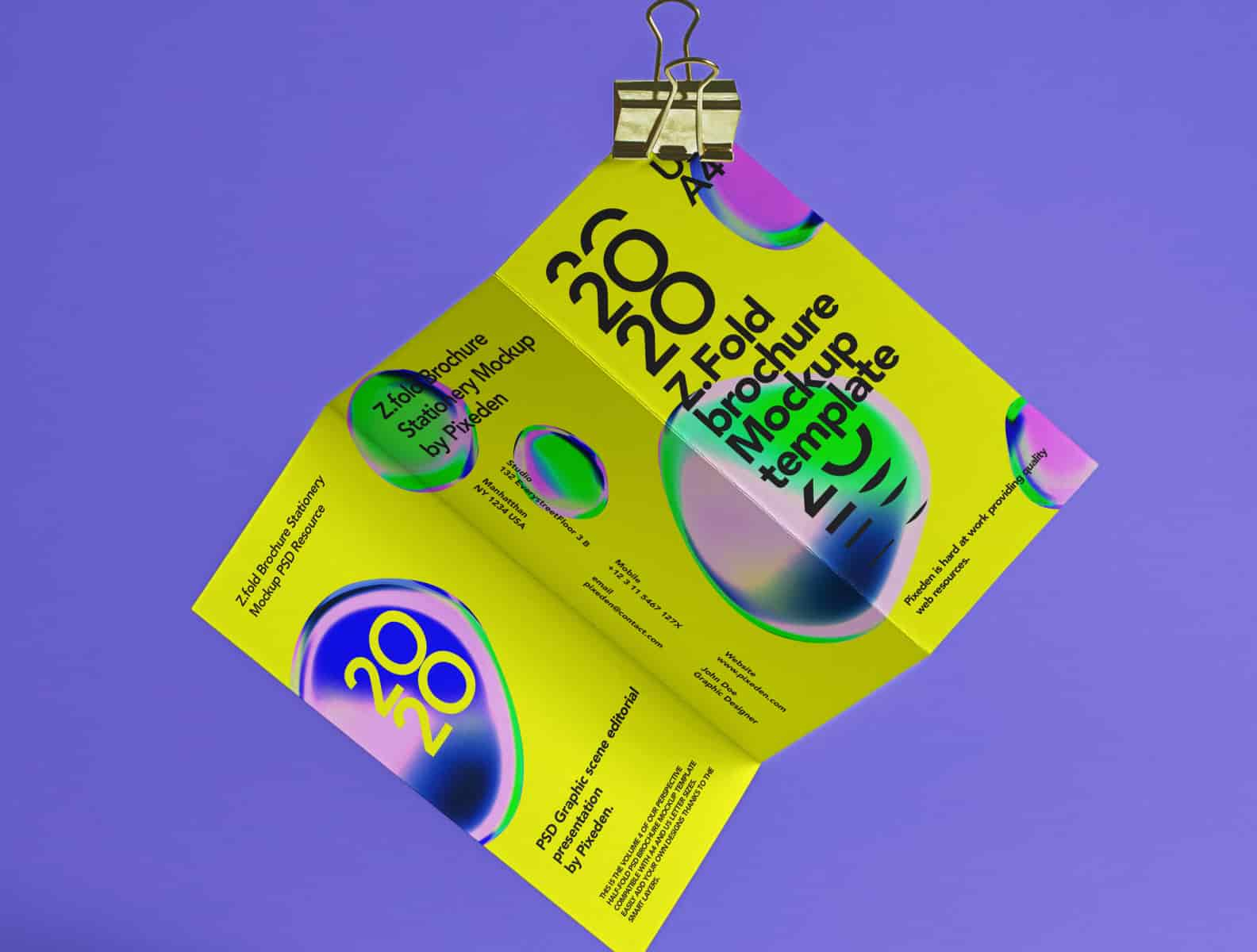
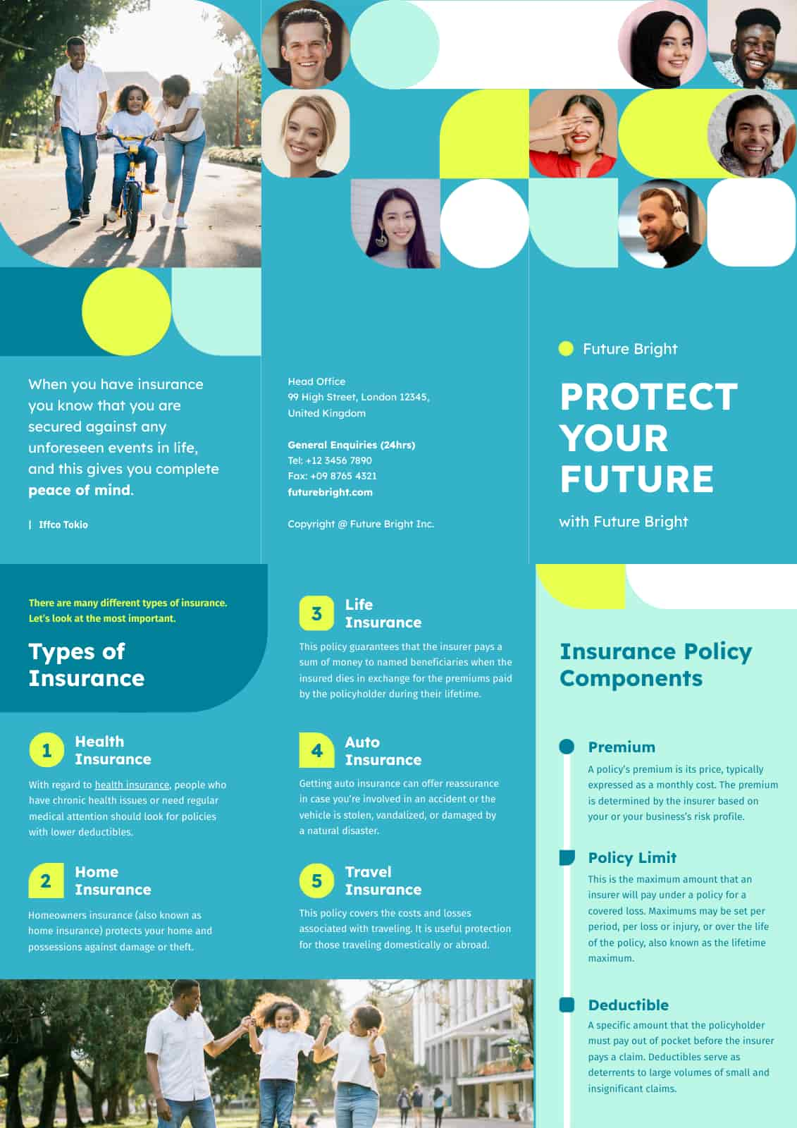
Z-fold brochure format
A Z-fold brochure is like a tri-fold brochure in size, but it has a different way of folding. This attention-grabbing option works well for brochures with a storytelling element on every new page, such as real estate brochures, travel guides, or product catalogs. A Z-fold brochure allows for a natural flow of information, leading the reader from one panel to the next. Create your own brochure in Z-fold format using the template below.
Other unique brochure folds to consider are:
- Window or gate-fold
- Double-gate fold
- eBrochure
- Accordion fold
- Double parallel fold
- Roll fold
- French fold
- Half-fold (or book fold)
Learn more: What are the different kinds of brochures?
Once you’ve decided, create a mockup of your brochure to see how your copy and own images fit within your preferred format.
Step 5: Pick a template
After planning your brochure copy, selecting your visuals, and deciding on the format, the next step is to pick a template. You don’t have to create a brochure with a blank canvas or blank document.
With pre-made brochure templates, professional-looking brochures are a few clicks away. Piktochart offers a variety of fully customizable brochure templates with its easy-to-use online brochure maker. Easily add your texts, existing images, and branding elements to your brochure.
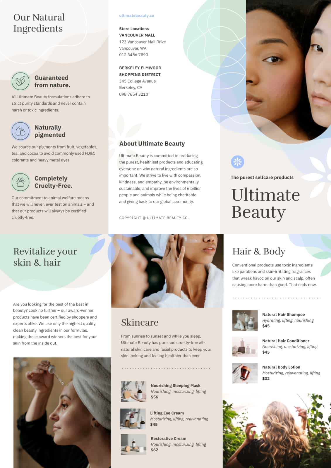
When selecting a template:
- Make sure it fits your brand’s style and messaging. Consider the template’s color scheme, fonts, and overall design to ensure it aligns with your brand identity.
- Look for templates with more space for your logo, contact details, and other essential information.
Step 6: Edit and customize your preferred brochure template
You’re almost there! As you customize your template, use the following formatting techniques to make your brochure stand out:
- Use headers and subheaders to break up the text to make it easier to read.
- Use bullet points, numbered lists, or table properties to highlight key information.
- Add colored text boxes or backgrounds to draw attention to important sections.
- Use consistent formatting throughout the brochure for a cohesive look.
- Use white space to create a clean and uncluttered design.
- Be consistent with your font size.
When editing your custom brochure templates, think about content placement too. Here are some important points to consider:
- The brochure’s cover or first page should be visually appealing and have a clear message to entice readers to open it.
- The interior panels will have most of your text, so use white space to keep it readable and avoid overwhelming the reader.
- The back panel is the perfect place to include your contact information and a clear call to action. The fourth panel in sequence becomes the back panel when folded for Z-fold brochures.
Remember, a template is just a starting point. Get creative and consider using each panel’s space to communicate your message effectively.
You will see more brochure templates in the next section below. Create a free Piktochart account to access its brochure maker and library of free brochure templates.
Step 7: Print your brochure
Now that you have your stunning brochure as the final product, brochure printing is next in line.
Pro tip: You can print brochures and supplement a small batch of physical brochures with a digital brochure that customers can download (as a PDF or PNG file) on your website.
Choose the right paper based on your budget, deadline, and desired outcomes. The type of paper you choose will affect your brochure’s overall look and feel, as well as its durability and cost.
Use the guidelines below as a starting point:
- If you have vibrant colors or large photographs, go for a glossy finish for your paper. However, it can be difficult to read under bright light for text-heavy brochures.
- Matte paper is ideal for black-and-white color schemes or high-contrast color pairings. Matte is often perceived as more professional than glossy paper.
- Uncoated paper is versatile, easy to read and write on, and a terrific option for jotting down contact information.
- Recycled paper has a textured finish. It is made from 100% post-consumer recycled paper and is a good choice for businesses prioritizing environmental sustainability.
In addition to paper type and finish for brochure printing, you should also consider the printing method if you want high-quality prints. There are two main options for printing brochures — digital and offset printing. Pick digital printing for smaller print runs and quicker turnaround times, while offset printing is better suited for larger quantities. It also provides higher quality and consistency than digital printing.
Now, you’re probably wondering how you print both sides of your brochure. Most printers these days have a duplex printer option, allowing you to print on both sides of the paper.
Pro tip: Create your own brochure online with Piktochart’s free brochure maker and download it as a PNG or PDF for high-quality prints. If you prefer to create digital brochures, use the PNG file to share via email or social media.
Say goodbye to generic-looking brochures with customizable brochure templates
Making a custom brochure doesn’t have to be limited to a few templates you’ve saved on your computer or Google Drive. Piktochart’s custom brochure maker and extensive template gallery of professionally-designed brochure templates are ideal if you’re looking for endless customization options for your next brochure design project.
Scroll down below for examples of free brochure templates. If you need help picking one that matches your needs, create a free account to get access to the brochure maker for more templates.
Trifold brochure
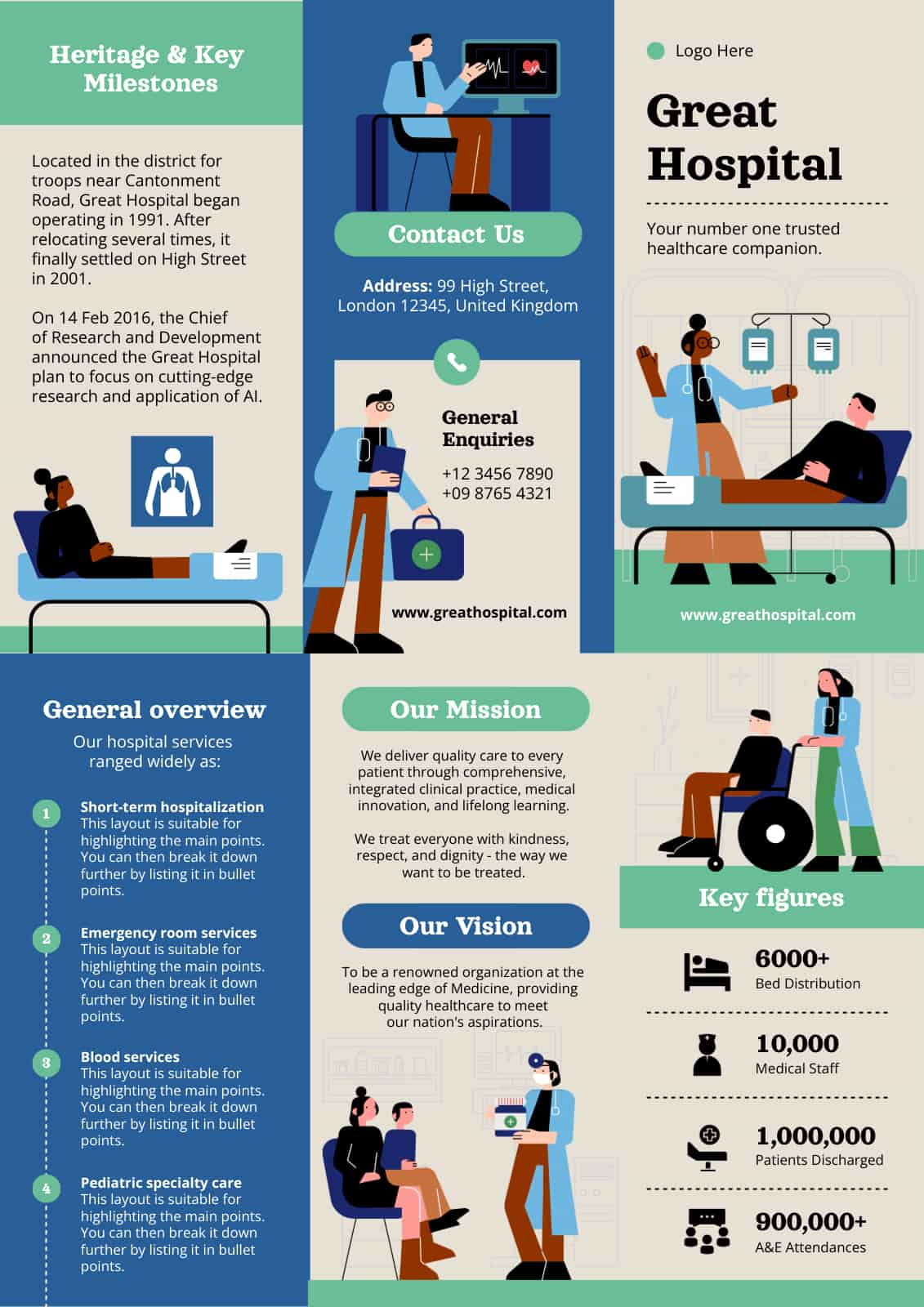
A trifold brochure template is a popular format for brochures that folds into three panels, with each panel measuring the same size.
This brochure template is a versatile option for showcasing products, services, or events and can be used for various industries.
Such templates are easy to customize to match your brand’s colors and style, making them a great option for any business looking to create an informative and visually appealing marketing visual.
Bifold brochure
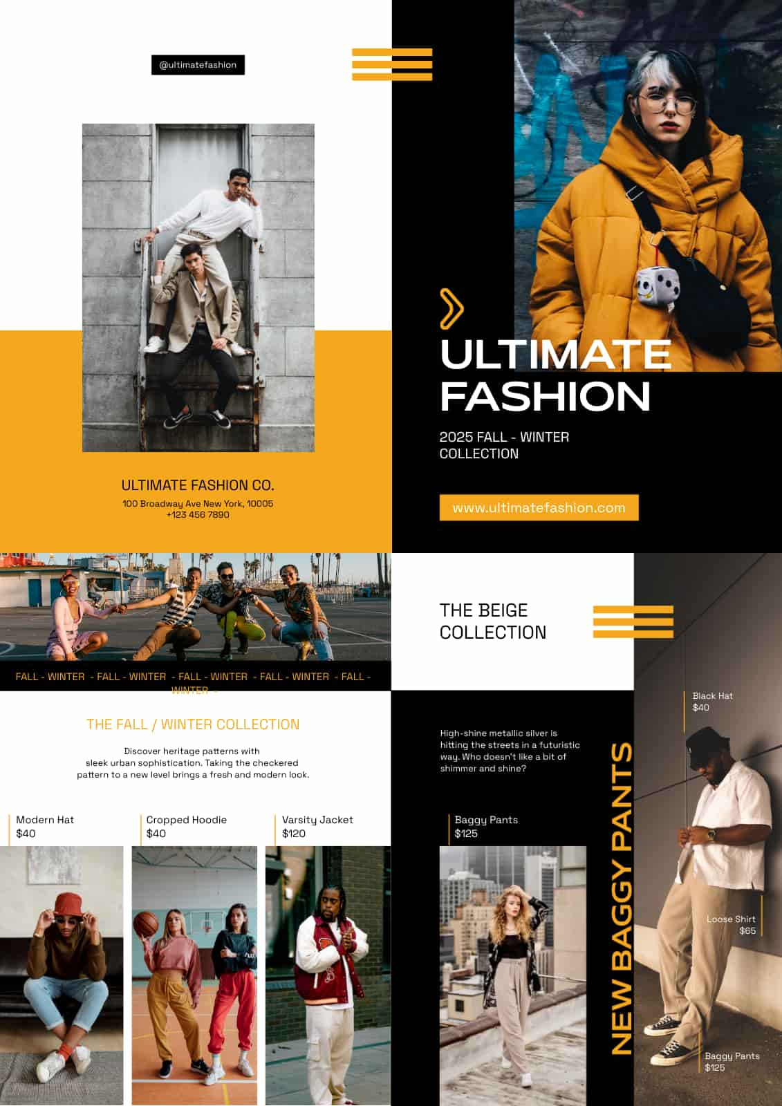
A bifold brochure is a single sheet of paper folded in half, creating four panels to help showcase your content. In this bifold brochure template, the front cover is usually the first point of contact with the reader, so it’s important to grab their attention with a striking image or headline.
On closer look, this brochure template puts the spotlight on dark yet modern-looking colors, which helps highlight the products featured in the brochure.
Fashion brochure
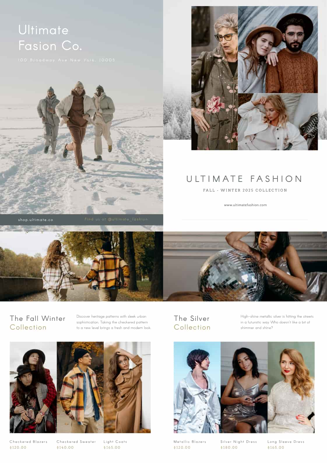
This fashion and style brochure template can help you showcase the latest trends, styles, and collections if you’re marketing for a fashion brand or style influencer. As you can see, the page setup and layout are clean and modern, focusing on the models wearing the clothing or accessories, along with descriptions and prices of the items.
Most brochures for fashion also include sections on the brand’s history, inspiration, or philosophy to give customers a deeper understanding of your brand’s values and mission.
Restaurant brochure
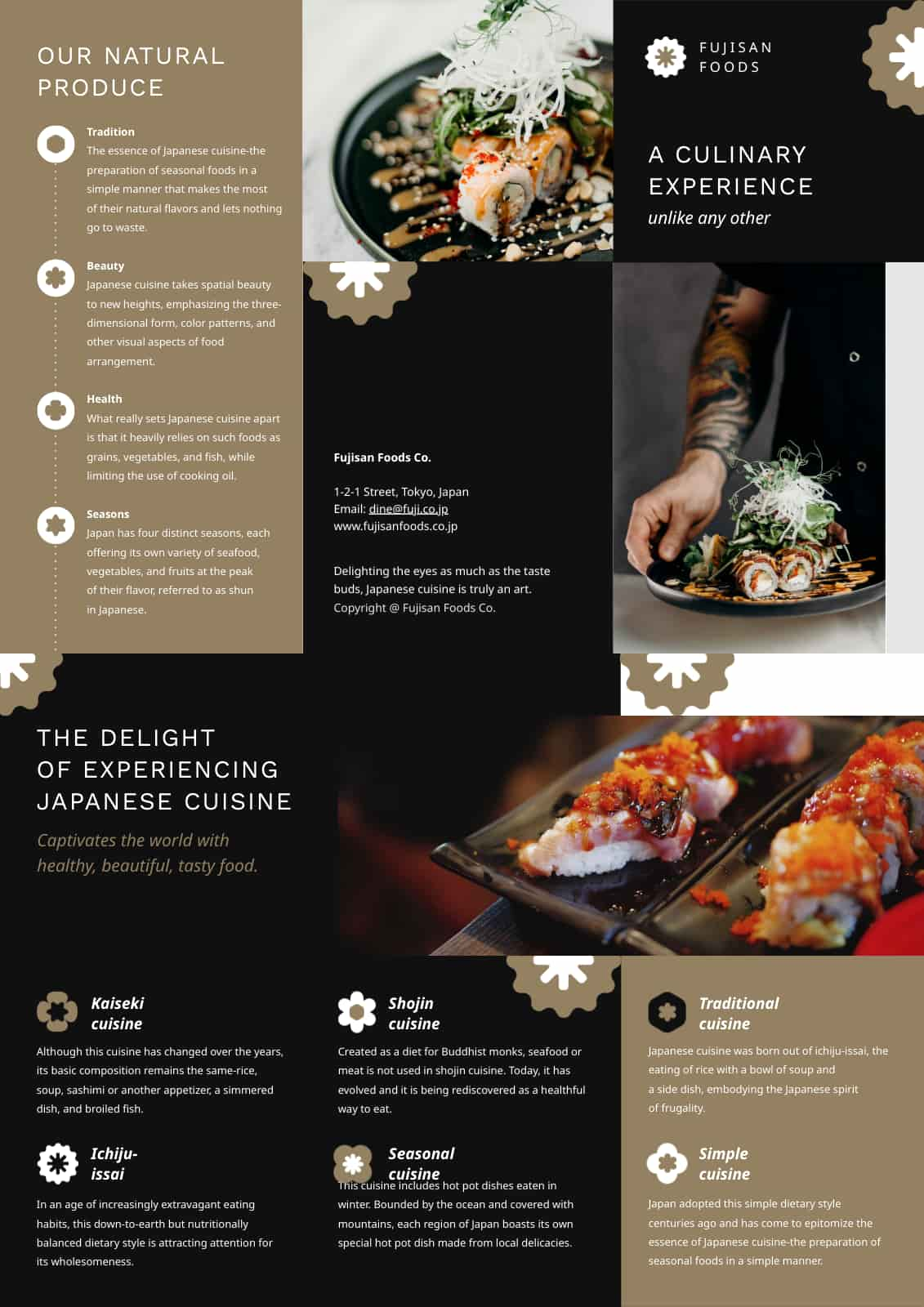
Show off the great dining experience offered by your restaurant with this visually appealing (and mouth-watering!) template. From appetizing food photographs to enticing dish descriptions, you can’t go wrong with such templates if you want to highlight your restaurant’s menu, daily specials, or catering services.
Two-page brochure
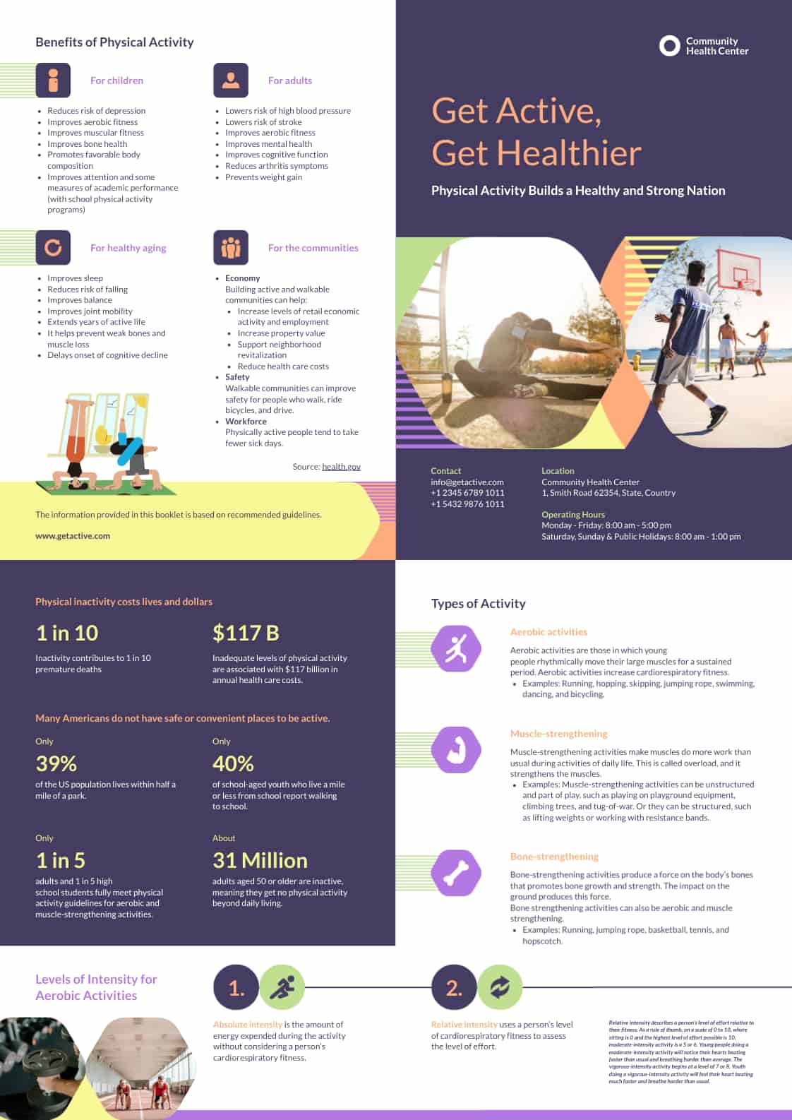
This two-page brochure is perfect for various niches — health and wellness, travel, real estate; you name it.
In this template, you will see that the brochure highlights healthy lifestyle choices, which are perfect for clinics and wellness centers.
The brochure’s clean and uncluttered design can be further customized with your preferred colors, texts, and design elements that are aligned with your overall branding.
College brochure
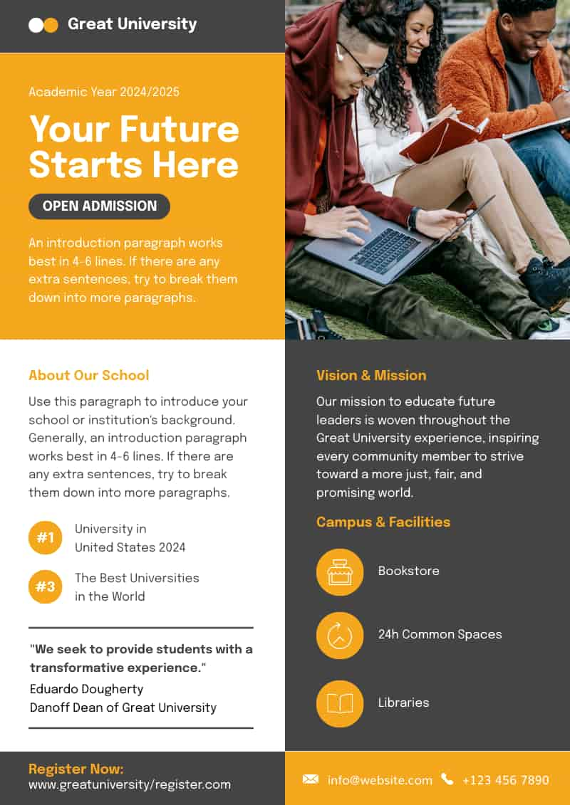
The college design brochure features a fun and modern layout, perfect for showcasing the benefits and offerings of a college. It includes ample space for your own photos and texts. Piktochart also has customizable color schemes and typography options. Whether for recruitment or informational purposes, such brochure templates can help colleges effectively communicate their unique message to prospective students and parents.
See more templates and examples of stunning brochures such as real estate brochures, environmental brochures, travel brochures, event brochures, and learn about the design process in 16 Creative Examples of Brochures You Can Edit and Print.
Make beautiful brochures with Piktochart’s free brochure maker
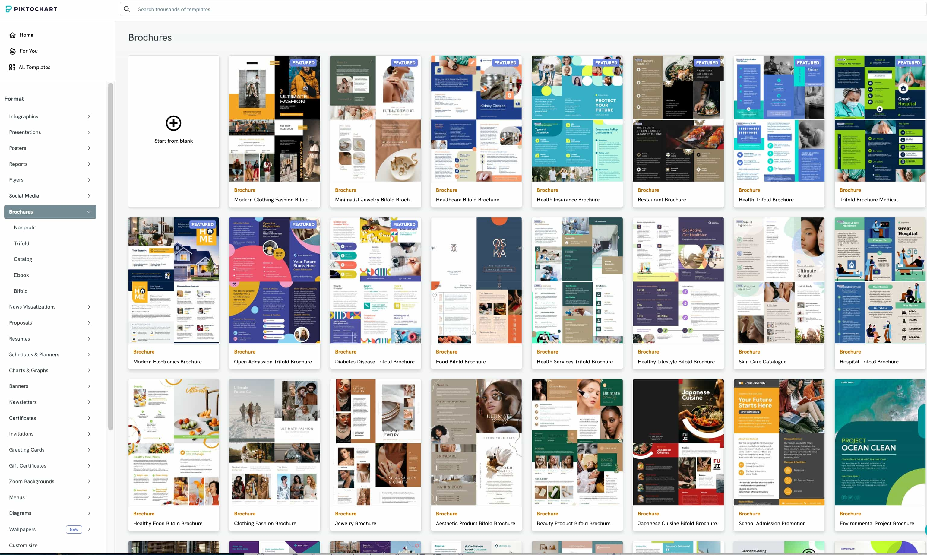
We hope this guide was helpful in learning how to make a brochure in 2024.
You don’t need to be a professional designer with design skills to create a custom brochure. All you need is access to an online tool, like Piktochart’s free brochure maker, which has hundreds of professionally designed templates for you to choose from.
The online platform also allows you to upload your own photos if you don’t find the images you’re looking for in its stock image library. Simply hover over My Files in the dashboard to find the insert menu for your own photos.
To quickly get started, why not try out our AI brochure maker? Just input your prompt and choose from one of the templates that best meets your design needs. With just a few clicks, you can create beautiful brochures you’ll be proud of. Advanced design skills are not required.
Piktochart is an intuitive tool that allows for easy customization for brands, data visualization, and online collaboration. Create reports, presentations, brochures, and more. Get started for free.
Want to speed up the design process without losing out on quality? Try out our generative AI tool for free now.

