Infographic is an effective marketing tool. By making great infographics, you can increase your website traffic, get more backlinks, maximize your sales, and get more shares, likes and followers (source: Infographics Cheat Sheet).
The following are some easy ways we can avoid creating junk infographics. Let’s learn to get it right together! You can follow along by creating an account on Piktochart for free.
1. Confusing representation of data
Chart that makes no sense will not help convey or support your message. Confusing graph and difficult to interpret visuals can make your readers frustrated. The example below uses wrong type of chart. It gives the impression that the 3 things should add up to 100% (but on quick mental calculation, it’s 143%!).
Tip: Use legit data source and show data that make sense
- Get legit, get real – Spend time in making sure your data is correct. Are your sources legit?
- Data sense – Double-check your charts / graphs so it make sense and easy to understand.
- Let them see not think – The message from your graph should be obvious, if not highlight it.
- Select the right data visualization
2. Charts that require effort to digest
There’s a high chance you’ll loose your readers if they need a map for your map, or you make your readers work for the info, i.e. the example below. Unless you are selling puzzle games app, I think it’s best to avoid such visual representation.
Tips: Use easy to understand visual representation
- Keep it simple – Don’t waste time trying to create what you may think is cool, like complex charts with even more complex legend (unless you can really nail it). Or else you’ll ended up confusing your readers.
- Cleverly use shapes and colors – to represent different sets of data. Make readers easily associate the elements and data. For example, use mobile and PC icons to represent user preferred devices for blog viewing.
3. Crowded with text
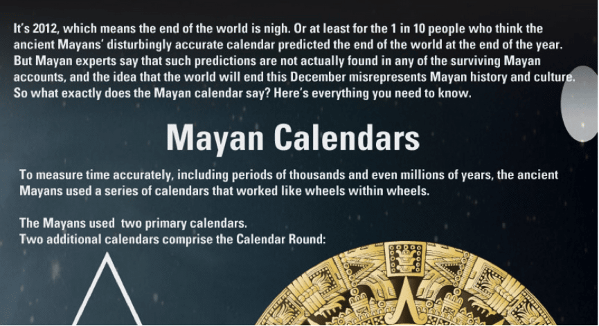
An infographic full of text simply defeats the purpose of infographic. Your readers are unable to grab any useful information at one glance.
Tips: Use text to support visuals (not the other way round)
- Only include important text – Cut down unnecessary sentences and only use it to support your visuals. The less words, the better.
- Visualize your text – As much as possible try to visualize your data and message into an easier to understand form.
Get started right away by creating a free account and selecting a template from our infographics gallery.
4. Overuse of color
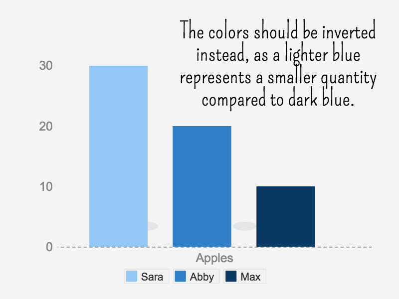
Using too many colors in an infographic renders it confusing – the less color there is in an infographic, the more likely for the infographic to seem minimalist and professionally designed. Apart from that, colors also represent data density in any chart. For example, darker color hues usually represent an increasing number. Refer to the example in the following chart.
For a more detailed guide on matching colors for the use of data visualization, please refer to this article by datavisualisation.ch.
Tip: Stick to a maximum of 4 colors
- Keep it to a minimum – Keep the number of colors to a minimum with good contrast between your background and content elements, like text, graphics, and charts.
- Use colors wisely – Make use of colors and their complementary natures
5. Adding as many icons and stock photos as possible
No doubt, a nicely designed infographic attracts readers. However, when there is an overuse of icons and stock photos, the infographic loses its focus. Take a note at the two “birds” in the following example – although the pink data says 55% and blue says 45%, the size and shaded area of the 2 birds remain the same.
The use of iconography and stock photos should be used sparingly and with purpose/i.e. to provide context and faster reference to the data points.
Tips: Information and graphic design go hand-in-hand
- Plan and check your data – Prepare your data before making infographic. Check that your data is correct.
- Design your data – Ensure your data can be presented in a clear and easy to understand manner.
- Design your content – Come up with a good, fitting design while ensuring the information is being relayed correctly.
Conclusion:
You can create effective infographics that attract readerships and provide good information at first glance. Start with the following tips on making good infographics:
- Plan and check your data. Ensure the source is legit and the data is presented correctly.
- Select the right data visualization that is easy to understand.
- Show, not tell your information—don’t make your readers work for the information.
- Visualize your data. Use text to support your graphics.
- Use colors smartly.
- Focus on both information and graphic design.
Making good infographics require a lot of practice. Take the first step by creating an account on Piktochart and don’t give up!


