A great infographic is made when your visual elements work together to draw your reader’s attention, through a killer infographic template.
The key to achieving a simple, elegant, and attractive infographic is through a combination of two elements: ample whitespace and a well-arranged layout.
In this guide, you’ll learn how to use white space and color appropriately in your infographic, as well as discover the different layouts you can choose from. You’ll also find examples and templates for each infographic design layout.
When you’re ready, you can get access to a wide collection of pre-made infographic templates with a free Piktochart account.
Let’s get started!
Table of contents:
- What is white space in an infographic layout?
- Types of infographic layouts with examples
- How to create a good infographic layout in five easy steps
What is white space in an infographic design?
As its name suggests, white space is a space that is unmarked in a visual asset, such as an infographic. Also known as negative space, it’s the space between the other visual elements included with your infographic design.
These could include margins, padding, or spaces between columns, text, icons, and design elements.
However, white space doesn’t have to be white.
Why white space matters when creating compelling infographics
An infographic crammed full of text and images will appear busy. This makes your content difficult to read. Your readers will also have a hard time focusing on the important stuff.
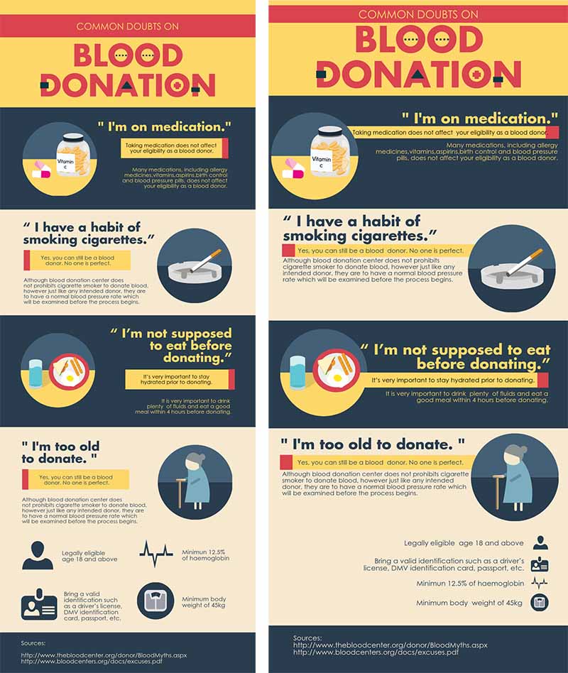
As you can see in the example below, the infographic on the left has enough space above the main heading. This gives the headline on the left the spotlight while the headline on the right looks cluttered. As a result, it loses its impact.
On the other hand, too much white space can make your page look incomplete, as seen in the bottom part of the infographic on the right.
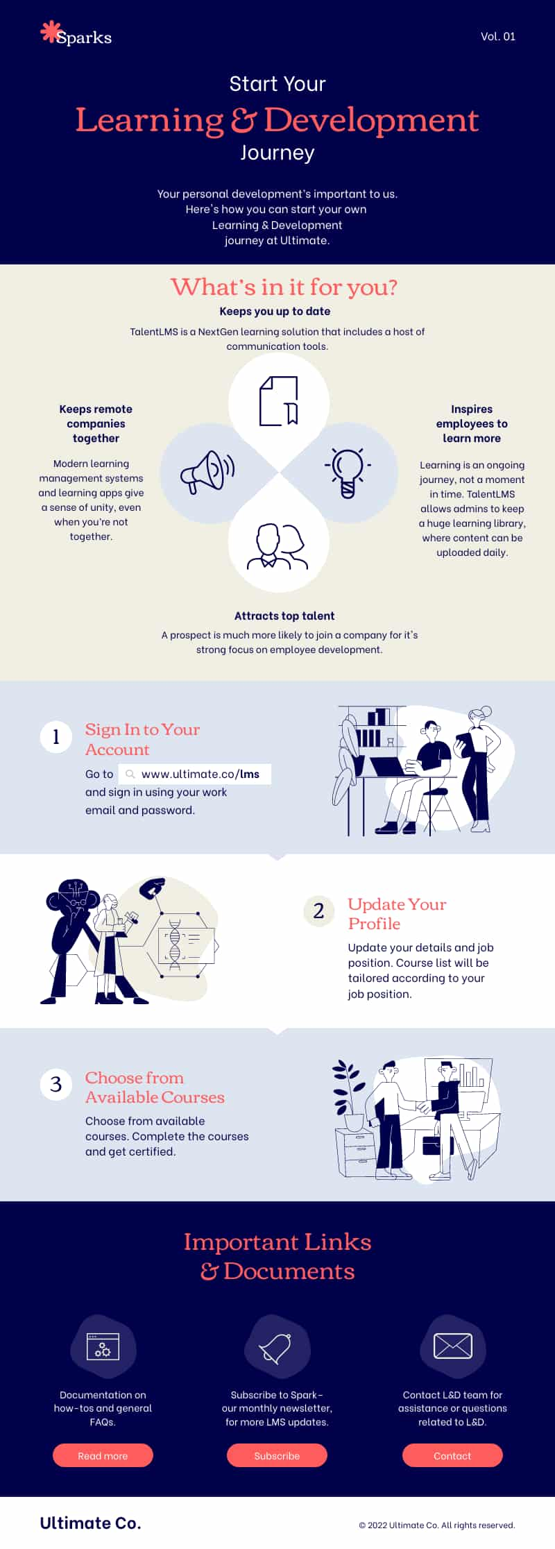
An infographic with ample white space is more calming to the reader’s eyes, as seen in the infographic template (that you can happily edit by the way!) below. It looks clean and simple, right?

Now, let’s move on and browse the different types of infographics and their respective layouts.
Types of infographic layouts with examples
An infographic layout refers to the visual arrangement of your design elements and your infographic content.
It could be as simple as a one-column layout when you have very little information, or two columns for slightly more complex content.
The most common types of infographic design layouts are:
- The useful bait layout
- The versus/comparison layout
- Data-heavy layout
- Road map layout
- Timeline layout
- Visualized article
Storytelling through infographics
As you begin working on customizing an infographic, it’s important to have a story to tell. For this reason, you need to pick an infographic design layout that best suits your story.
Using the right layout will ensure that you convey your message well which is a key advantage for dealing with distracted readers.
Whether you’re about to transform a long report into a business infographic or looking for free infographic templates to download, we have put together a cheat sheet of infographic layouts for you to reference the next time you’re designing an infographic.
You can learn more about creative infographic layouts in our in-depth blog post about the different types of infographics.
Each section also comes with tips and a template design which is a visual representation of the infographic template that’s highlighted.
1. The useful bait infographic design layout
These types of infographic templates work well with most types of data.
Rather than focusing on branding, stock images or other visual elements, these templates are created with a focus on practicality, in turn making these templates easy to read through digestible information.
Examples of these infographics can range from a reference sheet or a visualized workflow in your organization that you can create, download, and print to use repeatedly.
If your content has many subtopics, this format enables you to segregate them into clean chunks that are easy to consume.
2. Versus or comparison infographic design layout
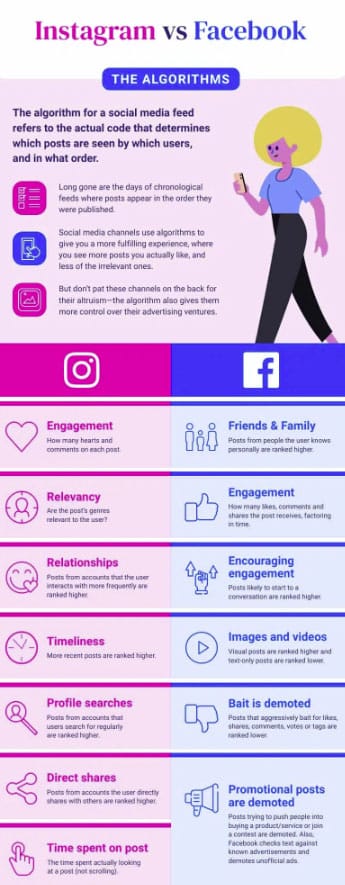
These templates are typically split vertically to give a clear side-by-side comparison.
Use this when you want to show readers the differences or similarities between the two items or topics you’re comparing. This layout works well if you have lots of “bullet point” information to share.
3. Data-heavy infographic design layout
Use this layout if you are working with a lot of statistics and charts. You can also connect the different points of your information by adding a flowchart along with diagrams.

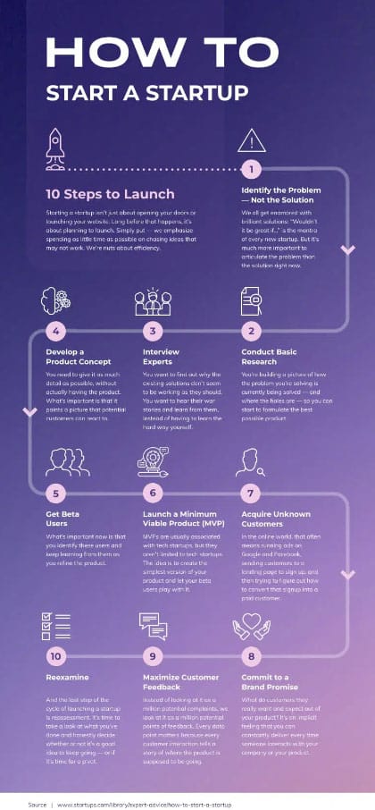
5. Road map layout
If you want to visualize your process or tell a story, this infographic layout offers a great way for your important information to flow naturally. Add compelling screenshots, images, stock images, icons or thumbnails (sparingly!) to complement your data.
6. Timeline infographic layout
If you’re about to explain historical events or present chronological information in your infographic, this is the template for you.
Companies usually use this timeline infographic in their annual reports or when reporting their business accomplishments and milestones internally or to the world.
7. Visualized article layout
If you have complex data or a lengthy story, this infographic layout is the best way to visualize it.
The focus of this layout is the visuals, not the text. You can also build your content separately into chunks to then include a strong title for each and share them on social media.

There are many types of design templates that you can use for your infographic.
The ones listed above cover all the basics, and give you the tools to create infographics from ready-made templates instead of starting from a blank canvas. The video tutorial below discusses more infographic types and layouts that you can experiment with.
Concluding infographic layout considerations
In summary, ample whitespace and compelling visuals and illustrations are the foundation of a good infographic structure and layout.
Piktochart’s infographic templates also make it easier for you to come up with an infographic layout that’s attractive and helpful at the same time to your readers. All you need to do is re-arrange the blocks to make room for your infographic layout ideas; no design skills are needed!
How to create a good infographic layout in five easy steps
Before you get started with your infographic template, here’s a step-by-step guide on how to come up with a good infographic layout:
- Step 1: Figure out your goal. What do you want to communicate through your infographics?
- Step 2: Determine your audience. Who are you creating infographics for?
- Step 3: Gather relevant information through research and interviews.
- Step 4: Outline the content you want to add to your infographic.
- Step 5: Choose an infographic template and get creative with your layouts.
Watch the video tutorial below to learn how you can make your own infographic template using Piktochart.
Piktochart Infographics: Infographic templates to suit all needs
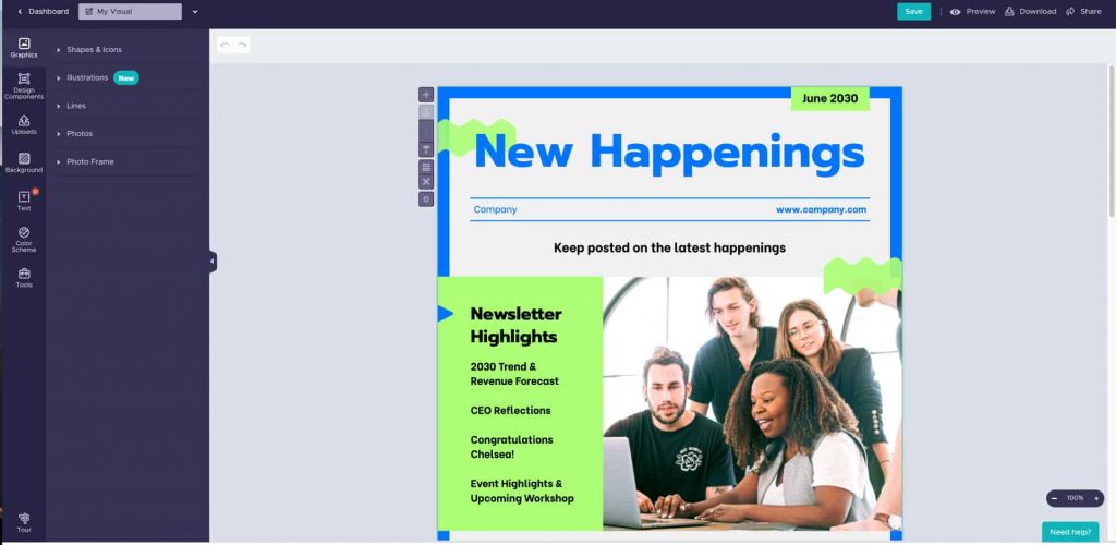
With the Piktochart Visual editor, you can easily play with the color scheme, edit the illustrations, and add a bit of data visualization elements like graphs, charts, and pictograms to any infographic template.
If you don’t have a Piktochart account yet, sign up for free to be able to create professional visuals in minutes online. Get inspired by more free infographic templates and start creating using our online infographic maker!
