In this post, we summarize 55 interesting data visualization statistics, proving the importance and effectiveness of data visualization in communication.
You will also learn why you might want to try infographics to bring your data visualization skills to the next level.
Whether you’re new to the topic and just trying to find a way to best present your insights or have been doing it for years, I’m sure you will be able to find something helpful here.
Ready to jump in?
How much data is out there?
We live in the era of digitalization. Have you ever wondered how this impacts the number of data we generate daily? Here are a few data visualization statistics to start with:
- With around 4.66 billion active Internet users worldwide, compared to just 2.6 billion in 2013, 2.5 quintillion bytes of data are generated each day. (FinancesOnline)
- By 2025, this number is expected to reach 181 zettabytes (Statista)
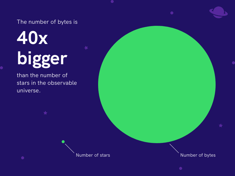
- To put that into perspective, it will mean the number of bytes is 40 times bigger than the number of stars in the observable universe. (World Economic Forum)
And where is all this data coming from?
Facebook users post around 350 million photos in a day, which contributes 4 petabytes of data. (Raconteur)
To help you grasp the magnitude of this number, the Milky Way Galaxy is home to approximately 200 billion stars. Assuming every individual star was a single byte, we would need 20,000 Milky Way Galaxies to match the number of stars with the number of data created by Facebook users each day.
Besides, 500 million tweets are sent on Twitter daily, and Instagram users share 95 million photos and videos. (Raconteur)
If you ever wonder how far you scrolled your social media feed in a year, researchers estimated that an average person would have scrolled the equivalent height of the Burj Khalifa (i.e., the tallest building in the world) in a week and Mount Everest in a year.
In 2022 alone, there were 8.5 billion searches on Google every day. (Oberlo)
1M+ LinkedIn members publish content weekly and generate 280 billion feed updates annually. (LinkedIn)
All those social media feeds and internet searches fueled the exponential growth of the digital universe, and it doesn’t look like this will stop any soon.
The question is, how are you keeping up with the immense amount of information coming towards you?
On top of tuning down some of the noise itself, you will need a method to see and digest data and information effectively.
And that’s where data visualization comes in handy.
What is data visualization?
Data visualization is the graphical representation of data through visual elements such as charts, graphs, maps, or timelines.
In the world of big data, data visualization is essential to analyze massive amounts of information and make data-driven decisions.
Human brains decode information through patterns. Researchers found that human brains try to detect patterns in our environment all the time because it makes learning easier.
Data visualization helps you break down, process, and present information in a visual context. This way, it takes less time and effort for the brain to digest the information than analyzing data tabularly.
You might not have noticed, but I gave you an example of how this works in practice in the previous section of this post.
When talking about the amount of data created by Facebook users each day, I asked you to visualize the Milky Way Galaxy and mentioned that the data is equivalent to 20,000 Milky Way Galaxies.
That’s how data visualization makes it easier for you to process that information.
The effectiveness of data visualization
Research by Robert Horn at Stanford University shows the benefits of using visual aids to accompany verbal communication:
- 64% of participants made an immediate decision following presentations that used an overview map.
- The use of visual language is proven to increase meeting effectiveness and efficiency, leading to 24% shorter meetings.
- Groups using visual language have experienced a 21% increase in reaching consensus compared to groups that did not use visuals.
- Combined verbal and visual communication increase credibility and influence rate to 43% compared to 17% when only verbal communication is used.
A study found that in organizations using visual data discovery tools, 48% of the managers can find the information they need without the help of IT staff. And 74% of organizations that use visual data discovery empower managers to make decisions when necessary. (Aberdeen Group)
Companies with the most advanced analytics capabilities are outperforming competitors by wide margins because their leaders are:
- Twice as likely to be in the top quartile of financial performance within their industries
- Five times as likely to make decisions much faster than market peers
- Three times as likely to execute decisions as intended
- Twice as likely to use data very frequently when making decisions
It is extremely valuable for professionals to gain insights into customer behavior, supply chain efficiency, and many other aspects of business performance.
Well-structured data visualization shortens the time needed to absorb information, unveil trends or outliers, and empowers decision-makers to make data-driven decisions.
Visualize Data Like a Pro
Need an infographic, interactive dashboard, or a report? With Piktochart, you get professional data visualization without involving your data team.
Create a free Piktochart account
Storytelling with data in business
Data visualization in marketing
Digital marketing and customer experience
Driving data-informed decisions is a crucial element of digital marketing in today’s world.
With the help of analytics and tracking tools like Google Analytics, Optimizely, Google Tag Manager, or Mixpanel, businesses are able to collect more and more data about consumers’ profiles and their behaviors.
This creates a need to properly visualize that data and turn it into actionable insights to guide the marketing strategy.
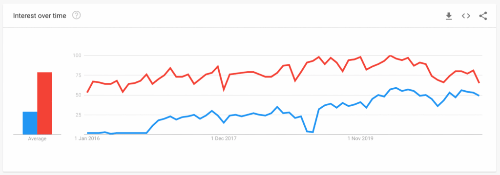
A graph from Google Trends shows how the correlations between “digital marketing” and “data visualization” continue to increase.
Here are just a few examples of questions that can be easily answered with the help of data:
- Is my website traffic trending up or down?
- What are my top converting landing pages?
- Where are my visitors coming from?
- What web pages on our site get the most traffic?
- Which organic keywords rank better in search engines?
Marketers can get the answers by digging through their raw data in the respective platforms. But this can be time-consuming and leaves room for error. That’s why data visualization proves to be so helpful in gaining quick insights into the performance of marketing campaigns and growth experiments.
- Currently, 86% of those working in digital experience use traditional web analytics, while 84% collect feedback on customer interactions through online surveys and forms. Just over half (56%) are also incorporating A/B testing into their digital experience approach. (Content Square)
- Of those surveyed, 42% are already using heatmaps to analyze behavior across their web and mobile sites, while a further 21% have plans to adopt this technology in the next 1–2 years. 29% are also tracking behavior through session replays. (Content Square)
Usage of data visualization tools and tactics continues to grow and gain importance across marketers. Data visualization allows them to offer the best digital experience to customers, magnetize high-potential leads, and stay ahead of their competition.
Analyzing social media data
Data visualization is crucial for marketers to get a deeper understanding of their social media data. Marketers can leverage social media data for:
- Audience Segmentation: Through analytics, marketers can segment their audience based on demographic parameters.
- Lead Generation: By analyzing social media data, marketers can develop an accurate lead generation model that revolves around the users’ activities on their social media profiles.
- Sales Outreach: Salespeople can use social media insights for personalized conversations and sales approaches.
- Content Engagement: Marketers can use their data to assess which social media platforms and what type of content work best for your audience.
Generate marketing content
- The most-ever read online story in The Washington Post is a visualized story. (Poynter)
- The New York Times Magazine’s most visited content in 2013 was an interactive dialect map (New York Times)
- In the early stages of their buyer journeys, 81% of B2B buyers report enjoying listicles, 72% infographics, 66% blogs, and 62% videos.
- In the mid-stage of their buying journey, 50% want to see assessments, 49% research and reports, and 46% case studies.
- Case studies (35%), third-party reports (31%), and assessments (18%) are preferred in the late stages. (Demand Gen Report 2021 Content Preferences Survey Report)
Including charts and visualized data increases consumer engagement and adds credibility to the content, which helps significantly in building trust between customers and the brand.
Data visualization in sales
Visualize CRM data
- Using a CRM tool, a company tripled lead generation, saved each user approximately four hours per week from eliminated data entry and time spent searching for records, and avoided a business development hire. The company implemented the software, set the system up within a week, and delivered a 998% ROI. (Salesforce)
- Sales productivity increases by up to 44% by monitoring the team’s performance across key performance indicators in real time with custom reports and dashboards.
- 53% of top-performing salespeople have a higher confidence level in their CRM data than their counterparts. (HubSpot)
With more and more companies adopting CRM tools, visualizing data is becoming a vital skill among sales talent. CRM tools these days allow their users to produce data visualizations that are updated almost as soon as more data comes in. Naturally, data visualization is integrated deeply into sales tasks to boost productivity and be the basis of their judgments.
Collaboration with Marketing and other teams
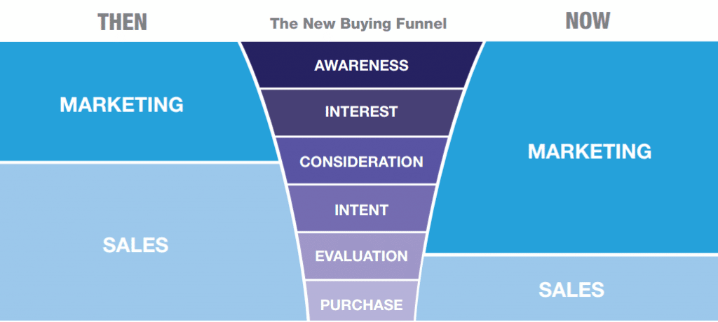
- 87% of sales and marketing leaders say collaboration between sales and marketing enables critical business growth. (HubSpot)
- Sales and marketing alignment can lead to a 32% increase in year-over-year (YoY) revenue growth. Sales and marketing alignment can lead to 208% growth in marketing revenue. (Marketo)
Data visualization has a crucial role in improving data integration in the modern-day, where the sales team works closely with the marketing team. For example, while sales teams could utilize CRM tools such as Salesforce, marketing data, on the other hand, could come from sources that include HubSpot and other alternatives, resulting in the massive data collected from many channels.
“The new reality is that sales and marketing are continuously and increasingly integrated. Marketing needs to know more about sales, sales need to know more about marketing, and we all need to know more about our customers,” notes Jill Rowley on Salesforce.
Data visualization tools create a common platform that integrates data results from sales and marketing activities. And with the data visually represented, the combined sales and marketing activities can be analyzed quickly and turned into well-thought strategies to build customer relationships.
Data visualization statistics in healthcare
Big health data and research
- According to the forecast, the healthcare market’s big data is expected to reach a market valuation of $34.27 billion by 2022. (WGR)
- Approximately 80% of significant healthcare market players invested in big data analytics and artificial intelligence-driven by the need for business transformation and market competition, enhancing agility and reducing expenditure. (WGR)
To deal with such a massive amount of data, scientists and researchers use visual displays to provide a multidimensional space to organize data and show connections between different pieces of relevant data.
Quoting Bang Wong, creative director of MIT’s Broad Institute. “Plotting the data allows us to see the underlying structure of the data that you wouldn’t otherwise see if you’re looking at a table.”
Digitalization in hospital and public health system
Researchers also found correlations in using visual displays to enhance the reading and comprehension of articles, provide the readers with additional data representation, and highlight the authors’ data analysis in qualitative research.
- By 2015, 80% of hospitals demanded data analytics and system management as the most needed skills for C-level candidates.
- In 2017, the EHR adoption rate by hospitals in the United States was nearly perfect, with 96% having a federally tested and certified EHR program—a ninefold increase since 2008. (NCBI)
- And by 2019, 72% of the public believed that their doctors would do a better job coordinating their care by adopting the EMR (Electronic Medical Records), which leads to improved overall quality of care in the country – US. (KFF)
- Using a dashboard to visualize electronic health record data resulted in a 65% reduction in time spent on data analysis in the first year alone (Marry Ann Liebert, Inc.)
Today every hospital uses data visualization solutions to manage their in-house process ranging from patient profiling like maintaining the patient record, conducting satisfaction surveys, filing complaint registers to capacity planning, and much more.
A few reasons why hospitals and healthcare practitioners find visualization helpful:
- Visualization sometimes helps avoid diagnosing errors by eliminating human error in a higher risky environment and setting a protective layer for patient safety through the dashboard, i.e., e-health records and e-medical records for tracking and monitoring patient health records.
- It helps reduce operational cost by presenting more accurate information to a doctor, nurses, and administration on the spot with understandable values.
- As time is the underlying factor in any healthcare industry, visualization helps increase response time by enabling real-time metrics and updates on more crucial information. The use of biometric data allows medical professionals to map the real-time activity of the patient and thus help in tracking and curing specific health issues.
Data visualization in HR
Talent decisions based on people analytics
- With the new data-driven strategy, Dropbox sees improvements in talent diversity by hiring as many as 42% of underrepresented groups from total hires that year. (SHRM)
- The research found data and algorithms can improve job performance prediction by 50%, which results in more productive hires. (APA)
- 2020 Work Institute Retention Report reveals that more than 75% of employees who quit could have been retained, and voluntary turnover costs exceeded $630 billion last year. But with the help of data, resignations can be predicted (and prevented) 17 times more accurately than guesswork or intuition alone. (Visier)
- The report shows a 242% increase in HR professionals with data analysis skills over the last five years. (LinkedIn Talent Solutions)
- 73% of talent professionals surveyed say people analytics will be a major priority for their company over the next five years. (LinkedIn Talent Solutions)
- Survey finds, out of 7000 talent professionals across the globe, on average, 85% say people analytics will be “very important” in shaping the future of HR and recruiting. (LinkedIn Talent Solutions)

People analytics have revolutionized the way HR and companies make talent decisions. Companies use people analytics to measure employee performance, identify skill gaps, determine job competencies, identify flight risks to improve retention, and plan a strategic workforce.
Experts predict an increase in unemployment rates in the coming years. By keeping a pulse on the trends and adapting hiring practices accordingly, talent professionals can be ready to hire and retain stellar talents.
And now that data is accessible to all, understanding and capitalizing on analytics has become a must-have skill in HR.
Data visualization tools
We know how powerful data is as a tool, but datasets can seem like an alien language to many in an organization outside of the Business Intelligence or Analytics team.
This is where data visualization comes into play.
Using data visualization, any professional can take raw data, turn it into something easy to interpret, and use it as the basis of good decision-making.
Depending on the needs, there are many approaches to data visualizations to explore. However, there are a few visual tools that cover most of the common data visualization techniques, such as:
- Pie charts
- Bar charts
- Histograms
- Gantt charts
- Heat maps
- Box-and-whisker plots
- Waterfall charts
- Area charts
- Scatter plots
- Infographics
- Maps
Here are our Top 5 Powerful Data Visualization tools you can use for your business:
- Tableau
Tableau is one of the most popular data visualization tools on the market. Not only it’s relatively easy to use, but it’s also incredibly powerful. Tableau can integrate with hundreds of sources to import data and generate dozens of visualization types—from charts to maps and more. Owned by Salesforce, Tableau boasts millions of users and community members, and it’s used widely at the enterprise level. - Google Charts
If you’re working with interactive data visualizations destined to live on the internet, Google Charts might be the best tool for you. Google Charts can pull data from various sources—including Salesforce, SQL databases, and Google Sheets—and uses HTML5/SVG technology to generate 18 types of charts, which explains why it is the popular free option among all the tools out there. - Zoho Analytics
Zoho Analytics is a data visualization tool specifically designed for professionals looking to visualize business intelligence. User-friendly dashboards are widely used to visualize sales and marketing data such as revenues, costs, and pipelines.
There are other tools that work similarly to Zoho Analytics and are tailored to sales and marketing professionals. HubSpot and Databox are two examples, both of which include powerful data visualization capabilities. - Datawrapper
Professionals looking into generating charts, maps, and other graphics for use online can consider Datawrapper. The tool’s original intended audience was reporters working on news stories, but any professional responsible for managing a website can find value in it.
Datawrapper also offers team collaboration features and integrations to Slack and Teams will come in handy to share your visuals across organizations. - Piktochart
What sets Piktochart apart from the other tools is that anyone can use it to create infographics and interactive dashboards (see video below). Piktochart offers 16 different charts that you can use in your infographics, reports, and dashboards. Additionally, the tool includes a drag-and-drop editor, hundreds of templates, thousands of icons and millions of photos that are free to use. The possibilities are endless with Piktochart, which is why it’s the preferred option among creative professionals.
Infographics and data visualization
Data visualization sits right in the middle of analysis and visual storytelling.
It’s not simply as easy as just dressing up a graph to make it look better or slapping on the “info” part of an infographic.
Effective data visualization is a delicate balancing act between form and function. The plainest graph could be too dull to catch any attention or to tell an impactful point. The most stunning visualization could utterly fail at conveying the right message.
The data and the visuals need to work together, and there’s an art to combining great analysis with great storytelling.
A good infographic can be a powerful communication tool. It helps to make informed decisions, educates, and drives engagement.
Here are some infographics statistics to convince you to start using this visual format in both your external as well as internal communications:
- 65% of brands use infographics in marketing. (Xerox)
- Infographics can boost website traffic by 12%. (One Spot)
- Infographics are the fourth most-used type of content marketing. (HubSpot)
- 84% of people who have used an infographic consider them to be useful. (Infographic World)
- Infographics and other colorful visuals can increase sales by up to 80%. (Xerox)
- Infographics get 94 percent more viewership than other static content (Practice Builders)

The future of data visualization
The world of data visualization constantly evolves.
In the past, advanced business intelligence and data visualization were so complex that only data scientists and analytics experts could use them.
Nowadays, any business stakeholder can easily collect and analyze large volumes of data and use data visualization to gain quick insights from complex trends and patterns.
Over the next few years, data visualization will continue to become more powerful and accessible to non-technical audiences.
Through the use of interesting infographics or interactive visuals, data visualization is adopting the newest technologies to make itself even more accessible, engaging, and insightful to any type of audience.
Here is a closer look into how our interactions with data visualizations will change in the future.
Data visualization in VR and AR
Desktop monitors, mobile devices, or television screens aren’t the best solution when it comes to visualizing data in 3D.
That’s where virtual and augmented reality comes into play.
With the use of virtual reality (or VR), you can analyze and review data in a 360-degree virtual space. Imagine a business presentation of the future. Without leaving your home, you can access a VR-simulated environment where you join other business executives at a virtual table, viewing a yearly summary of your company’s performance.
According to Alfredo Ruiz, Design Lead at IBM Watson, “visualizing data in 3D allows users to uncover trends and patterns that may not be immediately visible with 2D visualizations.”
- According to analysts, augmented virtual reality’s market value is projected to be approximately $114.5 billion globally by 2027. (Markets and Markets)
- 86% of customers said they shopped online to save time at the dealership during the pandemic, citing this as the No.1 benefit of virtual car shopping. And AR played a major role in the way consumers shop online. (wardsauto.com)
- Virtualitics has raised a total of $11.4 million to develop its Virtualitics Immersive Platform (VIP), which combines machine learning, big data, and virtual reality. (nanalyze.com)
