Customer Story

How a Government Research Analyst Presents Data Effectively With Piktochart

jesse stringer

Jesse Stringer

Research Analyst

For researchers, numbers and data points are key for analysis in making any decision. The nitty-gritty details behind the data cannot be undermined, but those data may not be translated clearly for non-researchers.

As part of our #PiktoChat series, Wilson had a brief chat with Jesse Stringer, a research analyst with the Alaska Department of Corrections. As a government research analyst who deals with data and numbers, Jesse has been using Piktochart to visualize research findings in a clear manner for his audience.

Visual communication has benefited Jesse’s career and the community in his state, as information is communicated precisely and understandably.

WM (00:06):

Hello, everyone! I hope you’re well out there and thank you for tuning in to our #PiktoChat series. My name is Wilson and I’ll be your host for today’s #PiktoChat.

If this is your first time listening to us, #PiktoChat is a series of chats with leaders and entrepreneurs who share their knowledge and experience in using Piktochart.

Today, I’m delighted to be joined by Jesse Stringer, a research analyst with the Alaska Department of Corrections. Jesse has been using Piktochart since 2021 and it’s my privilege to be speaking with Jesse today.

Hello, Jesse and welcome to our #PiktoChat. How are you doing?

JS (00:37):

Hi, I’m doing well. Thank you for having me. It’s a pleasure.

WM (00:41):

Firstly, thank you for making time for coming on this #PiktoChat and I’m excited to be hearing your story. Before we begin, I’m sure our listeners would also love to know you better.

Can you introduce yourself further and let us know how you go started in your professional career and what led to your current role?

JS (00:58):

Definitely. As you mentioned, my name is Jesse and I live in Juneau, Alaska, which is in the southeast portion of Alaska. It’s a temperate rainforest and I grew up here. I have a background in education as a teacher and I also have a background in accounting. So I’ve done some accounting work with the state of Alaska.

And after doing a bit of accounting, I was asked to move into the research department for the Department of Corrections and I’ve really enjoyed it. I feel like I have found my spot as an analyst.

WM (01:38):

That’s an awesome journey from an educator to also becoming now a researcher. Thank you for giving us an insight into your journey.

Now, let’s get our #PiktoChat started and I’m curious to know this, how did you discover Piktochart?

JS (01:52):

I discovered Piktochart because I was a new analyst. I was new to the whole study, the whole field in general. I didn’t really know much about how to present data or what are the best way to present data was. So I started doing research on YouTube. I like to watch videos to learn about what the best technology is or what I should be doing.

Piktochart was recommended quite a bit on YouTube. So I checked it out and I started using it. As I practiced with it and use the free trial version, I found that it was easy to use. The interface seemed pretty great and I really enjoyed it. I liked the icons. They just weren’t too cheesy. Sometimes with some software, icons can be a little bit cheesy but I basically found it through recommendations on the internet.

WM (02:47):

That’s awesome and I’m so glad that Piktochart has been helpful for you as well and also with the icons.

So you are a research analyst yourself. Can you let us know why you think visual communication is so important for your role?

JS (03:00):

Definitely. As a research analyst, I handle large amounts of data. Oftentimes, we can be dealing with millions of data points. We try to figure out if certain sets of data correlate with other sets of data. That can be done with tables and numbers and spreadsheets, but usually, the reader doesn’t want to go through and analyse the spreadsheets and the tables.

That’s my job as an analyst. And so being able to use Piktochart and create various graphs or infographics that the reader can use to understand what we’ve analyzed is really useful. The example I like to use is if we were counting all of the people in any home town, wherever a person lives.

“Being able to use Piktochart and create various graphs or infographics that the reader can use to understand what we’ve analyzed is really useful.”

Jesse Stringer, Research Analyst at Alaska Department of Corrections

If you were counting the people and their eye color. So you wanted to find out how many people in my town have blue eyes and how many people in my town have green eyes and how many people in my town have brown eyes? We could count everybody. We could put all those numbers together and depending on what town you’re in, that could be pages and pages and pages of numbers.

And we could present that to the reader and they could figure it out and look through that to figure out which eye color was the most popular in their town, or we could give them a good graphic and they wouldn’t have to weed through all of that. With the right graphic, they can know in a matter of seconds which eye color is the most popular in their town or whatever piece of information you’re trying to display. If it’s done with a good graphic, the reader can figure it out pretty quickly.

WM (04:47):

I think that’s a great example that you mentioned because I think for researchers, you all love getting into the nitty-gritty and the details of the data, analysing it, and coming up with a certain trend or pattern. But for lay people like myself, we might not be able to understand that. So I appreciate how you mentioning and giving us an example because eventually, we are all visual learners and when we see a graphic, we tend to get information much faster than reading through a research and many pages of reports.

You’ve been using Piktochart since 2021. Can you share a bit on how visual communication or Piktochart has benefited your work with the state of Alaska?

JB (05:28):

As I mentioned earlier, I was an entry-level research analyst trying to figure out how to best present the information that I was finding. I came across Piktochart and found that I was able to create some infographics pretty quickly and in a way that I enjoyed creating it. I felt like they looked good. I felt proud of my work and I was able to pass that on to my supervisor and I asked him if he thought was something that we might want to use.

“I came across Piktochart and found that I was able to create some infographics pretty quickly and in a way that I enjoyed creating it. I felt like they looked good. I felt proud of my work.”

Jesse Stringer, Research Analyst at Alaska Department of Corrections

They really liked it and so they encouraged me to keep doing that. Although I started out with trying to present one piece of information, because of the way I was able to present so clearly with Piktochart, they asked me to create the annual report for the whole Department of Corrections, which was just a real big honor and a privilege.

I really, really like my work. And I like the people that I work with. I feel like we’re all trying to do something great for society and to be given that responsibility is just phenomenal. I work with research analysts that have been doing this for five years or 20 years. And for them to feel like I have the tools to convey the information and share the data that they worked so hard to find and pull out. Yeah, it’s helped me quite a bit.

WM (07:04):

Kudos to you! I’m so happy and also encouraged to hear your story and how it has benefited your career as well and to be able to see Piktochart being a tool that actually helps to elevate your work and also not only in your career but also to get the research out there, especially with the annual report. I’m glad that it’s also making a difference not only within your department but also for the state itself.

JS (07:24):

And one more thing to mention is that the same report that I give, it goes to my community members, it goes to people that live in my town, that live in my state. It goes to legislators and lawmakers that make decisions. So I’m able to display the information so that the readers can see it quickly, understand it quickly, analyse it themselves in a reasonable manner and then make educated decisions on what they think is best for society.

To me, that’s really a lot more valuable than just what it has done for my own career. I feel like it’s helping my community.

WM (08:03):

Yeah, I think that’s the rewarding part of our career and the things that we do making an impact in the community and society out there. Kudos and great job to you!

Well, let’s talk a bit about the visuals that you’ve created with Piktochart. If you could narrow it down, out of all the visuals that you have created, what was one that you’re most proud of?

JS (08:24):

The visual that I’m most proud of would be a report called the offender profile. The graphics within that. I feel good about almost all of them. I feel like Piktochart gave me the ability to use so many different types of graphs and different types of icons that I don’t feel like I had to repeat myself.

“Piktochart gave me the ability to use so many different types of graphs and different types of icons that I don’t feel like I had to repeat myself. The report is a 50-page report and I don’t feel like it was redundant. If anything, it was exciting as each page is turned.”

Jesse Stringer, Research Analyst at Alaska Department of Corrections

The report is a 50-page report and I don’t feel like it was redundant. If anything, it was exciting as each page is turned. The annual report would be the thing that I’m most proud of.

WM (09:02):

That’s great to hear. Is there a way for also our listeners to be able to view the report publicly?

JS (09:08):

Yeah, definitely. So if you go to the state of Alaska website, that would be alaska.gov and navigate to the Department of Corrections and then research, you will find the 2021 offender profile there.

WM (09:25):

That’s awesome. We’ll be sure to also link that if that’s okay in the show notes so that our listeners and our users can actually go there to see the report itself and perhaps find inspiration when they are coming to also creating their own annual report.

Now based on your experience of using Piktochart so far and if you could offer three most important visual communication tips for researchers out there, what would that be?

JS (09:49):

I thought quite a bit about this, what would my three tips be. I think my first tip for someone that is working on visualizing data is to find a statistician hero. Find someone to look up to. That could be a boss, it could be a co-worker, you could look on Piktochart and find some inspiration there. I like how that’s readily available. For me, it’s a lady named Florence Nightingale. I really look up to her and that helps me having a hero that’s a statistician and seeing what they did in the world with data and data visualization and conveying their point with good graphics. It makes me want to do the same thing. We really can make the world a better place with good graphics. So that was my first tip.

“We really can make the world a better place with good graphics.”

Jesse Stringer, Research Analyst at Alaska Department of Corrections

And then my second tip is to use the help videos on Piktochart. They are really valuable and they help me with things like color schemes and making sure that my colors didn’t clash. I really like those.

The third tip that I would give is to learn from a lady named [need clarification] She is a statistician that is really good with data visualization and she has a lot of good tips about how to make sure that the product that we create is not overcrowded with too much that would distract the reader.

WM (11:21):

I think those are some really great tips for researchers out there to also consider when it comes to visual communication.

Finally, to wrap up this #PiktoChat, can you let us know what is your favorite feature about Piktochart?

JS (11:35):

Yeah, my favorite feature is definitely the charts tool. I especially like the icons option, the one that gives you the option to. You could use triangles. You could use circles. You could use smiley faces if you want to show different proportions.

For me, I like to use. If I’m presenting data on males, I’ll use the little male icon. If I’m presenting data on females, I’ll use the little female icon. That could go for whatever you’re reporting. If you’re doing a report on trees, you could pick a little tree and use that. It’s really helpful when people are looking at the shape of the actual thing they’re trying to analyze.

WM (12:16):

I think that’s a great feature and also a hidden one that not a lot of people might be aware of. Instead of just using the basic icons to represent your data, you can actually customize it according to your preferred icons. Like what Jesse said, it actually helps to communicate the information and message much clearer. Thank you for bringing that to our attention as well.

It was truly a pleasure to be speaking with you, Jesse. Thank you for sharing your inspiring story with us in this #PiktoChat. We are so grateful to have you advocating for visual communication and using Piktochart as one of the tools to make that happen.

If you’re listening to this and you’re enjoying the #PiktoChat episode, feel free to check out the rest of our episodes, where you can hear more inspiring stories from leaders and entrepreneurs in different industries. That’s the end of our #PiktoChat today and goodbye.

Infographic Templates Recommended for Research Analyst

International Women’s Day Infographic Infographics International Women’s Day Infographic
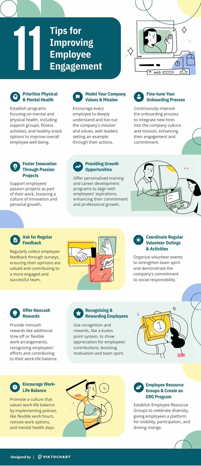
Tips for Improving Employee Engagement Infographics Tips for Improving Employee Engagement
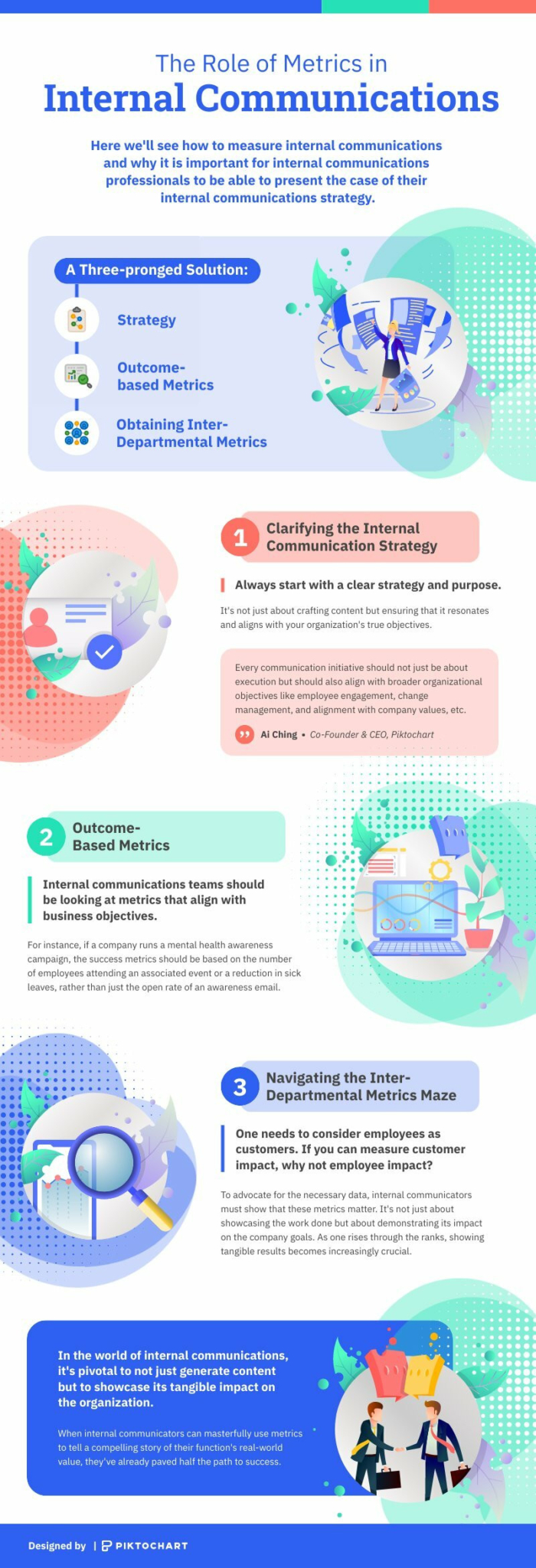
The Role Of Metrics In Internal Communications Infographics The Role Of Metrics In Internal Communications
Black Historical Figures Infographic Infographics Black Historical Figures Infographic
Facts About Women’s History Month Infographics Facts About Women’s History Month
History of Black History Month Infographic Infographics History of Black History Month Infographic
Explore more infographic templates

Ready to create an impressive infographic?

Join more than 11 million people who already use Piktochart to craft amazing visual stories.

More stories

Jamie Barkin

English and AP Literature Teacher at Wheaton High School

High school teacher, Jamie shares how Piktochart helps her improve learning in her classroom for her students.

Read Story

Dr. Aaron Fischer

Psychology and Psychiatry Professor at University of Utah

As a university professor, Dr. Aaron Fischer shares how Piktochart helps him to create resources to provide mental health support in schools.

Read Story

Theodore Paat

Instructional Designer at Affirm

Theo did a lot of research for various platforms ranging from Venngage to Canva. Find out why he decided for Piktochart.

Read Story