Your brand style guide is a huge part of your marketing plan.
It’s essential for your business because it helps you establish your brand identity, and it makes it easier for prospects and customers to recognize your business.
The more you differentiate your company from the rest, the more you will build a loyal customer base that will resonate with your brand.
In this article, you will see examples of brand style guides that you can learn and take inspiration from. You’ll also find templates to help you share and present your brand guidelines.
If you want to follow along with your brand assets as you learn, try Piktochart for free.
Let’s dive into it!
What is a brand style guide?

A brand style guide contains all the details that contribute to the look and feel of your brand, such as your logo design elements, typography, color palette of choice, imagery, and even your tone of voice and brand personality.
Why is it important for you to develop a brand style guide?
It makes it easy for you and your team to ensure brand consistency and brand recognition.
Whether you are making a social media post or creating a new marketing plan, a brand style guide will help you make your business unique and recognizable across platforms.
The two main elements of a brand style guide
There are two major aspects that define a brand style guide, and they are typically some of the first things that are visible about a specific company’s branding strategy.
These elements are:
Visual guidelines
They are typically characterized by the logo guidelines, the brand color palette, fonts and font sizes, and the overall imagery.
Brand voice
The brand voice is the personality that the brand embodies. For example, a brand personality can be friendly, professional, rebellious, playful, or authoritarian. Another element that constitutes the brand’s tone of voice is represented by the specific words that the company frequently chooses to use in its vocabulary.
Remember that to attract the right target audience for your company, your visual identity and brand personality need to complement each other and create a brand story that differentiates your business from the competition.
Recommended Reading: 14 Examples of Good Brand Guidelines (+ What to Include in Yours)
Now, let’s take a look at some unique brand style examples, and identify what makes their branding stand out from the rest.
Bring your brand style guide to life with Piktochart
Whether you’re making one from scratch or updating your visual brand guidelines, Piktochart’s presentation templates can help you clearly (and consistently!) communicate your brand story.
Sign up for free
1. Dove Healthcare brand style guide

Dove Healthcare is a living and healthcare company for seniors based in North Wisconsin.
The company describes itself as an innovative healthcare and community provider with high standards, striving to be the best healthcare provider in North Wisconsin who constantly dedicates resources toward improvement.
Brand voice
Dove Healthcare puts a lot of value in the word “you” rather than third-person pronouns. They also emphasize how certain words and key terms associated with their brand should be spelled or capitalized. The Dove Healthcare communications team is also a huge fan of the Oxford (serial) comma!

Visual guidelines
Dove Healthcare has specific rules about the use of its logo. If you’re planning to create your brand style guide, you should also do the same because correct logo use is important for preserving brand integrity.
Here are some examples they give on the wrong use of the logo:
- Reproduction of the logo under the wrong colors.
- Background colors and patterns that don’t blend well with the logo.
- Embellishments — the logo has to stay professional and straightforward.
- Altered position or elements of the logo
You’ll also notice that the brand’s color scheme is limited to blue and brown. Keeping it this way creates a stronger brand image by being easier to remember. These colors also symbolize the brand qualities they’re aiming for: compassionate, kind, and progressive. Take inspiration from pre-existing brand color palettes and use them to create your own.

Finally, their typography uses two brand fonts for different types of displays. Arial is used for the corporal typeface, while Black Jack Pro is their display font, used for main headlines. Both of which are practical and easy to read. Learn more typography hacks about how to pair fonts for your visuals.
2. Mozilla Firefox brand style guide
Anyone who has internet access has probably used Mozilla Firefox at least once. After all, it is one of the most popular internet browsers. Firefox aims to help its users feel “safer and more empowered online”.
Brand voice
Mozilla Firefox is a brand that distinguishes itself through a strong brand mission and personality, defined by certain characteristics:
- Opinionated – The brand speaks about its point of view in an assertive tone.
- Open – They do their best to sound more transparent and welcoming.
- Radical – Being “radically optimistic”, Firefox pushes the idea that the internet user experience can constantly improve.
- Kind – The brand shows empathy to the users in a genuine, non-invasive manner while empowering them.
Visual guidelines
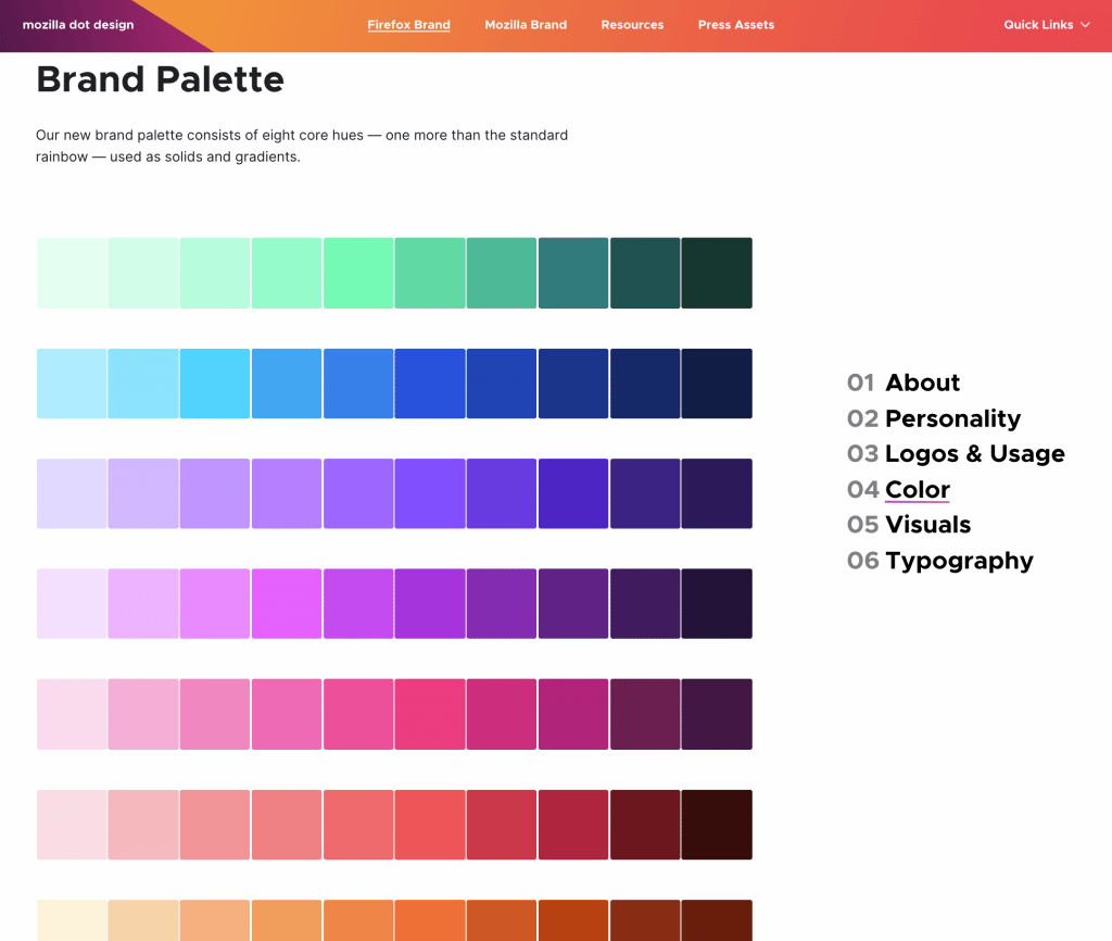
The most popular element in the open-source browser’s visual communication guidelines is its brand logo design. They use various styles depending on the context of use. Firefox also makes use of an extensive color palette.
They also use signal colors where every color represents a signal for a certain action. For example:
- Blue encourages clicking.
- Green marks a successful action.
- Yellow marks a warning.
- Red represents an error.

For their visuals, Firefox uses shape systems that have been derived from the product logos for backgrounds, spot illustrations, motion graphics, and pictograms. Meanwhile, their typography uses different fonts and font sizes for different functions.
3. NASA brand style guide
The National Aeronautics and Space Administration is a brand that has made itself well known throughout the entire world through its revolutionary achievements and its many decades of continuous activity.
Brand voice
According to their content guide, they believe that government communication can be fun and easy to read, so they have chosen to make their brand voice:
- Authoritative – Maintains a confident approach.
- Conversational – Open to starting a conversation and interacting with their audience.
- Friendly – Keeps their brand approachable to attract and appeal to more people.
- Instructive – Provides useful and informative content.
- Welcoming to all audiences – Shows an inclusive attitude.
Visual guidelines
For their original visual guidelines circa 1976, NASA offers a detailed guide on their free Graphics Standards Manual, available on their website, where they explain all their visual assets in great detail.
As the guide claims, their logotype is a symbol that must never be altered or redrawn but instead reproduced photographically. The guidelines also show the acceptable and incorrect ways to use the NASA logotype when using various backgrounds.
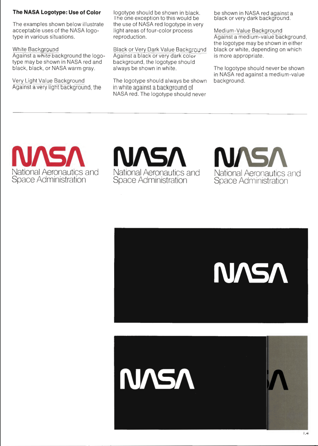
They also updated these guidelines in their new style guide, as shown below.

For their brand typography, NASA uses several fonts like Helvetica, Futura, Times Roman, or Garamond.
4. SocialBee brand style guide

SocialBee is a social media management tool that allows users to create, edit, schedule, and post content to all their social media accounts from one user-friendly dashboard.
It also offers numerous concierge services for content writing and social media management, helping entrepreneurs worldwide to better promote their businesses.
Brand voice
SocialBee has an uplifting, friendly, and positive tone of voice, with a brand mission to show the audience that the company is here to help them reach their full potential by improving how they approach social media.
Here are the main characteristics that define the SocialBee brand:
- Trustworthy – Honesty defines the way they communicate and approach their work.
- Playful – Has a fun and upbeat personality and uses humor when appropriate.
- Creative – Finds new and interesting ways to deliver content for their audience.
- Friendly – Invests time and effort into creating a close relationship with their customers.
- Young and innovative – Open-minded, digital savvy, willing to take risks, and always looking for new growth opportunities.
Visual guidelines
The brand’s colors are yellow, black, dark gray, and light gray, while the font used is Helvetica. The brand colors are found in the logo as well, as shown below.
5. The Youth Café brand style guide

The Youth Café is a not-for-profit pan-African youth organization that encourages the empowerment of African youth through proposing innovative solutions and driving social progress.
Brand voice
The organization’s brand guidelines are very clear about its brand values: respect, creativity and diversity, harmony and interdependence, accountability, legacy, and commitment to the community.
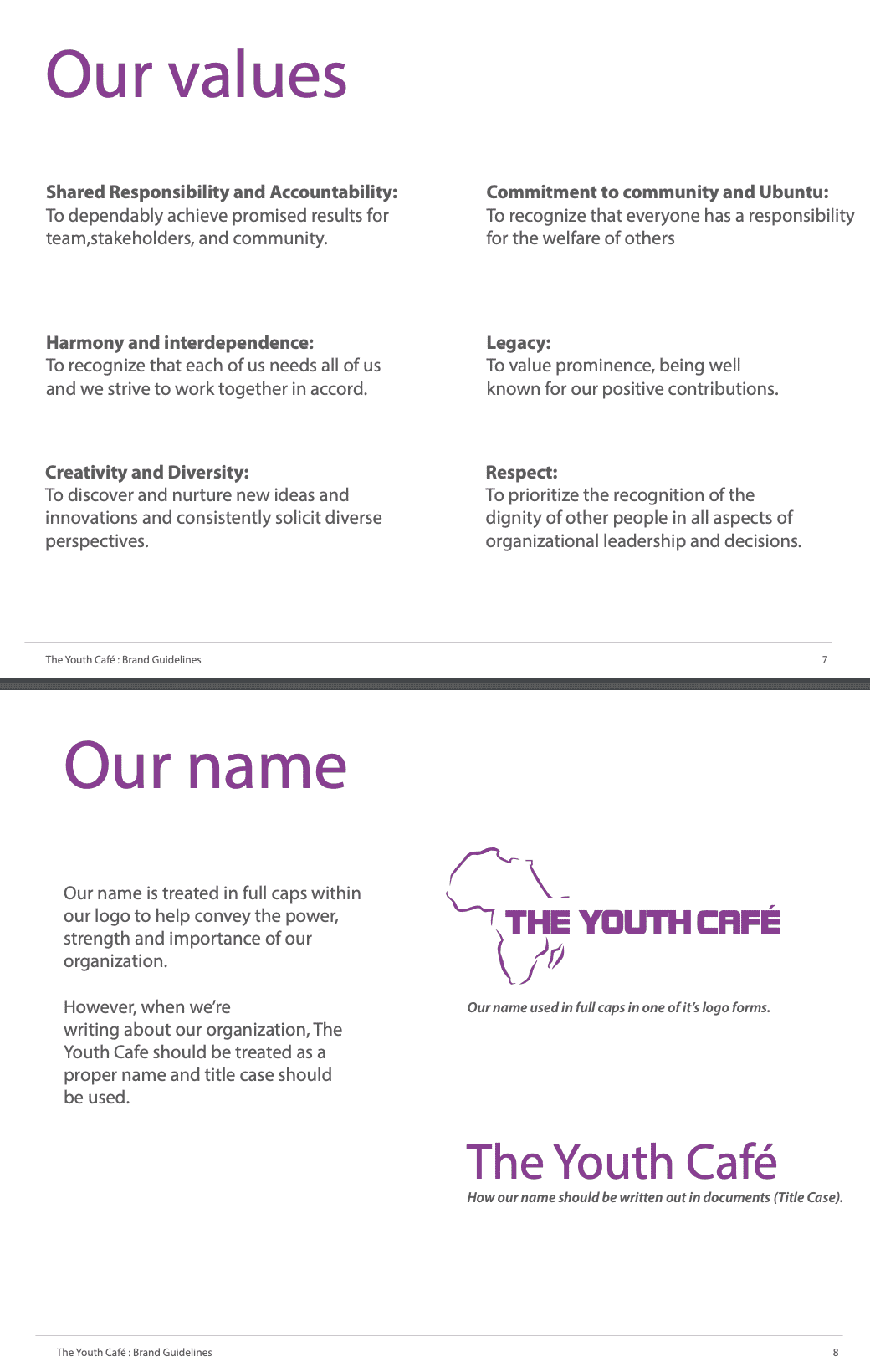
As you scroll through the guide, you’ll also learn how to capitalize their brand name based on usage and context.
Visual guidelines
The brand logo represents their country of origin which is Africa. Their brand style guide also shares how you can use their logo with different color variations.
As for their typography, you will notice that they picked a universally accessible and versatile font like Myriad Pro and Calibri, a friendly, yet semi-formal looking sans serif font. Finally, the guide also has a section on the right way to edit their brand photographs and presentations.

6. Baker Amy Cooking School brand style guide
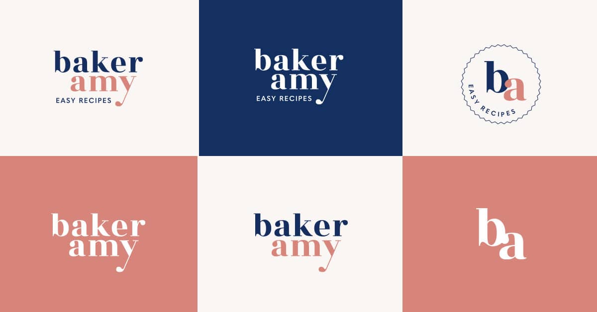
Baker Amy is a virtual cooking school that offers easy and healthy baking courses to busy working mothers.
The brand has a minimalistic, playful, and recognizable identity that resonates well with its target audience. It also makes it very easy for the audience to remember the brand while also giving a warm, welcoming impression.
Brand voice
As the brand focuses on mothers who are busy and in need of simple courses on how to create healthy meals, designer Natzumi Nishizumi shared that she created Baker Amy’s brand style guide with the following brand personality characteristics in mind: friendly, playful, minimal, honest.
Visual guidelines
An interesting quality of the Baker Amy logo is that the brand name is always written in small caps, while the description at the bottom is always written in all caps.

The brand’s color palette is clean and relaxed, reinforcing the simplicity and friendly image of the brand, dominated by shades of pink and blue, with the occasional addition of dark gray.
Another element contributing to the brand’s simple and relaxed brand image is its typography, which uses playful, easy-to-read fonts like FreightNeo Pro and Quasimoda.
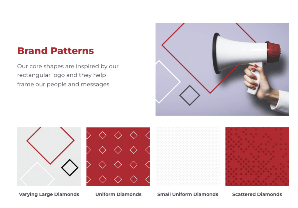
7. First Bank brand style guide

First Bank is an independent community bank serving North and South Carolina in the USA. They offer full banking services, with a mission of helping customers “change their lives, grow their businesses and support their families.”
Brand voice
The brand mission is to offer the best services in every community they serve, with core brand values like commitment to safety, accuracy, simplicity, and helpfulness.
As you can observe in their communication style, their brand voice is honest, conversational, professional, and optimistic.
Visual guidelines
The brand’s visual guidelines also align perfectly with their brand voice.
The brand logo is simple yet professional-looking, with little permission for added changes. The only variations permitted are the black and white and red background versions (or any background that doesn’t provide much contrast).
The core color palette of the brand is composed of shades of red and gray, but there is also a secondary set of colors representing each area of business. Each color in the brand’s color palette can also have lighter variations.

The brand’s typography uses variations of the Montserrat font, as it looks professional yet easy to read at the same time.

This brand style guide also stands out among other guides because it also talks about their brand’s use of shapes and patterns in design. As a bank, the rectangular shape in their logo represents a sense of comfort and security.
Your turn to present your brand style guide with these templates
Creating a well-defined brand style guide is crucial for your brand strategy, as it creates a strong identity and makes it easier for you to position your business.
Brand consistency builds trust. The more your audience trusts you, the more likely they will support your brand and buy from you.
Take inspiration from the brands we’ve listed while bringing out your brand’s unique style at the same time. Designer Natzumi Nishizumi’s guide to creating a brand style guide for your small business is also a great start!
Once you’re ready to present your brand style guide, you can also use the following brand guidelines presentation templates by Piktochart.


Try Piktochart for free and see more templates that you can edit and customize right away!