Print isn’t dead, it’s just evolving. The printables world is still just as important nowadays, but it just requires a combination of old school tactics and digital elements to make them effective.
Just like the event flyers that promote them, events are gatherings that leverage real human connection, something that will never get old.
Which is precisely why these one-page printouts have to work extra hard – they cannot fail to make a genuine impression. In a world where people are inundated by endless streams of information, not only do they have to be aesthetically appealing and eye catching, but they also have to contain cleverly-crafted concise content (how’s that alliteration?).
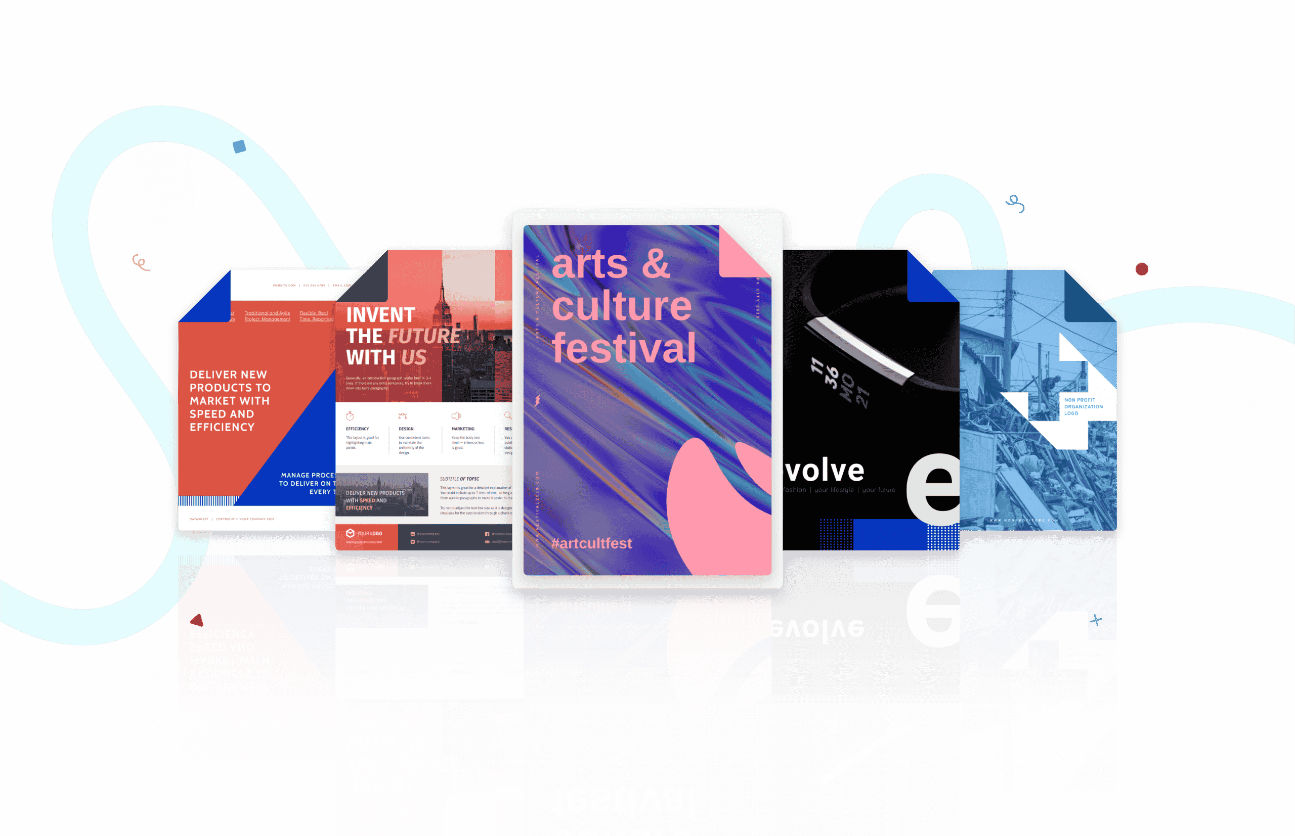
When it comes to creating a successful event flyer or poster, inspiration is usually your first port of call and so we’ve created an interactive site to stir up your imagination before you roll up your sleeves.
Want to start creating right away? Create an account and check out Piktochart templates.
There is a lot of thought that goes into a successful event flyer, which is why we’re sharing a mixture of marketing and design tips to give you a leg up on your next project.
Ready? Let’s get started!
Marketing Tips
1. Include A Call To Action
A Call To Action (CTA) is of course, important in any piece of content that you produce with the intent to get people to do something. The same goes for your event flyer. After people have seen your flyer, they should be prompted to take immediate action by following a compelling CTA – whether it’s to read more about it on a website, or make a purchase.
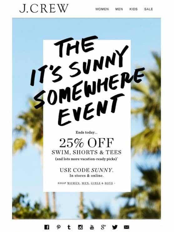
Examples of this could be an early bird discount as an incentive to get people to act quickly. Whatever you choose, make sure that your CTA stands out with large typography and eye-catching icons.
The below event flyer uses a limited discount CTA to get shoppers to act fast.
2. Avoid Using Too Much Information
The more is not the merrier when it comes to adding information on your event flyers. While some people might think that filling a flyer to the brim with event details is going to be persuasive, the reality is that less is more.
To achieve this, stick to key details such as your event name, venue, date, time, and a short description. Remember, you can always direct your audience to your website through a link or a QR code.
The below music festival poster is an example of too much information. While listing a line up may be important, it’s possible to let your audience follow a link to access the rest of the list.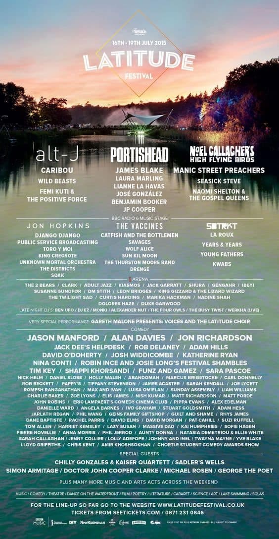
Did you know you can add background images to your visuals with Piktochart? Just create an account for free to get started.
3. Add A QR code
If you have a lot of information to share, this is where a QR code can come in handy by giving people who want to read more about the event a chance to.
A QR code will help reduce the amount of text in your event flyer, and can also double as a channel for people to send in their RSVP. You can also create a branded QR code to match your flyer design with a custom QR code generator, improving your brand recognition and improving user experience.
If you choose not to use a QR code in your flyer for aesthetic purposes, you can also consider shortening and customizing your flyer links with bit.ly instead of showing the full link.
See the below flyer example for a well-placed QR code.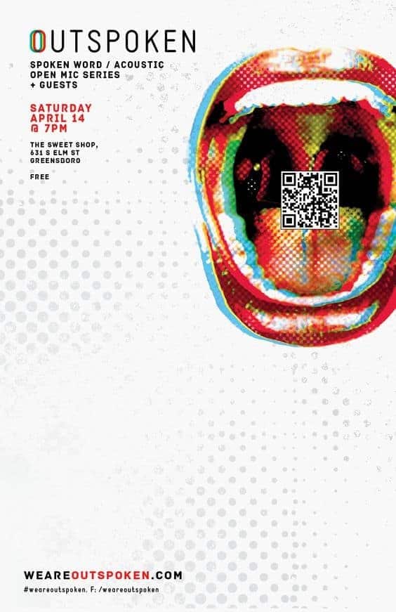
4. Add UTM Tracking To Your Event Flyer
If you do decide to add a QR code, make sure it’s tethered to a UTM tracking code. For those unfamiliar, a UTM code is recognized by Google Analytics to measure the impact of your links.
This way, you’ll be able to test and measure the impact of your links, as well as figure out what works and doesn’t work on your event flyer. Data is power, people!
If you’re unfamiliar with UTM tracking codes, read this article to learn more.
5. Optimize For The Web And Social Media
The event flyers of the past were all printed out in the traditional A4 paper size, but now more attention should be paid to the channels that the event is being promoted in. You have to keep in mind the platform and tailor the format.
For example, a Facebook post will look very different from an Instagram story. And event websites such as Meetup or Eventbrite will have different dimensions so your design should be optimized accordingly.
And if you’re running a campaign, make sure to have the flyer resized to fit your Facebook cover photo – having every visual consistent across the board will help in your promotional efforts!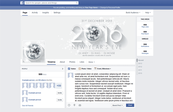
6. Keep The User Experience In Mind
Simon Sinek said: “Communication is not about speaking what we think. Communication is about ensuring others hear what we mean.”
To this point, when creating an event flyer, we should be aware of the purpose of the flyer – who are we trying to reach out to and why? A good event flyer isn’t just a vehicle for information, and we should be also aware of the experience that people have with it. How does the flyer make them feel? Are they getting the information they need from it?
See the below flyer example – by using pastel colors in a gradient – it succeeds in helping the audience get into the ‘night market’ mood while also passing on all the necessary information.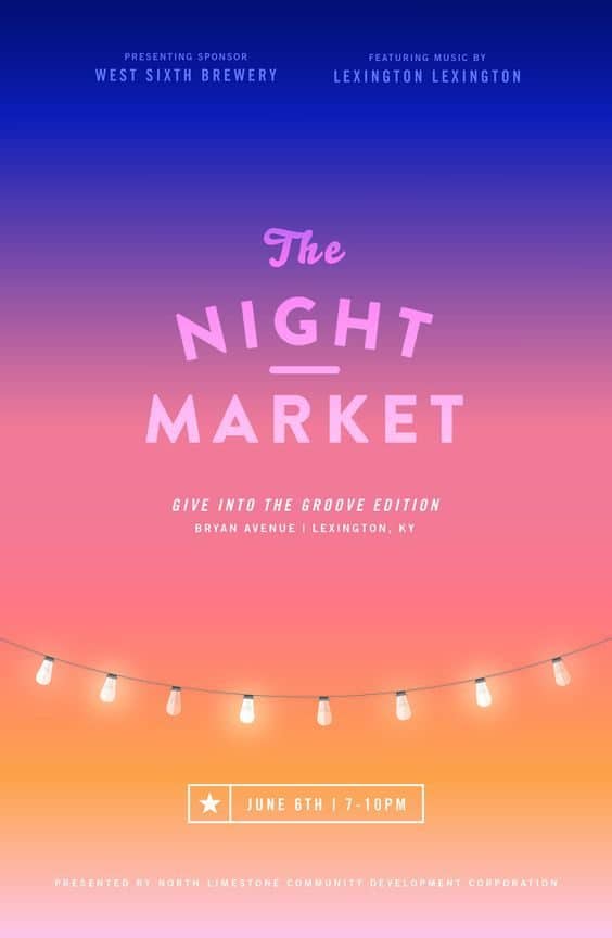
7. Be Honest With Your Content
Which leads to this point – honesty will get a lot of points with your flyer. As much as your goal is to stand out and get as much attention as possible, you need to make sure to represent yourself in an honest way.
For example, if you are hosting a career fair for developers – then it is acceptable to use blocks of code or dabble in a bit of geek jargon. But if you are trying to promote something unrelated to tech, then it’s best to avoid these kinds of references as it may be perceived as misleading – as eye catching as it may be.
8. Include Company Logos
Make sure to include the logo of whichever company is organizing and sponsoring the event. This can be especially useful when these organizers and sponsors are well-known, which helps with the credibility of your event.
Have an independently organized event that’s linked to a big name like TED? Use it!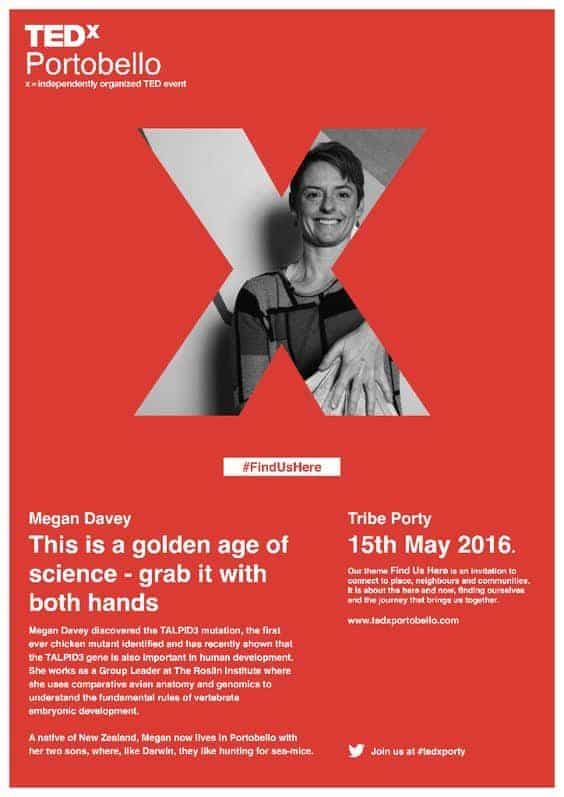
9. A/B Test Your Flyer
Chances are, you’re not just creating a flyer to be plastered on the walls of your neighborhood, so you can A/B test your flyer to try to create the best version of it as possible. To do this, try making subtle changes to see how people respond to your flyer, such as changing your CTA buttons or the colors of your hyperlinks.
Design Tips
10. Create Visual Hierarchy
Your poster should be attention grabbing and also easy to skim, so ensure that you are creating visual hierarchy ranking information in order of importance.
Here’s how to do this: use big headlines and also group information into sections of text that can be easily digested by your audience.
See the below flyer as an example – big headline, check. Visual hierarchy? Also check.
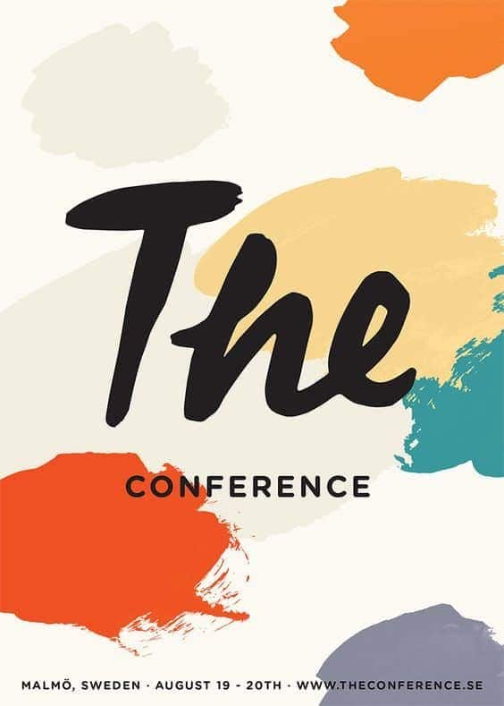
11. Use Color Schemes
The common mistake that most people make when tackling a visual project is adding too many colors. The solution here is to stick within a color scheme, which can be developed by having a main color be accompanied by sub colors.
You can also consider using different shades from within one color while still staying within your color scheme.
Here are a couple tips to keep in mind when using a color scheme:
- Follow a set of brand colors
- Use the seasonal colors
- Draw inspiration from nature
Of course, there may always be an instance where more colors are necessary – especially when you’re designing a flyer for a kids event. Something to consider!
See the below flyer as an example – the color scheme only contains a few colors, but it still varies visually because of the shades in the image.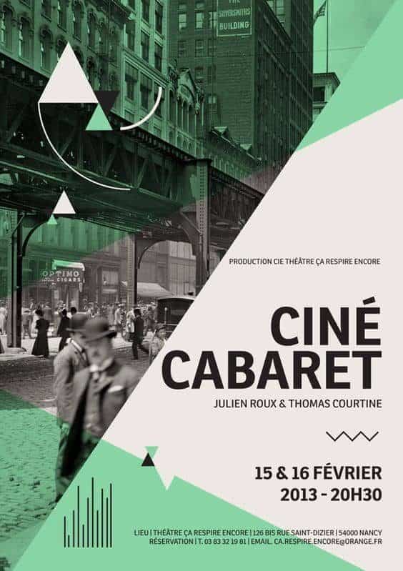
12. Get Party Ready With Metallics
Besides selecting the right color scheme, you’ll also want to consider the types of colors that you’re using and the mood it conveys. If your event is a party, then consider using metallics in your color scheme.
Metallics doesn’t just exude glamour, it also brings a certain atmospheric mood to your flyer. So go ahead, play with a bit of gold, silver, and copper in your flyer.
See the below flyer as an example.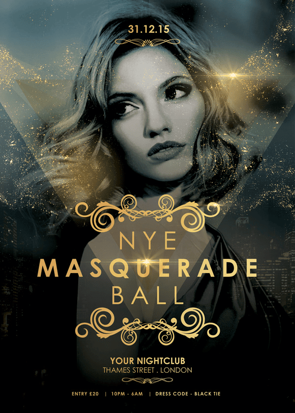
13. Let Typography Lead The Way
Using large typography as the focal point of your event flyer, as it could have far more impact than adding a lot of text or using an image. As the purpose of a flyer generally works to attract attention and disseminate information, using a short and catchy title can do the trick. Read on to learn about how to pair fonts for an in-depth knowledge of typography for your visuals.
The below flyer example speaks for itself.
You can also upload your own fonts with Piktochart Pro. Sign up for free.
14. Use Banners And Dividers
Which leads us to this point – if your poster is led by typography, otherwise known as typographic design, you’ll want to enlist the help of banners and dividers to help make it look less text-heavy. Not only will it break up the sections on your flyer, but it will also make it more visually interesting than if you were just to use plain text.
The below flyer exactly.
15. Alignment Is Key
Although most flyers are not supposed to be very text-heavy, it is important to make sure that whatever text you’ve selected is well aligned. Paying attention to alignment doesn’t just help with readability, but it also helps with giving your flyer some much needed breathing room – also known as the very important white space!
The minimalist flyer below is fairly well-aligned.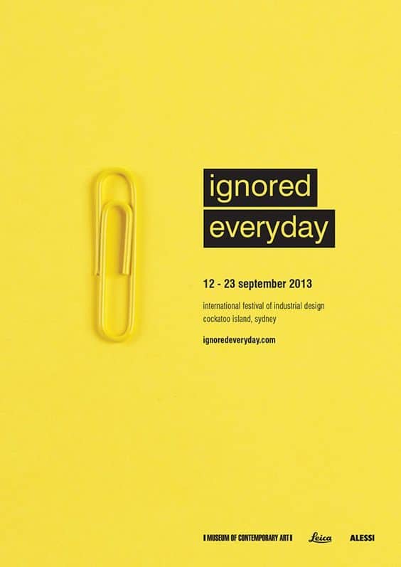
16. Include Lots Of White Space
White space is really important, not just to your event flyers, but to every visual project you will create. Fact is, no one will be drawn to a flyer that looks messy and overcrowded. Not to mention a claustrophobic flyer will decrease its readability.
As mentioned above, you should give your flyer design plenty of room to breathe so viewers will be able to parse through the information with ease.
This visually clever flyer has a lot of white space, which makes focusing on the essential information easy.
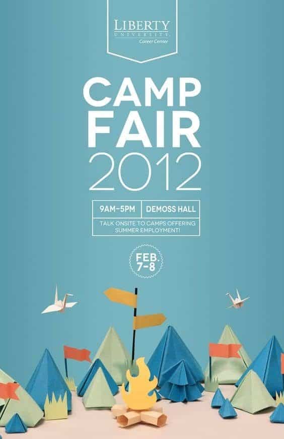
17. Match Your Flyer’s Design To Your Event
An interesting way to look at your event flyer is that it’s like the “door” to your event, so it should match up with your event’s theme. If your event is formal, then the flyer should look professional and sleek. If your event is a hip and trendy, then you’ll have more free reign to use bright colors and quirky illustrations.
Beyond event theme, you should also keep in mind the demographics of your attendees, as certain design elements will be appreciated only by some groups of people. Bottom line is you want to make sure your design resonates with your intended audience.
The below flyer is quite cartoony, which is appropriate for this particular event.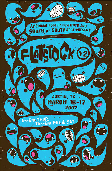
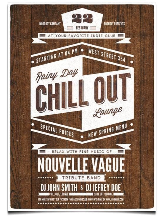
18. Consider The Use Of Texture
To the above point, it all goes back to matching your flyer’s design to your event theme. If you’re looking to attract a young and hip crowd to your rather casual event, why not consider adding some texture to the background of your flyer?
While flat design contributes to a sleek and professional flyer look, layering in some grungy elements can help your flyer achieve an effortlessly vintage effect.
The grungy effect works well in the below poster as it is to promote a live music show.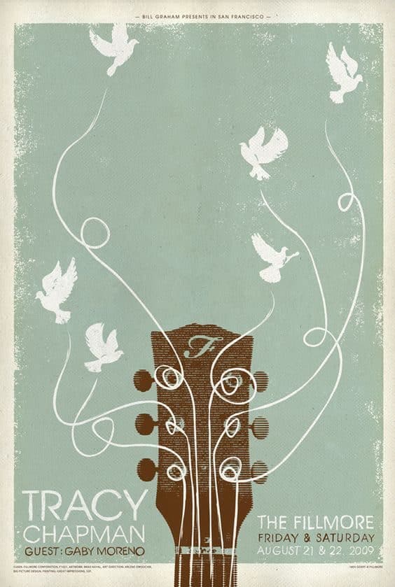
19. Go High-Res All The Way
When it comes to your event flyer, you should always be using the most hi-res photography you can find. This is exceptionally important for print, and can be a big selling point if your main keynote speaker is a recognizable face.
Using subpar, low-res images may lead to your flyer looking pixelated, which can come across as unprofessional. Put your best foot forward and make sure your images are of the highest quality!
20. Don’t Forget To Include the Event End Time
This is a small and important detail that often gets overlooked. Unless you are hosting an event where the end time is flexible, do include the event end time as it helps event attendees manage their expectations a bit more.
The below ladypreneurs event flyer is clear about the end time.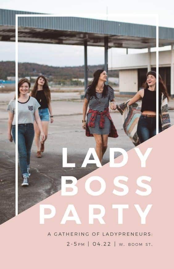
Time To Make Your Own!
So there we have it, 20 design and marketing tips for those of you that want to create a successful event flyer. Now that you are equipped with these downloads, it’s time to start trying these skills on for size by making your own.
Luckily in Piktochart, we have a bunch of professionally designed flyer templates for a variety of event themes and moods. So whatever great event you’re trying to pull off, we have you covered. You can create a free account and jump right into creating amazing visuals with our free flyer maker.
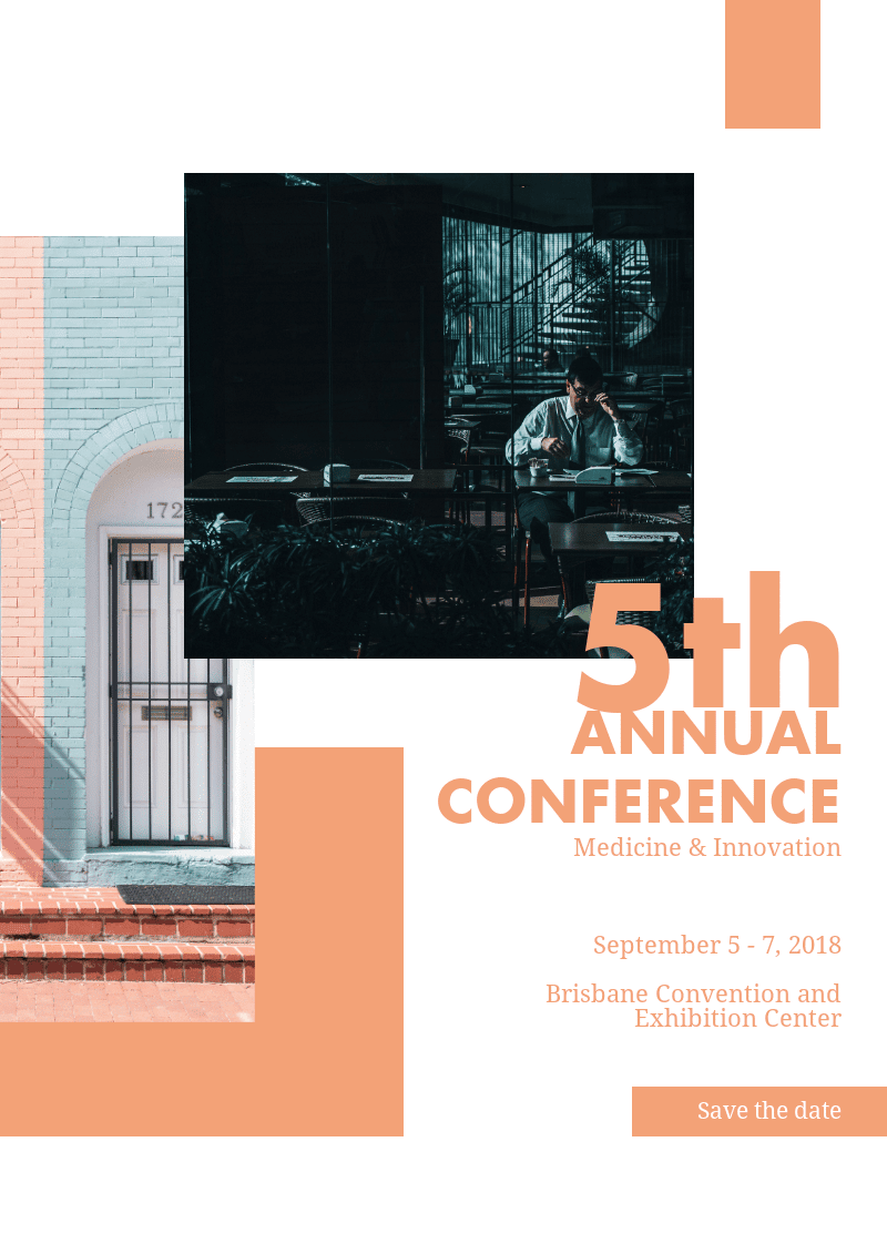
01. Innovation Event Flyer
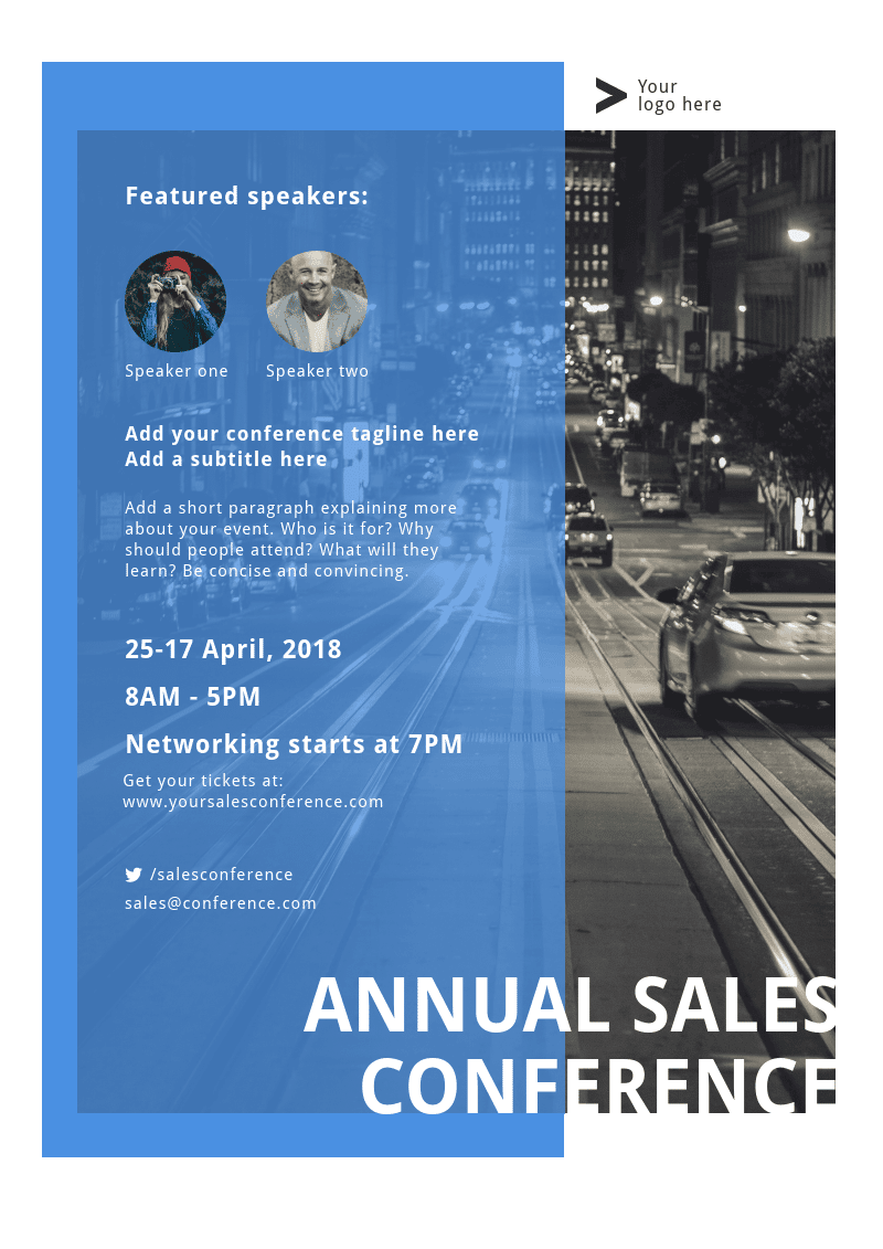
02. Sales Conference Event Flyer
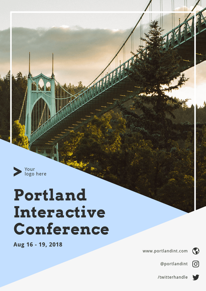
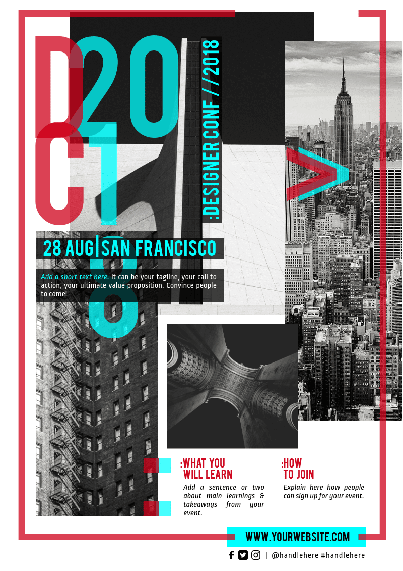
03. Digital Conference Event Flyer
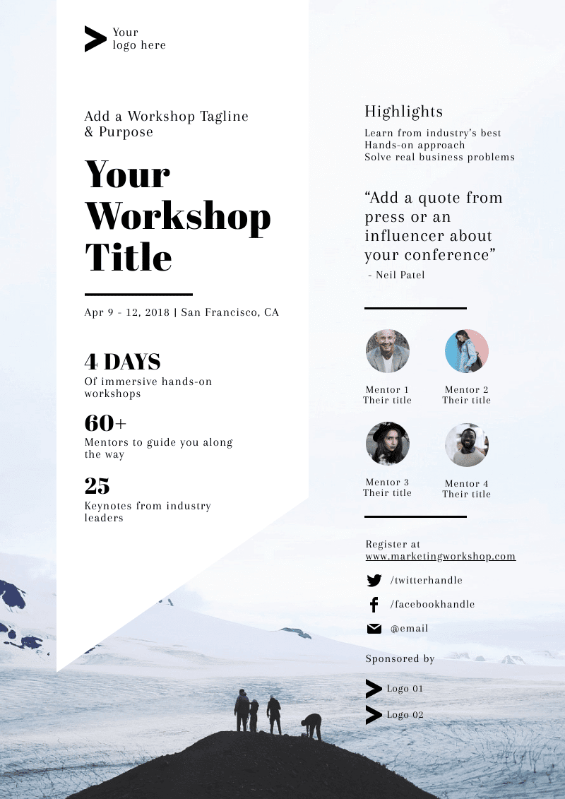
04. Marketing Workshop Event Flyer
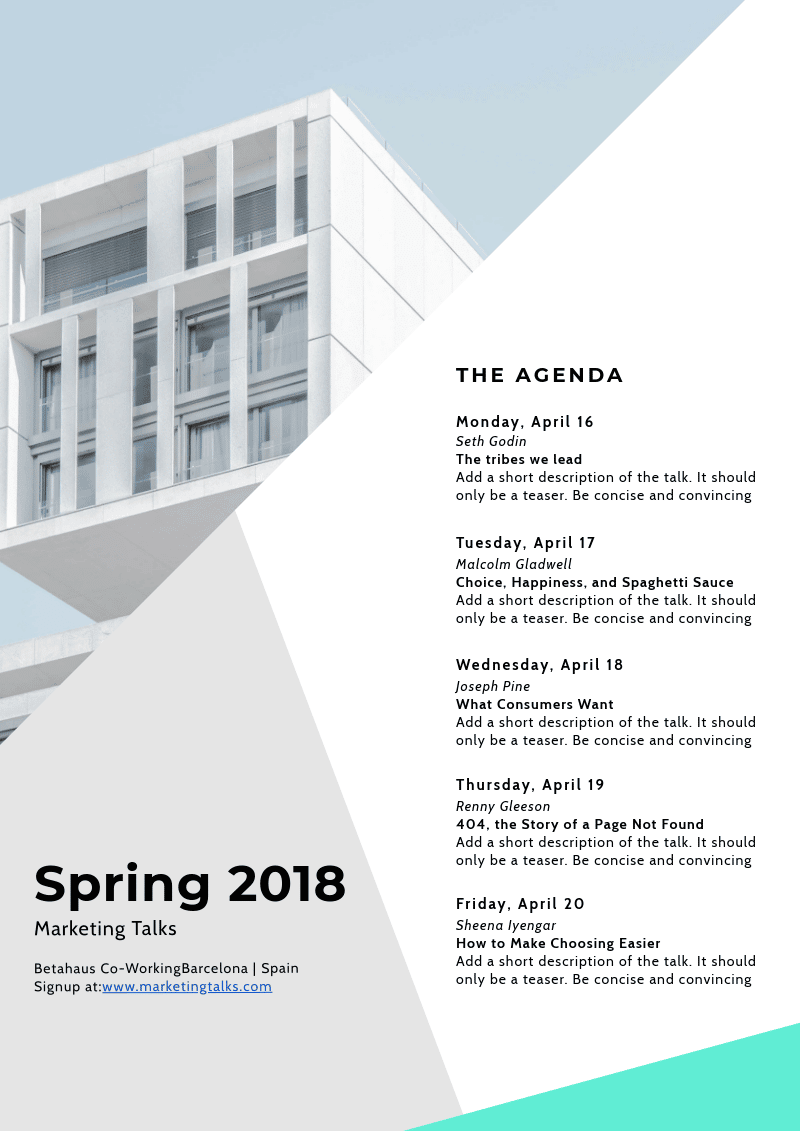
05. Marketing Talks Event Flyer
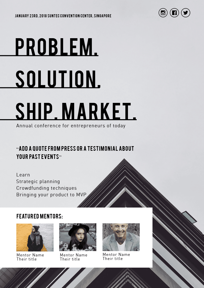
06. Entrepreneur Conference Event Flyer
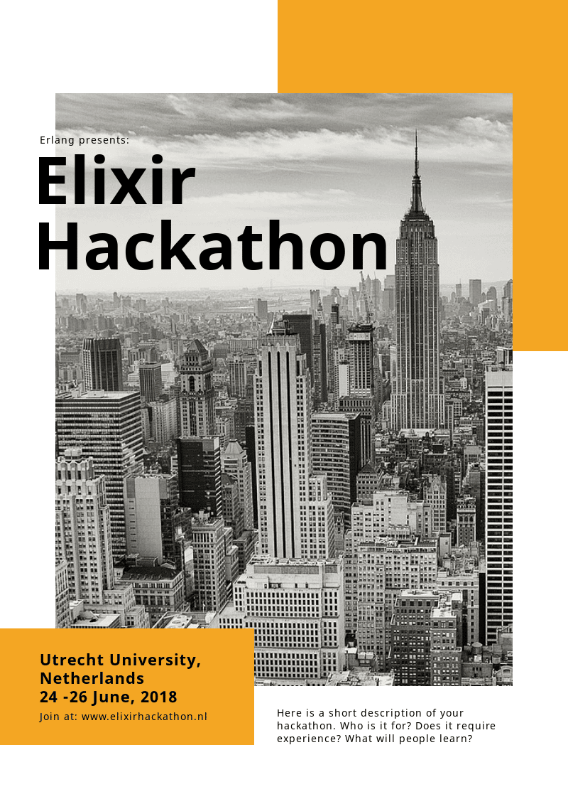
07. Hackathon Event Flyer
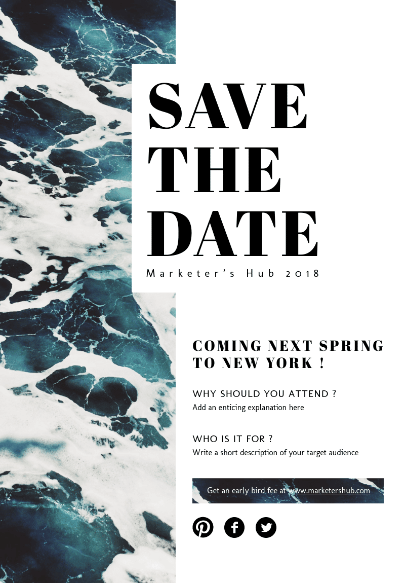
08. Save The Date Event Flyer
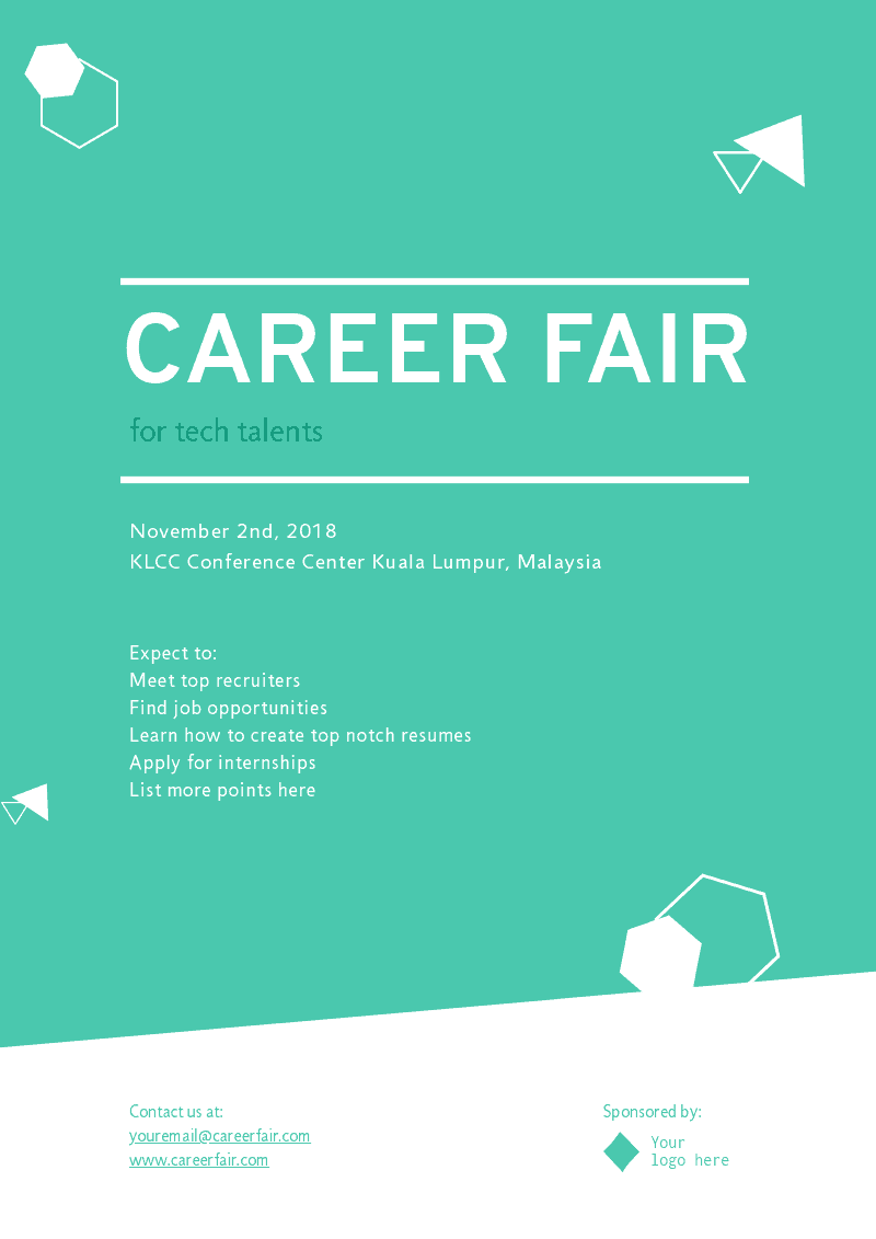
09. Career Fair Event Flyer
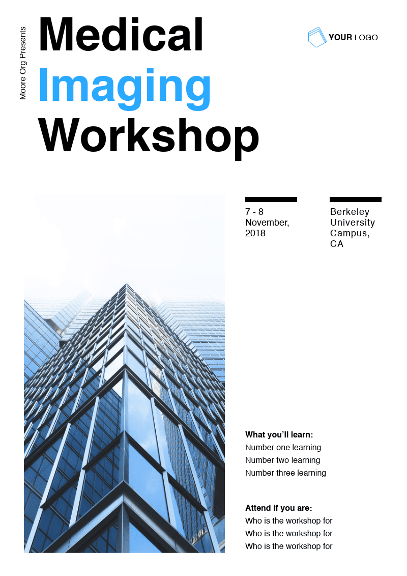
10. Medical Workshop Event Flyer
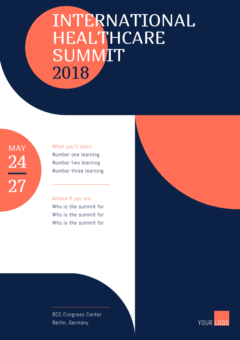
11. Healthcare Summit Event Flyer
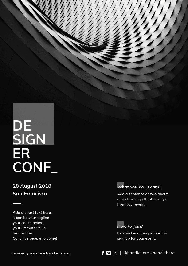
12. Design Conference Event Flyer
13. Design Event Flyer
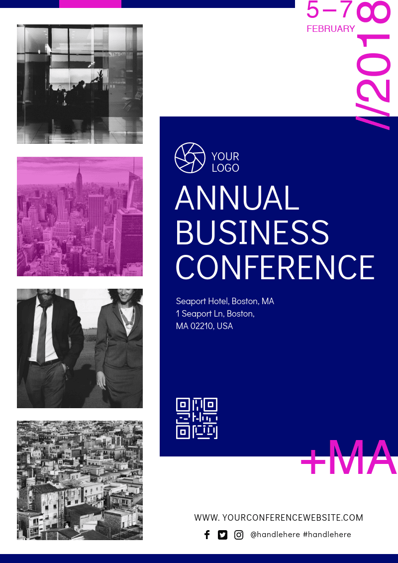
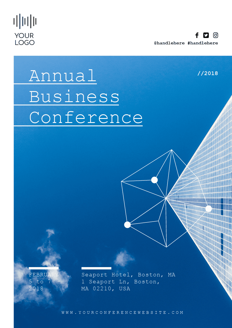
14. Business Conference Event Flyer
16. Enterprise Event Flyer
17. Business Event Flyer
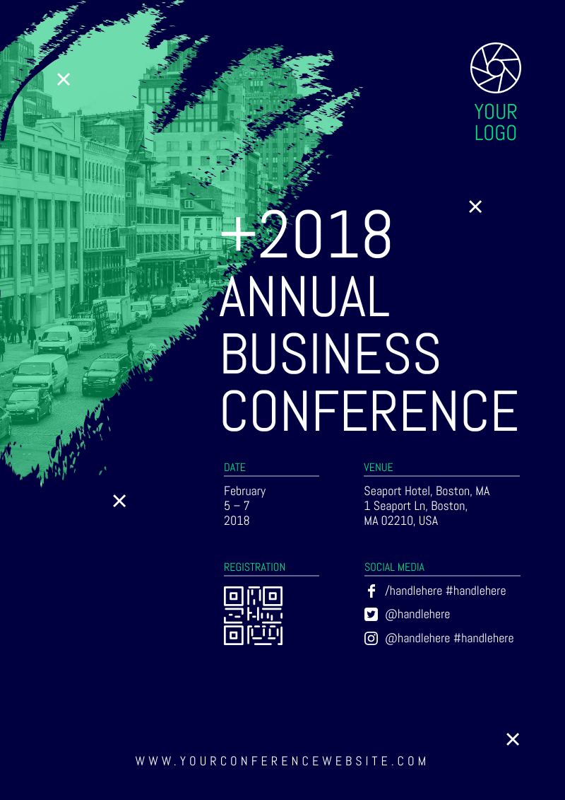
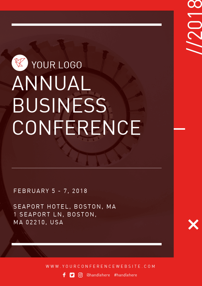
18. Business Conference Event Flyer
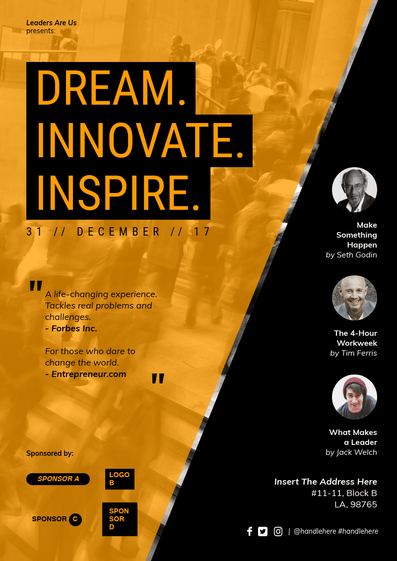
19. Inspirational Event Flyer
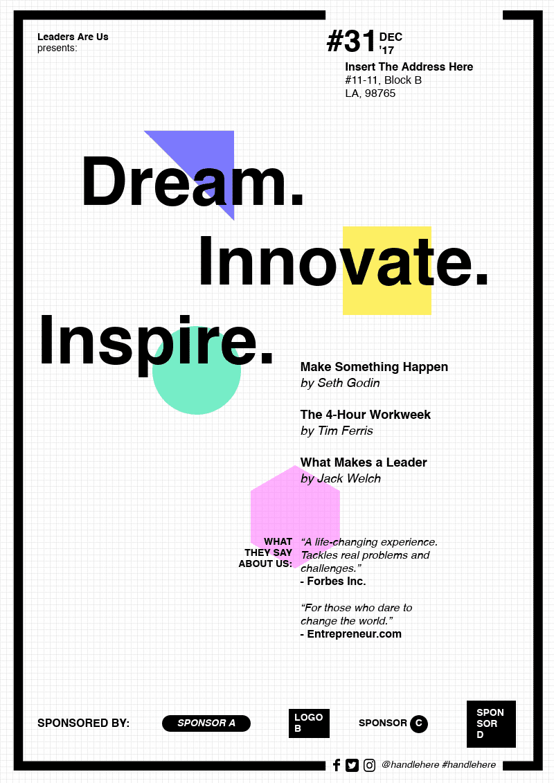
20. Innovation Event Flyer
Create visuals with professional templates.
Make presentations, flyers, reports, infographics, and more.
Sign up for free