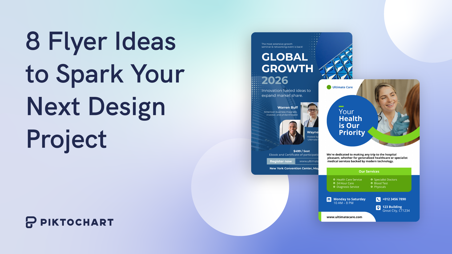
Eight Flyer Ideas to Spark Your Next Design Project
Think back to the last public event you attended. There was probably a flyer that made event attendance. And that, dear reader, is the power of flyer design. you aware it was being held. A simple promotional tool can have a major impact on
Flyers have lost none of their potency as promotional tools in the digital age. In fact, digital flyers don’t have any printing costs and can reach a much larger audience. Every event organizer knows the value of having exciting flyer ideas to raise awareness.
The best part about creating digital flyers is how convenient and cost-effective it is, since you don’t need to bear the costs of printing and materials. All you need is some strong flyer design ideas, a clear design vision, and the right tools to help create it. For example, websites like Piktochart have hundreds of flyer ideas in a template gallery that you can tweak to your liking and create your own flyers for free!
Before diving headfirst into creating your cool flyers, it’s crucial to learn a little more about flyer designing principles. In this blog post, we’ll explore what makes a flyer pop, how to get the audience reaction you wanted to your flyer, and what is the best free flyer template.
Key Elements of Eye-Catching Flyer Design
Flyer design is easy to grasp but difficult to master. A great, memorable flyer and a forgettable one will usually have the same elements, with one important difference. What sets them apart is how those elements are used.
If you want to master the art of creating flyers, you need to become familiar with the main elements of every effective flyer.
1. Headline
Compelling, attention-grabbing headlines are vital. Your headline needs to be short, snappy, and memorable. Anyone reading the headline should know exactly what the flyer is promoting.
2. Visuals
If you want your flyer to have maximum impact, you need to ensure it uses high-quality visuals (photos, graphics, illustrations) that are distinctive and attention-grabbing.
3. Copy
Remember, you are designing a flyer, not a pamphlet or brochure. A flyer has no room for long paragraphs. You need to include concise, benefit-focused copy that can be easily summarized in a handful of bullet points.
4. Color and Typography
Bold colors and interesting fonts go a long way toward making your flyer ideas stand out. Your color choices when designing a flyer should match your brand’s colors so as to reinforce brand identity.
When choosing a font for the flyer, use vibrant colors that complement each other and reflect your brand personality. Pick modern, readable fonts in a hierarchy of sizes to establish information hierarchy at a glance. High-contrast fonts may work well here, such as Open Sans, Helvetica, or Raleway.
5. Call to Action (CTA)
If your flyer doesn’t have a clear CTA for the audience, it’s not effective. You need to direct readers to engage with your brand after reading your flyer, and that is why including a CTA on every flyer template becomes important. Place it in an easily visible area of the design layout, and experiment with typography to ensure it is easily legible. Your CTA should also be easy to follow, and contain just a single instruction, like “Scan this QR code” or “Call this number,” rather than a complicated series of steps.
6. Branding
Flyers are a simple way to raise brand awareness, but to do that, their design needs to be consistent with all other brand aesthetics. If your brand already has a distinct identity, people who see your flyer will immediately make the association, even before seeing the brand’s logo. To maintain consistency, use websites that allow you to upload your brand’s assets. For example, with Piktochart, you can seamlessly upload and integrate your brand’s colors and fonts onto your chosen template.
10 Flyer Design Tips to Make Your Message Pop
By now, your mind must be brimming with exciting new flyer ideas. You’re almost ready to start designing your own flyers! Take everything you’ve learned about the elements of flyer design and use them to your advantage. Let’s examine some of the best practices to remember when working on flyer design.
Use Contrast & Vibrant Colors to Stand Out
Bright, vibrant colors naturally draw the eye and should form part of your flyer’s palette. However, along with eye-catching colors, your flyer’s layout should also include some basic design principles.
For starters, you need to provide designers with a quick reference color swatch of your approved brand shades. Then focus on combining them in highly legible, high-contrast ways.
It’s also important to choose the right combinations of colors. Light text on a light background is a simple recipe for eye strain and will turn off readers who are viewing your flyer. Keep legibility and contrast in mind when deciding on your flyer’s final color composition.
Incorporate High-Quality Visuals
The prime objective of any flyer is to draw eyeballs. That’s why it’s essential to make your flyers look as good as possible before releasing them to the audience. Photos, layouts, and illustrations that look like the work of professionals hold more weight with the audience than amateurish designs.
You can even guess the event experience from the flyer quality. Fuzzy images and sloppy layouts scream ‘amateur hour.’ Crisp, well-composed visuals convey a top-tier affair.
Wherever possible, use high-resolution and high-definition visual assets instead of free, MS Paint-inspired imagery. A picture speaks a thousand words, so make sure your flyers are sweet-talking the audience and not insulting their intelligence instead.
Leverage the Power of Infographics
You want your flyer to be informative but not overwhelming. How do you strike that balance between sharing too little information and too much? The best flyer designers know the most effective solution to this conundrum is a simple one.
Infographics are an easy way to convey a large amount of data without taking up too much space on the flyer or relying on long paragraphs of copy. Most great flyer designs include an infographic like a graph, pie chart, or table supporting the message. The best flyer designers know how to smoothly mix data and visuals for eye-catching results.
Create a Visual Hierarchy with Typography
“It’s not what you say; it’s how you say it” applies to flyers as well. Using fonts on flyers has a similar function to changing our pitch and tone during conversations. It helps provide emphasis and highlights the essence of the message being conveyed.
Your font choices should have a clear, established visual hierarchy. Naturally, the headline and CTA need to be easily visible, depending on the relative size and weight contrast between all the different design elements.
Limit yourself to 2-3 fonts max to keep the layout cohesive. Experiment with font sizes and styles in your flyer template to see what works best for the flyer copy before settling on a final design template.
Write Benefit-Focused, Actionable Copy
The whole point of designing a flyer is to say more with less. To that end, your flyer copy should be concise and clear, with no extra fat. Every section of the copy should have a clear reason for being there.
When writing copy for your flyer, put yourself in the reader’s shoes. Ask yourself what information a reader would want from the flyer and what reaction the flyer would elicit. If it’s not compelling them to take action, the copy needs to work harder. Ensure your copy leads readers to take the desired next steps after viewing the flyer.
Toward the end of your copy, include a crystal-clear call-to-action like ‘Buy now,’ ‘Reserve your spot,’ or ‘Get the app.’
Organize Content with Grids and White Space
While it’s great to create an informative flyer, it’s possible to have too much of a good thing. You don’t want your flyer to feel like a stuffed suitcase on the verge of bursting. If you are going to cram your flyer template full of text and visuals, the final result will be overwhelming for viewers.
When it comes to flyer design, sometimes less is more. Only include what is necessary, and leave enough blank spaces on the flyer for readers’ eyes to rest before moving on to the next point. Having ample blank spaces and a clear layout vastly improves the readability of your flyer, something you should always aim for. Some principles of design to keep in mind are:
Have a central focal point featuring the most important element of the flyer
Use short bullet points instead of long paragraphs
Ensure your CTA is prominently placed
Use Shapes and Icons to Enhance Meaning
Once you become familiar with flyer design, you will realize that there is a convenient visual shorthand you can use in your templates. Simple, universally recognized icons–like the “no smoking” sign or the male and female symbols–are a valuable asset in every flyer designer’s toolbox.
Using easily identifiable shapes and icons makes your message clearer and more understandable. Incorporating them will help reinforce your message on every flyer you design.
That said, try not to go overboard. Limit yourself to two or three of the most relevant and easy-to-decipher icons. Otherwise, you risk creating that confusing visual clutter we warned about earlier.
Make Your Offer or CTA Crystal Clear
If your flyer doesn’t encourage readers to take action, it is failing in its mission. The good news is that it’s easier than ever to measure your flyer’s effect on audience engagement.
You can use methods like QR codes or special promo codes to track how effectively the flyer connects with your target audience.
Try Different Flyer Sizes and Formats
Variety is the spice of life…and flyer designs! While the standard format for a flyer is rectangular with a portrait orientation, there are no hard-and-fast rules for choosing the size and shape of your flyer.
Flyers with unconventional silhouettes stand out easily from the rest. Depending on the type of event or activity the flyer is promoting, you can experiment with the size of the flyer as well. A long, multi-day conference will require a larger format by default, while an afternoon workshop will benefit from a smaller flyer that easily fits in someone’s palm or pocket.
Maintain Your Brand Identity
While your flyer’s primary objective is to promote an event or activity, that’s not all. Every flyer is also an opportunity for brand promotion, which should always be your secondary objective.
The best way to accomplish this is by sticking to consistent fonts, colors, and logos that viewers can easily associate with your brand. Over time, your audience will become familiar with your flyer’s aesthetic, making them valuable tools for brand promotion as well as event promotion.
Eight Creative Flyer Examples for Design Inspiration
Flyers are one of the fastest ways to raise awareness for initiatives launched by your brand. Whatever the occasion, you can find flyer ideas for inspiration and create an effective promotional flyer.
Here’s a list of common types of brand initiatives, along with examples of different types of flyers used to promote them.
Event Flyers
Does your brand have an upcoming event? Then your customers need to know all the important details, like when it’s taking place, where it’s being held, and why they need to be there. Every good event flyer contains these three Ws: When, Where, and Why.
Here’s a couple of examples of good event flyers and what they did right:
Tacoma Film Festival
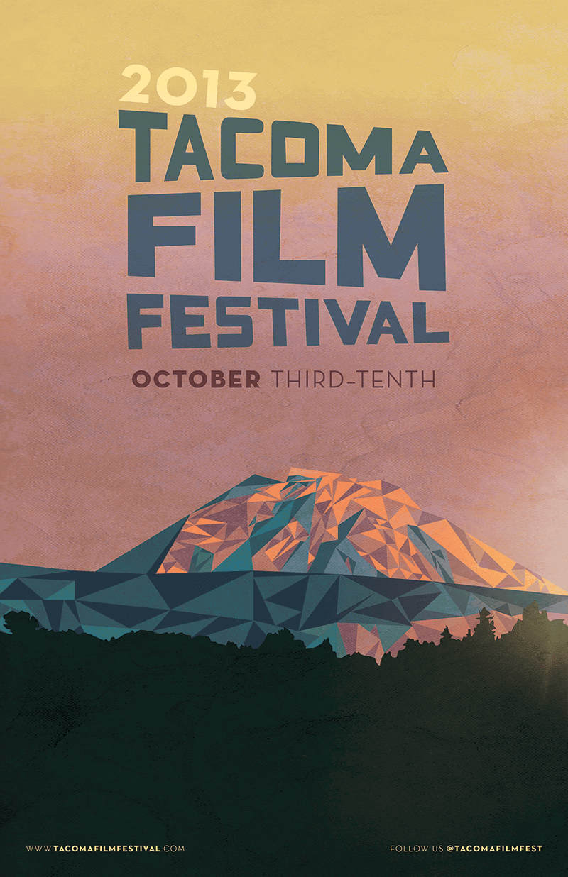
Source: Deviant Art
Smart font design makes the title impossible to miss. The use of a single, stylized image is a bold choice that also highlights the event location. Simple website and social media links at the bottom direct viewers to learn more about the festival.
Halloween Extravaganza
(
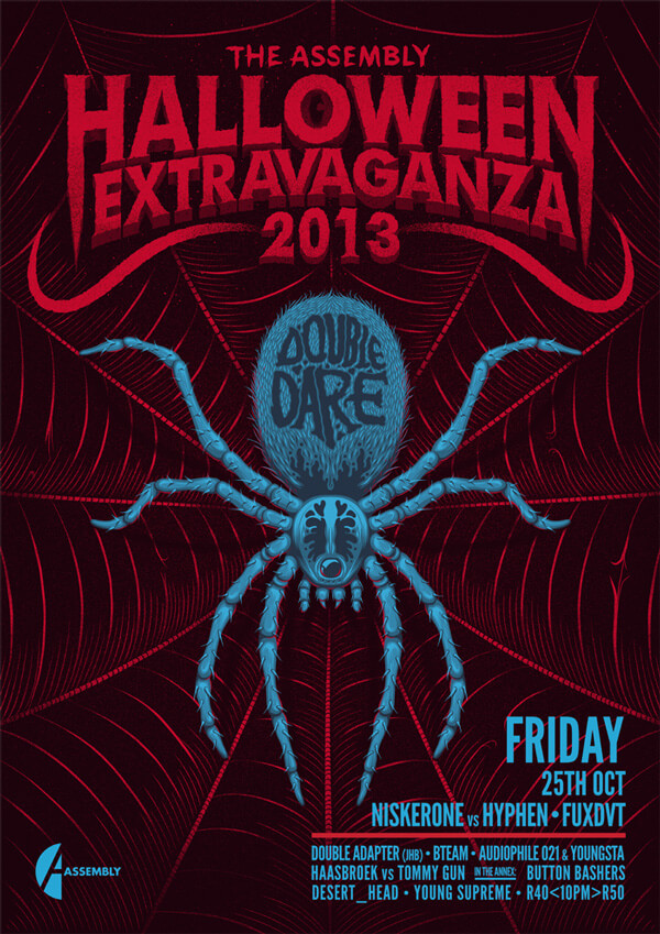
Source: Ian Jepson
This flyer screams Halloween, from the blood red shades to the eerie spider dominating the frame. It shows how important it is to stay on theme for a flyer that gets people excited for the event. Despite needing to fit in a long list of featured acts, the flyer opts to contain them in the bottom right corner, allowing the spooky image to command attention.
Product Flyers
Digital flyers are extremely effective as advertisements online. The same template and design layout for a flyer can also easily be transplanted onto a print advertisement as well. Whether you’re trying to sell a single product from your store or showcase the range of offerings that customers can expect, you can use a product flyer to get your message across.
Here’s a couple of product flyers that do well at selling the product and brand:
Fitness Equipment Flyer
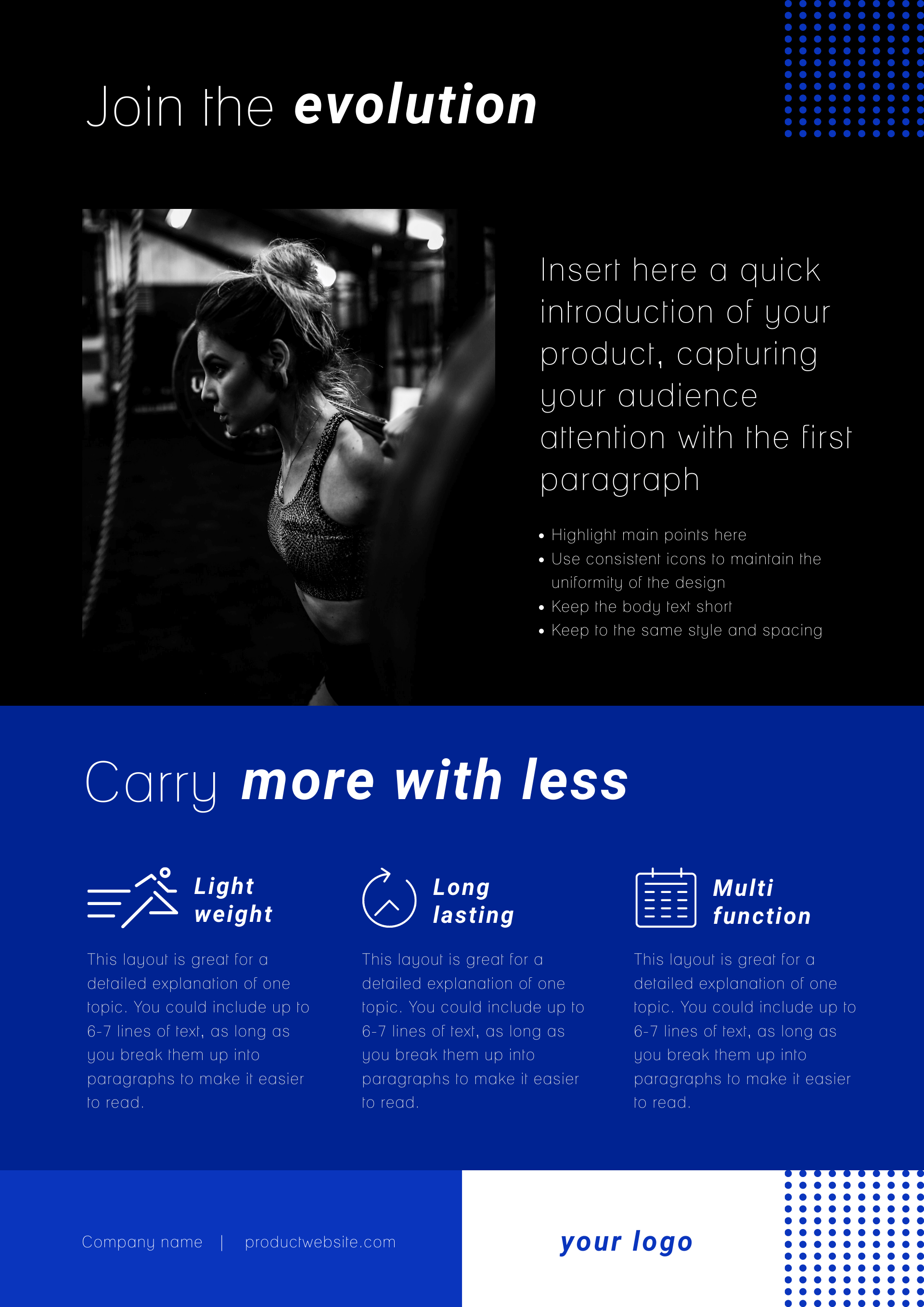
Source: Piktochart
This design sticks to darker colors, conveying a sense of determined purpose, which is perfect for a workout! There’s space to include product benefits with eye-catching icons, making a strong case for the product.
Beauty Products
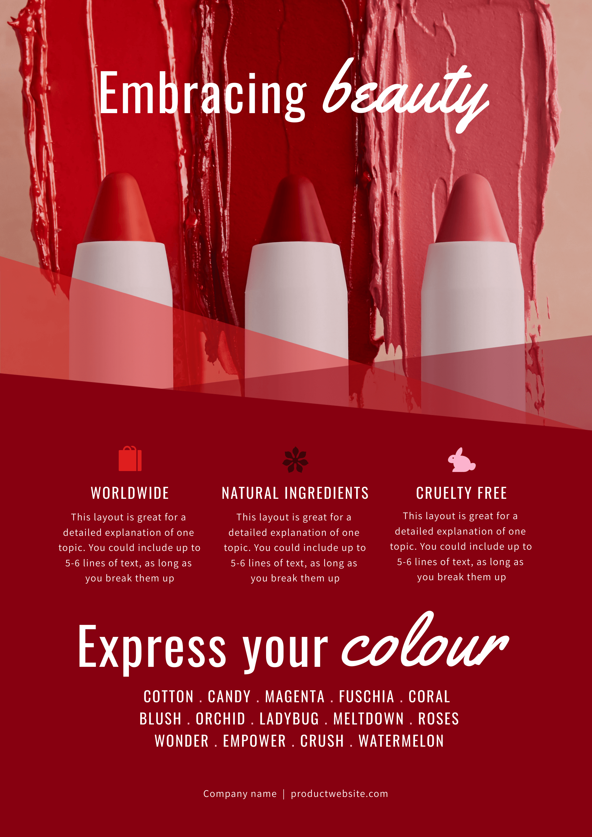
Source: Piktochart
A classic example of show, don’t tell, this flyer highlights what the lipstick looks like when worn by users. A strong slogan at the top only emphasizes the wow factor, while the bottom third makes a strong case for buying the products.
Sales Flyers
In e-commerce and traditional retail, a sale is one of the best ways to delight existing customers and draw in new buyers. However, a sale is only effective when people know about it, so you should have a strong flyer design ready if you’re planning a sale at your business.
Here are some examples of eye-catching flyers you can use for inspiration to drum up interest for your upcoming sale:
Christmas Mega Sale
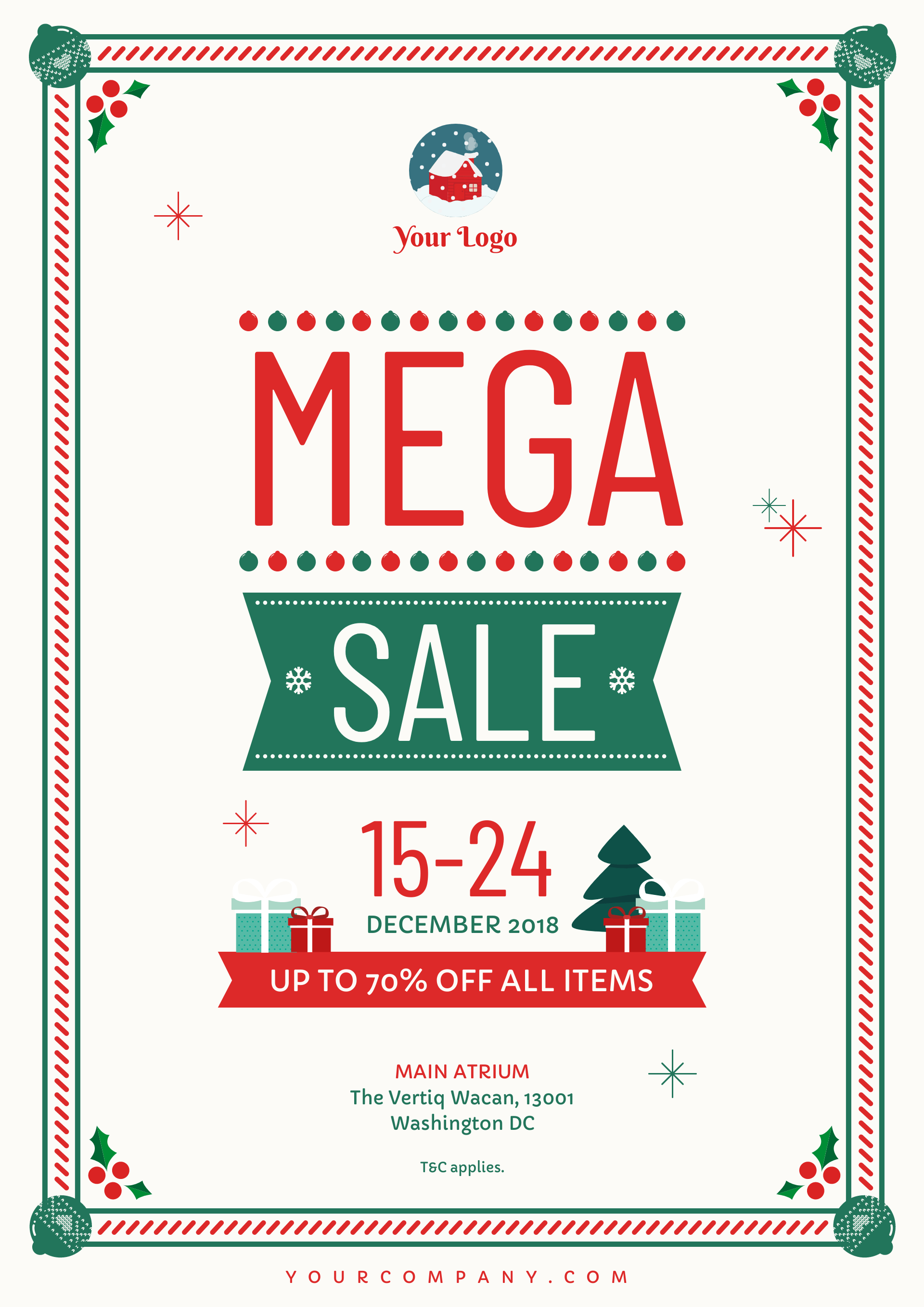
Source: Piktochart
With white, red, and green, this flyer embraces the classic color scheme of Christmas to great effect. Every little element, including the mistletoe adorning every corner, gets the viewers thinking about the festive season and what gifts they need to buy for their loved ones.
Foot & Sole Clearance Sale
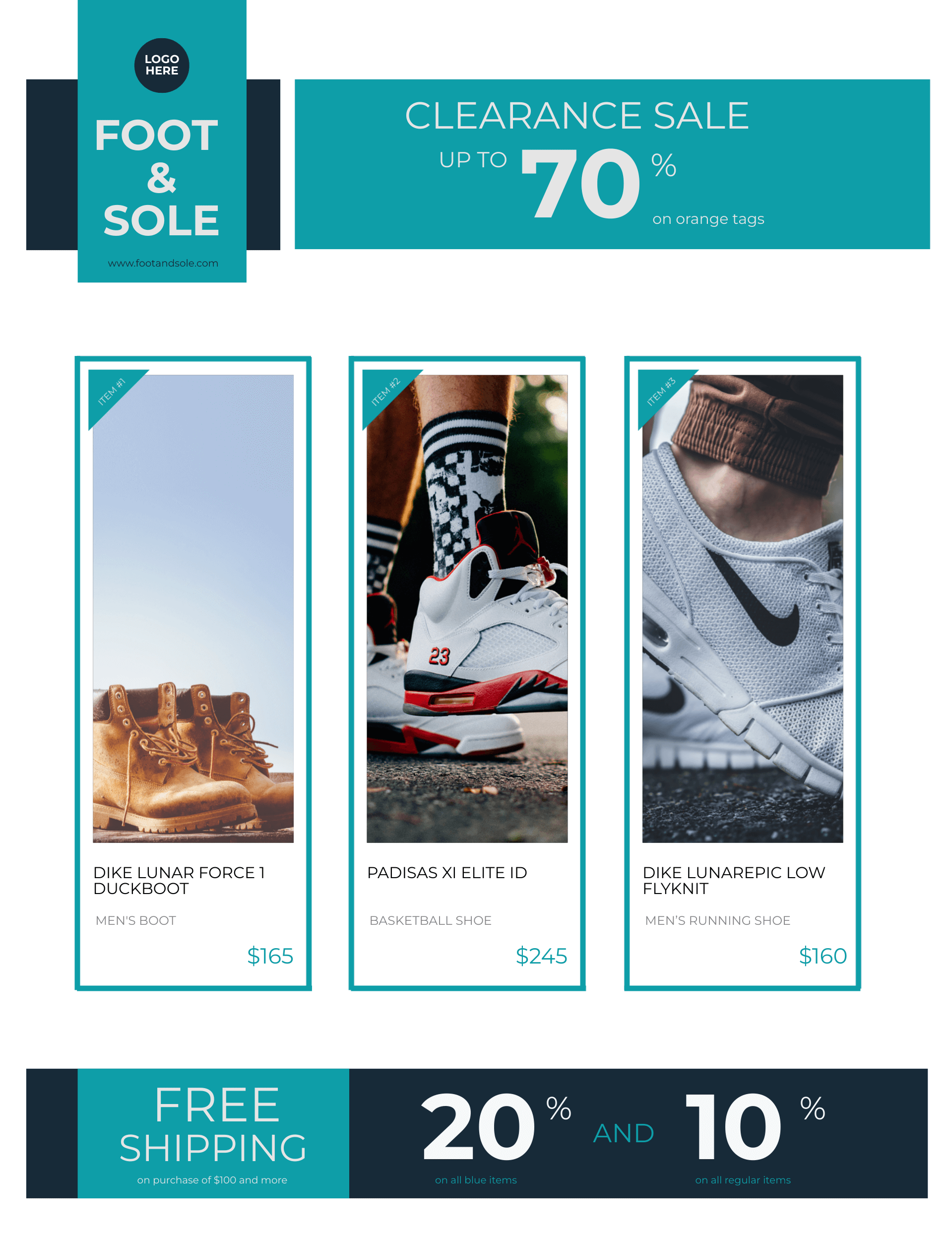
Source: Piktochart
This flyer cleverly places the deep 70% discount right at the top, before showcasing product images to show buyers what a good bargain they’ll be getting. The clean white background allows all the product shots to have room to breathe and stand out.
Service Flyers
Distributing flyers among your target audience is a reliable way to promote your business. Physical flyers and digital flyers work equally well in raising awareness. A strong flyer design helps make your services stand out from the competition.
Look at these examples of flyers that did a good job promoting their services:
Kango Travel Agency
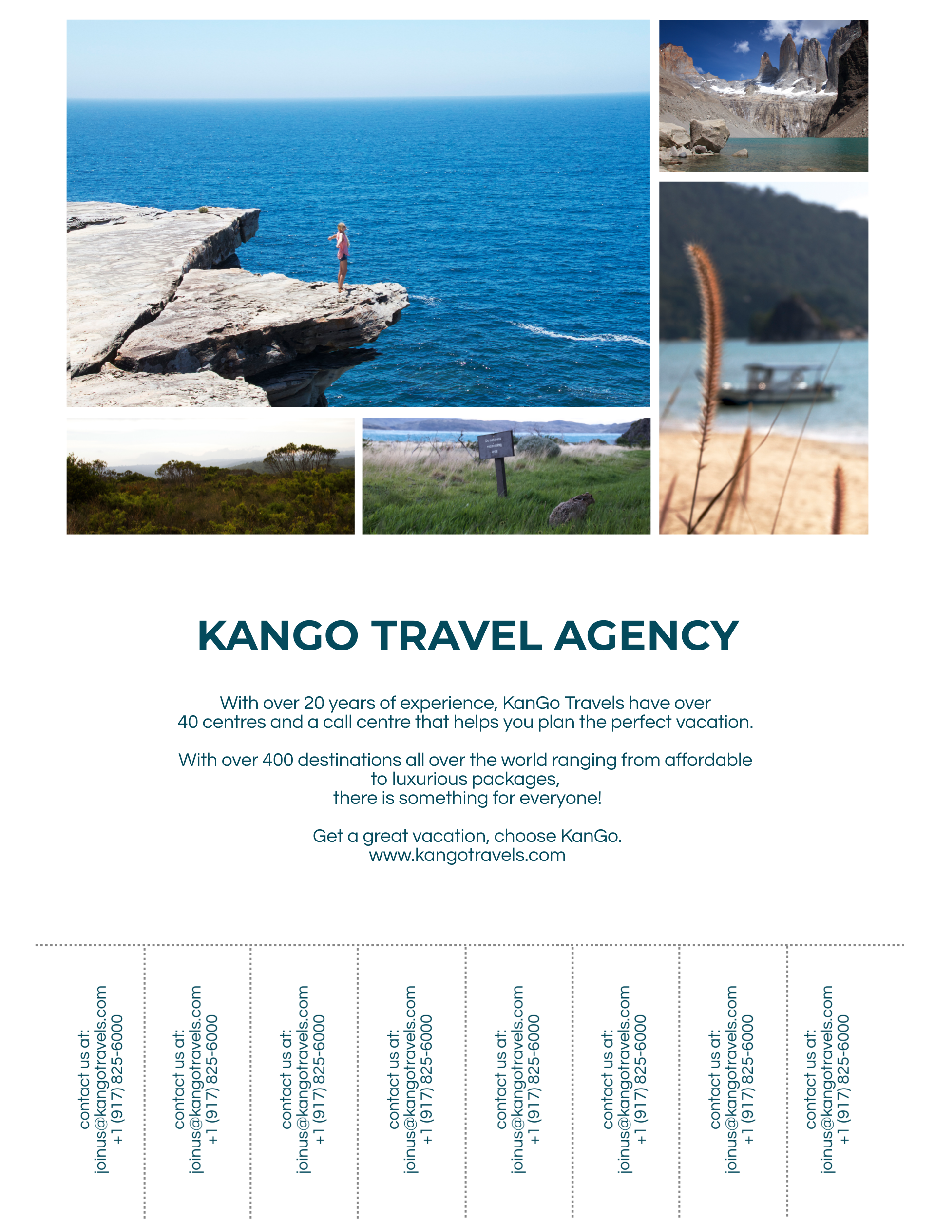
Appealing to wanderlust is a good strategy for a travel agency, and this flyer realizes that. While the travel agency’s name occupies a central position, the eye is first drawn to the neat grid of images that show off the stunning destinations that await the agency’s customers.
Thanksbury Chocolates
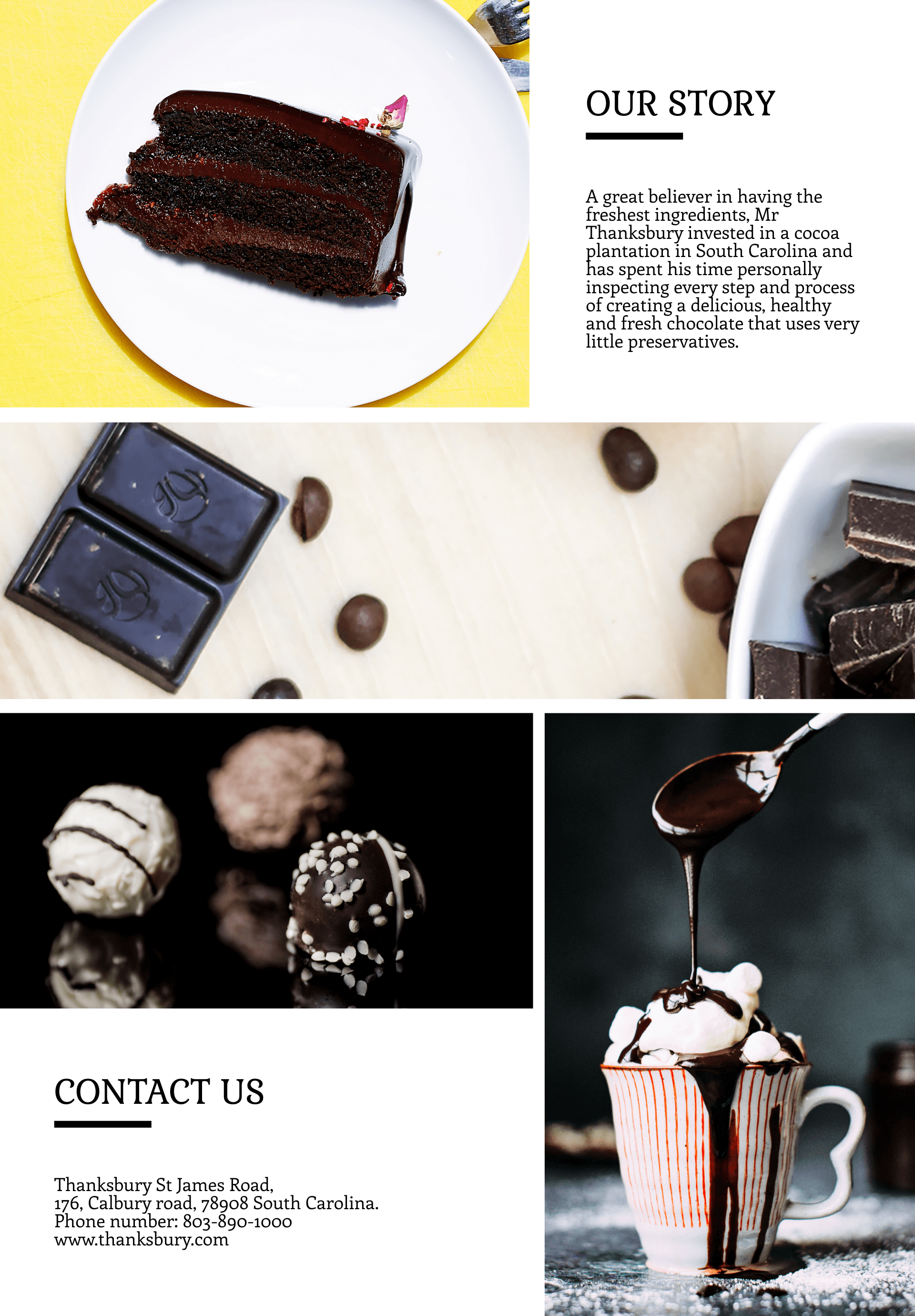
A home-baking service needs to raise awareness and trigger appetites. This flyer manages to do both, with drool-worthy shots of the baked desserts framing an intimate write-up that makes customers feel closer to the brand.
Event Flyer Template Ideas
While flyers can be used for any form of promotion, they are most commonly used for events. Long before the internet, event flyers were stapled to telephone poles or left under windshields to draw attendees. Decades later, a standout event flyer is still your ticket to a packed house and a successful shindig.
Regardless of the nature of the event, you can create a brilliant flyer that attracts more positive attention. All you need is an effective template that you can customize to your own creative vision. There are many online resources for free flyer templates, like Piktochart. Studying these available templates will help you come up with original flyer ideas for your own events. Let’s take a look at some proven templates for different kinds of events.
Conferences and Seminars
These flyers rely on a compelling hook, like a popular speaker or a sought-after course, to give viewers a reason to attend. They also have to convey the key information about when and where people can attend. Here are some flyers that successfully promote a seminar. Both examples have eye-catching colors and clear and concise text that focuses on the event’ essential information.
Music Festivals and Concerts
This is an event flyer that’s meant to drum up excitement. Apart from including names of artists, the design aesthetic of the flyer needs to match the festival’s own, as these did. Vibrant colors and quirky fonts capture the essence of these events.
Fundraisers and Charity Events
When creating flyers for charitable causes, you need to give the most prominence to your CTA. These flyers need to have a compelling reason for people to take action and donate to your cause. Highlight your CTA the same way this flyer did.
Grand Openings and Store Launches
The date and time are most important when designing flyers for one-time events like store openings. You’ll also need to include information about why this store is worth visiting over other similar stores on the flyer, as this one did.
Happy Hours and Restaurant Promos
Ongoing promotions like happy hours need to be inviting. Your design should trigger the viewers’ appetites with evocative, eye-catching, drool-worthy visuals. Only a few details matter most here, like the discounts, special offers, and timing, so you can devote most of your layout to crafting an arresting visual.
Key Takeaways for Fantastic Flyer Design
This long list of flyer ideas, flyer designs, and flyer templates should have given you a ton of creative inspiration. As long as you keep the tips covered in this blog in mind, you should have no trouble when it comes to creating effective, exciting flyers that grab the audience’s attention. Flyer design is a simple process at heart. Whether you’re designing a flyer for work or for school, all you need to do is remember a few simple pointers, such as:
Use compelling headlines
Rely on eye-catching visuals
Write clear and concise copy
Comply with brand colors and fonts
Craft an irresistible CTA
Killer flyers aren’t just for marketing. HR, sales, product, and beyond can all benefit from this versatile format. Well-designed flyers have the power to inform, excite and motivate both internal and external audiences. If you want your flyers to drive viewers to take action and engage with your brand, investing in flyer design will help you create an impact.
After reading this guide, you’re well-equipped to start designing your own flyers. Use the examples and templates covered here as starting points, and let your imagination and creativity guide you on the design journey.
The Piktochart flyer maker is a handy tool for all flyer creators, where every flyer idea takes shape into an exciting, finished product. Use all the features of Piktochart’s flyer maker in your creative process, and experience the positive impact of flyers in your next design project!