This article was written in collaboration with Piktochart’s design team, the industrious creators of the templates you love.
Ever wonder why you get the sudden urge for a burger when you drive past the Golden Arches?
Or why did you buy something you didn’t actually need at the department store?
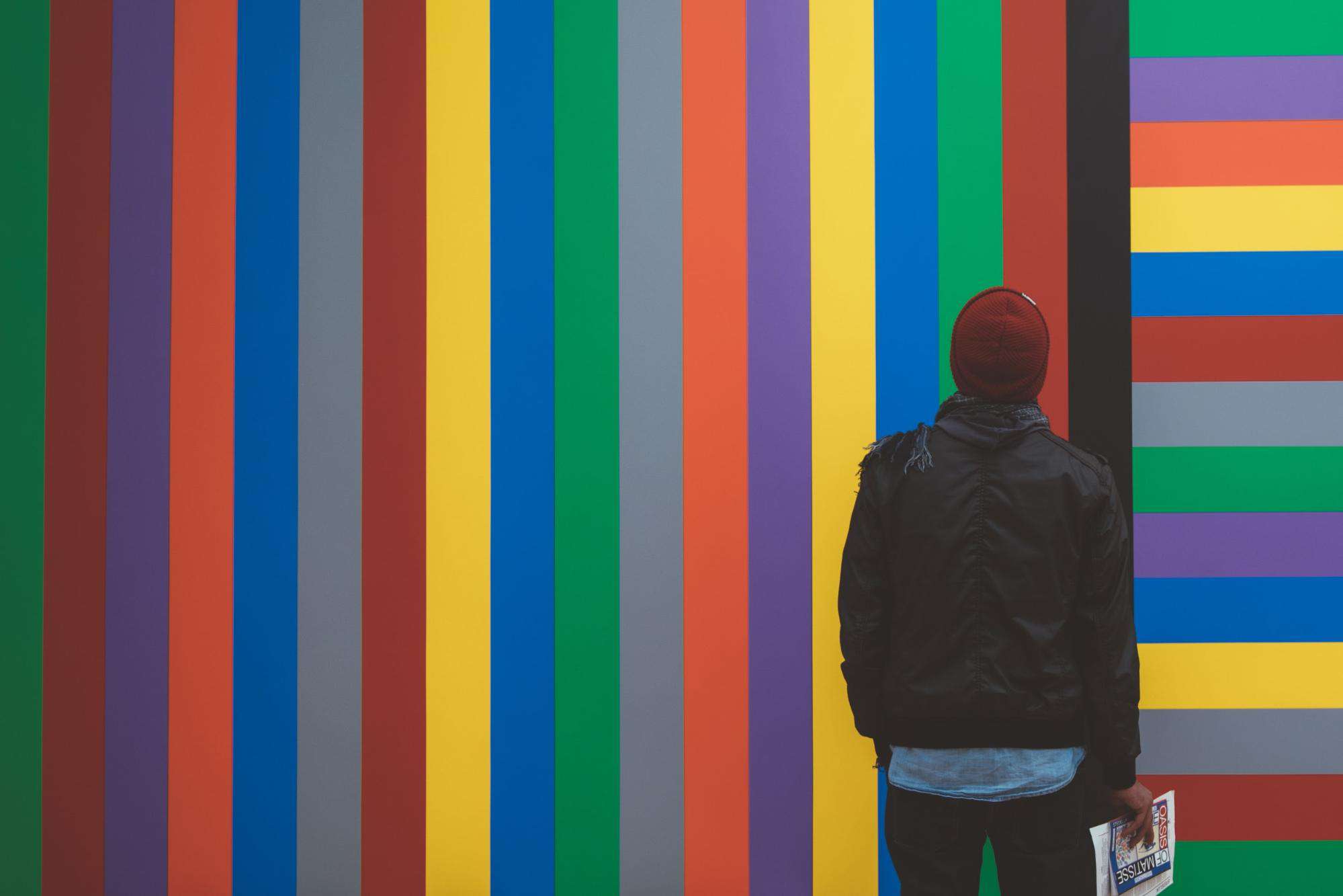
It’s probably due in part to the influence of colors.
How does color influence consumers?
Color has a powerful influence on our emotions, behaviors, and perceptions. Here are some ways that color can influence us:
-
Emotions: Different colors can evoke different emotions. For example, warm colors such as red, orange, and yellow can create feelings of warmth, excitement, and energy, while cool colors such as blue, green, and purple can create feelings of calm, relaxation, and peace.
-
Behaviors: Color can also influence our behavior. For example, the color red has been shown to increase appetite and encourage impulse purchases, which is why it is often used in food marketing. Blue, on the other hand, has been shown to have a calming effect, which is why it is often used in healthcare settings.
-
Perceptions: Color can also influence our perceptions of objects and spaces. For example, a room painted in warm colors, such as yellow and orange, may feel cozy and inviting, while a room painted in cool colors, like blue and green, may feel more spacious and calming.
-
Culture and context: The influence of color can also be influenced by cultural and contextual factors. For example, in Western cultures, white is often associated with purity and innocence, while in some Asian cultures, it is associated with death and mourning.
Overall, color can have a powerful influence on our emotions, behaviors, and perceptions, and can be used in various ways to communicate different messages and evoke different responses.
However, this logic is not always used effectively.
Example: Brand color blunder
Take, for example, the case of Heinz’s Ez Squirt.
Heinz is a global food brand known for its products, including ketchup, condiments, sauces, and canned and frozen foods.
While best known for its iconic ketchup, which has been a staple in households around the world for over a century.
In addition to ketchup, Heinz also produces a range of other condiments, including mustard, relish, and barbecue sauce.
Heinz is a well-established brand with a strong reputation for quality and reliability.
The company’s products are widely available in supermarkets and grocery stores worldwide, and its ketchup is a beloved condiment used in various dishes and recipes.
In 2000, Heinz rolled out their novelty ketchup in a range of vibrant colors.
They began with the color green as part of a promotional tie-in with the release of the animated movie Shrek.
As you know, the film was a massive hit with kids.
The green ketchup flew off the shelves.
But once the movie began to fade into memory, sales fell, too.
Unfortunately, the additional ketchup colors that Heinz launched did not do well either.
Turns out, consumers were rather put off by the idea of ketchup being an incongruous shade of blue or pink.
EZ Squirt was eventually pulled from the market in 2006.
The point is, color can influence the way we feel and behave.
A study on the impact of color on marketing found that people based 62 to 90 percent of their initial impressions about a product on color.
In other words, the color you pick for the wall of your new retail space can have a direct impact on sales, while your choice of hue for the company logo can influence how customers perceive you.
This is why color psychology is used so pervasively in marketing and branding.
The right color combination projects a certain image and evokes feelings that allow you to attract, influence, and retain your target audience.
With Piktochart, you can customize almost every element of a template. Visualize timelines, processes, and concepts. Add icons, illustrations, charts, and images. Personalize the visual with brand assets. Get started for free by creating an account.
Making a case for brand and logo fonts
Ever heard the phrase, “The shoes make the man”?
Brand fonts and typefaces are to design what shoes are for your outfit. You could be dressed to the nines from your head down to the ankles—but if your shoes are scuffed and dirty, it might leave a bad impression.
Remember that even if the typography only makes up a tenth of your design, it can still significantly impact brand identity and perception.
Fonts and typefaces either complement the entire look and tone of a brand or take it in a completely wrong direction.
With that in mind, we’ve now made it possible for our PRO users to upload their own fonts onto Piktochart!
Selecting the right typography really impacts the look, feel, and mood of your visual – so you’ll now be able to customize your projects even further.
Take a look at the below GIF to see how to start uploading.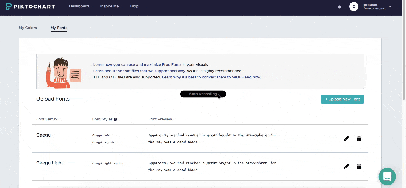
If you don’t have an account yet, just sign up for Piktochart here.
A free account is available, and it’s easy to get started.
Take a look at this visuals gallery and choose a template to customize.
Good to know, right?
Now let us take a look at the retail, healthcare, and finance sectors and their use of logo color and brand fonts in some detail.
Retail branding
Logo colors
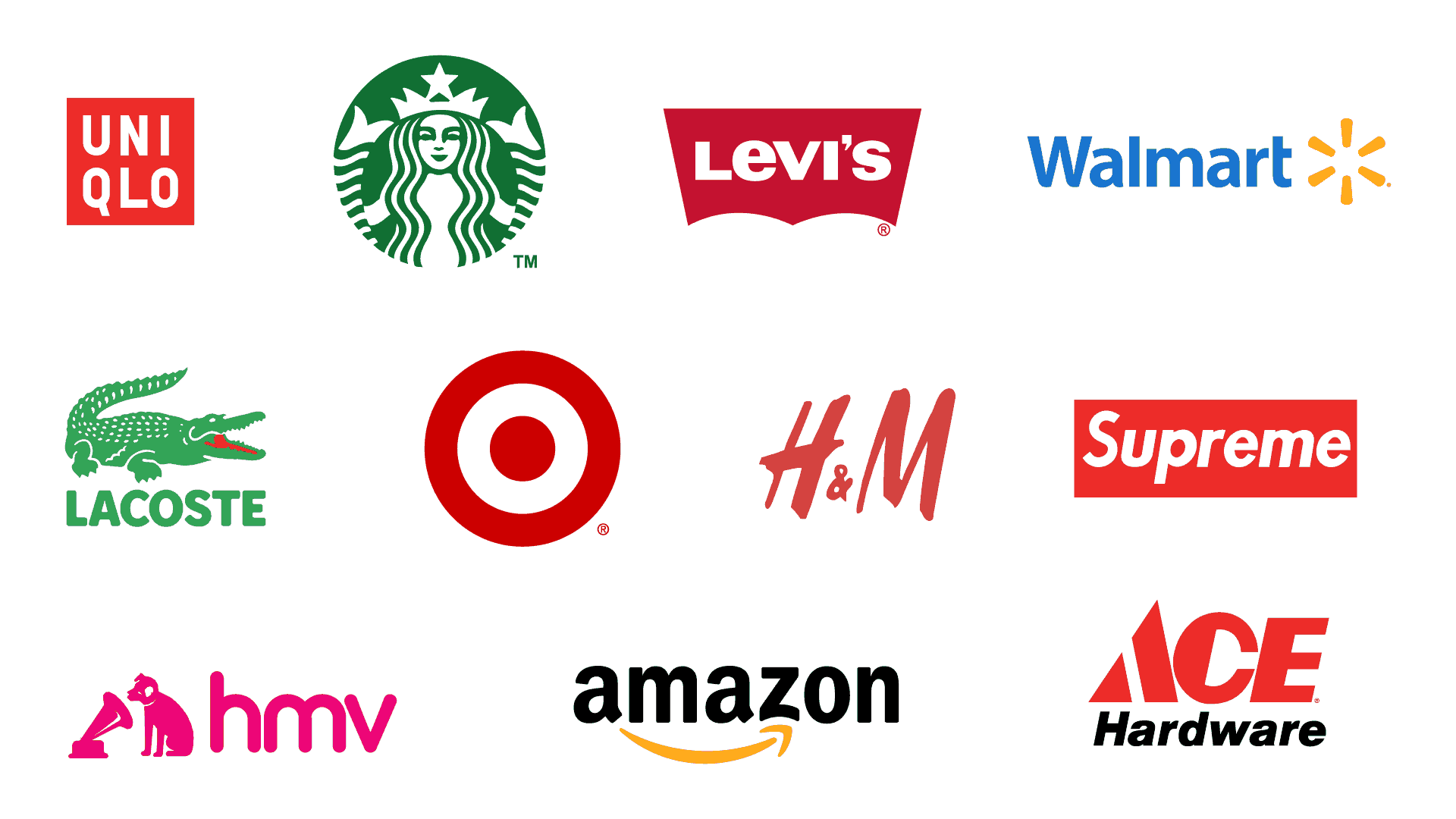
Retail industry brands typically go for vibrant, loud logo colors as a way to stand out.
The right brand fonts, with the right brand colors, also serve two other purposes through these two styles—to help relay the brand message and enhance a customer’s shopping experience.
There are no firm rules about which logo colors should retail companies should use, but vibrant colors like red, orange, yellow, and green are frequently the hues of choice. (To create contrast, blue or black are often paired with these colors.)
The primary goal of any retail brand in the fashion world is to leave a solid and lasting impression on consumers, and these bold logo colors get the job done.
Logo font family colors, including red and orange, also imbue brands with a sense of power, optimism, dynamism, and confidence.
Generally, the retail industry’s more modern brands also tend to use hues and tints more than tones and shades.
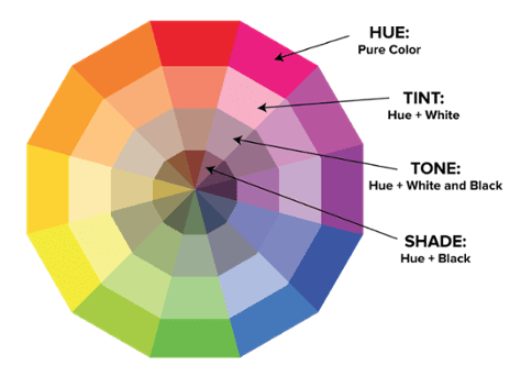
Hues and tints
Hues and tints are terms commonly used in color theory, which studies how humans create, mix, and perceive colors.
A hue refers to a specific color in the spectrum of colors, such as red, yellow, or blue.
Each hue has its own wavelength and is unique in appearance.
On the other hand, a tint is created by adding white to a hue, which makes the color lighter and brighter.
Tints are often referred to as pastel colors and can range from pale pink to light blue, for example.
Hues and shades
Tones and shades are two further terms used in color theory, often used in combination with hues and tints.
A tone refers to the overall lightness or darkness of a color.
When a hue is mixed with gray, the resulting color has a lower saturation and becomes a tone.
Tones can be described as muted or subdued versions of the original hue, and they often have a more complex, nuanced appearance.
Alternatively, a shade is created by adding black to a hue, which makes the color darker.
Shades can range from deep and rich to almost black, depending on the amount of black added.
Shades are often used to create dramatic effects and convey depth or contrast.
Gray, on the other hand, is hardly ever the color of choice in retail industry visuals.
The nondescript color expresses dullness and a lack of confidence.
Brand fonts
Fonts are generally considered the ‘face’ of the brand in the retail industry.
Here are some ways that fonts can impact a brand:
- Brand recognition: Consistent use of fonts across all brand materials helps to create a strong visual identity and can increase brand recognition. By using a unique and recognizable font, a brand can stand out from competitors and become more memorable to customers.
- Brand personality: Different types of fonts can convey different moods and personalities. For example, a bold, modern font may communicate a sense of confidence and innovation, while a classic, serif font may communicate a sense of tradition and sophistication. By choosing a font that aligns with the brand’s personality and values, a brand can create a consistent message across all brand touchpoints.
- Legibility: Fonts can impact the legibility of brand materials and affect how easily customers can read and understand the brand’s message. Choosing a legible font that is appropriate for the medium (such as a sans-serif font for digital materials) can help ensure that customers can easily read and comprehend the brand’s messaging.
- Accessibility: Fonts can also impact the accessibility of brand materials for people with visual impairments. Choosing a font that is easy to read and has a high level of contrast can help make brand materials more accessible to a wider audience.
Overall, fonts play an important role in a brand’s visual identity and can impact brand recognition, personality, legibility, and accessibility.
By choosing fonts that align with the brand’s personality and values, and by using them consistently across all brand materials, a brand can create a strong visual identity that resonates with customers.
So while layouts do change, the brand fonts need to be legible and communicate brand identity to customers.
After all, brands want to deliver a consistent message to their customers.
And if customers can’t read your message clearly, they might simply move on.
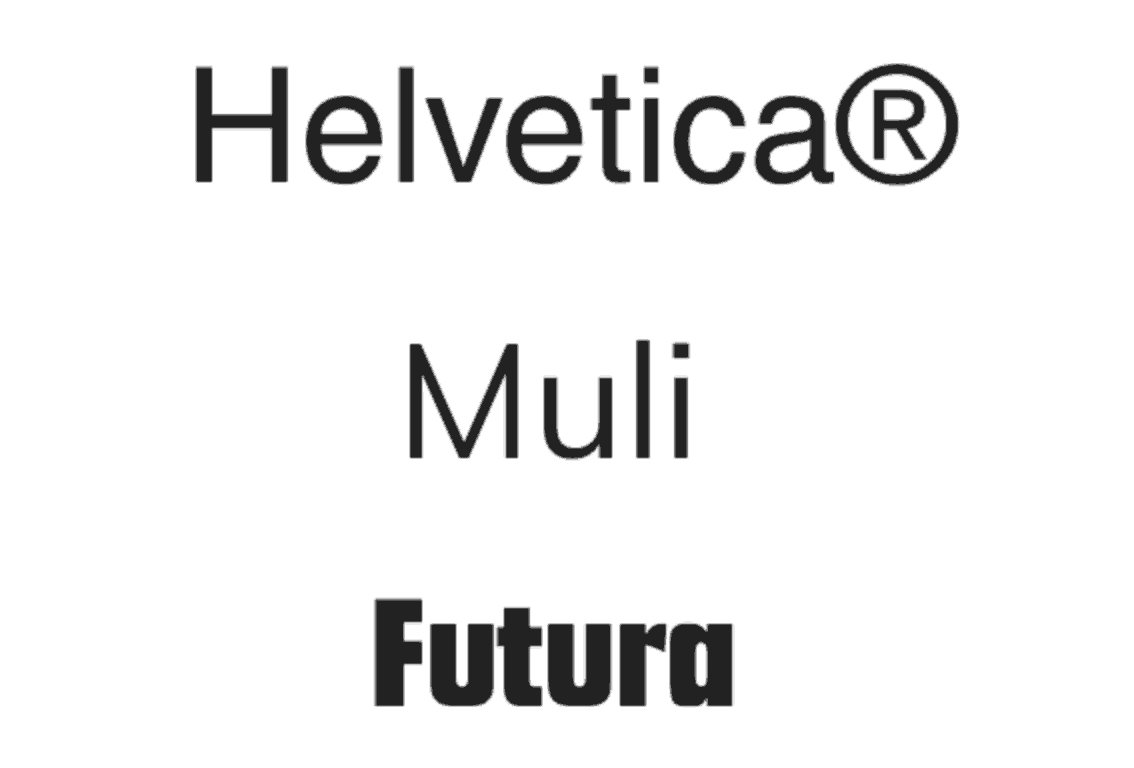
In retail, using a Sans Serif font for your logos, such as Helvetica, Muli, and Futura, is favored for its boldness and is suitable for strong headlines.
If you’re seeking a trendy Sans Serif font that is popular in logo and website use, Gilroy could be the perfect geometric Sans Serif typeface for you and your brand.
This geometric Sans Serif font is based on simple geometric shapes — most notably the circular ‘O’ shapes — and is a very modern typeface.
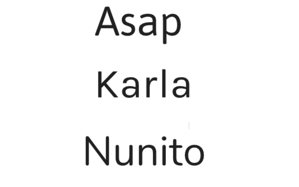
For subheadings and body text, brand fonts high in readability, such as Asap, Karla, and Nunito, are recommended (instead of a Geometric Sans Serif typeface which works better for headings).

Serif fonts (e.g., Arapey and Playfair Display) or Slab Serif fonts (e.g., Arvo) can be used partially for titles or headlines.
Geometric Slab Serif (also called mechanistic, square serif, antique or Egyptian) typeface is a type of serif typeface characterized by thick, block-like serifs.
If you are experimenting with typography, you may want to pair a Serif font with a Sans Serif font.
Pairing a Serif font with a Sans Serif font can create a harmonious and balanced visual effect that can make the text more engaging and easier to read.
Here are a few reasons why you might want to consider pairing these two font types:
- Contrast: Serif fonts have small decorative flourishes or lines at the end of each stroke, while Sans Serif fonts lack these embellishments. This contrast in style can create an interesting visual effect that draws the eye and makes the text more visually engaging.
- Hierarchy: Serif fonts are often used for titles and headings, while Sans Serif fonts are used for body text. This contrast in style can help to establish a visual hierarchy that makes it easier for readers to scan and navigate the text.
- Legibility: Serif fonts are often more legible in print, while Sans Serif fonts are more legible on digital screens. By using a Serif font for printed materials and a Sans Serif font for digital materials, you can help ensure that your text is as legible as possible in each medium.
- Personality: Serif fonts can communicate a sense of tradition, elegance, and sophistication, while Sans Serif fonts can communicate a sense of modernity, simplicity, and clarity. By pairing these two font types, you can balance classic and modern styles to help communicate your brand’s personality and values.
Overall, pairing a Serif font with a Sans Serif font can create a visually interesting and balanced effect that can improve the legibility, hierarchy, and personality of your text.
This classic duo complements each other well and can add some nice contrast and create visual interest.
However, note that employing a Serif font is not generally recommended for body texts as they give off too much of a classic, traditional vibe instead of a fresh, engaging vibe associated with a modern font.
The modern take on logo colors and perfect logo fonts
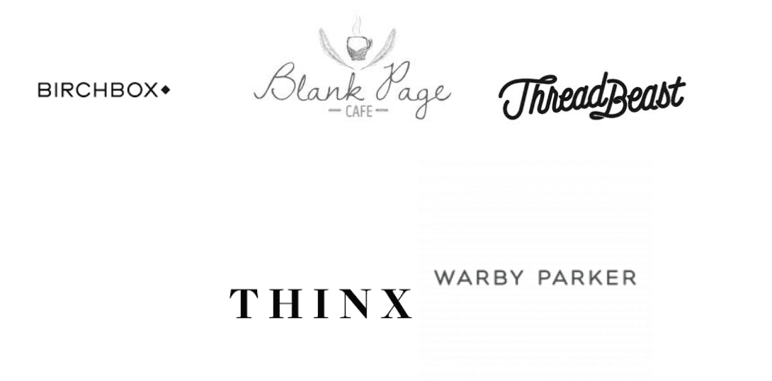
E-commerce clothing brands and retailers like Warby Parker and Thinx exude understatedness and timelessness using simple black logo fonts and a good amount of white space.
Meanwhile, the logo of fashion curation brand ThreadBeast may be short on color but makes up for it with a cursive font giving an elegant look as if it had been woven from a thread.
In this case, the logo font alludes to a key component (thread) of the product being sold (clothes).
Online retail brands like the aforementioned attract customers with easy-to-navigate and user-friendly platforms that make the buying process as simple as possible.
A minimalist aesthetic effectively communicates the message of fuss-free functionality.
Hand-drawn logos, which inject a unique personality into each brand, have also become a popular trend in retail, as have logos with a retro or vintage feel that harken back to the ‘good old days.’
Such logos reflect the brand’s personality and appeal to niche markets.
Below are some visual examples from Piktochart templates with ideal color and brand font pairings. Get inspired!
1. Arapey for the headline, paired with modern font Lato for body text
2. Splash of pastel colors in the logo font family to attract female customers

Healthcare branding
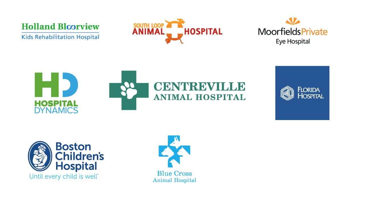
Fonts for logos and high-contrast colors of health
Traditionally, the healthcare and medical sectors can be identified by a very distinguishable color palette.
Cool tones such as blue and green, in particular, are frequently selected to relay a sense of calm, trustworthiness, professionalism, and reliability.
As a balance to the coolness, high contrast shades such as orange and red may be introduced to contribute feelings of optimism, warmth, and happiness.
While verdant, grass-like hues are often the color of choice, avoid the louder and brighter shades such as neon green in the field of health and fitness.
This shade of green is jarring to the eye and denotes frivolity, which is not in line with the image of professionalism that the healthcare industry wishes to project.
Brown is also unpopular within the industry, as it is considered to be lacking in sophistication.
Medical fonts
In the healthcare industry, the role of the font and certain letterforms is to portray professionalism and reliability without sacrificing readability.

Modern Serif fonts that evoke strength and security (such as Arapey and Droid Serif) are often paired with Sans Serif ones (such as Roboto and Overpass).
This font family collaboration is used to conjure feelings of dynamism and professionalism in the medical field through logo font.
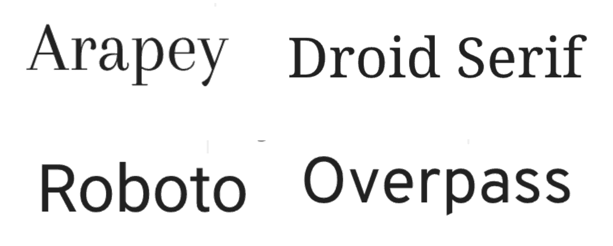
On the other hand, using handwritten fonts as a primary font, such as Oleo Script, Open Sans, Gill Sans, and fancy fonts such as Codystar or an italic version of those mentioned above are discouraged, as they are overly playful and lack the necessary gravitas.
Feeling inspired? Give these tips a try by creating a free account and customizing a template!
The modern take on health colors and medical fonts
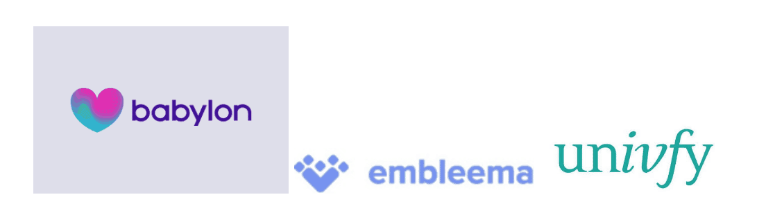
Some newer, more modern healthcare companies choose a less traditional route to establish their brand identity through a contemporary look and font family.
For example, health-tech companies, such as Babylon Health and Univfy, have experimented with unique health color gradients (where hues gently transition from one shade to another).
Others, like Embleema, have chosen a cleaner, more minimalist aesthetic and font family.
Making bolder and more unusual choices in health color and medical fonts allows these brands to stand out and present themselves as fresh, forward-looking companies with cutting-edge technology.
1. Choose medical fonts that are Sans Serif like Muli and Lato for high readability
2. Dark blue is the main logo font color, which is paired with a bright color like orange as the secondary font color for health

Financial Services
Financial colors
As a general rule, financial services brands prefer a toned-down color palette and the use of geometric shapes for their font in order to establish feelings of trust and reliability.
A brand font can establish feelings of trust and reliability by creating a consistent, legible, and professional visual identity that communicates the brand’s personality and values effectively to the target audience.
There is also a certain consistency in color used among the major brands.
Typically, one color is chosen as the main feature, then paired with a secondary color to help make the logo pop.
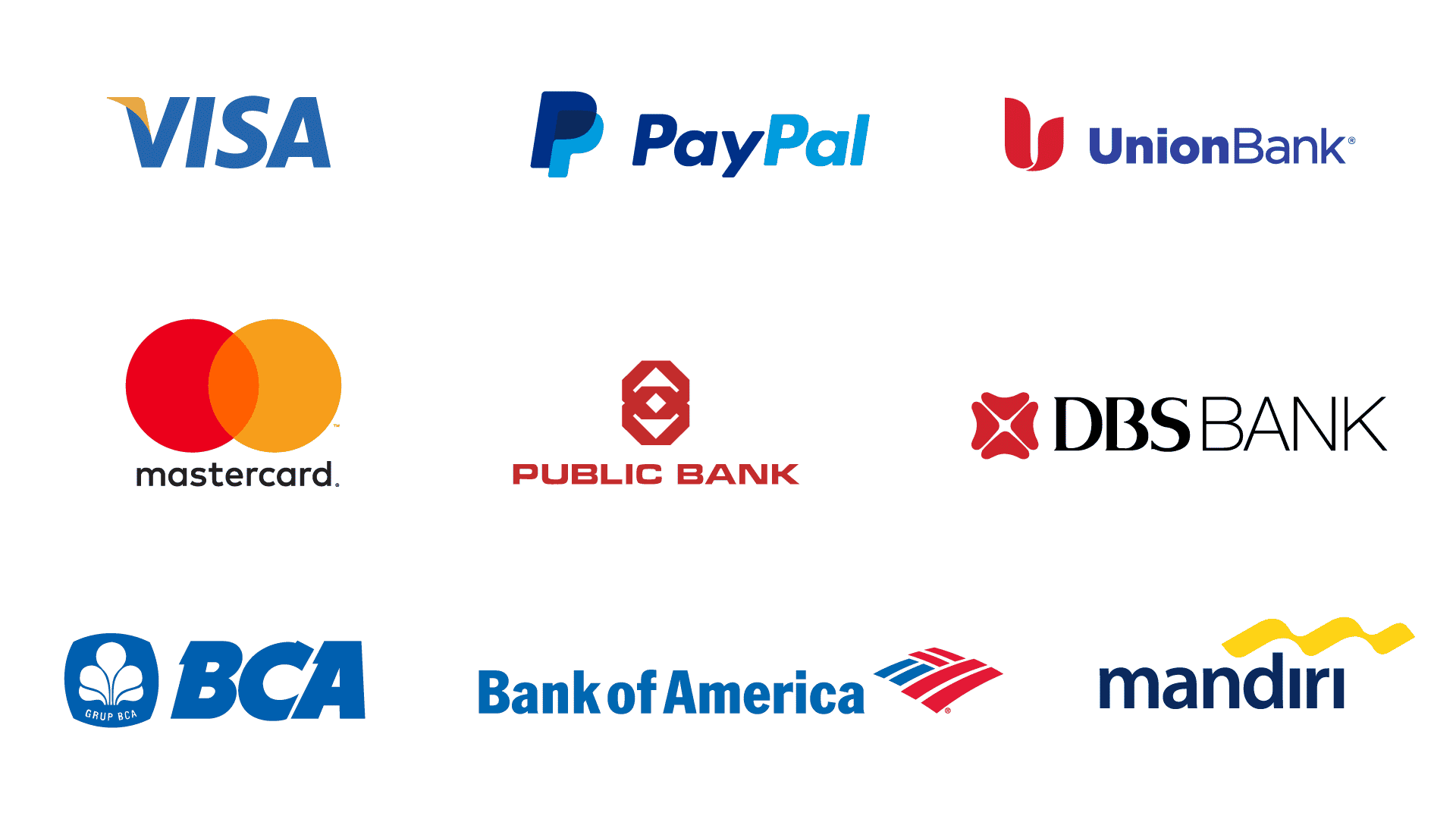
Take DBS and OCBC, for instance.
While both banks use red as their primary color, the red in DBS is combined with black to convey strength and aggression.
Meanwhile, OCBC plays with color negative to create a stark contrast and emphasize the red part of its logo.
Blue, black, and red are the commonly used colors in banking and finance.
Blue represents loyalty, professionalism, and trustworthiness; black signifies ambition and security and; red denotes power and passion.
These are often paired with green, orange, and yellow—colors that provide balance and contrast, allowing brands to reach a wider target audience.
On the other hand, the finance industry traditionally shies away from pink and purple, which are deemed to denote softness and lack of strength.
Brown, which is associated with a passive personality, is likewise rarely seen in the finance sector.
Fonts
The financial services industry is similar to the healthcare industry in that both typically seek out brand fonts that embody professionalism and reliability.
However, unlike the healthcare sector, the finance industry now attempts to use more modern logo fonts and new color palettes.
Through their font, they want their audience to know that although financial institutions may have been around for a while, they are young and active.
In fact, Finance organizations can be dynamic innovators by adopting a culture of innovation and investing in the right tools and technologies.
Here are some ways finance organizations can become more innovative:
- Embrace new technologies: The finance industry constantly evolves, and organizations must keep up with the latest technologies to stay relevant. This includes adopting new accounting software, data analytics tools, and other emerging technologies to improve efficiency and accuracy.
- Encourage experimentation: To foster innovation, finance organizations must encourage experimentation and take calculated risks. This means being open to new approaches and allowing employees to test new ideas without fear of failure.
- Promote a culture of continuous learning: Innovation requires continuous learning and improvement. Finance organizations should provide their employees with access to training, mentorship, and development opportunities to help them stay up-to-date with the latest industry trends and best practices.
- Foster collaboration: Collaboration is key to innovation. Finance organizations should create opportunities for employees to collaborate across departments and teams, share knowledge and insights, and brainstorm new ideas.
- Be customer-focused: Innovation should be driven by the needs of the customers. Finance organizations should strive to understand their customer’s pain points and work to develop solutions that meet their needs and exceed their expectations.
By adopting these strategies, finance organizations can become more dynamic innovators and better equipped to respond to the changing needs of the industry and their customers.
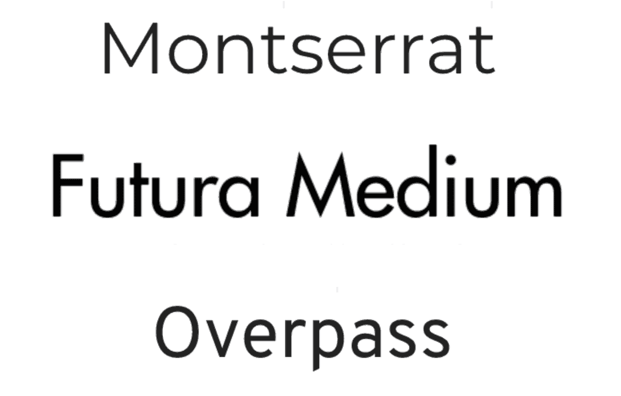
Typically, modern Sans Serif fonts that project strength, reliability, and stability (such as Montserrat, Futura Medium, and Overpass) and Sans Serif fonts with a strong personality (like Arsenal) are generally used in the financial services industry.
‘Rounded’ Sans Serif typography like Capriola, Comfortaa, Open Sans, and Gill Sans are to be avoided, while Sans Serifs with sharp edges and stronger personalities are favored for font choice.
On the other hand, handwritten logo fonts such as Bad Script, Caveat, and Euphoria Script, and fancy fonts such as Frederika the Great are not encouraged as they come across as casual and playful.
The modern take on logo colors and logo fonts
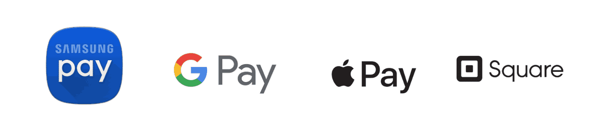
Interestingly, e-payment systems like Apple Pay and Samsung Pay have been relatively conservative in their logo fonts and colors.
They use modern Sans Serif typography and colors like blue and black to convey stability and reliability.
This approach makes perfect sense, as the goal is to make customers feel safe and assured about moving to a new and unfamiliar banking mode.
1. Arsenal, a logo font with a strong personality, combined with a high readability brand font like DIN Pro
2. Playfair Display for the headline, combined with a high readability brand logo font like Asap for the body text
Change Is the Constant
Whether we are looking at the retail, healthcare, or finance industry, it is clear that there are simply no hard-and-fast rules when it comes to designing and creating a brand personality through logo designs and fonts.
Choosing the best fonts for logos and associated colors is a complex task. How many fonts have you already considered? More than what you can count on your fingers.
This is especially true with the myriad of unconventional and modern businesses that have emerged, employing one or more aspects of contemporary design in their visual identity.
In many cases, online channels have helped lead to the rise of the use of bold, bright, and saturated tones in font and branding, while others are choosing less traditional styles by experimenting more boldly with serif logo fonts and typefaces.
Is online branding bolder?
Online brands often use bolder fonts and colors for several reasons:
- Attention-grabbing: In the digital world, attention is a scarce resource.
- Brand recognition: Bold fonts and colors can help establish a brand’s visual identity and make it more memorable.
- Readability: Bold fonts can improve the readability of the text, making it easier for users to read and scan through the content quickly.
- Emphasis: Bold fonts and colors can be used to emphasize specific points or calls to action on a website or social media post.
Overall, using bold fonts and colors is a common strategy for online brands to make a strong visual impact and stand out in a crowded digital environment.
Whether they are established modern brands or new startups trying to build brand identity and brand personality with unique characteristics, the goal is the same—to stand out from a sea of competitors through their logo font and colors.
And the correct logo font pairs and logo colors can help them do so.
At the retail, healthcare, or finance industry, it is clear that there are simply no hard-and-fast rules when it comes to designing and creating a brand personality through logo designs and fonts.
Choosing the best fonts for logos and associated colors isn’t a simple task. How many fonts have you already considered? Probably more than what you can count on your fingers.
This is especially true with the myriad of unconventional and modern businesses that have emerged, employing one or more aspects of contemporary design in their visual identity.
In many cases, online channels have helped lead to the rise of the use of bold, bright, and saturated tones in font and branding, while others are choosing less traditional styles by experimenting more boldly with serif logo fonts and typefaces.
Whether they are established modern brands or new startups trying to build brand identity and brand personality with unique characteristics, the goal is the same—to stand out from a sea of competitors through their logo font and colors.
And the right font pairs and colors can help them do so.
Piktochart offers professional visuals to create infographics, reports, presentations, posters, brochures, and more.
Customize almost every element of a template with Piktochart. Add your brand assets and custom modern fonts with PRO. Get started for free.