If you’re looking for design inspiration, nature’s green palette is an endless source of wonder. Think of the tender shoots of springtime, the deep hues of a rainforest canopy, or the subtle sage of desert succulents.
Green is commonly used in branding, especially for companies who want to convey freshness, sustainability, health, growth, or financial themes. It also brings a sense of balance or a deliberate pop of contrast in website layouts, illustrations, and marketing materials.
Keep your eyes peeled for 25 green color combinations drawn from the world around us. Each palette below includes hex codes and suggestions for where to use them – from websites and branding to interior design and illustration.
To test them out as you go along, sign up for a free Piktochart account in seconds and get access to our top-of-the-class editor and AI design tools!
What colors go best with green?
Our collection of green color schemes below showcases the versatility of neutrals such as white, black, and beige when paired with greens of various shades. In addition, analogous colors like blues and yellows, and complementary colors like reds, can create different moods depending on the intensity and hue of the green being used.
When choosing the best color palette for green-inspired designs, consider the specific shade of green and the mood or feeling you want to convey!
Now, let’s not dill-y dally any longer (pun intended!)
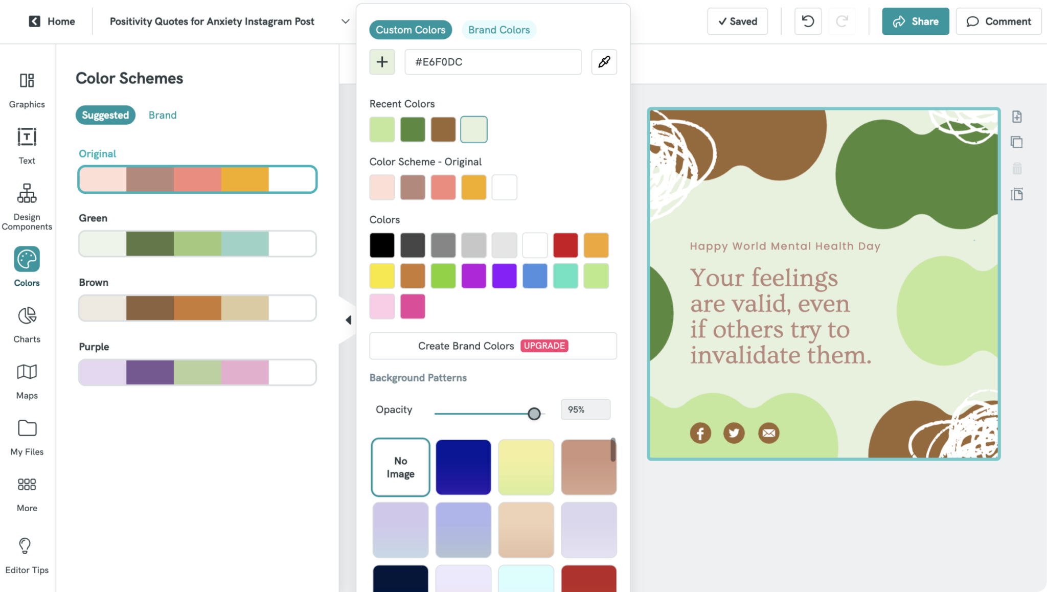
#1: Sweet Sage and Spice
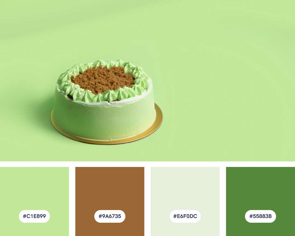
- #C1E899
- #9A6735
- #E6F0DC
- #55883B
This green color palette mixes warm and cool tones, evoking nature and baked goods. Soft pistachio green is reminiscent of spring and herbs, while rich cinnamon adds warmth and spice. Accented with forest green, it’s perfect if you want to convey a welcoming vibe.
Design ideas for this green color palette:
- Foodie-focused: This palette works beautifully for cafés, bakeries, or food-focused branding that want to convey a natural, wholesome vibe.
- Eco-chic goods: The colors have a gentle, organic feel that is perfect for sustainable products, natural textiles, or home decor with a handcrafted aesthetic.
- Nature-inspired illustrations: This palette is also ideal for botanical illustrations, whimsical drawings, or artwork focused on gardens and outdoor themes.
#2: Coastal Escape
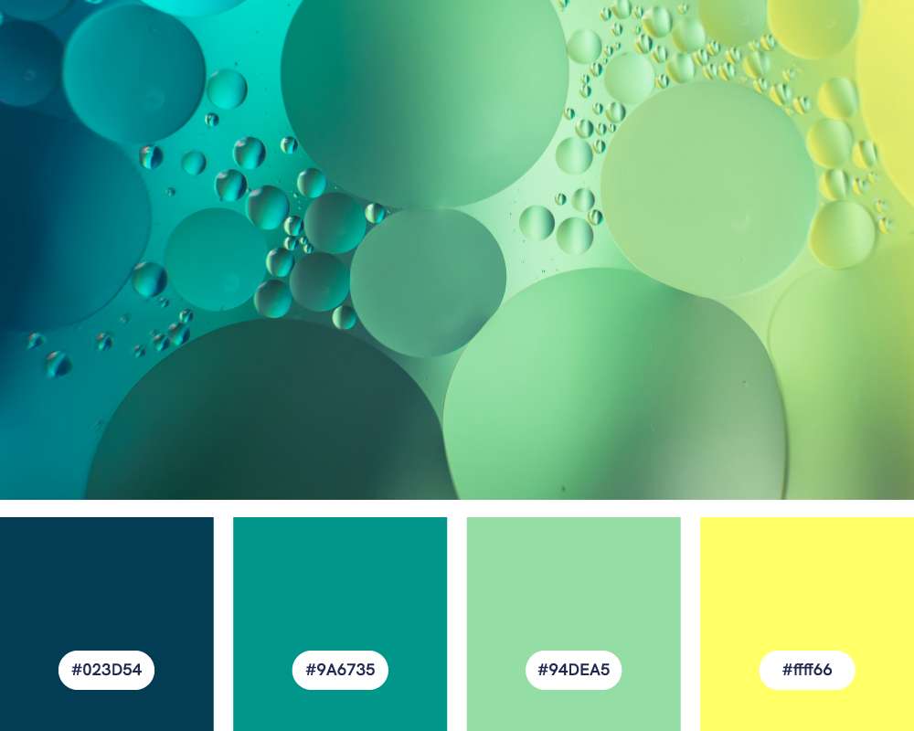
- #023D54
- #9A6735
- #94DEA5
- #ffff66
Look no further if you’re in need of looking for a dark green color palette with a hint of yellow accent. While the deep teal evokes the vastness and deeper waters, the seafoam green will remind you of rolling waves and sandy shorelines. The bright, cheerful yellow adds a pop of sunshine and optimism to the palette.
Design ideas for this green color palette:
- Spa-like interiors: This color scheme is ideal for creating a peaceful and relaxing atmosphere in bathrooms, spas, or meditation rooms.
- Playful children’s spaces: The bright yellow hue adds a touch of fun to the calming greens and blues, making this palette well-suited for daycare centers, playrooms, or children’s furniture.
- Modern art: The contrasting colors in this palette can create a dynamic and visually interesting backdrop for modern art pieces or graphic design projects.
#3: Enchanted Forest
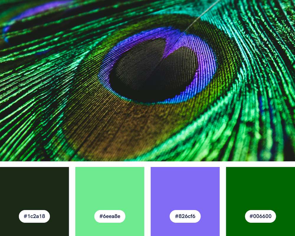
- #1c2a18
- #6eea8e
- #826cf6
- #006600
This dark green color palette evokes the deep greens of dense foliage, the cool teal of dappled sunlight or hidden ponds, and the delicate lavender of forest wildflowers. The dark charcoal and lavender color also carry an air of the fantastical, reminiscent of the forests found in fairy tales and legends.
Design ideas for this green color palette:
- Luxury interiors: This palette can create a sophisticated and dramatic atmosphere in living rooms, bedrooms, or home offices.
- Fantasy-themed design: : Ideal for creating a mystical or enchanted ambiance for children’s rooms, game rooms, or fantasy illustrations.
- Historical or cultural design: The rich teals, purples, and deep greens can reference royalty, regal settings, or cultural elements from certain parts of the world.
#4: Jewel of the Jungle
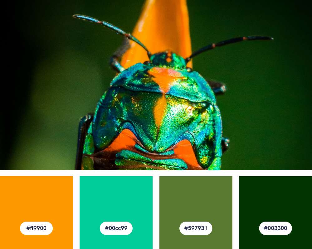
- #ff9900
- #00cc99
- #597931
- #003300
This palette plays on the bold gem-like tones of the orange and teal, balanced by the earthy greens that are reminiscent of a dense jungle. The two shades of green act as grounding elements for this green color scheme, balancing out the vibrancy of the orange and teal.
Design ideas for this green color palette:
- Retro-inspired design: Especially effective for a 1970s aesthetic, with its bright orange and bold teal. You can use it for vintage posters, funky furniture, or playful fashion.
- Modern tropical interiors: Ideal for creating a vibrant and cheerful atmosphere, with accents of orange against lush greens. Think tropical-themed wallpaper or textiles.
- Nature-inspired branding: Great for brands that want to project a sense of vibrancy, warmth, and connection to the outdoors, perfect for eco-friendly or adventure-related products.
Suggestion: This color combo would be fantastic if you’re sharing a presentation related to the ecosystem or wildlife-related topics. Try it for yourself by creating a presentation in our AI presentation maker in seconds, and input the color codes above.
#5: Cool Coastal Breeze
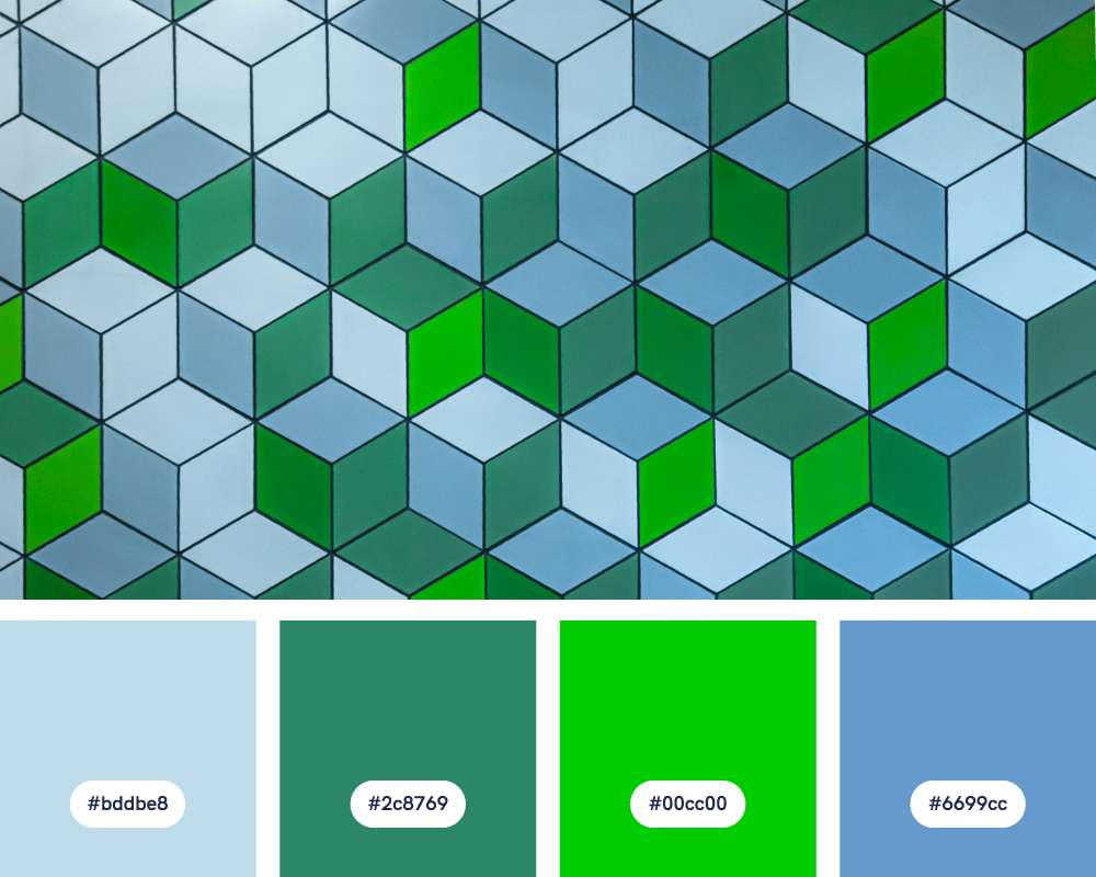
- #bddbe8
- #2c8769
- #00cc00
- #6699cc
This green color palette gives off that refreshing and tranquil vibe found near the shore. The blues capture the vastness of the sky and sea, while the greens hint at shoreline foliage and vibrant sea life. The overall softness of the palette, with no harsh contrasts, creates a peaceful and soothing atmosphere, much like gazing out at a calm ocean.
Design ideas for this green color palette:
- Tranquil interiors: Perfect for creating calming bedrooms, bathrooms, or yoga studios. The balance of blues and greens inspires both relaxation and rejuvenation.
- Nature-inspired branding: Ideal for companies or products focused on health, wellness, or environmental awareness. The colors convey a feeling of balance and harmony with nature.
- Delicate illustrations: This palette is perfect for whimsical watercolor illustrations, botanical drawings, or children’s book artwork. The soft tones and subtle contrast create a sense of playfulness and innocence.
#6: Mermaid Lagoon
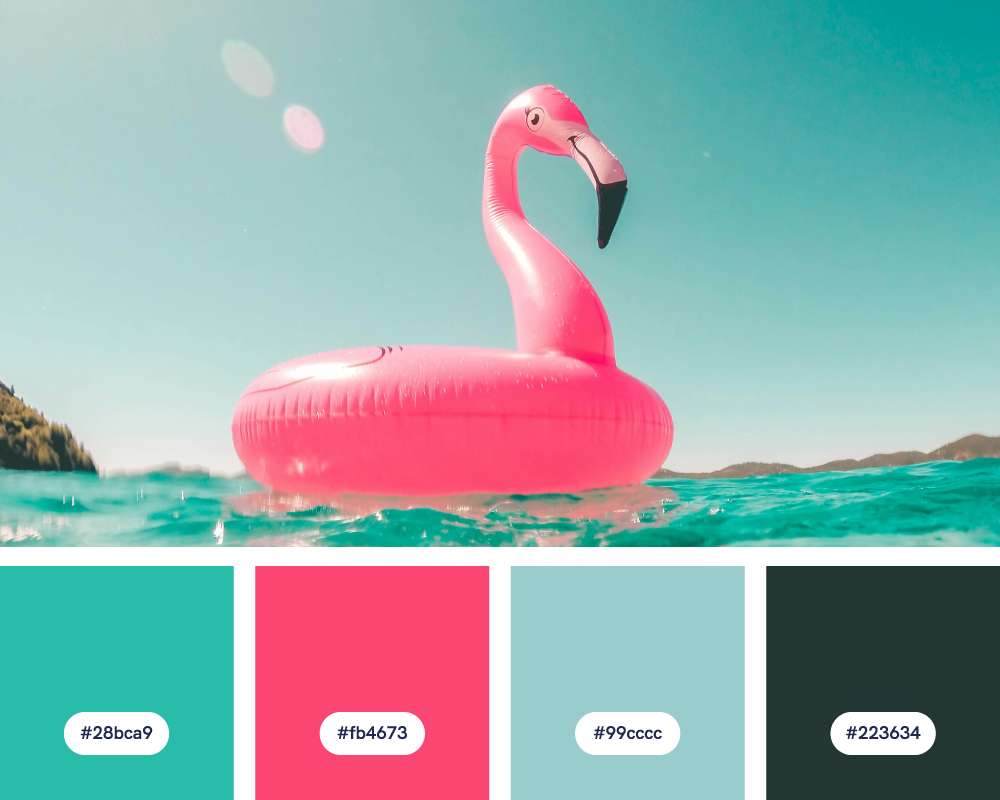
- #28bca9
- #fb4673
- #99cccc
- #223634
This whimsical green palette references the mythical creatures associated with oceans. The blues and greens evoke the depths of the ocean, while the coral pink adds a touch of vibrant energy and femininity.
Design ideas for this green color palette:
- Whimsical artwork: This palette is perfect for fonts and colors of children’s book covers, or graphic designs with a youthful, tropical vibe.
- Feminine fashion and accessories: The combination of vibrant turquoise and coral pink is playful and energetic. These colors work well in patterns and textiles for swimwear, dresses, and accessories.
- Coastal chic decor: This palette brings a sophisticated yet inviting feel to beach-themed interiors. Great for accents like cushions, curtains, or decorative accessories.
#7: Tuscan Sunset
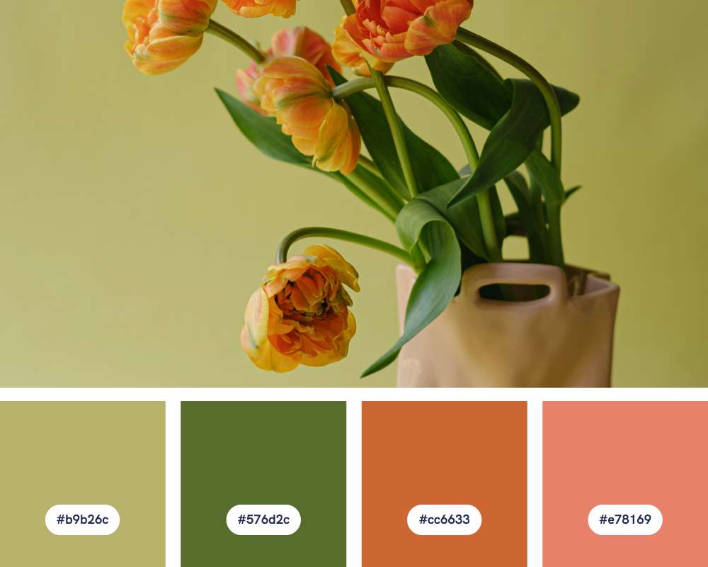
- #b9b26c
- #576d2c
- #cc6633
- #e78169
This is one of the green color combinations in this collection that creates a sense of old-world charm and the warmth of a Mediterranean evening. The terracotta and salmon suggest sunbaked earth and buildings, while the green and yellow hint at rolling hills and olive groves.
Design ideas for this green color palette:
- Organic branding: Perfect for brands and products emphasizing natural ingredients, hand-crafted quality, or a boho-chic aesthetic.
- Rustic interiors: This palette adds warmth and texture to spaces like living rooms, kitchens, or home offices. Think natural materials like terracotta tiles, textured linens, and weathered wood accents.
- Landscape-inspired art: This palette is ideal for paintings or illustrations capturing deserts, canyons, or sunbaked fields. The warmth in the colors creates a feeling of depth and richness.
#8: Bold & Botanical
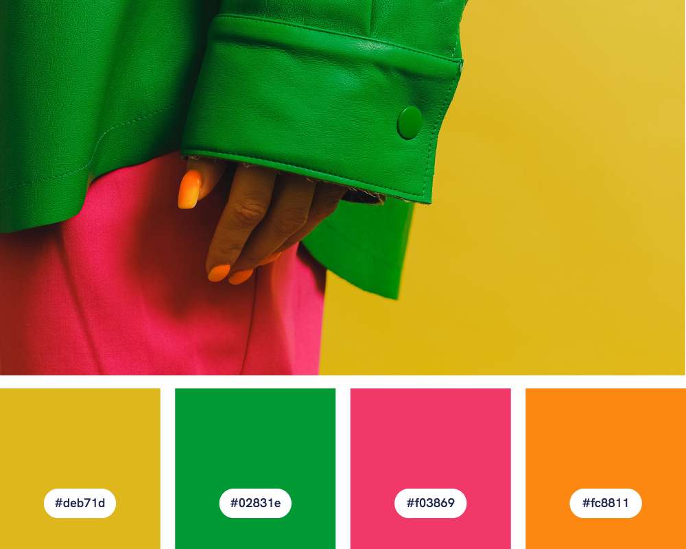
- #deb71d
- #02831e
- #f03869
- #fc8811
Use this color combination for bold, energetic design combos. The bright pink, orange, and yellow act as vivid floral elements set against the deep, leafy green.
Design ideas for this green color palette:
- Maximalist interiors: This palette is perfect for bringing a sense of playfulness and boldness to living spaces. Think patterned wallpaper, bright furniture accents, and eclectic artwork.
- Eye-catching branding: Great for brands that want to stand out and convey a sense of energy and optimism. The unexpected color combination works well for logos, packaging, or a color scheme for your website.
- Vibrant fashion: This palette is ideal for bold prints and statement-making pieces. Perfect for swimwear, resort wear, or accessories.
#9: Candy Shop Garden
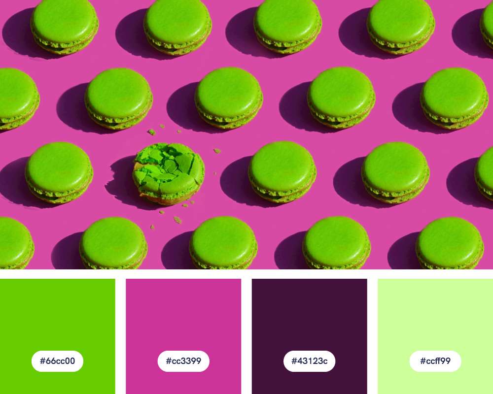
- #66cc00
- #cc3399
- #43123c
- #ccff99
This playful green palette references the bright, sweet colors of candy in contrast with the vibrant green suggestive of a playful garden. The pastel green adds a touch of softness to the palette.
Design ideas for this green color palette:
- Quirky and modern branding: Perfect for brands that want to stand out and showcase a sense of fun and unconventionality. Ideal for product packaging, marketing campaigns, or website design.
- Funky fashion and accessories: These bold colors work well for prints, playful jewelry, or statement fashion pieces.
- Retro-inspired branding: This color combination has a touch of ’80s flair. It works well for niche brands that want to project a cheerful, non-conformist vibe.
#10: Primary Play
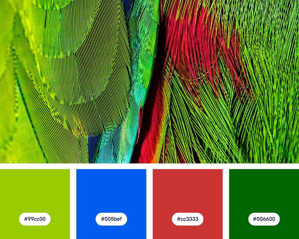
- #99cc00
- #005bef
- #cc3333
- #006600
The palette’s use of strong primary colors (red and blue) with a twist of green gives a playful vibe, reminiscent of paints or building blocks.
Design ideas for this green color palette:
- Modern geometric art: This palette works with clean lines, geometric patterns, and striking abstract compositions. It can create dynamic and impactful modern artwork.
- Sports team colors: This green color combination has a strong, classic feel, reminiscent of traditional sports team uniforms. It works well for sporty brands or designs catering to athletic audiences.
- Vintage-inspired posters: This color scheme feels nostalgic, referencing classic pop-art and comic book designs. Worth exploring for event posters, travel prints, or retro-themed graphics.
#11: Garden Bistro
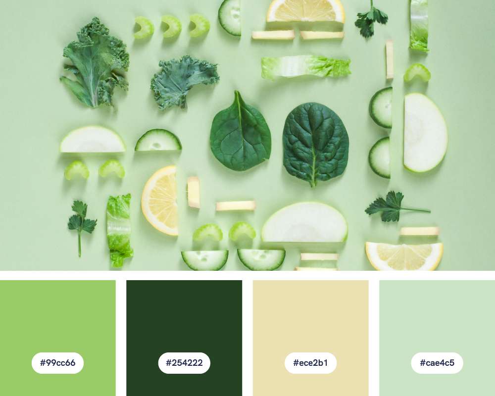
- #99cc66
- #254222
- #ece2b1
- #cae4c5
This palette of muted greens, beige, and a light mint green perfectly matches the vibe of a Garden Bistro. It’s earthy yet sophisticated, calming yet welcoming – just how you’d want a bistro to feel!
Design ideas for this green color palette:
- Textiles and accents: Incorporate soft mint green and beige in tablecloths, cushions, or napkins. Frame botanical prints of herbs for wall decor, and don’t forget terracotta-potted plants!
- Wholesome food packaging: If creating packaging for food products, use the earthy greens and beige to suggest wholesome ingredients. Consider natural materials like kraft paper or glass.
- Recipe cards: Design recipe cards with this color combo while utilizing botanical illustrations for decoration.
#12: Rainforest Sanctuary
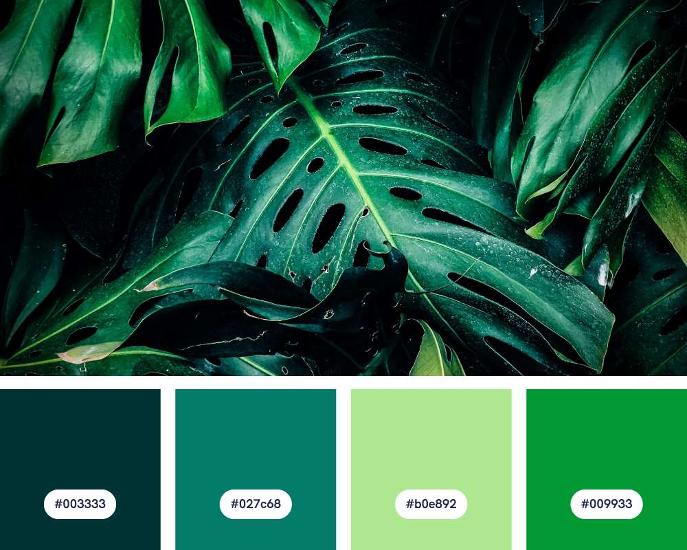
- #003333
- #027c68
- #b0e892
- #009933
This color palette evokes a peaceful natural retreat with dark blue for the night sky, teal for the ocean and greens for coastal plants.
Design ideas for this green color palette:
- Luxury interiors: This palette creates a sophisticated and moody atmosphere in living rooms, bedrooms, or home offices. Think dark blue walls accented by the greens and mint green for a touch of vibrancy.
- Spa branding: The colors are perfect for creating a sense of relaxation and rejuvenation, ideal for spa logos, websites, or marketing materials.
- Natural history murals: The deep and light greens alongside the teal would be perfect for creating a mural depicting a lush forest or underwater scene.
#13: Earthy Neutrals
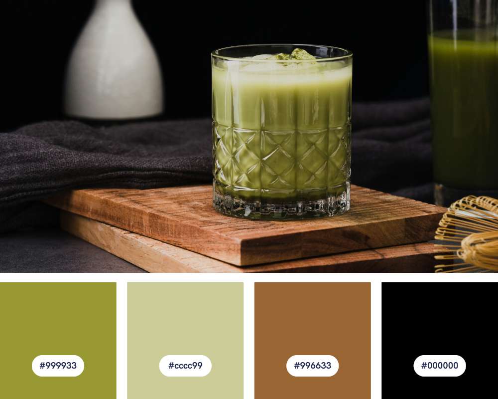
- #999933
- #cccc99
- #996633
- #00000
The natural, grounded feel of this green color palette exudes a sense of comfort and relaxation like a cozy coffee shop atmosphere.
Design ideas for this green color palette:
- Masculine branding: This color scheme can be great for brands targeting a male audience or those wanting to convey a sense of strength, stability, or tradition.
- Modern farmhouse interiors: This palette creates a warm and inviting atmosphere in living rooms, kitchens, or bedrooms. Consider natural materials like wood furniture, woven baskets, and black metal accents.
- Landscape photography These natural tones can be a great base for landscape photos, highlighting the earthy greens, browns, and grays found in nature.
#14: Tropical Punch
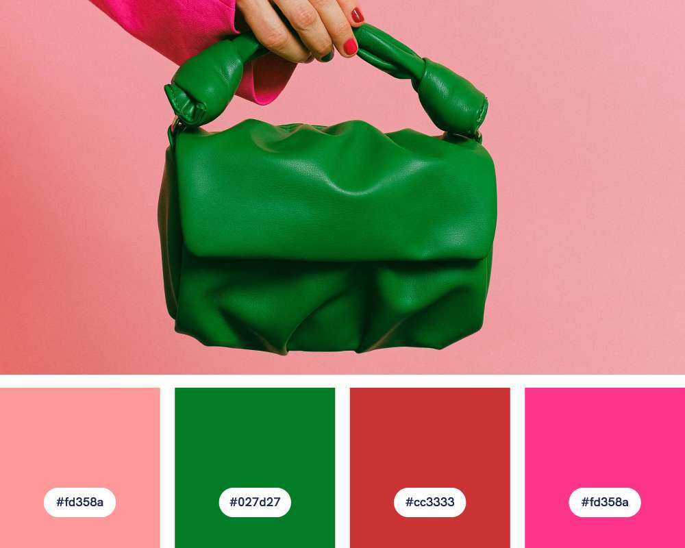
- #fd358a
- #027d27
- #cc3333
- #fd358a
This color combination plays on the bold, vibrant pink and its similarity to tropical fruit punch. The deep green adds an exotic touch, like a garnish of jungle leaves.
Design ideas for this green color palette:
- Bold fashion and accessories: The bold, inspirational brand colors would make a strong statement in fashion design. Think color-blocked textiles, statement jewelry, or vibrant scarves.
- Summertime branding: These colors are ideal for brands and marketing materials associated with summer fun, tropical getaways, or products with a vibrant, youthful spirit.
- Expressive artwork: The contrasting colors create a dynamic and captivating backdrop for modern paintings, illustrations with a bolder style, or graphic design with a playful twist.
#15: Woodland Trail
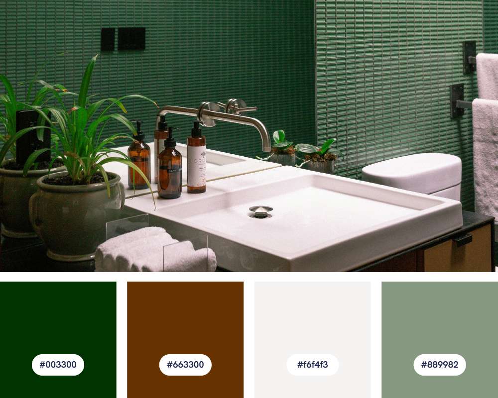
- #003300
- #663300
- #f6f4f3
- #889982
This green color palette suggests a calm walk through a shaded forest. The greens and browns suggest dense foliage and earth, while the off-white hints at a path through the woods.
Design ideas for this green color palette:
- Earthy interiors: This palette is perfect for creating warm and inviting spaces with a connection to nature. Imagine woven textiles, exposed wood, and soft, natural lighting.
- Sophisticated branding: Ideal for brands emphasizing craftsmanship, heritage, or a luxurious take on nature-inspired design. The palette feels both classic and fresh.
#16: Emerald Lagoon
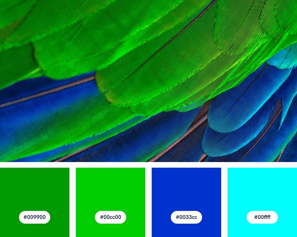
- #009900
- #00cc00
- #0033cc
- #00ffff
If you want to highlight the beautiful contrast between the deep greens and vibrant blues, this green color palette is for you. It suggests clear blue waters surrounded by lush greenery.
Design ideas for this green color palette:
- Nature-inspired with a twist: While the palette has a natural feel, the bright lime green and cyan add an unexpected, modern twist. This lends itself to nature-themed designs with a contemporary touch.
- Children’s toys: The playful and bright colors work well for toys, games, or kids’ clothing. It conveys a sense of energy and fun.
- Tropical-themed design: Great for evoking a sense of fun and escapism through travel posters, beach-inspired decor, or packaging for summery products.
#17: Eucalyptus & Rose
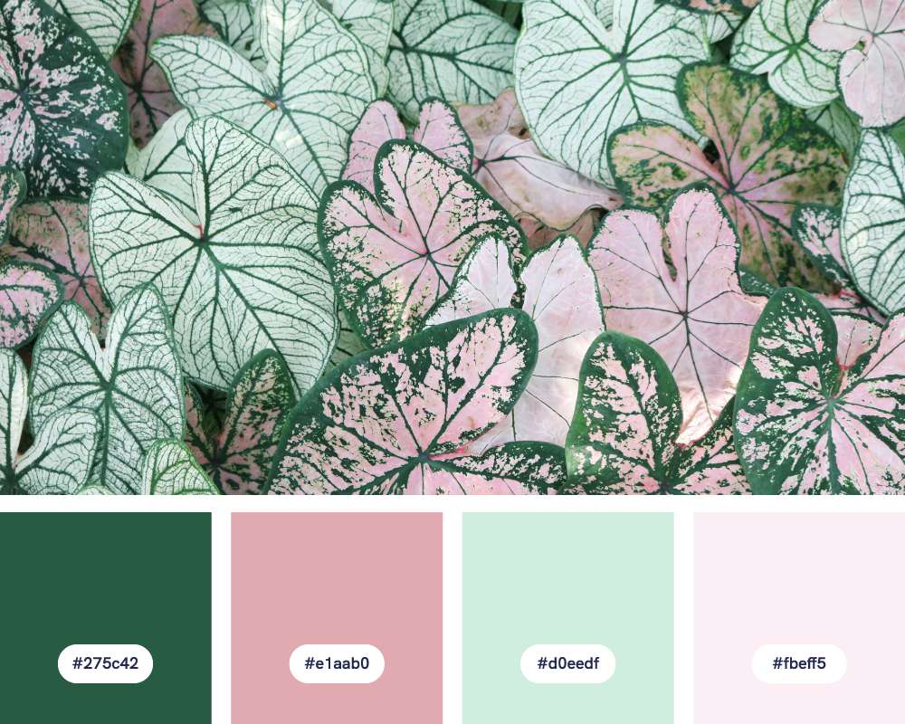
- #275c42
- #e1aab0
- #d0eedf
- #fbeff5
Eucalyptus & Rose has two distinct color tones, with “eucalyptus” representing the calming green and “rose” referencing the dusty rose shade.
Design ideas for this green color palette:
- Wedding stationery: The soft greens, rose, and light tones are perfect for wedding invitations, menus, and place cards, creating a romantic and elegant feel.
- Spa-hotel interiors: This palette creates a balanced and calming atmosphere in bathrooms, bedrooms, or meditation spaces. Think soft lighting, natural materials like wood and stone, and lush greenery.
- Eco-friendly packaging: The colors are perfect for sustainable or organic products, conveying a sense of nature and care for the environment.
#18: Jane Austen’s Garden
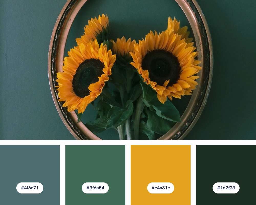
- #4f6e71
- #3f6a54
- #e4a31e
- #1d2f23
Inspired by Jane Austen’s novels, this palette hints at English gardens and emphasizes the mysterious and earthy feel of the darker greens and charcoal.
Design ideas for this green color palette:
- Historical or nature branding: This color palette is perfect for brands or products with a focus on history, exploration, or a deep connection to nature. The colors feel grounded and authentic.
- Sophisticated interiors: Great for creating a subdued yet inviting atmosphere in bedrooms, libraries, or studies. Imagine velvet accents, antique wood, and leather-bound books.
- Earthy fashion: These colors can translate beautifully into clothing or accessories with focus on natural fibers and textures like jackets, chunky knits, and leather details.
#19: Harvest Bounty
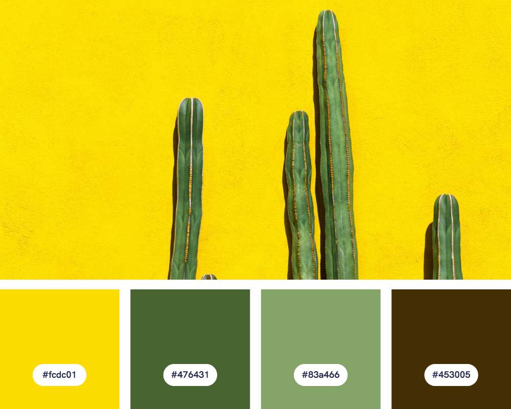
- #fcdc01
- #476431
- #83a466
- #453005
Can you sense the opulence and abundance in this color palette? The golden yellow and deep green suggest a table overflowing with autumn produce.
Design ideas for this green color palette:
- Rustic kitchen decor: Perfect for creating a cozy and inviting kitchen. Consider copper accents, natural wood furniture, and woven baskets to complement the palette.
- Thanksgiving-themed design: These colors would create a beautiful and festive tablescape for a Thanksgiving dinner. Use natural elements like placemats woven from jute or centerpieces with fall leaves and gourds.
- Fall-themed designs: These colors seamlessly fit with autumn decor, marketing materials, or illustrations. Use these to illustrate harvest festivals, changing leaves, and the warmth of the season.
#20: Matcha Macaron
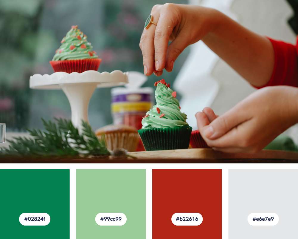
- #02824f
- #99cc99
- #b22616
- #e6e7e9
This color palette, inspired by green tea cookies, evokes elegance with a mix of classic brick red, modern teal, and light green.
Design ideas for this green color palette:
- Spa bathrooms: Create a tranquil and rejuvenating space with calming teal walls, mint green accents, and light gray towels for a sense of serenity.
- Vintage-inspired posters: Design bold posters with brick red text, teal backgrounds, and light green illustrations for a retro, eye-catching aesthetic. See here if you want more poster ideas.
- Earthy living rooms: Decorate with natural textures like linen and wood, throw pillows in brick red, and furniture accents in teal for a grounded yet vibrant living space.
#21: Urban Oasis
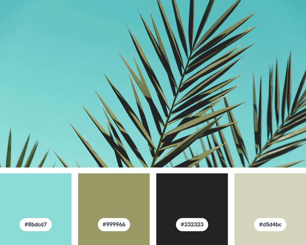
- #8bdcd7
- #999966
- #232323
- #d5d4bc
Urban Oasis hints at a sense of tranquility amidst a bustling city. The greens offer a calming element, contrasting the concrete feel of the charcoal and beige.
Design ideas for this green color palette:
- Modern interiors: Use this palette to create a clean and sophisticated atmosphere in living rooms, bedrooms, or offices. Perfect for natural textiles, textured wallpaper, and pops of metallic details.
- Wellness website and branding: Ideal for brands focused on wellness, minimalist lifestyles, or businesses that want to project a polished, calming image.
- Timeless, understated fashion and accessories: These muted colors can create beautiful garments and accessories with a timeless and understated feel. Great for lightweight linens, leather goods, and nature-inspired jewelry.
#22: Soothing Green Oasis
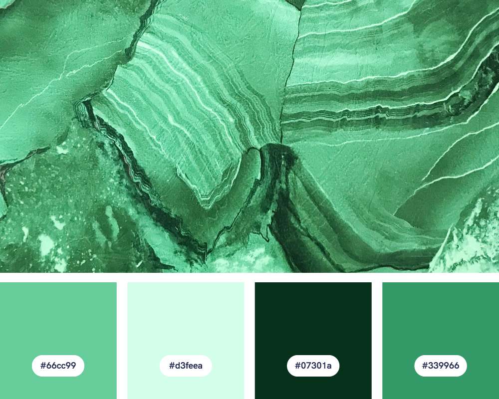
- #66cc99
- #d3feea
- #07301a
- #339966
Looking for a fresh and soothing green color palette? Soothing Green Oasis is the perfect palette! The calming and refreshing blues and greens create a sense of serenity often associated with coastal environments.
Design ideas for this green color palette:
- Tranquil interiors: The clean lines, soft textures, and natural light of this palette is perfect for creating calm and rejuvenating spaces like bedrooms, bathrooms, or yoga studios.
- Cheerful children’s rooms: The playful greens and soft aqua would create a cheerful yet balanced space for children’s rooms or play areas.
- Wellness-inspired branding: Ideal for brands focused on wellness and holistic medicine. The colors evoke a sense of balance, refreshment, and connection to nature.
#23: Timework Beauty
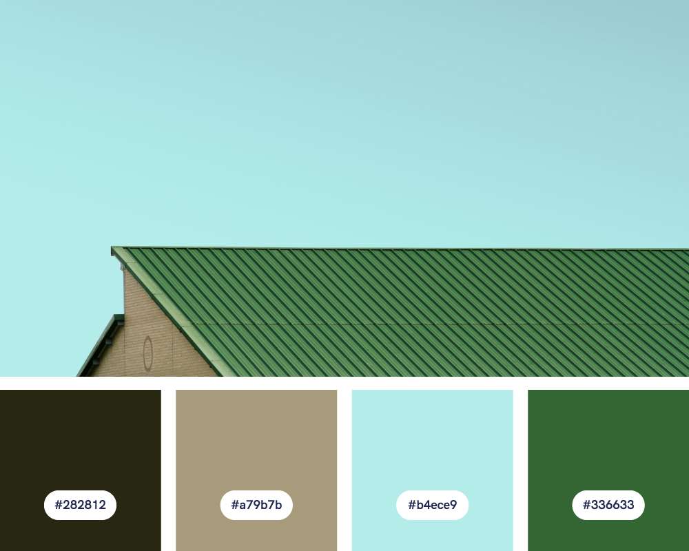
- #282812
- #a79b7b
- #b4ece9
- #336633
This palette references the soft, oxidized colors that form on metals, often with green undertones. It suggests age and beauty.
Design ideas for this green color palette:
- Accent wall treatments: Create a faux patina on an accent wall for a sophisticated, aged appearance. Metallic glazes layered over the deeper green and gray tones would add depth.
- Artisan-crafted goods: For a timeless, crafted feel, use the palette for patinated leather goods, hand-thrown ceramics with reactive glazes, or oxidized metal jewelry.
- Digital illustration: Create illustrations and patterns with a vintage, textured feel with this palette, as if found in aged books or documents.
#24: Seascape Serenity
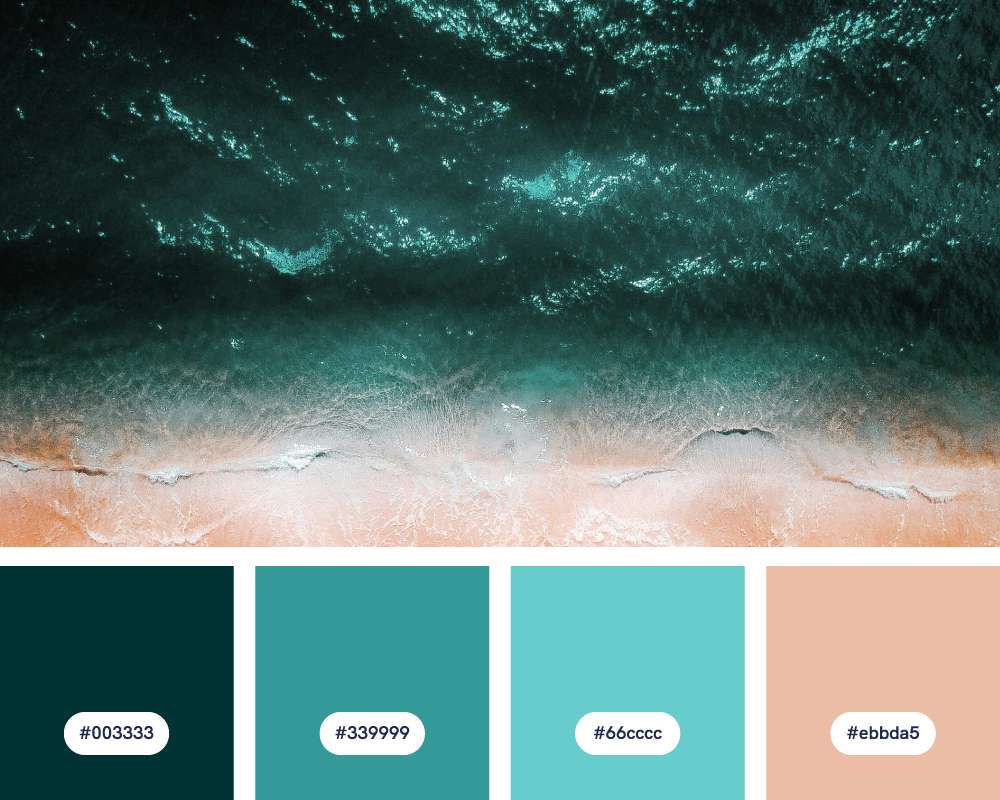
- #003333
- #339999
- #66cccc
- #ebbda5
Seascape Serenity captures the calming and peaceful feeling of the ocean, with colors ranging from dark blues to light, sandy tones.
Design ideas for this green color palette:
- Nature-themed wallpaper: Create a subtly textured wallpaper pattern for a bedroom or bathroom using light blue-green tones and abstract ocean motifs for a relaxing and immersive feel.
- Ocean-themed greeting cards: Design beach or ocean-themed greeting cards and postcards with simple illustrations or photographs using the color palette.
#25: Popsicle Palette
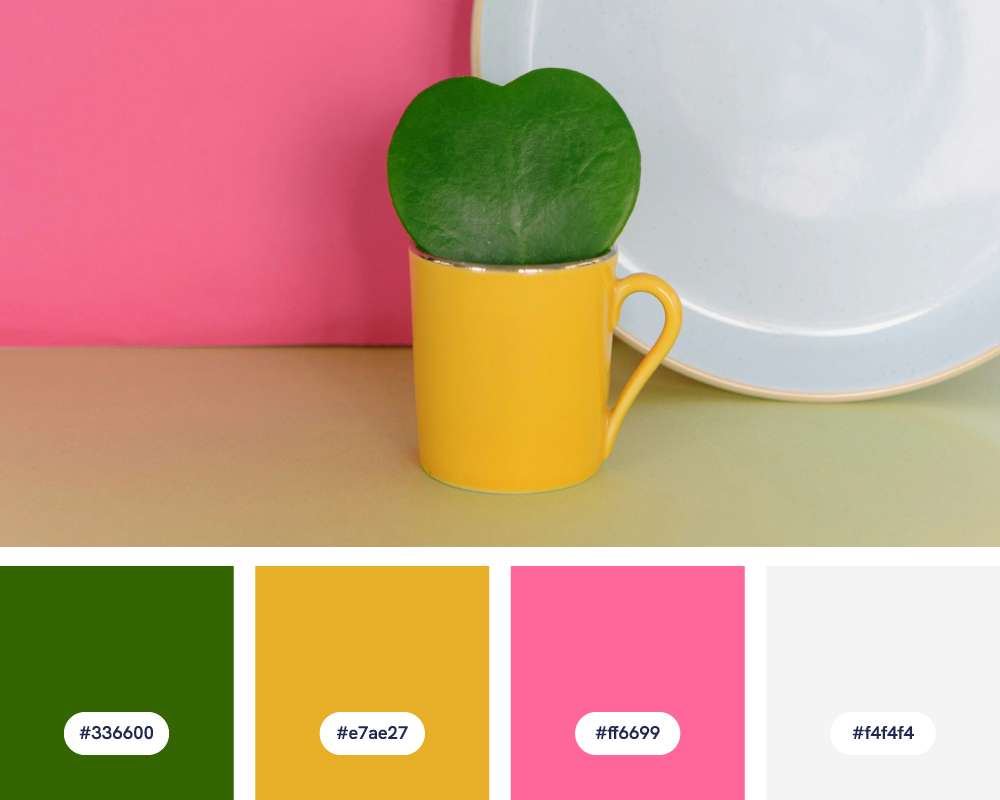
- #336600
- #e7ae27
- #ff6699
- #f4f4f4
Last on the list of green color schemes (but definitely not the least!) is the Popsicle Palette. It highlights its core colors’ cheerful and fun feel, and suggests bright, flavorful, frozen treats on a warm summer day.
Design ideas for this green color palette:
- Juice or smoothie brand: The palette’s energetic colors are ideal for tropical juices, smoothies, or healthy food brands, suggesting freshness and vitality.
- Pool toys and accessories: Think inflatable beach balls, pool noodles, and colorful floats featuring your palette for a fun and summery aesthetic!
- Bold floral designs: Create prints of oversized tropical flowers or abstract florals using your palette — imagine bright green leaves with bursts of pink and yellow-orange blooms.
Bring your green palette ideas to life with Piktochart
Sign up for a FREE Piktochart account today and use our design tool to try out the green color schemes we’ve just shared!
All you need to do is enter your preferred green color palette hex codes, and voila – your infographic, poster, or brochure is ready with the green color palette of your choice.
Try it out with a free Piktochart account now.