The first thing you’ll notice when you login into Piktochart is this:
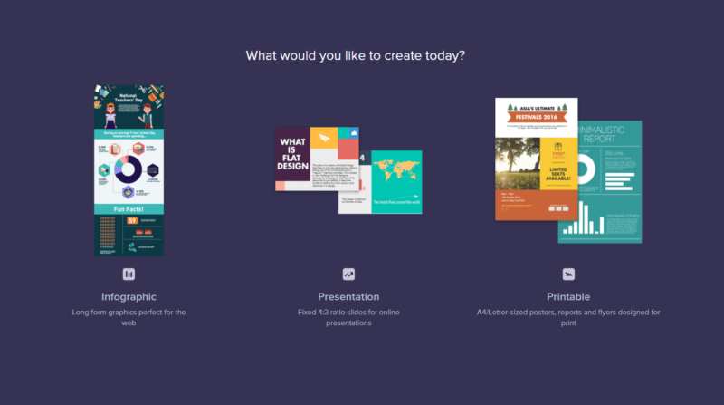
Templates, templates, templates. There’s a reason why you’re brought to our template section after you login to Piktochart. In the Intro to the Series, we talked about the importance of being able to repurpose and modify our templates to suit your needs – but we never showed you how to do it.
Well, now we will.
Today’s post is something I’ve been wanting to share for a few weeks now. We’ve noticed that many of you choose templates based on the content you need to portray. The purpose of this post and and this month’s series is to show you that you can adapt most of Piktochart templates to whatever content you might have. If you have not signed up for Piktochart yet, create an account now for free. Before choosing a template, think of the goal and structure of your infographic first. Then pick a template by layout, not content. Understand what infographic layouts are and how to select a layout that works for your needs.
I recently recorded a tutorial that will show you, step by step, how to modify and adjust one of our templates using Piktochart. For this blogpost, I turned that video into bite-size GIFs to show you how to perform each step. You’ll be able to see exactly what’s happening on my screen while I repurpose an article called 8 Steps To A Successful Sales Call into an infographic.
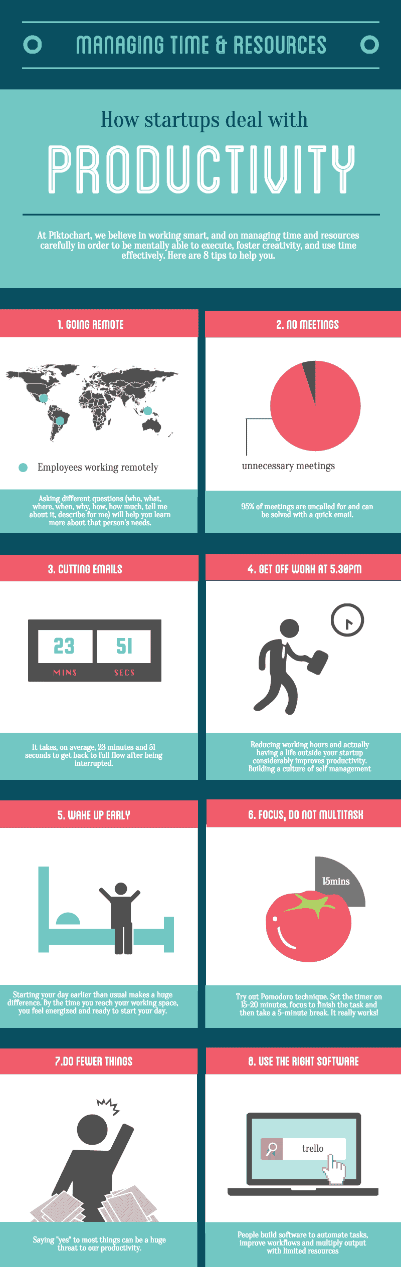
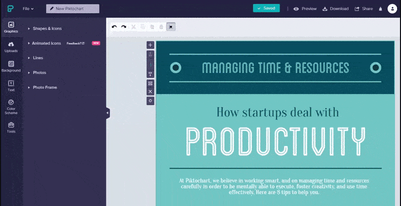
I chose the template ‘How Startups Deal With Productivity’ because it’s a beautiful and versatile design created to illustrate steps or processes. This is what it looks like:
After 30 minutes of work, and some magic, I managed to transform the initial design into this:
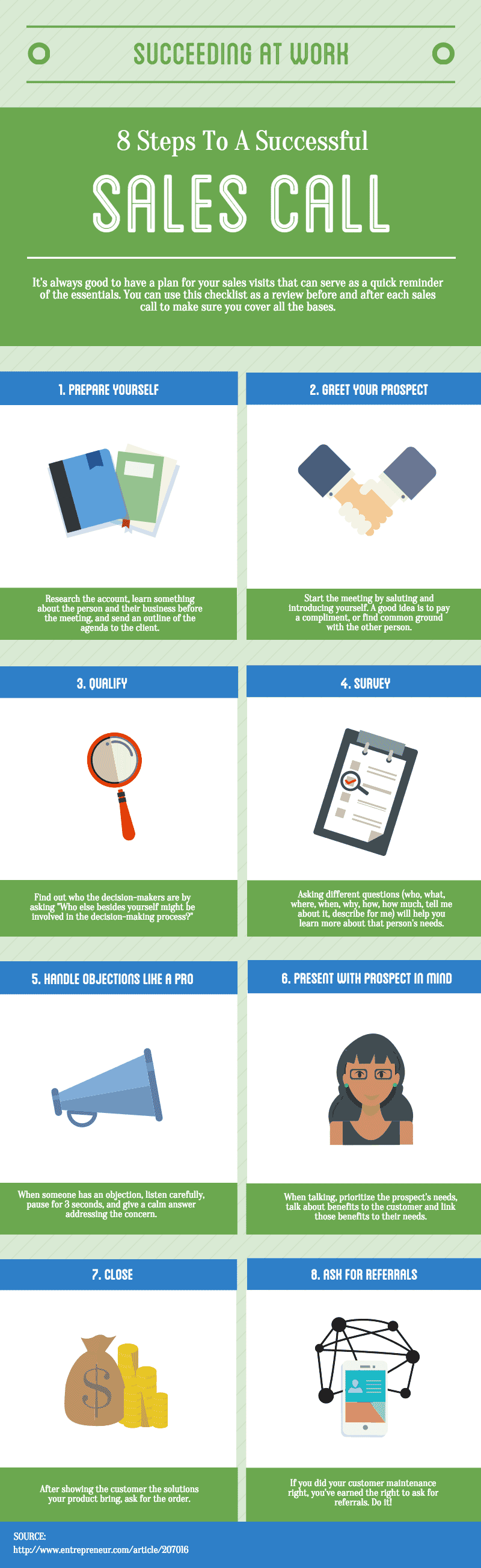
It’s important to highlight that I’m definitely not a designer. This is a nice representation of my design skills.
Let’s start! You can follow along by creating an account on Piktochart and selecting one of our infographic templates.
Replacing Content
The first step is replacing existing content with your own. This is extremely important to get right, as content is the foundational structure of the infographic. This involves some prep work beforehand – you should carefully assess what you are trying to portray, and only pick the most important points. In this case, I went through the post and picked the 8 steps outlined.
Adding Your Own Text
To start, what we’ll do is swap the template’s content with the content we picked beforehand. Remember, all of our templates can be edited, but I strongly encourage you to lean on our designs.
To edit text, simply double click the text box then edit or erase it as you see in the GIF below: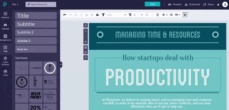
Personally, I’m going to start with the header block. It’s the introduction and needs to grab your reader’s attention. This is where I will edit the main headline, subtitle and the small introduction below. After I’m done with the Header Block, I’ll move to the blocks below. In this infographic, we have 4 content blocks, each containing two different points we’d like to make.
Replacing Icons
What we are going to do now is replace the visual elements in the template – the icons, maps and charts – with icons of our own.
The first thing you’ll want to remember is that you need to be consistent when picking icons. They will all need to share the same style throughout the whole design. If not, the infographic will look messy and cluttered.
The first step is deleting the existing graphics for this template. After that, you should go to the left-hand side and click on graphics. You have a ton of options to choose from – icons, photos, photo frames – all ready to use. Right now, we are going to pick icons. They are simple, and great to illustrate steps in an infographic. Let’s go pick some icons!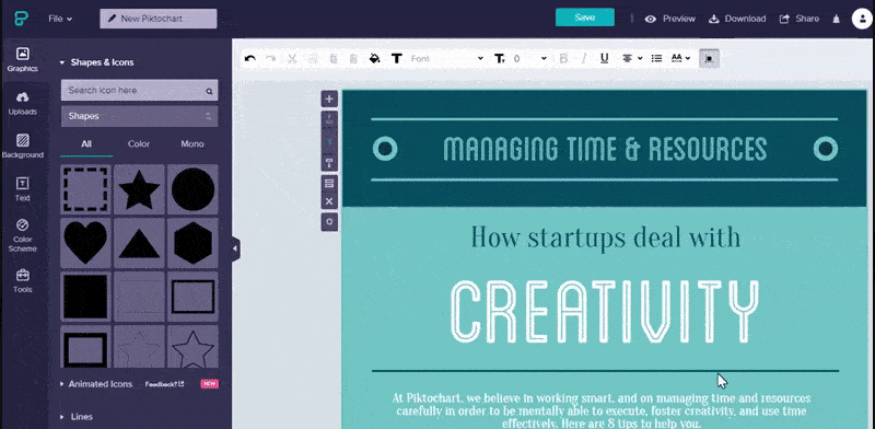
We have also curated a reliable list of icon marketplaces and websites for you to explore!
To use an icon, simply drag and drop it exactly where you need it. You can always move it around, resize it or rotate it as you see fit. Remember, when resizing, you need to hold the shift button down to keep the proper proportions or else the icon will look wonky (and yes, that is the technical term!).
Adding The Source
After taking care of the text and icons, I’m going to focus on something super important. Although often overlooked, you mustn’t forget to add the source of the infographic. In this case, the source is a link to the article we are repurposing.

For that, we’ll need to add a new block. Once you select the last block, a small sidebar on the left will pop up. What we’re going to do is click on the plus sign, and add a new block. If you need to adjust the height of a certain block, just click on the bottom border, and drag that line up to reduce the height of the block. After that, we’ll need to add some text.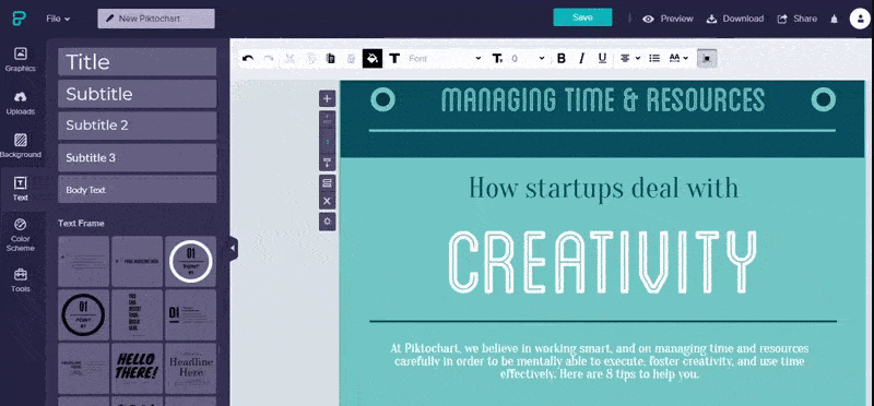
As you see in the GIF above, to add any element, simply go to the left sidebar of the editor. You can see that you have a plethora of options available. In this case, we are going to select ‘Text’, and then ‘Body text’. Click it, and it will appear on the selected block with the templates default font. Then, all you have to do is replace the sample text for your link!
Adding A Coat of Paint
After you have your basic content structure laid down, it’s time to make things beautiful. To keep things simple, we are going to focus on changing the color scheme and the typefaces used in the infographic to match your own. This is entirely optional, as you can always lean on the work of our designers, but I’ll show you how to do it anyways because I think it gives your infographic more personality.
Changing Typefaces
To change the typeface, you’ll need to click on the text block and go to the top option bar. You can decide how to pair your fonts in various ways. Simply click on the typeface menu, and you’ll see a dropdown with dozens of fonts. Simply select the one you like, and the text will instantly change.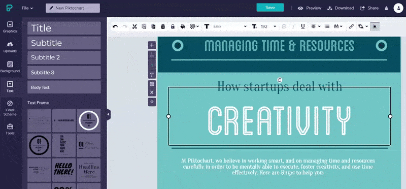
Adapting The Color Scheme
Another thing we can try is modifying the existing color scheme, and adapting it to our own needs (or our brand’s!). As I mentioned, it’s important to be consistent so what we’re going to do is replace one color with another. Understand more about how to choose color combinations for infographics and then allow your creativity to take charge.
To change a color, you have to click on the specific element you want to modify, open the color bucket at the top and pick a new color from the palette (or paste a HEX code).
Getting Your Infographic Ready
Awesome! I think we’re getting close to a finished product! We just learned how to change content, formatting, source, icons, we moved things around and deleted other elements… we basically covered everything we need to repurpose one of our Piktochart templates into an infographic of your own! Now, on to the last steps!
Saving, Publishing & Downloading Your Infographic
The last step is to save it and download it or share it. You can do both on the top bar.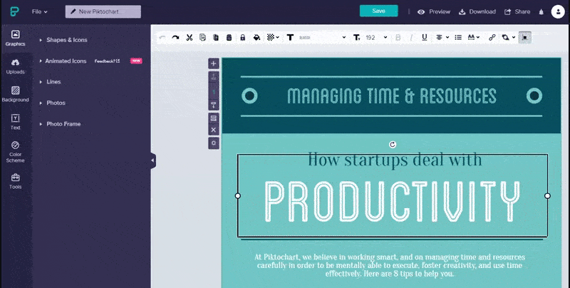
If you need to download it as a .png or .pdf, simply click on download, and you’ll be able to save a version of your infographic to your computer.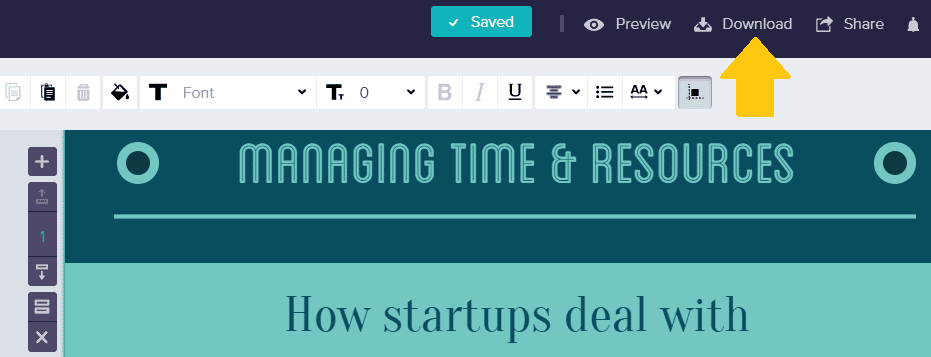
Let us know if this tutorial has been useful and feel free to ask us questions in the comments below!
You can make beautiful infographics, presentations, reports, social media graphics and posters with Piktochart. Create an account for free to make impactful visuals.