Mapping has evolved significantly over the years, blending the art of ancient cartography with today’s cutting-edge digital tools.
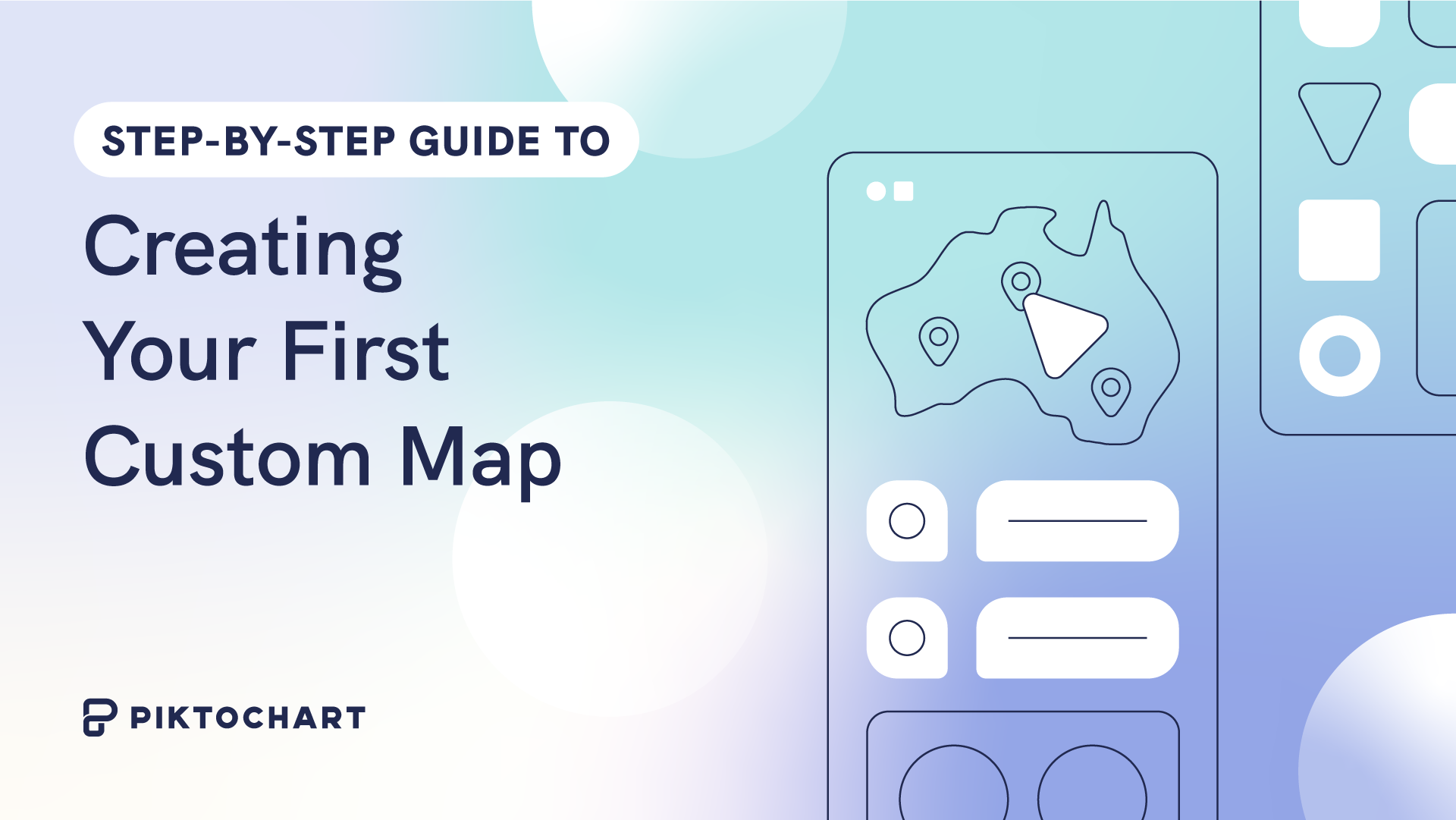
A visual representation of geographic data can shape strategies, guide decisions, and drive change. In this guide, we’ll go through a step-by-step guide to create your first custom map, ensuring you’re equipped to craft compelling maps for any purpose.
Table Of contents
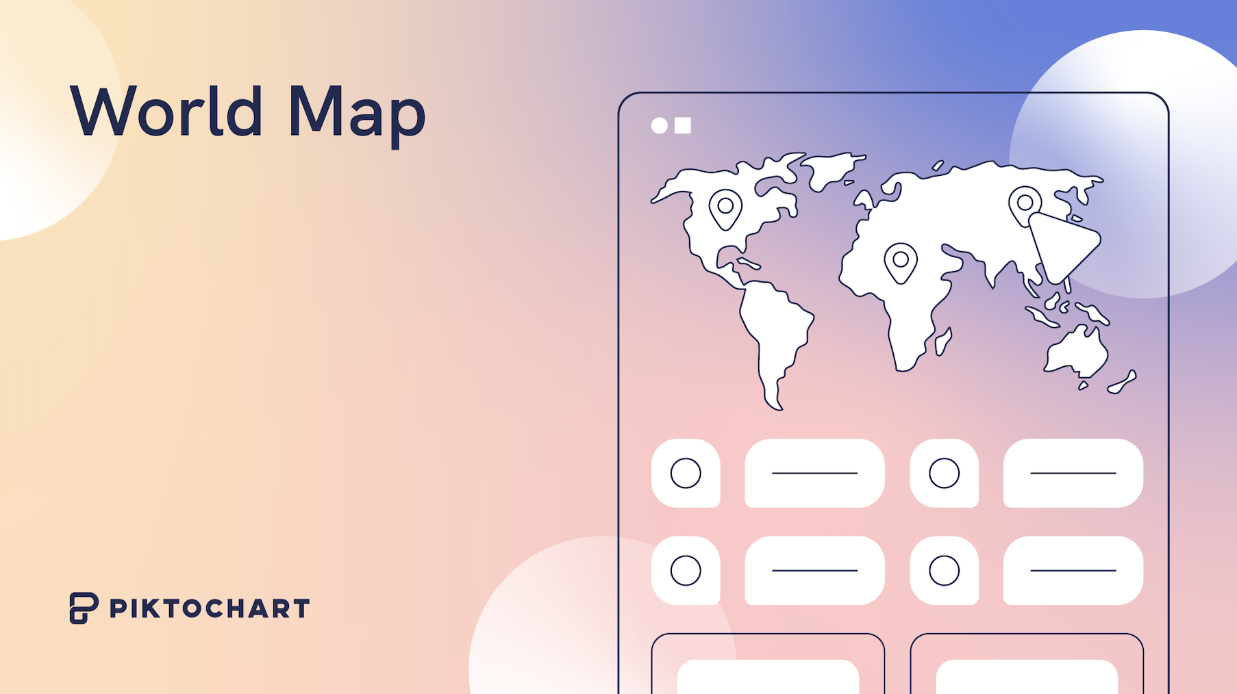
What is a Map?
A map is a visual representation of space. It captures geographical areas and their relationships to derive insights at a glance.
A choropleth is a map that uses different colors or shades to represent data values in specific regions, making it easier to identify patterns or disparities across the mapped area.
You can make both maps and choropleths on Piktochart!
How to Make a Map for Free on Piktochart
To get started, you can create a free Piktochart account and select a canvas for your map. You can pick a presentation template, infographic, report, or more, depending on the purpose of your visual.
Inserting a Map
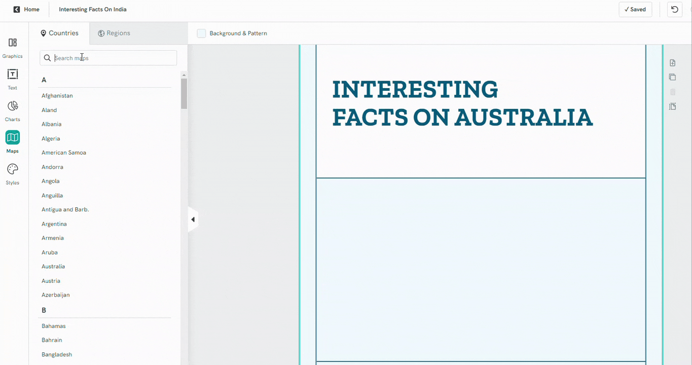
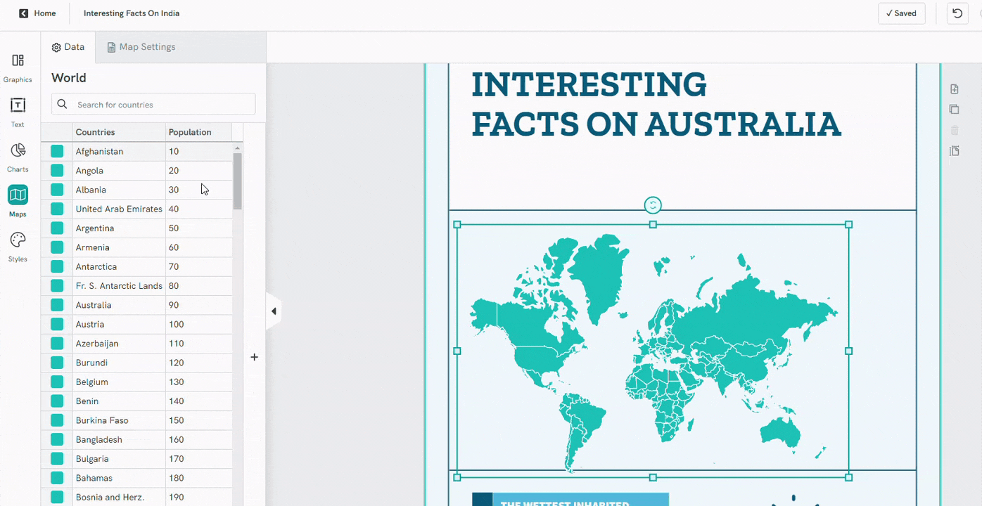
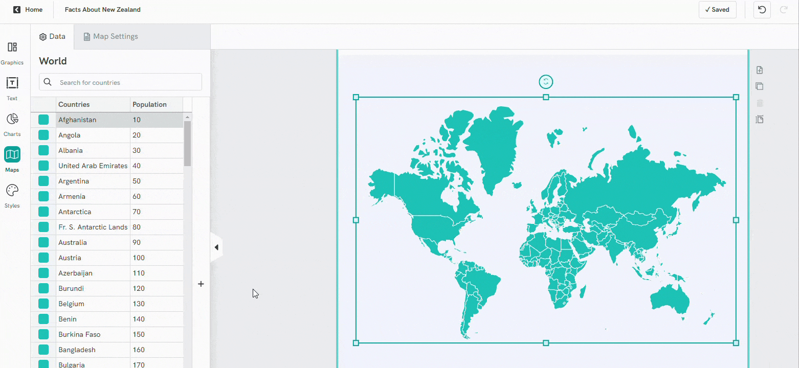
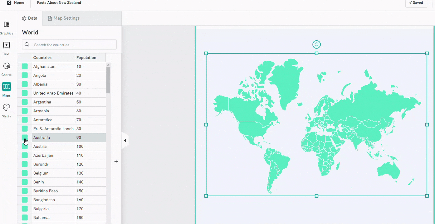
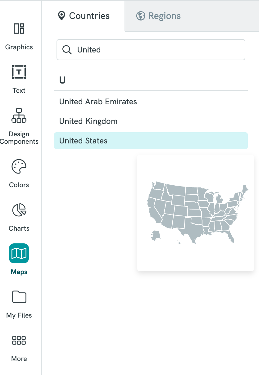
To begin, navigate to the left panel and select ‘Maps’ in the editor.
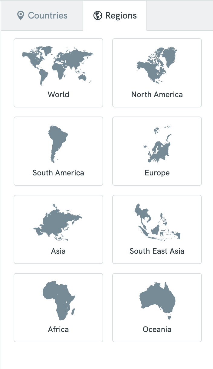
Atop, you’ll notice two tabs: one for countries and another for regions.
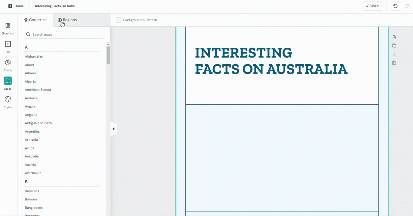
For a country-specific map, utilize the search bar or peruse the comprehensive list. If broader geographic contexts like the World Map, Africa, or Asia are more suited to your needs, the ‘regions’ tab is your ally.
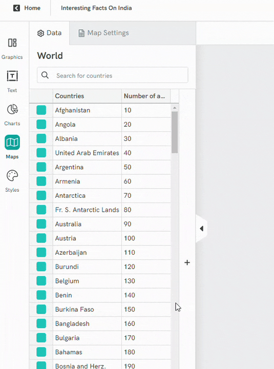
Access the datasheet to input or edit your map data, ensuring uniformity in data types across columns. To clarify, one column might house numbers, while another exclusively contains text. If you would like to see a color-based data visualization on the maps, please use numbers.
Interesting to note: when shared online, your data captions become discernible upon hovering. However, this static data remains absent in the downloaded versions.
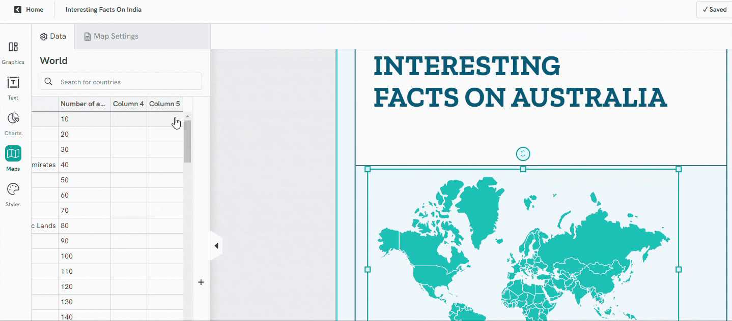
Editing map data? Click on the ‘+’ icon to incorporate more columns.
Conversely, a column can be seamlessly discarded by right-clicking on any cell and selecting ‘Delete This Column’. Be prudent; this will erase all data within that column.
Final touches involve selecting the map’s primary color, defining borders, and designating colors for individual states or regions.
Changing Map Color
Beside the list, you’ll find color tiles; click on them to reveal a color picker tool popup.
To render the entire map in a consistent hue, activate the ‘One Color for All Series’ option. Most people would have one color across the entire map and then use several colors to selectively draw and highlight locations of interest.
However, if differentiation is your goal, you have the autonomy to assign different colors to individual states, regions, or countries, ensuring precision in your visual communication.
Customize Tooltips
For an interactive touch, engage the ‘Tooltips’ feature. Here, you can opt between a minimalist Light or a more pronounced Dark style for when users hover over map areas.
Embedding the Map on your Site
Integrate your map seamlessly into a blog or website using our HTML embed code. You can also save the map as an image. To extract this embed code:
- Navigate to the top-right of the Editor and select ‘Share‘.
- Confirm that your visual’s accessibility is set to ‘Public on the web‘.
- Choose ‘View Code‘ and copy the requisite segment.
You can choose from either the Responsive Width code or Custom Width code if you prefer to adjust the width of the visual yourself.
Maps Do’s and Don’ts
Creating accurate and effective maps requires attention to both the science of cartography and the art of design. Here are some dos and don’ts associated with making maps:
Dos:
1. Use a Consistent Scale: This ensures accurate representation of land areas and distances.
2. Legend is Essential: Always include a clear legend that explains symbols, colors, and other elements.
3. Prioritize Data Accuracy: Ensure the information presented is current and accurate.
4. Stay Clear & Simple: Too much detail can overwhelm the viewer. Use line markers to annotate the map if necessary (in print). Otherwise, hover-over tooltips are great for interactivity as well as to not overcomplicate the map with information.
5. Use a Logical Color Scheme: Colors should help convey information rather than distract. Having too many colors in a map is a no-no.
6. Cite Data Sources: Always give credit to the sources of your data.
Don’ts:
1. Avoid Overcrowding: Too much information and graphics can make the map unreadable and confusing.
2. Don’t Use Confusing Symbols: Symbols should be intuitive and universally understood.
3. Avoid Inconsistent Labeling: Ensure fonts, sizes, and placement of labels are consistent.
4. Avoid Random Color Choices: Colors should have purpose. Random colors can mislead or confuse the viewer.
5. Avoid Making Assumptions: Don’t presume certain knowledge from your audience. Not everyone knows geographic specifics.
6. Don’t Forget to Proofread: Small mistakes, like typos in labels, can greatly diminish the credibility of your map.
Remember, the primary goal of any map is to convey information clearly and accurately. Keeping these dos and don’ts in mind can help ensure your maps are both informative and engaging.
Create Multiple Maps on Piktochart
There are several maps that are available for free on Piktochart. Sign up for free to access the template gallery.
Global or World Map
Map by Continent
Map by Country (240+ Countries)
Free Customized Map Templates on Piktochart


As you embark on the project of crafting a map, it’s essential to balance your creative vision with detailed precision.
Piktochart offers professionally-designed templates to create reports, presentations, brochures, and more. Sign up for a free account today to create impressive visuals within minutes.