Coming up with a set of brand colors, and even a singular logo color, is an essential part of the journey that every company needs to take on its way to developing a unique brand voice and identity.
Moreover, a company’s logo and associated design elements need to be the pinnacle from which all other colors and color combinations are derived and used in association with your brand, in order to comply with the best user experience (UX) practice.
For example, if your logo color scheme uses light blue and light purple, customers will expect to see these colors (or other logo color combinations) throughout their user journey with your offering; from web pages, printed collateral, social media posts, digital ads, etc. Your chosen logo color scheme must be prominent, unique, and always used when representing your brand.
The bulk of our users come from brands running the gamut of marketing to small businesses. This is why we’ve created a feature called “Brand Colors” to help you define your principal logo color and consider different logo color combinations aligned to your brand voice and identity.
Want to jump right into finding your logo color using Piktochart? Create a free account here. You can also follow these four steps to select a color combination for a visual.
With Piktochart, you’ll be able to “magically” create a brand palette by uploading an image of your choice. Nifty, isn’t it?
Having a deep understanding of how certain logo color schemes make consumers feel (I.e, incorporating color theory into the creation of logo color combinations), and also whether those colors actually represent your brand, is an essential step to crafting your brand logo color and identity.
This is why we put together a list of brands, large and small, that have nailed it in terms of their brand identity and the visual assets that they’ve created for their target audience—to both inspire and help you create a consistent brand image.
Food & Beverage Brand Colors
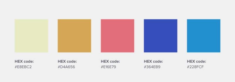
1. Talor Jorgen Coffee – This Norwegian coffee roastery uses pastel color palette versions of the primary colors (red, yellow, and blue) instead of secondary colors to communicate its warm and playful brand identity.


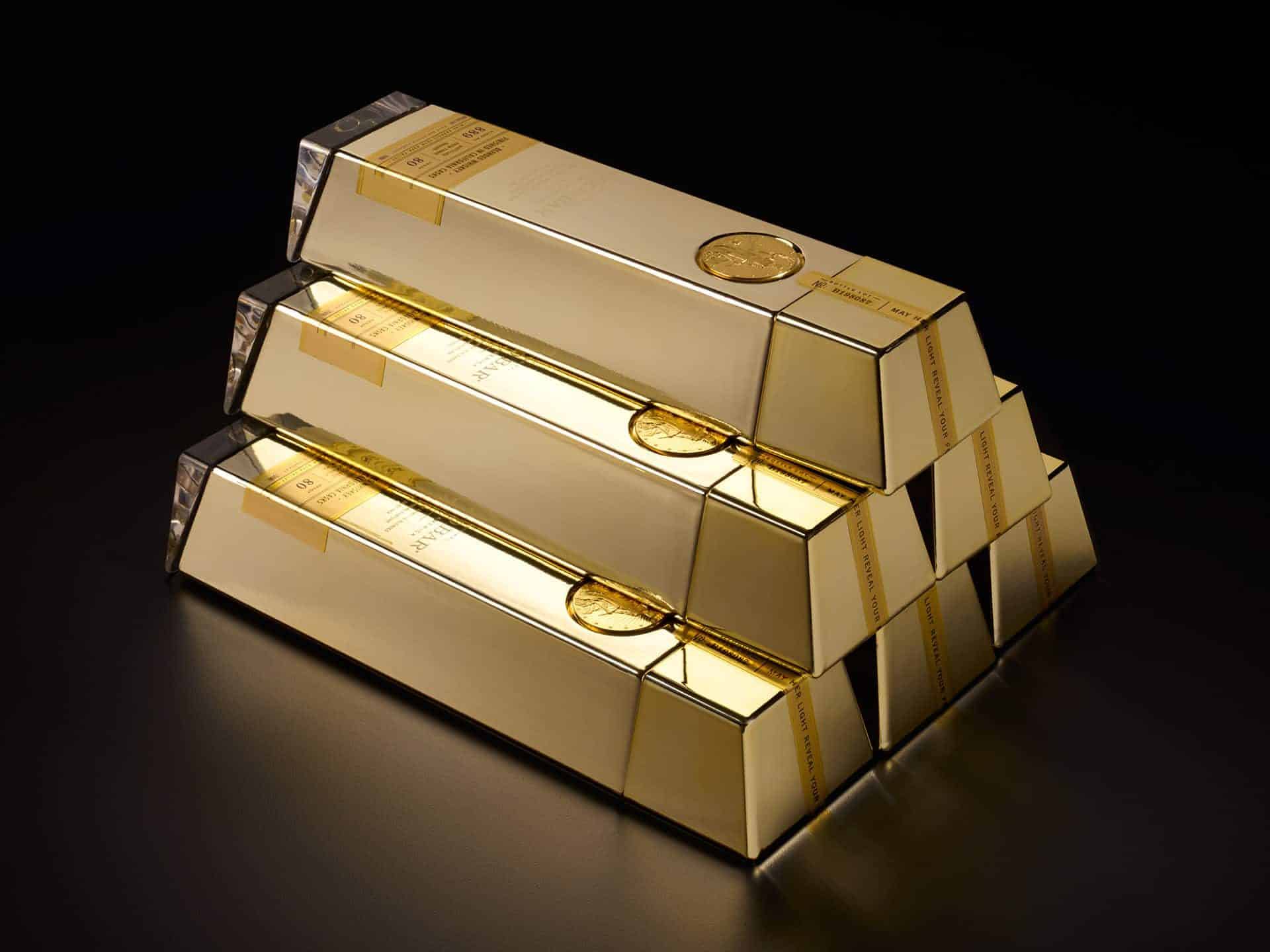
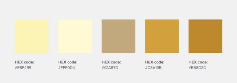
2. Gold Bar Whiskey – As an aptly named whiskey brand, Gold Bar Whiskey’s packaging is literally shaped like a gold bar.
By using a logo color combination that includes gold and black, this brand feels sleek, premium, and very fun when the product is stacked.

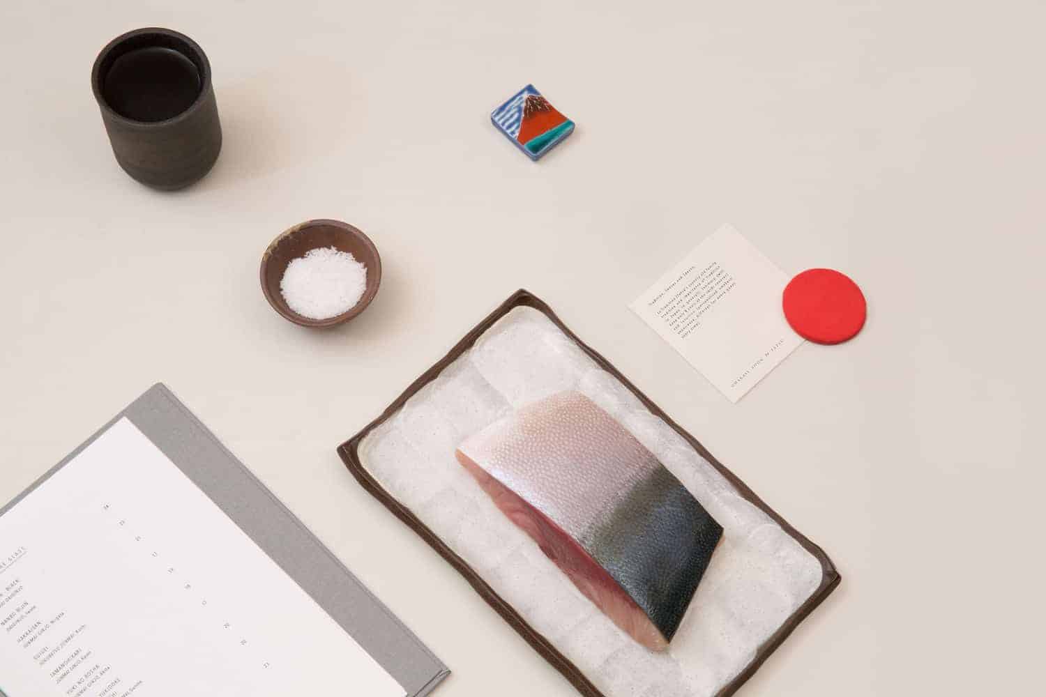
3. Omakase Room – This Japanese omakase (phrase meaning “I’ll leave it up to you” in Japanese) restaurant uses only white and red—the colors of the Japanese flag.
The logo color combination result is clean and sophisticated, with the motif of red circles used throughout the branding as a nationalistic nod.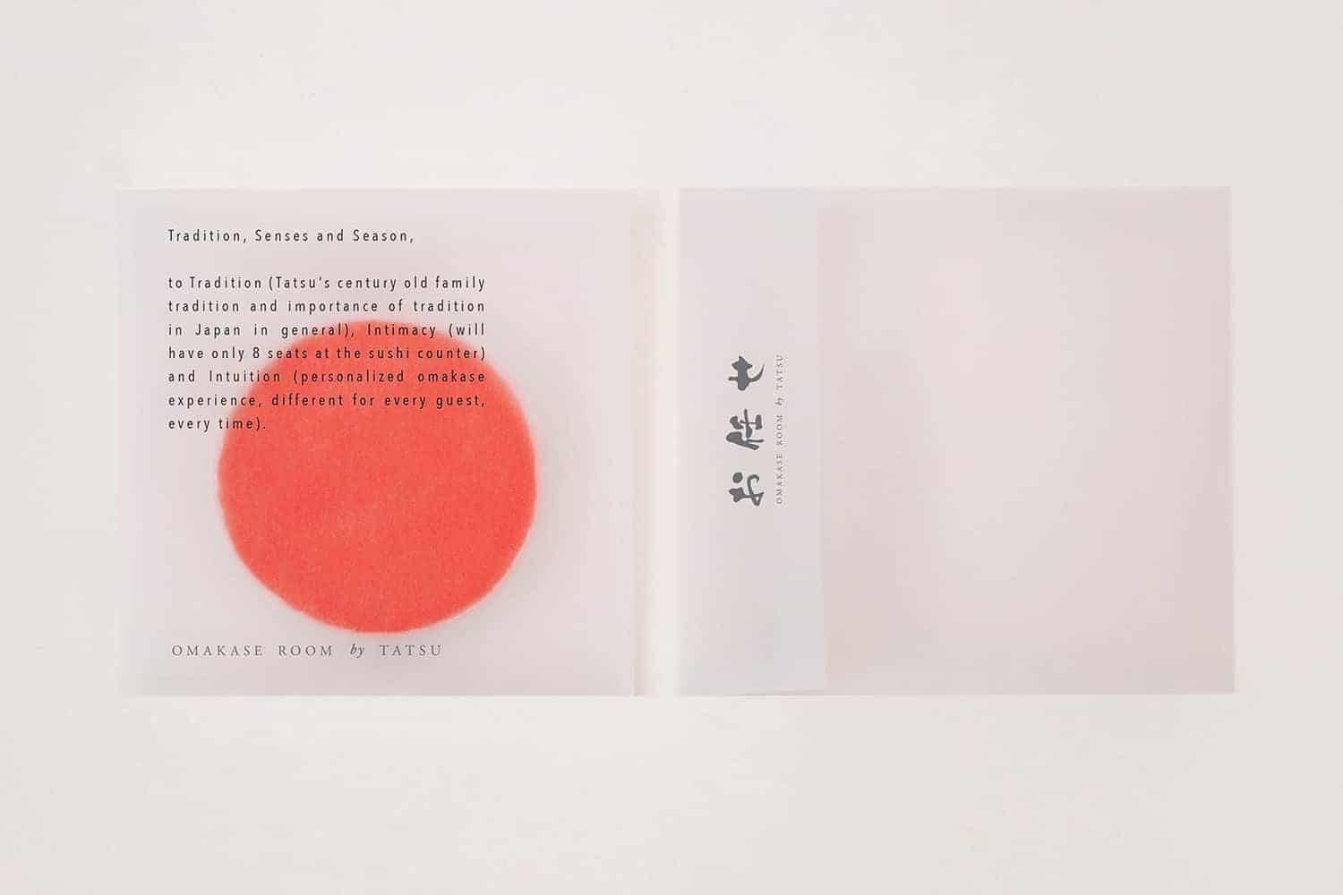
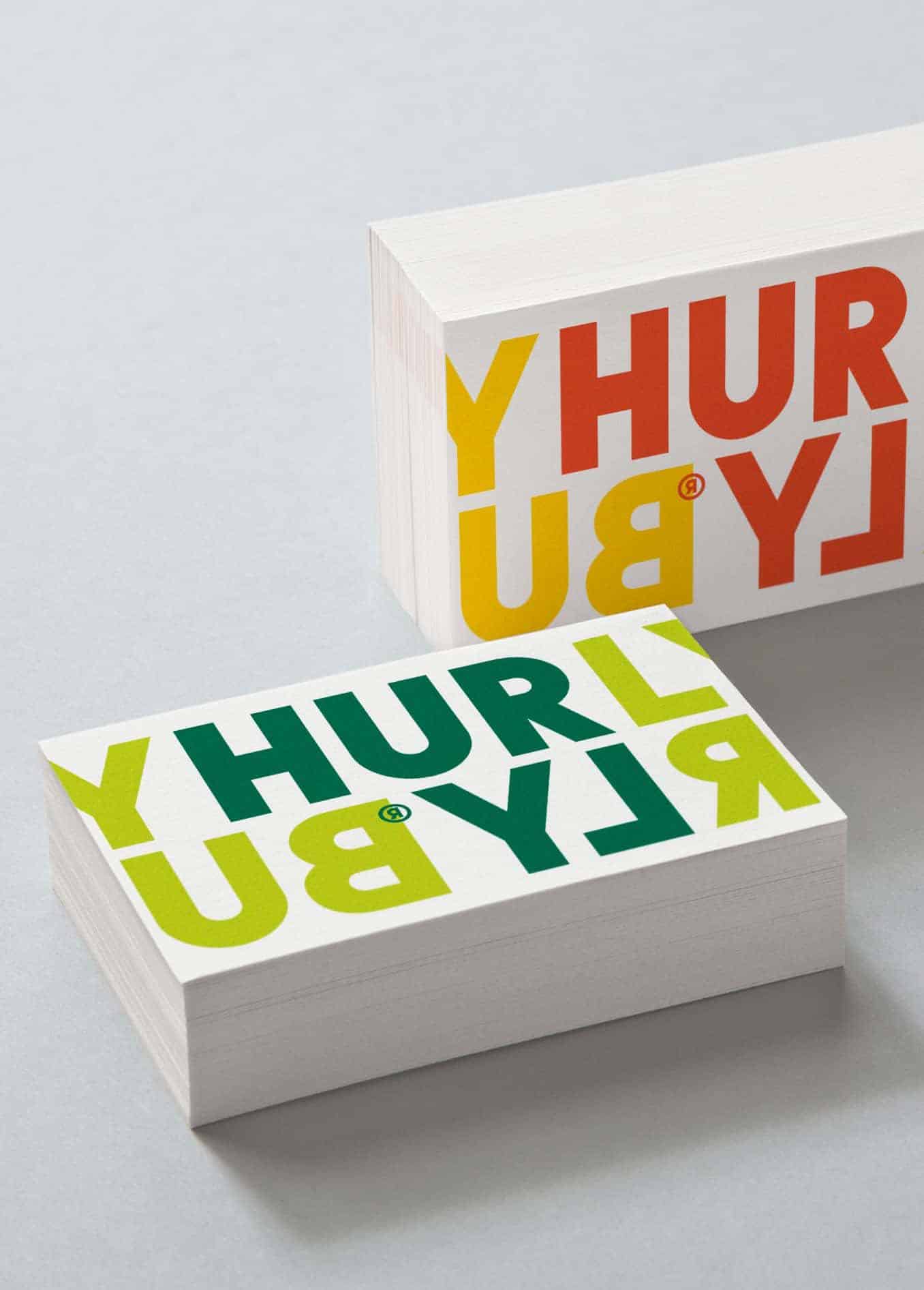
4. Hurly Burly Live Cultures – A food brand that uses bright, playful, and quirky colors to represent its brand of fermented foods.
Its color palette is drawn from the actual food color combinations themselves.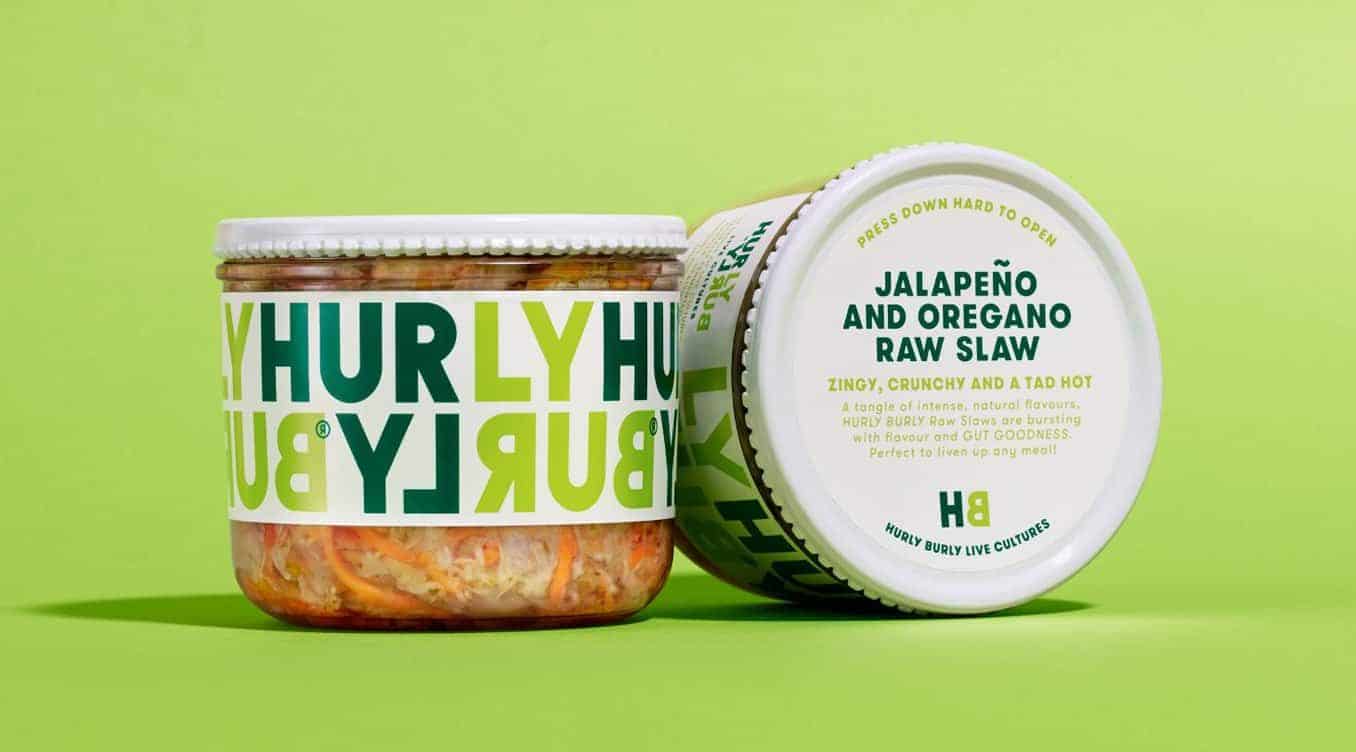
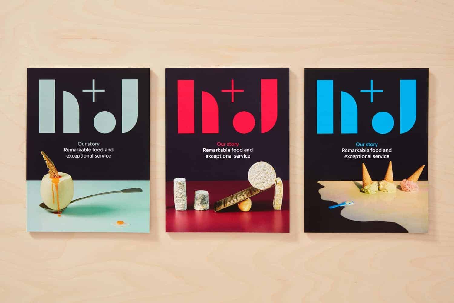
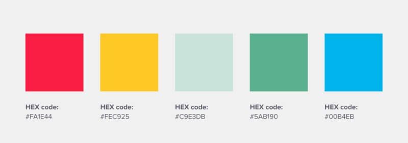
5. H+J – This UK catering business uses bold colors to convey the different personalities of its many events, ranging from street food to office lunches.
Represented by cheerful yellow, fiery red, cool green, and sophisticated grape; the logo color combination certainly makes them stand out from the crowd.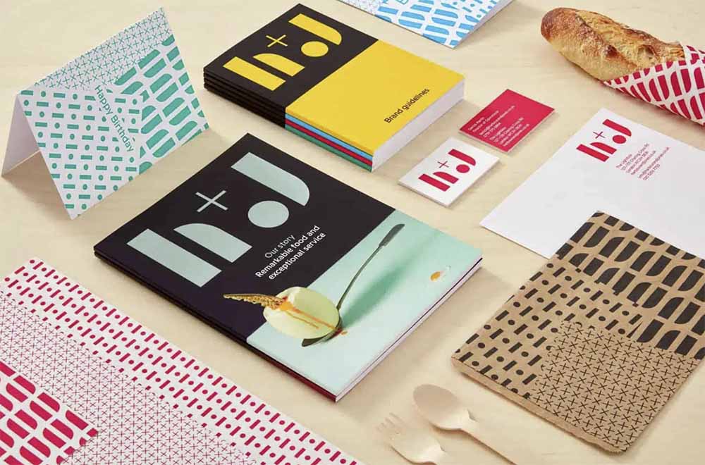
Create infographics, presentations, reports, flyers or posters online, with Piktochart. Just sign up here and try it out for free. With Pro, you will be able to easily extract your brand colors and use them in your visuals.
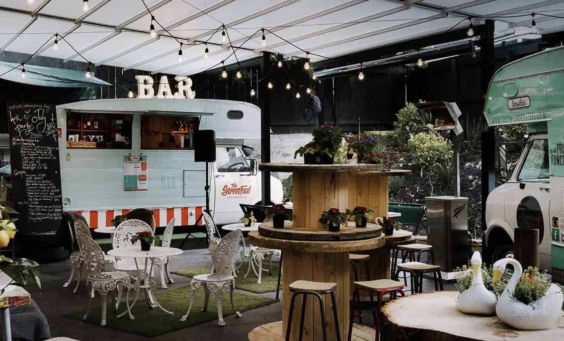
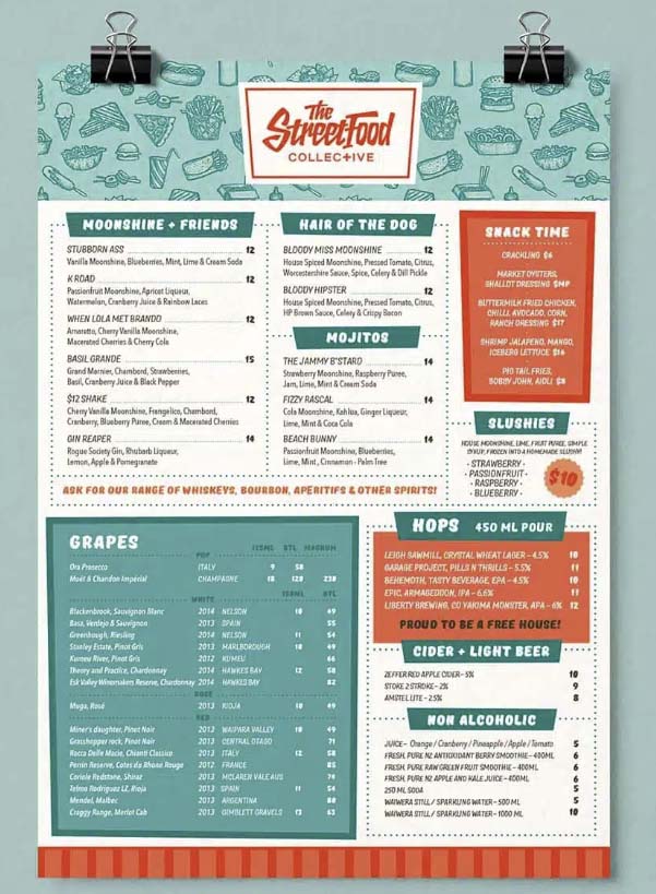
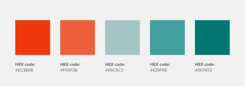
6. The Street Food Collective – This food brand’s color palette is reminiscent of a 50’s diner scene and is made up of vintage hues. The employed logo color combination fits their branding to a tee.
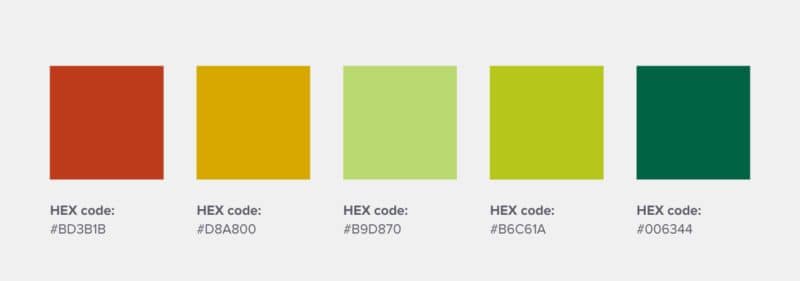
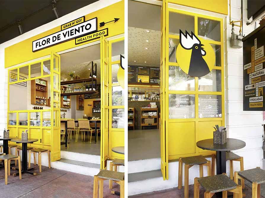
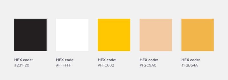
7. Flor de Viento – An organic health food shop from Mexico. It uses yellow for its main logo color to represent energy, light, and a brand new start—which is fitting for anyone looking to swap in a better diet.
The visual aspects of a weather vane and rooster also signify their connection with farm produce.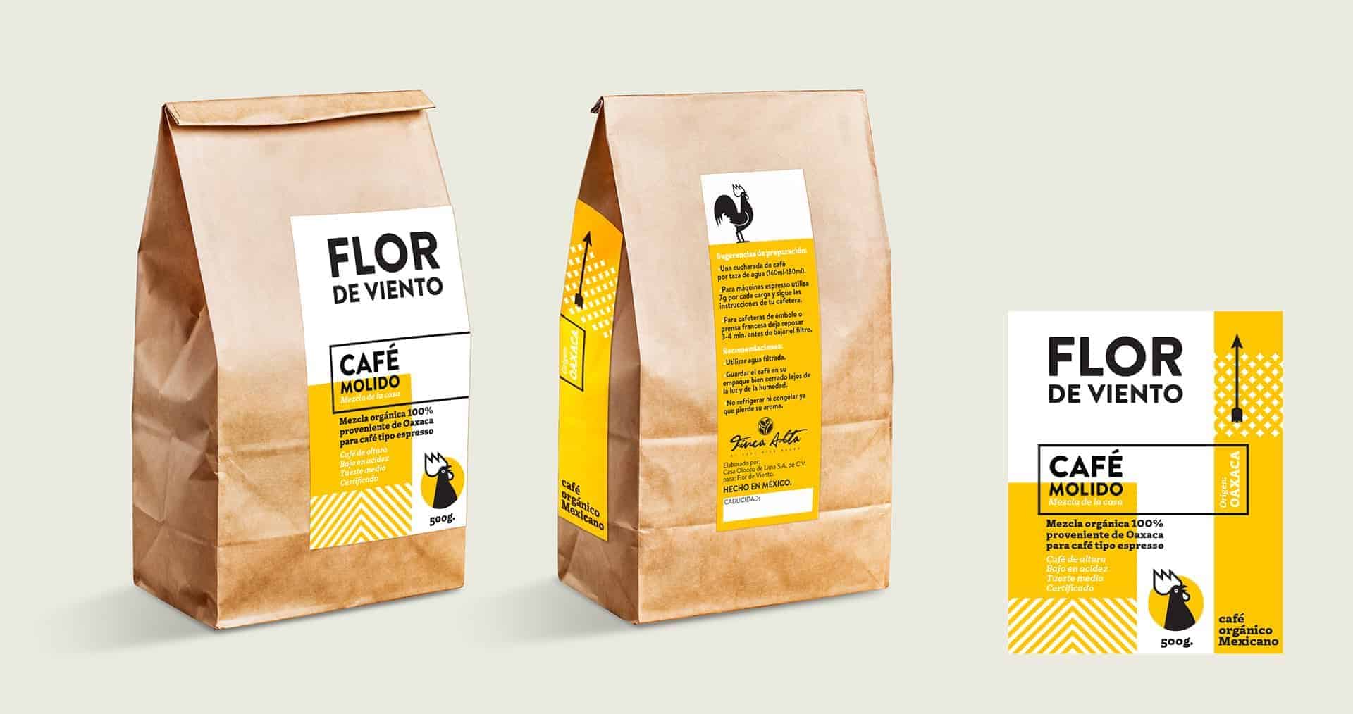
Lifestyle Logo Color Scheme Examples
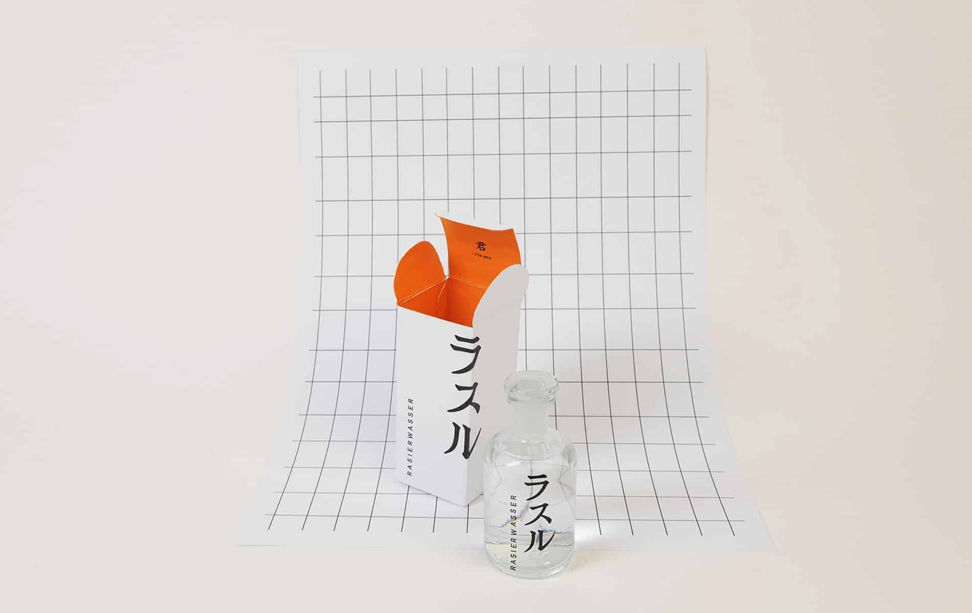
8. Rasaru – A Japanese men’s perfume brand that uses orange and white in its logo design color palette. The orange, in this case, was likely meant to evoke feelings of vitality and confidence in consumers.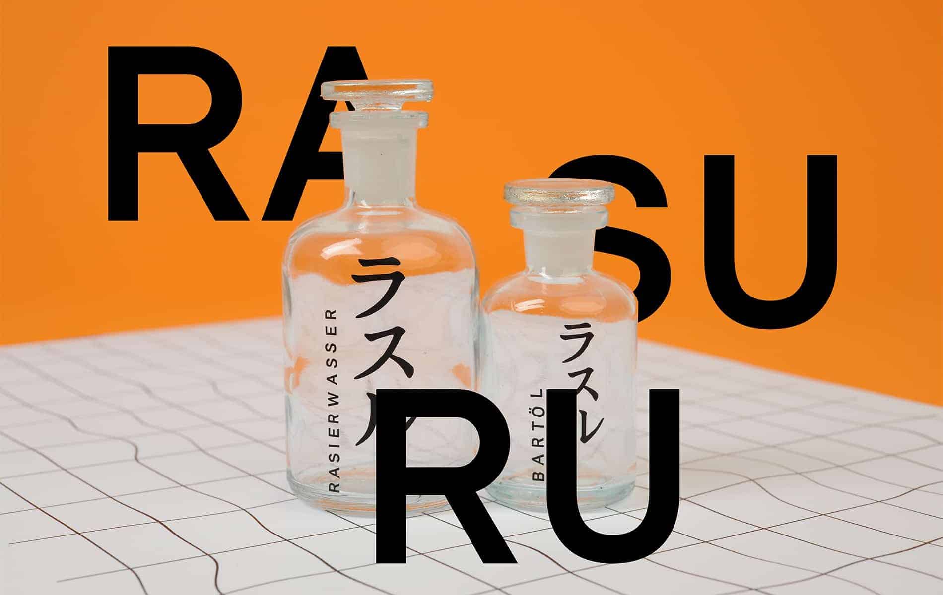
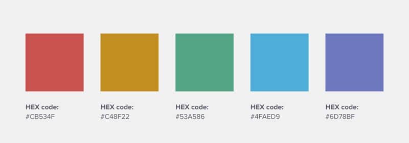
9. Bassetti Home Innovation – This Italian home textile brand uses a set of primary and secondary color combinations to convey innovation, ease, bravery, novelty, and freshness.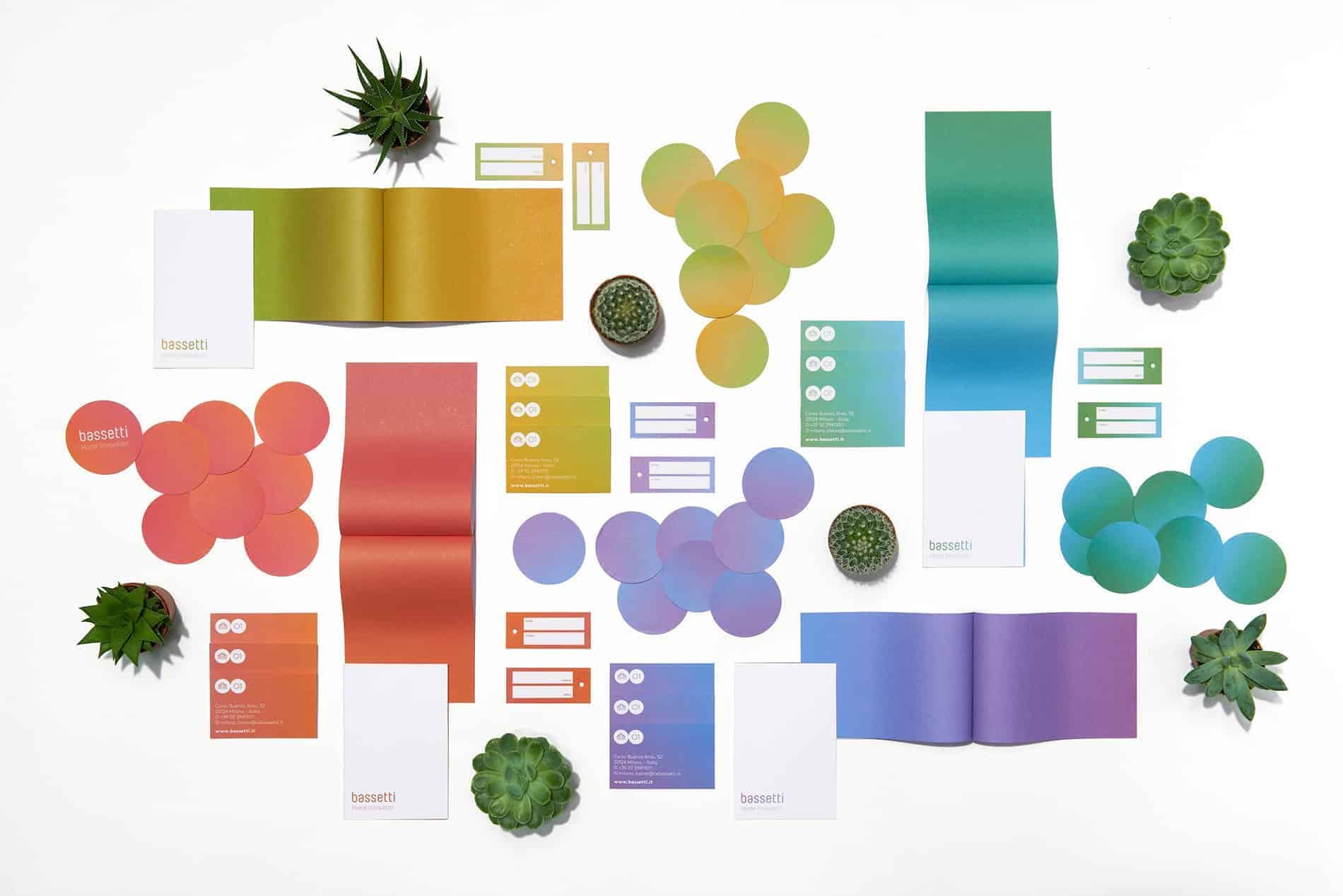
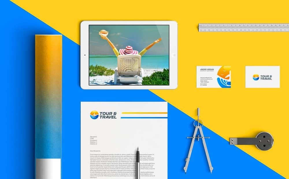
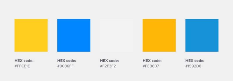
10. Tour & Travel – A London-based travel startup that uses sun orange and ocean blue as its two brand colors. Fairly fitting for this brand identity.
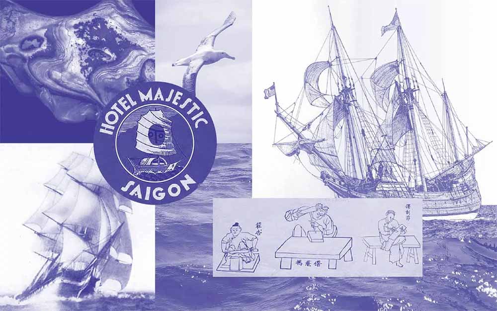
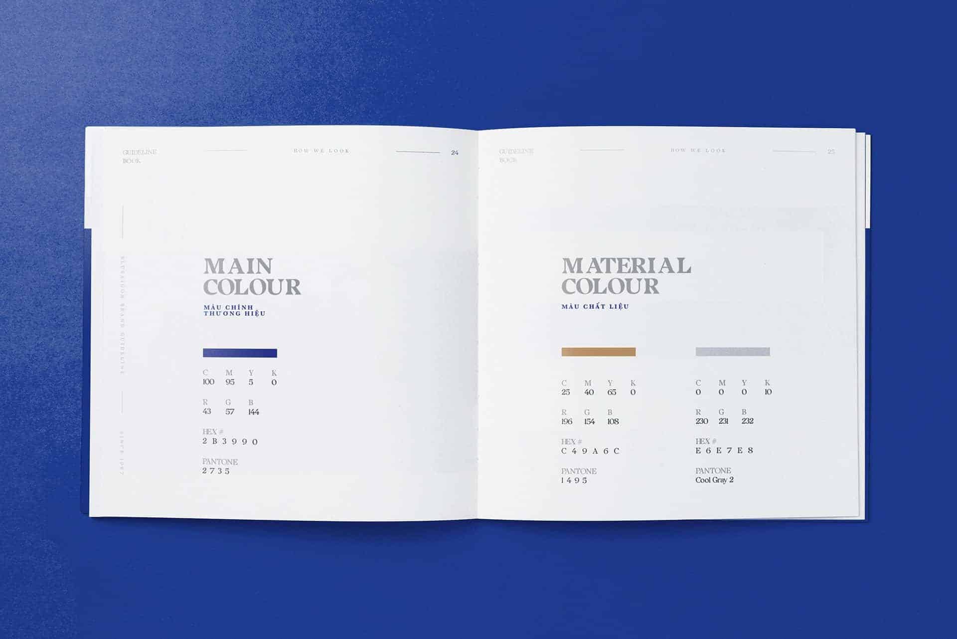
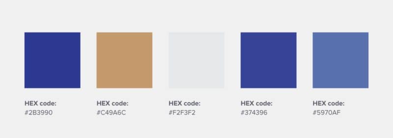
11. Blue Saigon – A Vietnamese button-making family business that uses indigo as the brand’s primary color. The color indigo has cultural and historical significance to Vietnam, as the indigo plant grows in the country’s northern highlands and is used to dye a lot of its fabric.
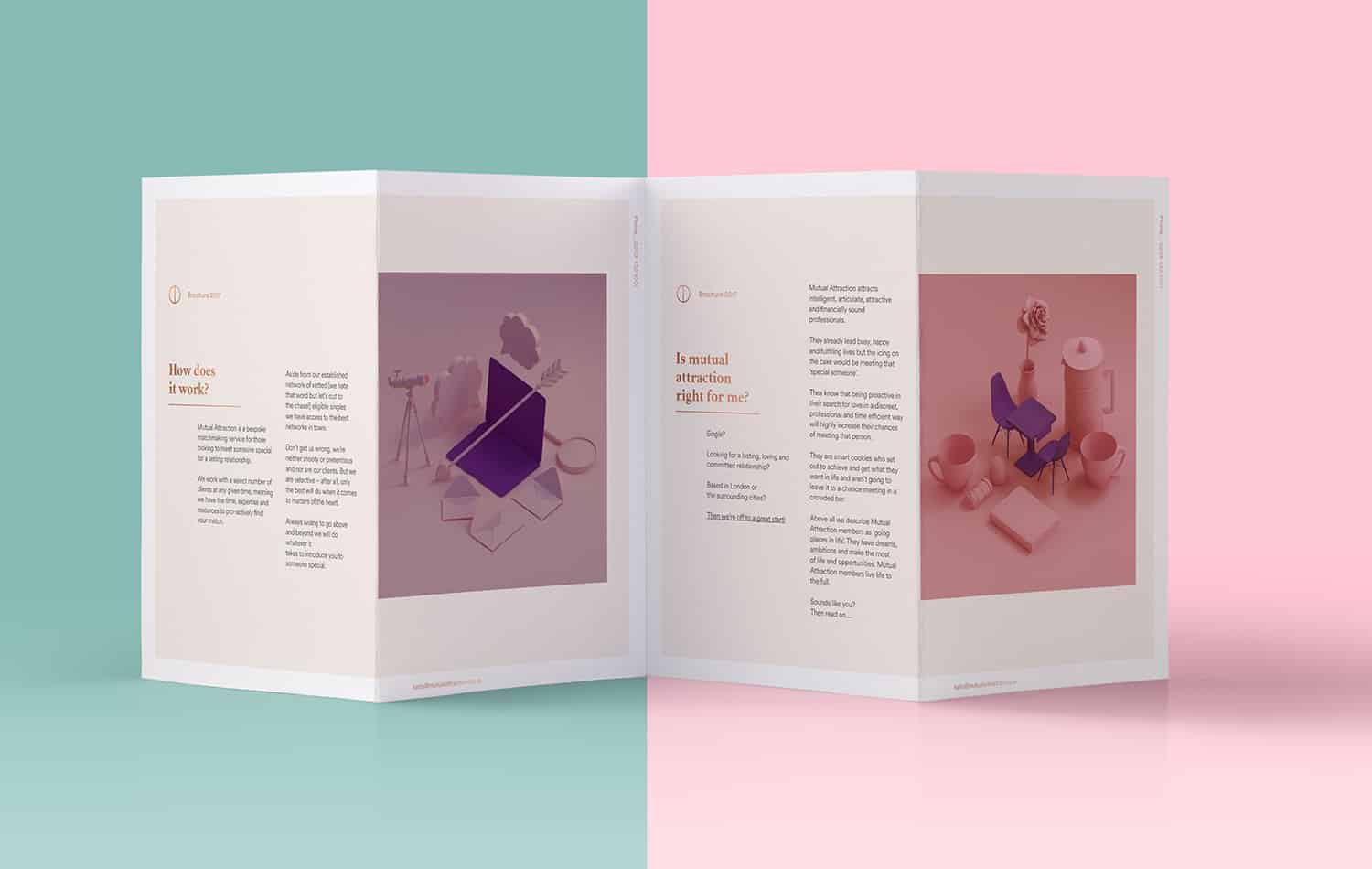
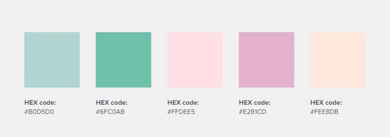
12. Mutual Attraction – This London-based matchmaking service uses pastel pinks and greens as its main logo design color combination, which feels modern, youthful, fun, and reliable.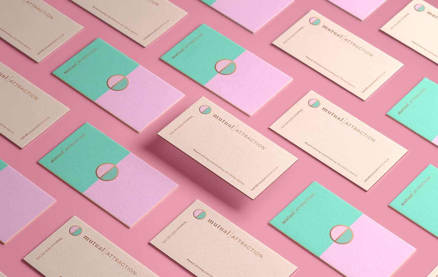
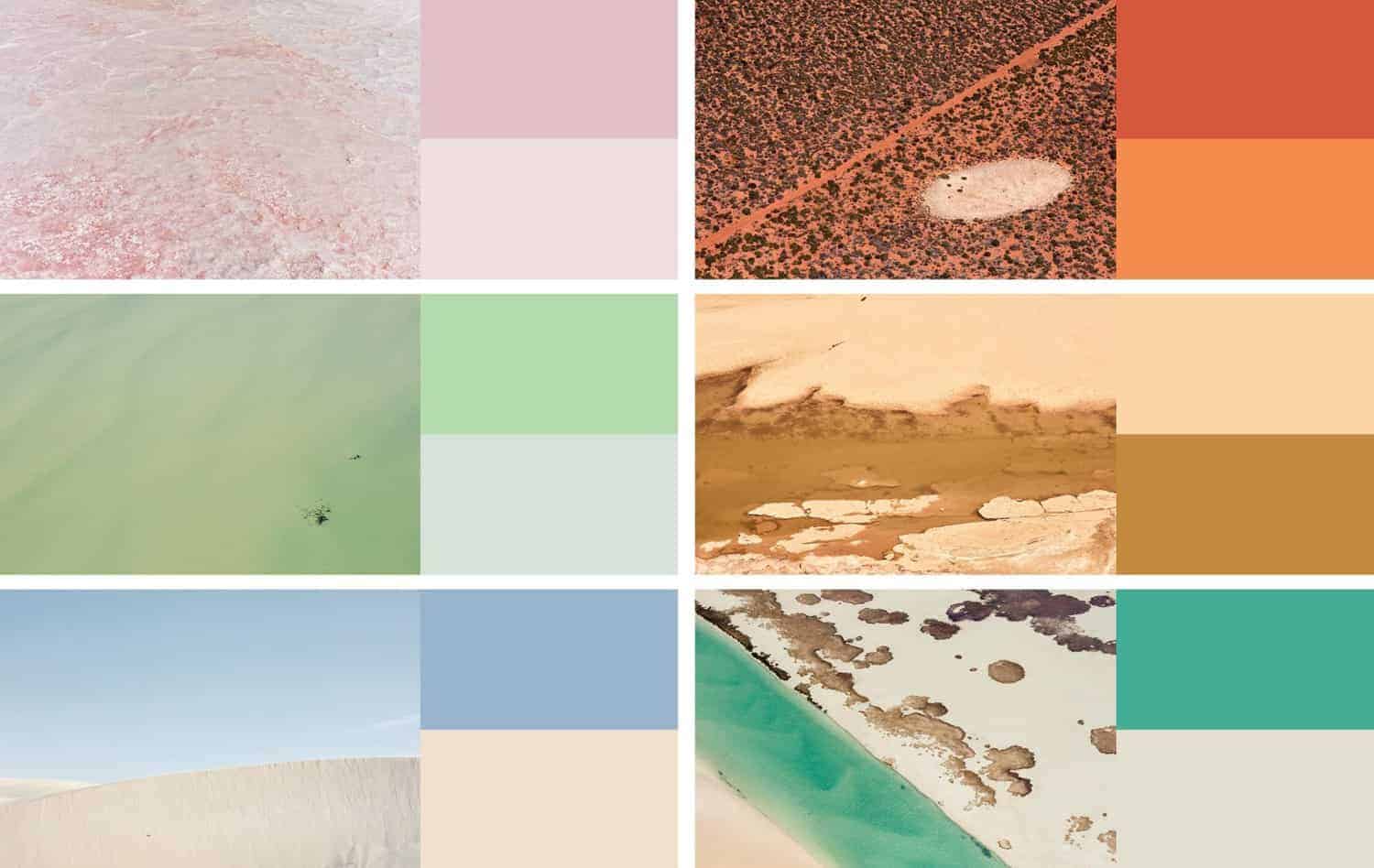
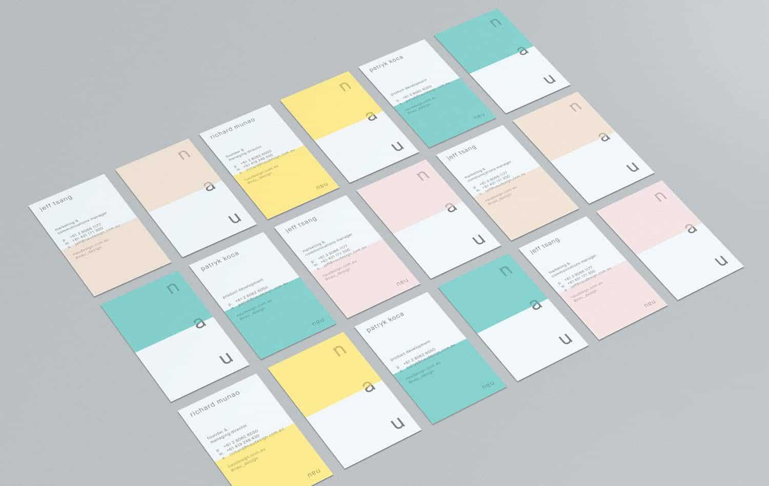
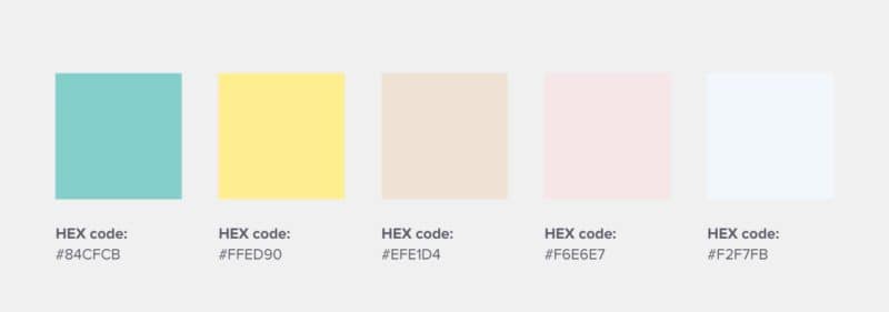
13. NAU – This Australian furniture design company derives its logo color combination and color palettes from Australia’s diverse landscapes, and the results are really something.
Digital Color Combinations for Logo Design
14. Cashtree – An Indonesian digital rewards startup that uses radical red and royal blue, also including red to purple gradients, to make up its brand logo design.
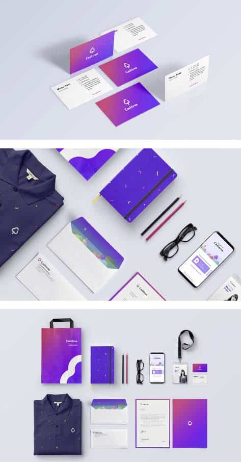
This logo color combination represents the “fun” and “diverse” aspect of the brand.
15. Mobu – An Argentinian mobile retail brand that uses bright color combinations to communicate its fun, hip, and youthful approach to business.
For their logo design, they use electric green, red, and yellow, which are starkly contrasted with dark green and grey.

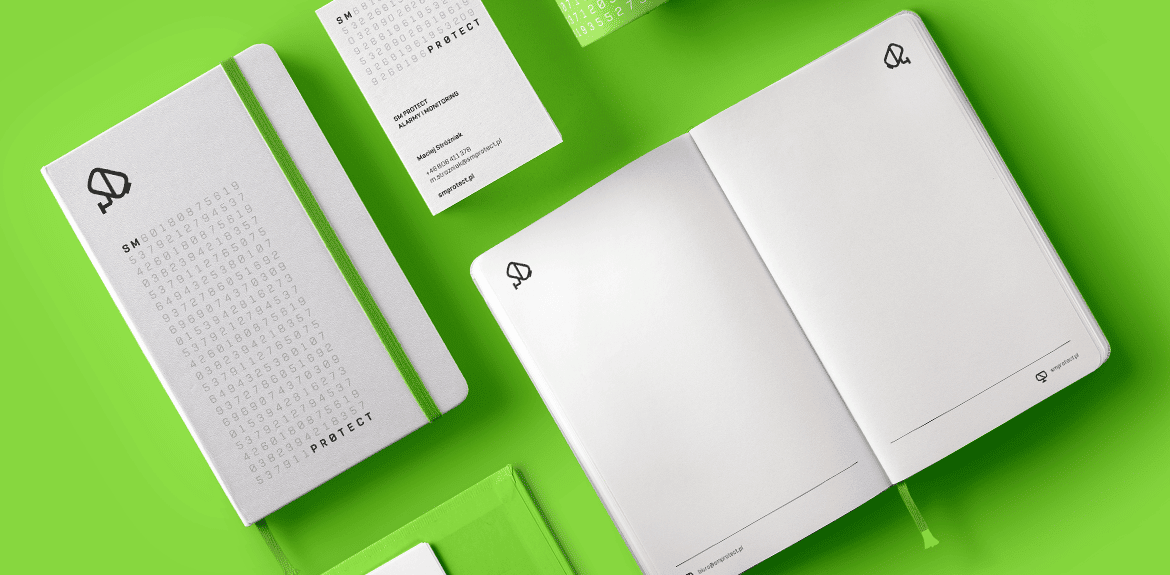
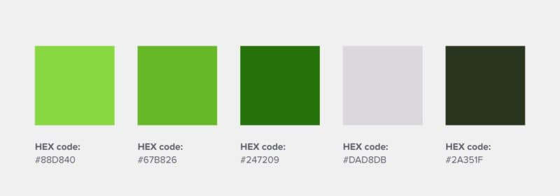
16. SM Protect – This systems security firm uses all green, with white as offset color, to represent its brand through its logo design.
Green works well for this company, as it has deep emotional associations with safety, among other positive emotions, according to color theory.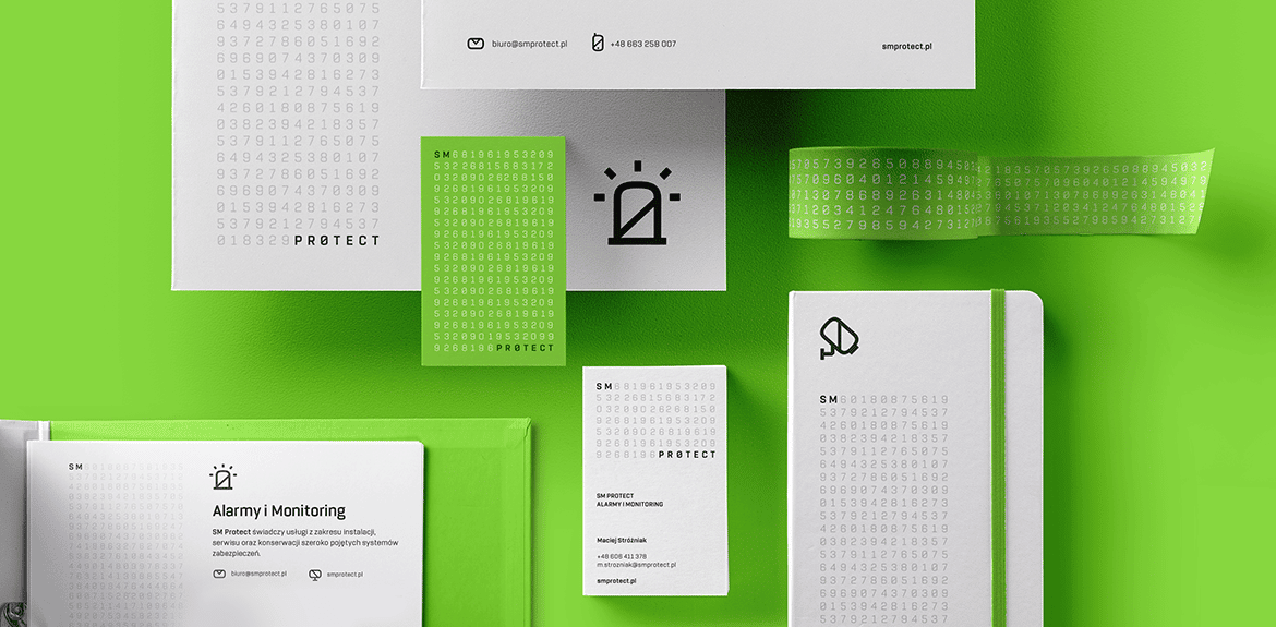
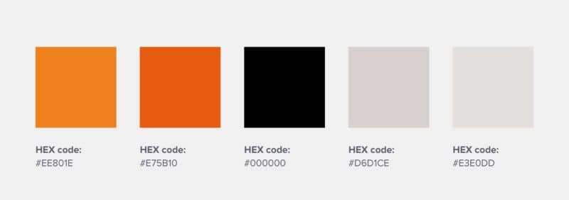
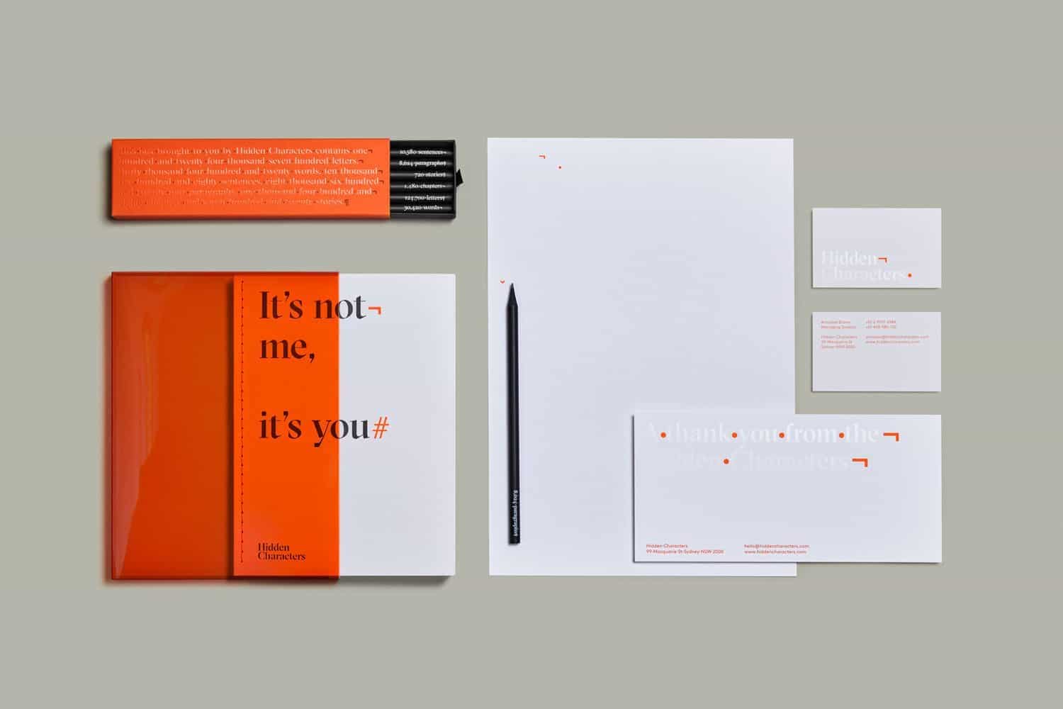
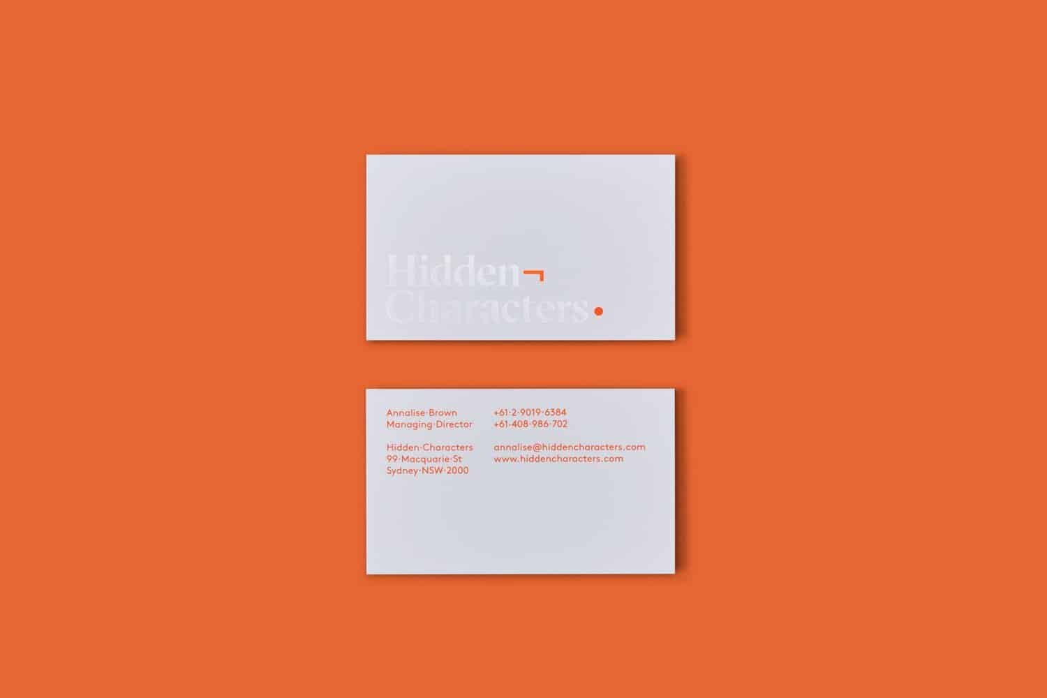
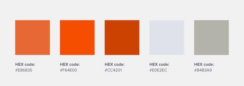
17. Hidden Characters – This creative agency uses orange as its primary brand color, which bursts forth with brightness, energy, enthusiasm, and creativity. This logo color scheme works in their favor through a strong logo design.
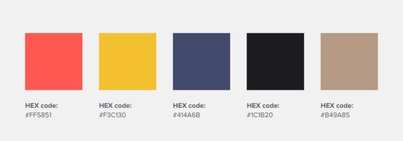
18. Wokine – This design agency and startup studio uses red and yellow as its main brand colors, which exude creativity, energy, and lightheartedness through its logo design.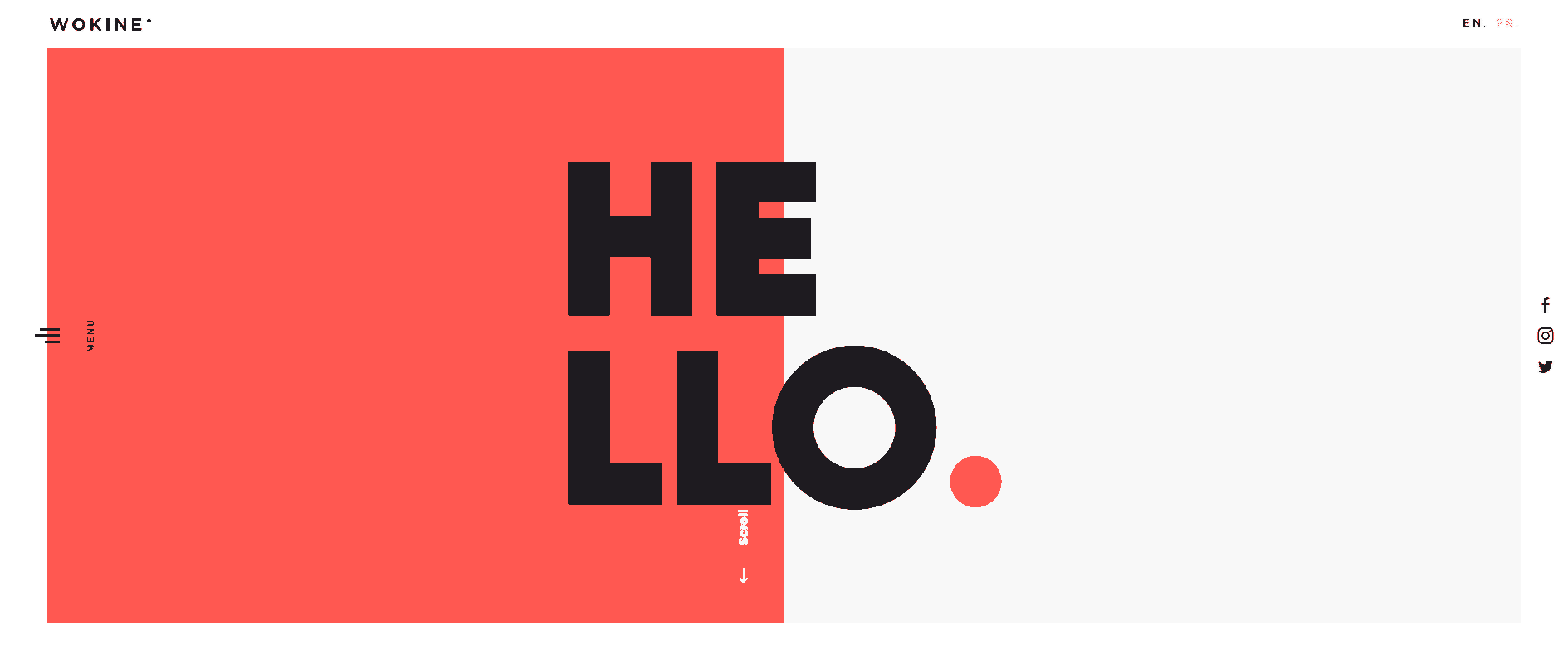
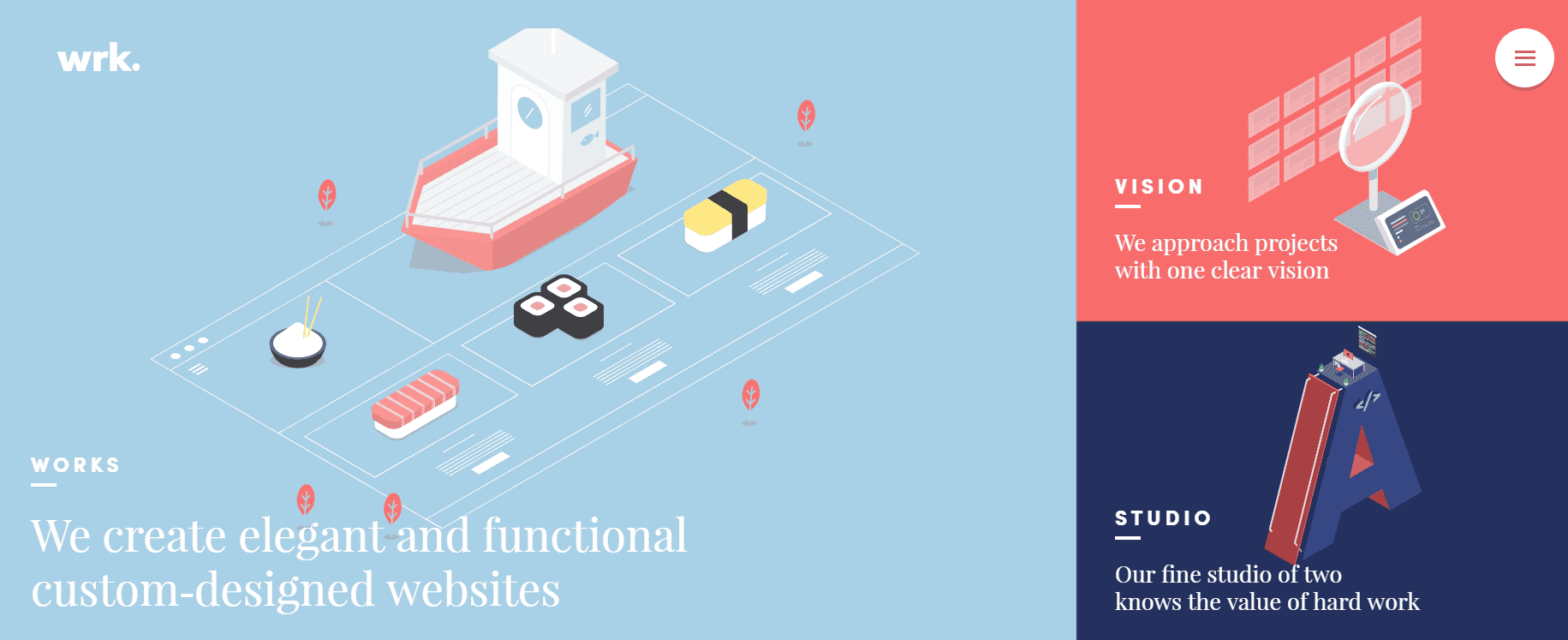
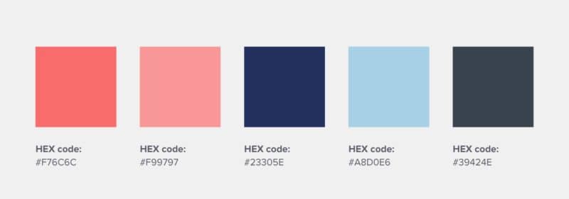
19. Waaark – This creative web studio builds custom-designed websites for its clients, and uses pastel reds and blues that are both elegant and playful for its logo color scheme.
Logo Color Combinations for Big Brands
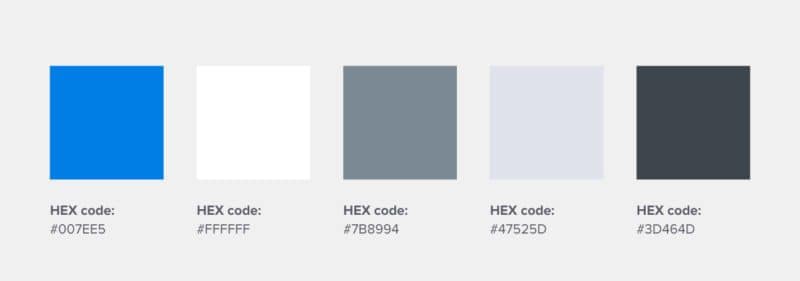
20. Dropbox – Blue, in all its forms (light blue, royal blue, dark blue, navy blue, baby blue, to name a few among various different shades) is probably the most universally-preferred logo color.
This file-sharing service capitalized on this color psychology, and uses blue in its logo color scheme to reflect reliability, trustworthiness, and communication—which works well for a collaboration tool like Dropbox.
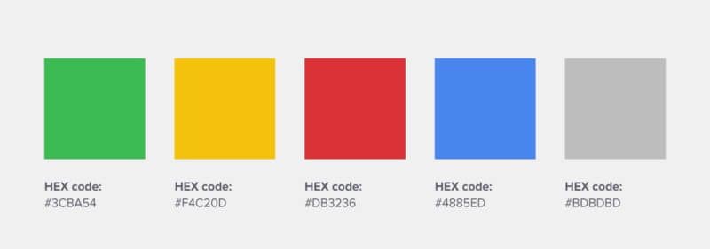
21. Google – The search engine giant’s original logo design, designed by Ruth Kedar back in 1998 used the same logo color scheme you see today.
She said it best: “The colors evoke memories of child play, but deftly stray from the color wheel strictures so as to hint to the inherent element of serendipity creeping into any search results page.”
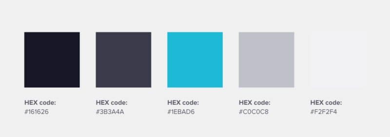
22. Uber – The controversial ride-hailing service’s original colors of cool blue, black, and grey offer an indication of a sleek, sophisticated, and reliable premium service.
However, due to its latest rebrand, Uber has begun introducing splashes of color to its color palette by presenting different mood boards for each country it operates in.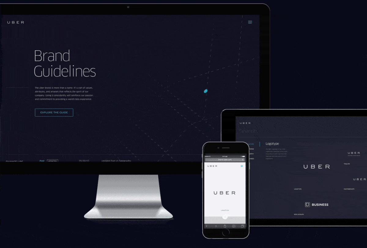
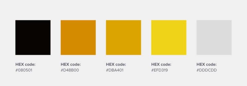
23. Lufthansa – Although they use blue like most airlines, Lufthansa has one of the best logo color combinations in the industry as they also ventured into the rare use of yellow to signify brightness, optimism, exclusivity, and daring.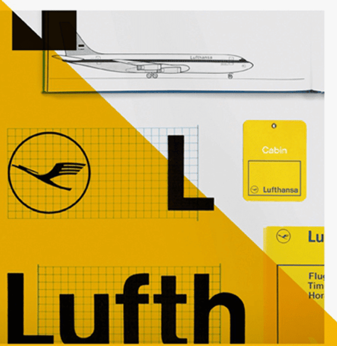
24. Asana – As a part of their rebrand, the Asana team wanted its branding and logo color scheme to appear to be balancing clarity with energy.
While clarity is the feeling of being on top of things, energy is the feeling of making progress. By using bright and colorful gradients, Asana’s new logo design does just that.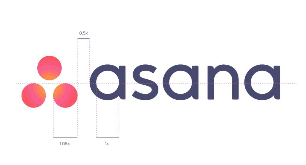
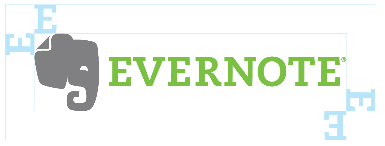
25. Evernote – As a productivity app, Evernote uses green as its resting color, to evoke a sense of stability and peace in its users.
The logo’s color palette represents the application of color psychology, and how different colors evoke different feelings in people.
26. SpaceX – As a part of SpaceX’s rebranding, a lucky design student in LA was tasked with creating the space exploration company’s new branded logo design.
The logo color palette is fairly aligned with the company’s interplanetary transport goals, which use Mars gold, galactic bright orange, space maroon, and infinite black. 
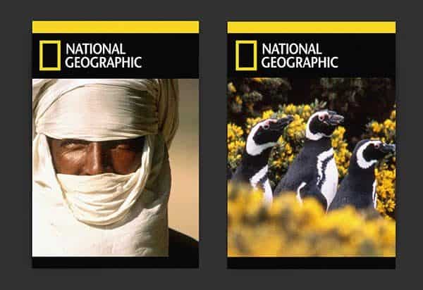
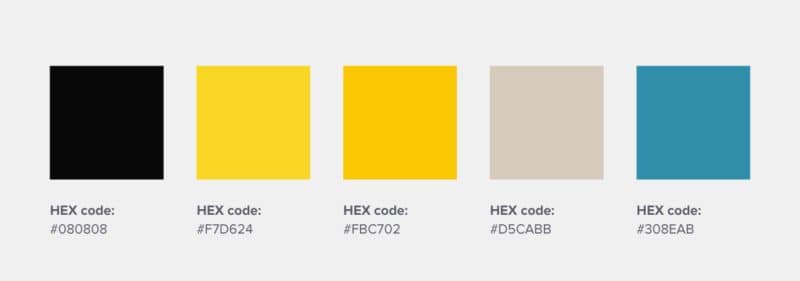
27. National Geographic – With its iconic bright yellow frame representing a window or portal to the world, National Geographic’s yellow is best associated with knowledge and wisdom.
This classic logo design is globally recognized and is a great example of how a distinct logo color can resonate with audiences simply by association.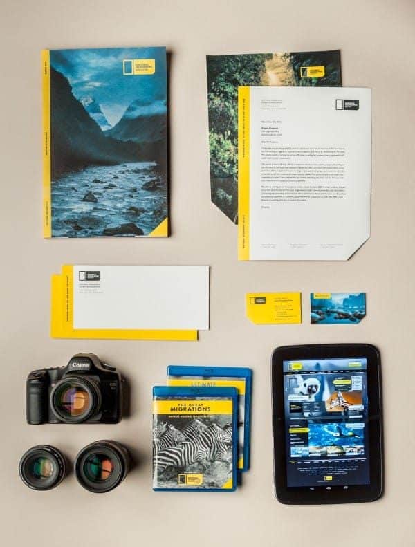
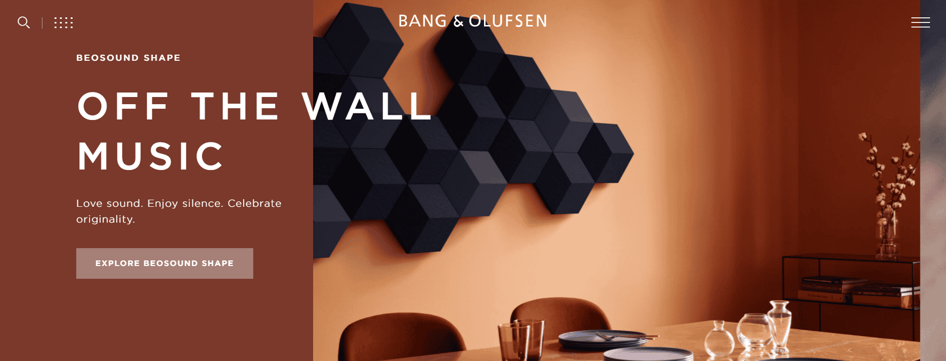
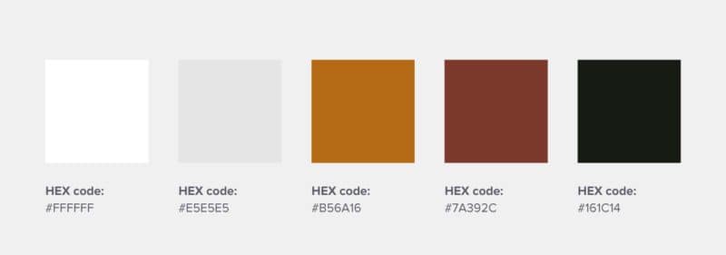
28. Bang & Olufsen – This high-end Danish consumer electronics company uses a sleek and warm color palette to represent its aesthetically pleasing and functional products, making for a great logo color combination.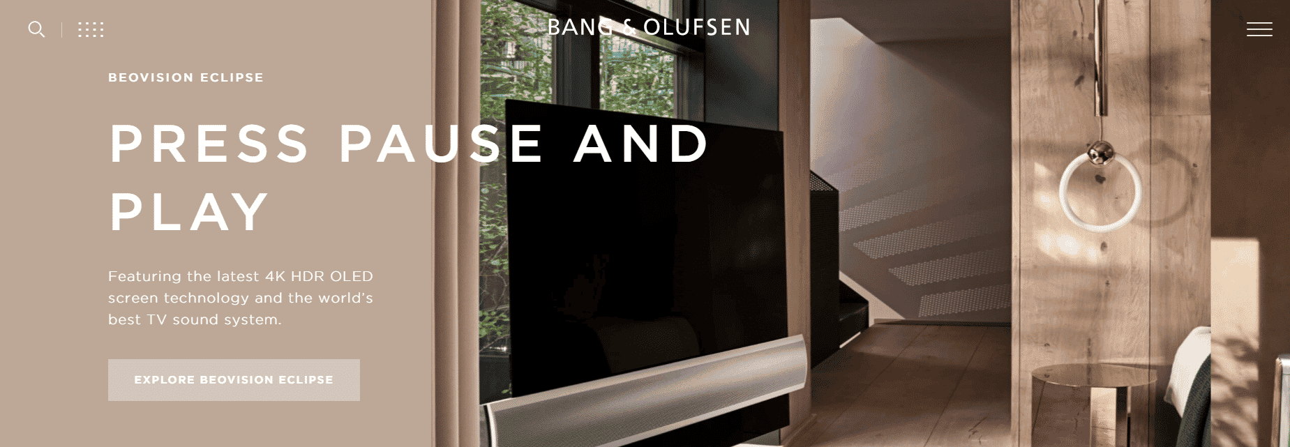
29. Spotify – The hip digital music service that everyone uses leverages the color green as its primary color to likely represent freshness and vitality, something essential to a music brand’s logo design.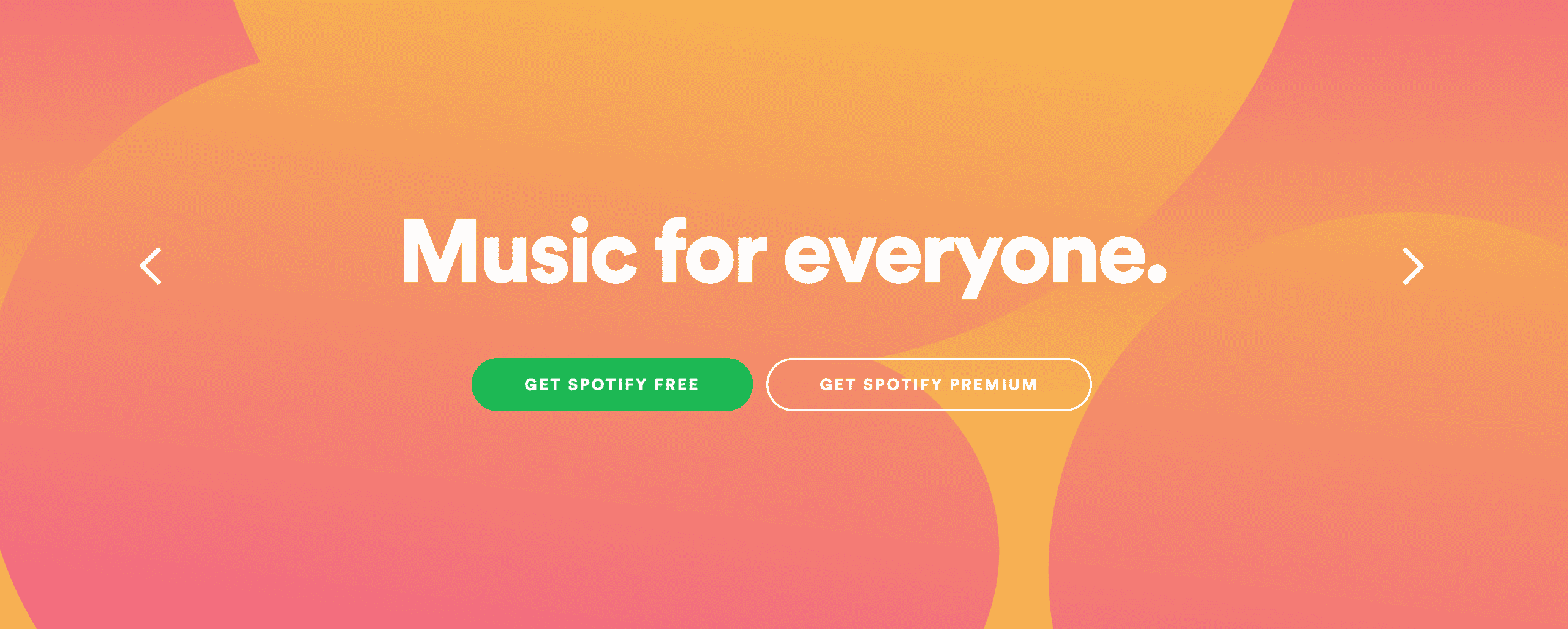
30. Airbnb – The online accommodations marketplace uses colors that reflect passion and emotion, without the aggressive energy of a bright red.
The purpose of this color combination was to represent the idea of being able to belong anywhere, through the logo’s eye-catching color palette.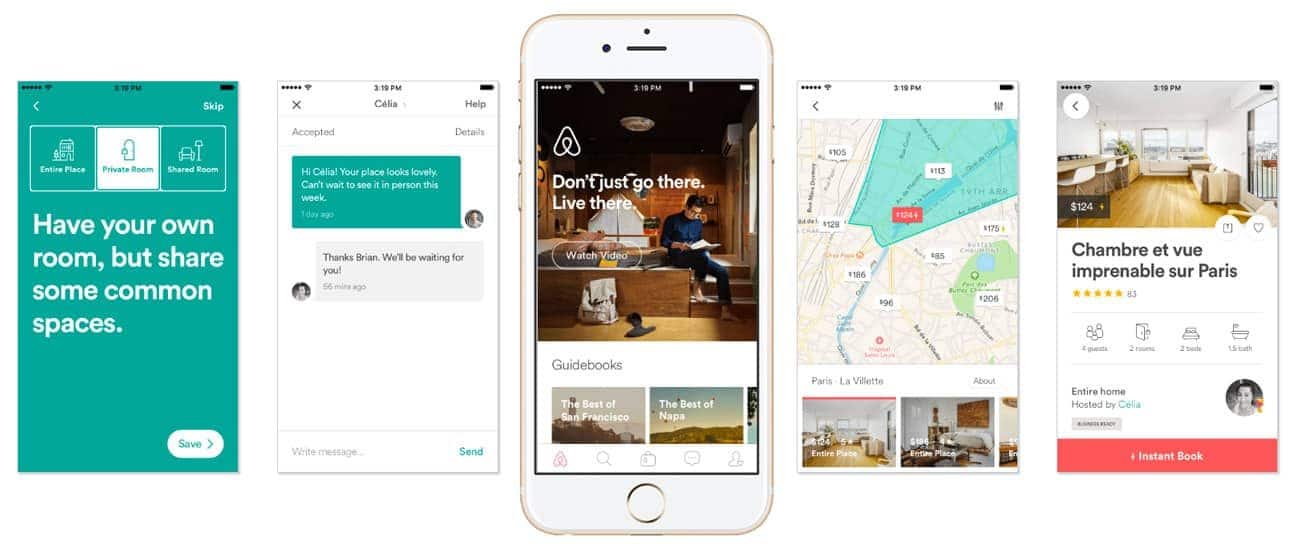
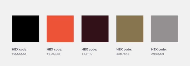
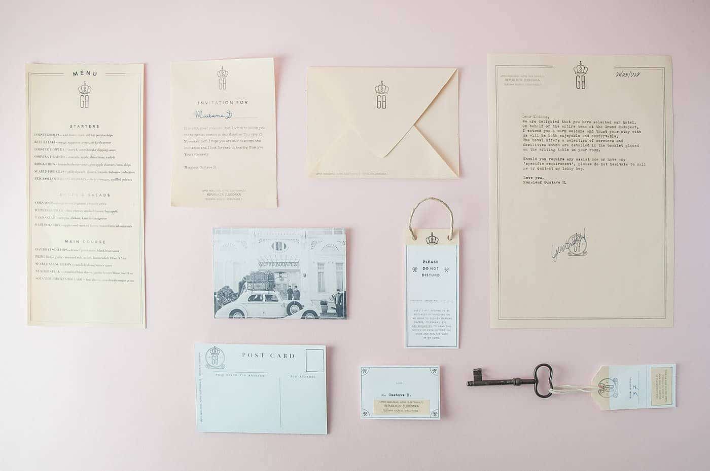
31. The Grand Budapest Hotel – This majestic early 1900 establishment is home to legendary concierge M. Gustave, and also the stuff of Wes Anderson’s dreams.
The hotel’s use of royal purple, sand, rose, salmon, and olive, presents a feeling of warmth and luxury through the use of warm colors in their logo design. 
Inspired and want to get creating? Here’s how.
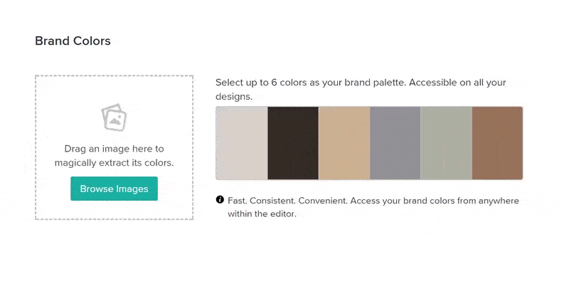
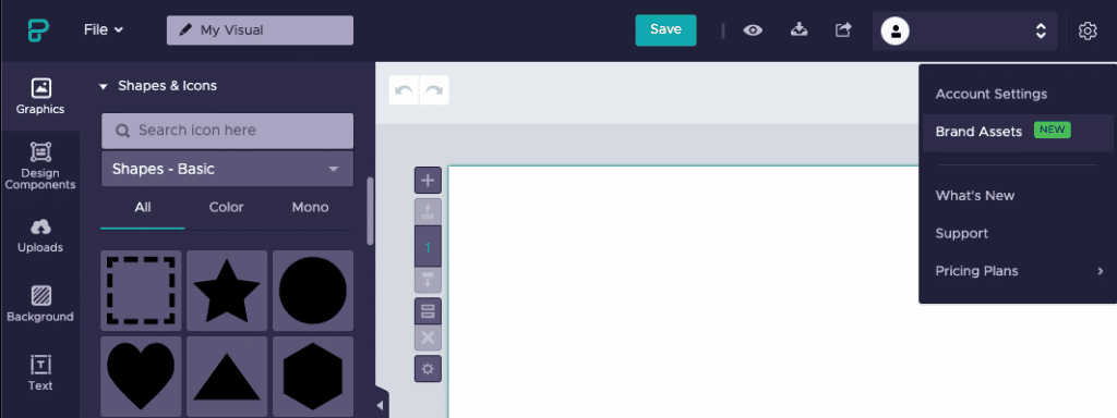
1. Open up the Piktochart editor, and click on “Brand Colors” under your user drop-down menu.
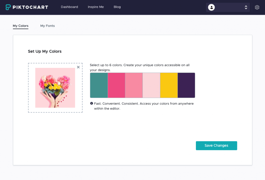
2. Welcome to the ‘Brand Colors’ tool! Here, you’ll be able to create your very own brand color palette.
One option is to use HEX codes, or our color picker, to create your color palette with different color combinations; from complementary colors to contrasting colors and everything in between.
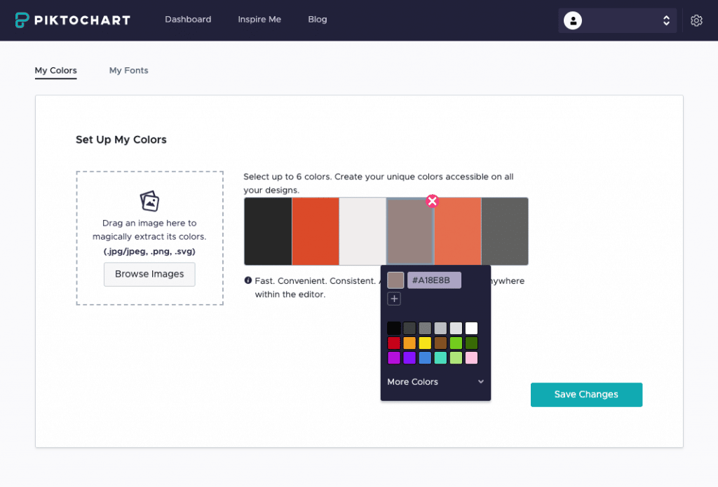
3. Or, you’ll have the option to click on ‘Browse Images’ and grab colors from an image of your choice.
If you were inspired by any of the brand colors in the above post, this is where our tool will come in handy.
Check out our brand colors Pinterest board for further inspiration and logo color combinations to show off your unique brand personality. Create logo designs easily using our expert templates. You can also use a color palette generator like Color Minds to come up with ideas for the perfect brand color palette.
Don’t forget to sign up for Piktochart, there are hundreds of visual templates so you don’t need to start from scratch! Easily create infographics, presentations, posters, brochures, and more with Piktochart. Happy brand coloring for the perfect logo color scheme and beyond!
Frequently asked questions
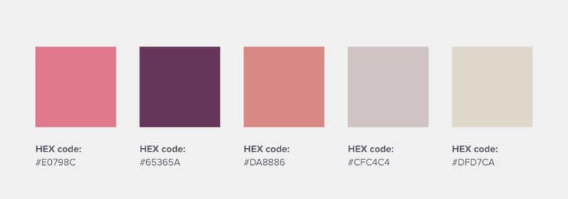
What is a brand color palette?
A brand color palette is a crucial aspect of a brand’s identity, and more than just a selection of colors. It consists of a carefully chosen combination of colors that represent the brand’s personality, values, and objectives. These colors are used consistently across all branding materials, from logos and websites to packaging and advertising.
A well-designed color palette is instantly recognizable and helps to establish a connection with the audience (such as Coca-Cola). Each color evokes specific emotions and associations, contributing to the overall brand story and experience.
What are the guidelines for a brand color palette?
Creating a brand color palette requires thoughtful consideration. The first step is understanding the brand’s core values and the message it wishes to convey. Each color should align with these values, evoking the right emotions and perceptions in the audience.
It’s essential to consider color psychology and the cultural context, as colors can have different meanings in different cultures. The palette should be versatile, working well across various mediums and applications.
It’s also important to ensure good contrast and readability, especially for digital platforms. A balanced mix of primary, secondary, and accent colors can create a harmonious and effective palette.
How do I choose a color palette?
Choosing a color palette for your brand is a blend of art and science. Start by considering the brand’s personality – is it playful, serious, luxurious, or down-to-earth? This personality will guide your color choices.
Next, think about how you want the colors to influence users. For example, blue often conveys trust and dependability, while yellow can evoke optimism and energy.
Research competitors to see common industry colors and think about how to stand out. Use color theory to create a balanced, harmonious palette, and test it in various applications to ensure versatility and effectiveness.
Why is brand color palette important?
A brand’s color palette plays a pivotal role in its recognition and perception. Colors have the power to evoke emotions and create associations, directly influencing how a brand is perceived by its audience.
Consistent use of a color palette across all brand touchpoints builds recognition and trust. It differentiates the brand in a crowded market, making it more memorable.
A well-chosen color palette can also enhance the user experience, guiding attention and creating a visually appealing aesthetic. The color palette is a silent ambassador of the brand, conveying its essence and values without words.