Reports play a vital role in businesses and organizations. They help in documentation, decision-making and accountability. But reports don’t have to be plain and boring. You don’t want your readers dozing off while reading your reports.
After all the research, analysis, writing and editing, the last thing you want is for your hard work to go unnoticed. That’s why you need report designs that will keep your readers engrossed all through.
A well-designed report is highly readable, visually appealing, and keeps readers engaged from start to finish. Thankfully, you don’t have to create a report design from scratch anymore – simply sign up on Piktochart and choose from a variety of captivating free report design templates.
7 Tips for Effective Report Design
An outstanding visual report is the result of strategic report design. Here are seven tactical tips for a more compelling report design.
1. Know your audience
Knowing how to write a report starts with understanding the audience. Understanding your audience is crucial for creating a standout report design. Then, knowing who will read your report guides your content and layout choices.
For example, if you’re writing a company’s annual report, your target audience would be managers and C-suite executives. Understanding their status, knowledge base and information priorities will guide you on the kind of info to include in your report and the report layout design to use. This act alone will set your report design in the right direction.
2. Start simple
Simplicity is always classy, especially if you’re a beginner in report design. You can start with a blank template and add just a few details like a text box or diagram to buttress your points.
Likewise, you can borrow elements from templates or use the general structure of templates to speed up your work. Just be careful not to overcrowd your report with too many elements, which can make it look clumsy and disorganized. So, keep it simple.
Piktochart’s drag-and-drop editor makes it a breeze to customize report templates, even if you’re not a designer.
3. Mix visuals with text
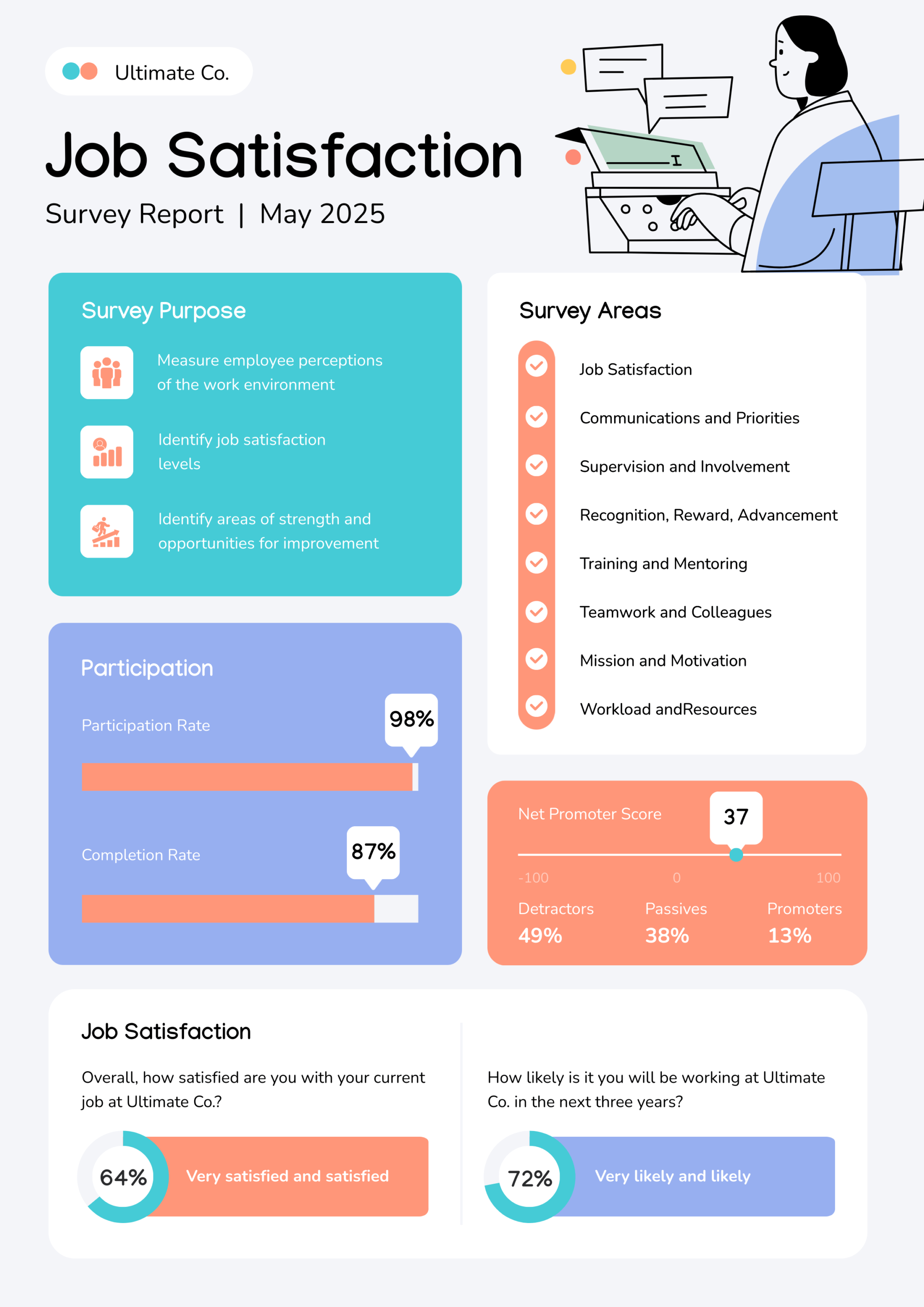
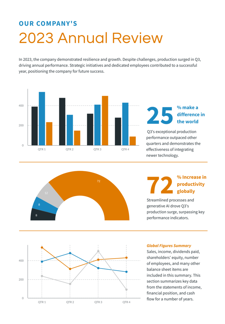
Another trick to improve your report designing is to balance visuals with text. Too much text can overwhelm your readers. Break this up with eye-catching visuals to boost readability and comprehension. Find below an example of a good balance of text and visuals.
Aim for a harmonious blend of graphics and words to keep readers engaged. After all, we see 60,000 times faster than we hear. Use this to your advantage by showing, not just telling, your story in your report.
4. Experiment with text placements
The placement of text in your report design also determines its effectiveness. Experiment with layouts, such as multi-column formats to improve readability. These formats are very handy when you want to break down long sections of text into smaller chunks.
Easy comparison is another reason to use multi-column formats in your report design. When presenting different sets of data, a multi-column format makes it easy for readers to identify similarities and distinctions. That way, they digest the information more effectively.
5. Add more whitespace
Despite its name, whitespace doesn’t have to be white. It simply refers to the negative space around design elements.
Whitespace gives your report structure and balance, making it more legible. It also enhances flow and draws the reader’s attention to key elements. With sufficient whitespace, your visual report becomes easier to read and comprehend.
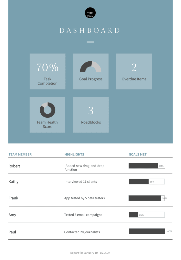
This survey report template is a great example of good use of whitespace.
6. Practice The Rule of 3 for colors
To create an impressive report design, practice The Rule of 3 for colors. The Rule of 3 is a design principle that entails using a palette of three main colors – primary, secondary and accent – to create a visual design that is harmonious and appealing.
- Primary color: This is the dominant color and should be most prominent in your report design. This color should reflect the tone and mood of the design.
- Secondary color: This is used less frequently than the primary color.
- Accent color: This is used sparingly for highlights, links or other vital information that needs attention.
When practicing The Rule of 3 for colors, ensure that you follow the 60-30-10 rule. This implies using the primary color for 60% of the design, secondary color for 30% and accent color for 10%. Implementing the color theory can also work wonders for your design, depending on the emotion you want to invoke.
7. Choose easy-to-read fonts and font sizes
Fonts are often overlooked but they play a very important role in your report design. Opt for clear, simple fonts free of excessive embellishments. Some fonts look pretty but are difficult to read and will stress your reader.
The most readable types of fonts are Sans-Serifs. They’re very suitable for body text. Others are Arial, Times New Roman and Calibri. Stay away from script fonts in your reporting design; they’re typically best for designs like wedding invitations rather than professional reports.
Common structures of report types
Mastering report design means understanding the common structures for different types of reports. Knowing which category your report falls into will enable you to determine the structure and design of your report.
Analytical reports
Analytical reports contain data analysis, interpretations, insights and recommendations to examine trends and patterns, drive decision-making, and inform strategy.
Analytic reports usually have the following components:
- Executive summary: This is basically an overview of the analysis, findings, insights and recommendations. Its main purpose is for the reader to know what the report is about at a glance.
- Introduction: This section introduces the report. It gives the background and states the objectives of the report.
- Methodology: The methods and approaches used in collecting and analyzing data are carefully explained in this section. This part validates the findings of the report.
- Findings: This is the section where the findings of the data analysis are stated in detail. It contains graphs, charts and tables that help show the result of the report visually.
- Insights: This part contains insights derived from the study based on the findings.
- Recommendations: Based on the findings and insights, the recommendation section suggests solutions to the problem the report aims to address.
- References: This section contains all the cited sources in the report.
- Appendices: In this section, you provide extra material like raw data, notes and tables that support the analysis.
Are you designing an analytical report? Try this free template. It has all the components of an eye-catching report design. Simply customize it and you’re good to go.
Progress/periodic reports
Progress or periodic reports provide stakeholders with status updates over a specific period.
A progress report usually follows a regular cadence (daily, weekly, monthly, quarterly, biennially or annually). This kind of report helps to address issues early, communicate milestones and achievements as well as restrategize.
Typical sections include:
- Title page: This page contains details like the title of the report, the name of the project, the project manager, team members and the date.
- Introduction: This section gives an overview of the report, serving as an appetizer to the reader.
- Time frame: Since it is a progress report, this section states the time frame the report is covering.
- Accomplishments: This page contains details of accomplishments during the time frame being covered.
- Challenges encountered: Under this section, the challenges encountered during the time frame are highlighted. The page also covers how the challenges were overcome or what plans have been put in place to solve the problems.
- Tasks status: Updates on current tasks are stated on this page. The section shows the stage or percentage of completion of tasks.
- Next steps: This section contains future plans and the next steps for the project.
- Resource allocation update: When applicable, a progress report contains details of how resources have been allocated or used.
- Conclusion: This is a summary of the whole report. It contains the key points and insights.
Want to design an easily digestible progress report? Use this free template.
Marketing Reports
Marketing reports are used for monitoring and analyzing marketing efforts in a bid to improve strategies. They provide an overview of campaign performance, market trends, and consumer behavior to guide resource allocation and decision-making.
Here are common elements of a typical marketing report:
- Executive summary: This page is an overview of the report; its findings, insights and recommendations.
- Introduction: This section talks about the background and objectives of the report.
- Market analysis: Under this section, we have information about the marketing environment like customer demographics, competitors and market trends.
- Performance analysis of marketing campaigns: This page showcases details of the performance of marketing campaigns, stating the relevant metrics.
- Customer behavior and classification: Details of how customers behave and their segmentation are addressed in this section.
- Budget and expenditure: This section assesses the marketing budget and showcases how much is spent on different campaigns.
- Conclusion: This page is a summary of the findings of the report.
- Recommendations: This section gives actionable recommendations based on the performance analysis of marketing campaigns.
- Appendices: Here, supplementary info and material related to the report are shared.
Using high-quality visuals and visual hierarchy play a big part in creating effective marketing material design, as you can see from the above template.
Sales Reports
The main purposes of a sales report are to assess how effective sales strategies have been and to set new Key Performance Indicators (KPIs) and targets based on findings. The report focuses on performance metrics like sales volume, revenue, leads, customer behavior and market trends.
The following are the main components of a sales report:
- Executive summary: This portion of the report gives a concise overview of what the report is about.
- Sales performance summary: This section contains information on the volume of sales and the revenue generated as compared with previous performance and targets.
- Product/service performance: This page breaks down sales performance by product or service, allowing readers to see the top-performing products/services and the underperforming ones.
- Geographic performance: Under this section, we have a review of how well products/services do in different locations.
- Customer segmentation and behavior: Information about customer demographics, buying patterns and segmentation are found in this section.
- Sales channels evaluation: This part of the report showcases sales performance across different channels, enabling readers to know the strong and weak channels.
- Team/individual performance: A sales report also usually contains a segment that assesses the performance of teams and individuals.
- Challenges and opportunities: This page is dedicated to discussing the challenges encountered during the period under consideration as well as opportunities for improvement.
- Conclusions and recommendations: This section contains the conclusions drawn from the data presented and recommendations for further action.
Creating an outstanding sales report design has become a walk in the park with free ready-made templates from Piktochart. Try out this template.
Financial Reports
Financial reports provide a snapshot of an organization’s financial health and performance. This information helps the organization make informed decisions while also boosting accountability. Apart from aiding internal decision-making, financial reports also guide investment decisions and help the company comply with accounting standards.
Here are the basic elements of a financial report:
- Executive summary: This segment gives an overview of the entire report, letting the reader know what the report is all about.
- Balance sheet: On this page, we’ll find details of the company’s assets, liabilities and shareholder’s equity.
- Income statement: This section contains information about the company’s revenue, expenditure, profit and losses over a specified period.
- Cash flow statement: This page shows how cash and its equivalent flow in and out of the company. The cash flow section is segmented into operating, financing and investing activities.
- Equity statement: This part details the changes in the company’s equity during the specified time frame.
- Notes: This section provides any additional material or information needed to understand the report.
Prepare your next financial report design with this winning template.
Create professional reports with confidence
Preparing a report shouldn’t be a pain in the neck. By applying these proven report design tips and strategies, you’ll be well on your way to creating engaging, effective reports that get results.
Don’t forget to categorize your report appropriately. This will enable you to choose a suitable report design template.
Remember – every template you need for the different types of reports is available for free on Piktochart’s report maker. From eye-catching annual reports to data-rich sales decks, our extensive template library makes it easy to create high-impact reports in less time. Simply sign up for a free Piktochart account today and you’ll have access to an extensive library of customizable report design templates.