If we are what we repeatedly do, then consultants are report presentations. In the words of veteran consultant John Kim, “If you cannot put together a well-structured, persuasive, and visual presentation… you won’t be a management consultant for long.”
Unfortunately, over 90% of consultant report presentations fail to make an impact, either because they don’t have enough content, have too much content, are unstructured, lack persuasiveness or in all honesty, are just plain boring.

You can know your data inside and out, and you couldn’t have a firmer grasp on the industry, but no matter how prepared or well-researched you are – even one bad slide can ruin great content. Not to mention, a poorly designed presentation can literally cost your department and your organization over $100,000 per year (conversely, a well-design presentation earns you significant advantages).
The good news is that you don’t need a swanky suite of tools or a big design team to overhaul your reports – there are tons of free and online resources for creating interesting, compelling, and seriously persuasive reports. Just sign up for a free Piktochart account and use any of the available slides templates to start easily.
So while the pyramid principle remains one of the best ways for structuring your presentation content, in this article we provide other top tips and insights you can use to create powerful slides that speak to your audience through 25 best practice examples.
Make Your Data Digestible
This deck ticks a lot of boxes when it comes to giving tips for powerful presentations. This report consists of an absolutely brilliant use of data visualization, a subtle “progress bar” at the top that reminds the audience which part of the presentation they’re at, and concise summaries accompanying each infographic. Here at Piktochart, it’s certainly one of the best report presentations we’ve swooned over in a while.
There is an overwhelming amount of data here, but McKinsey does a commendable job of keeping it engaging with clear summaries and good-looking infographics (slides 30 & 42). Some slides might feel a bit more cramped than others (slide 41–49), but when creating your own reports you should try to save these huge chunks of data for an article or whitepaper that a client can download and peruse at their own leisure. Your presentation should only contain the highlights.
You’ll appreciate the brilliance of this presentation even more when you see the original. Instead of just inserting data in its raw form as graphs or tables, Stinson transforms their findings into something more graphic and appealing. The rest of the report also takes on a less-is-more principle, distilling only the most important points that would matter to the client – not the presenter.
Leanplum only presents one point per slide, making their presentation supremely easy to follow along with (despite having 105 slides!). While they do use traditional line graphs and bar charts, they also find unconventional ways to illustrate their data (slides 71–77) or slip in nuggets of data that don’t detract from the main point (slides 52–53) – they use data to back their insights, rather than make the data the focus of the slide.
Clean Up Your Report Presentation Slides
Make use of white space and clean graphics to get your point across more effectively. This consulting deck does what most report presentations neglect, which is to highlight key takeaways (and bolding the important points) to avoid cluttering the audience with too much information.
Clean and simple, each slide in this presentation has a clear focus, enhanced by the use of one question per slide and accompanying minimalist-style icons. It’s one of the easiest styles to replicate, and can be used strategically at certain portions of your presentation where you want to remove distraction and place emphasis on certain messages.
Choose the Right Fonts For Your Report Presentation
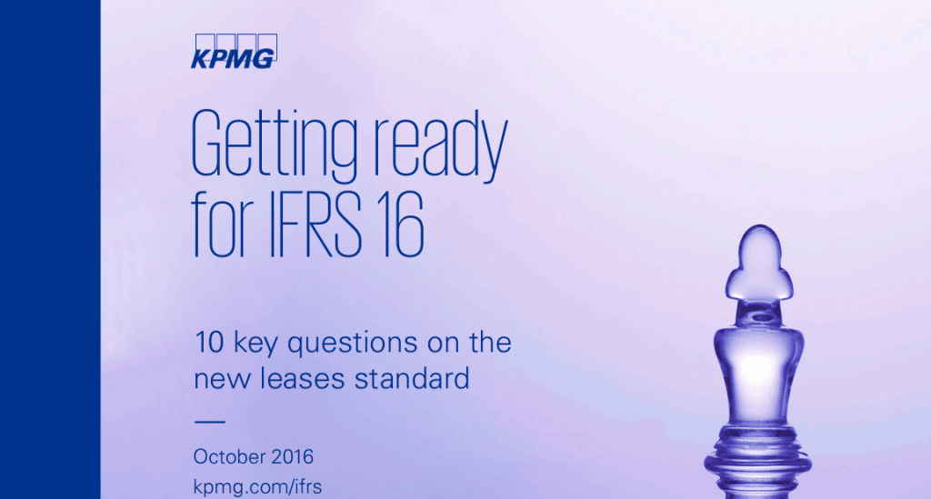
7. Global Retail Trends 2018 by KPMG

Crisp and clear, the choice of sans serif fonts keeps your report looking sleek, modern, and supremely legible when presenting. While your choice of font may be constricted by brand guidelines or house style, regardless, a good rule of thumb in your report presentation is to use clear, minimally-styled fonts so your message doesn’t get lost in a web of visual distraction.
Make Use of Report Presentation Visuals
This presentation has been viewed over 87,500 times, making it a great example of what works in an educational deck. The use of screengrabs gives both current and potential clients better recognition of your services or products. It’s also been proven that visual elements attract clients better.
Smart use of custom illustrations and images helps audiences to instantly identify with each pain point. Good, relevant visuals amplify your message because they elicit emotional responses, helping your audience retain key points.

The first half of the presentation has a strong storytelling quality bolstered by great illustrations to help set up the second half – where the important data is presented. Our brains process images faster than words, so this is a good hack to getting messages across more effectively.
Stay Organized
Having a table of contents to display on the side of the slide helps prevent audience fatigue – often when a presentation is too long, the audience’s retention rate starts to slip. A “tracking” tool like this can serve as a visual cue so that your audience knows where they are, and what they can expect next.
There is a clear flow to this presentation – it starts with introducing some key statistics, which eventually leads up to why these statistics matter, and ends with what the proposed solution is. It’s all very organized. Another great thing about this presentation is that it uses graphics to reinforce, not distract from, its key points (slides 22–29).
Speak to Your Audience, Not at Them
This is an all-around stellar presentation, which makes use of an active voice (“we did this…”, “we found this…”, “my digital strategy is…”) to better connect with the audience. The use of conversational copy, straightforward messages, and a consistent aesthetic theme make this one of our favorite report presentations to share with our users.
At strategic points in this long presentation, polls are taken to keep the audience engaged and give them a break from information overload. By asking them to reflect on their current status and thoughts, they are “primed” into receiving what the presenter next has to say.
This is another example of keeping your audience engaged through the use of questions (slides 2, 3 & 7). The questions’ tone and voice were also creatively and intelligently crafted because it uses FOMO (fear of missing out) to ensure customers want to listen.
Break Your Report Presentation Down
The title speaks for itself – breaking down your solution step-by-step is one of the best ways to create an effective presentation. The smart use of “hit or myth?” in each of its slides also gets the audience to reflect on their own experiences and (potentially false) impressions of the industry.
There is a lot to say in this presentation about the findings and impact of IoT on various industries, but Deloitte presents it in a way that keeps it relevant – by using a question-and-answer format that works to connect rather than alienate the audience.
This is a prime example of how you can capitalize on the “listicle” style of writing to present your main points with supreme clarity and persuasiveness. Notice that each of the 10 steps is supplemented by key statistics? That’s how you can add weight to what you’re saying without overloading the audience with too many graphs and data charts.
Give Actionable Insight in Your Report Presentation
What makes a great consultant is his or her ability to go beyond surface data to give customers real, actionable insight. Not only does this presentation by PwC provide step-by-step recommendations (slides 15–18), but it uses real case studies and testimonials to boost credibility and illustrate value.
Identified an issue? Great. Worked out a solution? Even better. This presentation breaks down its proposed solution through one message per slide, punctuated by a relevant graphic that reinforces its key point. It’s clean, clear, and effective.
Personalization works in every industry. The next time you prepare a presentation, think about how you can give tailored advice to the unique stakeholders involved (slides 30–33).
Keep Your Report Presentation Short and Sweet
There’s a reason why TED talks are only 18 minutes or less – any longer and the speaker will lose the audience’s attention. Taking this advice, keep your report presentations short whenever possible. This example by Deloitte depicts a smart way to keep things bite-sized yet meaty, and also publicizes all your white papers and articles in one place.
This compact presentation is a great example of how to summarize all your key findings in less than 10 slides. When you force yourself to reduce clutter, you start being more discerning about what you include. Remember, what you find interesting may not be the same as what the audience finds relevant. Don’t get too attached, and be prepared to edit down.
Try using a report presentation as a “preview” for your full suite of business services. This way, you summarize your best points to potential clients, and if what you’ve said interests them enough, they will be more invested in a follow-up meeting.
The key to doing this successfully, however, is that whatever few points you choose to present need to be accompanied by some form of tailored business solution or insight into their specific needs.
Don’t Forget to Take Credit
It seems obvious, but you would be surprised how many times consultants neglect to put their profile image and professional business contact information at the end of each report.
There are many reasons to do so, but most importantly, it helps your potential business client remember you better. The truth is, we remember faces better than names, and adding this information allows them to reach out if they’re interested in a follow-up oppurtunity.
“Simplified and impressive reporting in one landscape. Quick templates are present for impressive graphical visualizations! Ease of use, upload and export options.” – Derrick Keith, Associate Consultant at KPMG
Easily create reports, infographics, posters, brochures, and more with Piktochart. Sign up for free.
Audience First
Clarity of thought translates directly into how succinct your presentation comes off. A key presentation design tip is that your slide deck should always be the last thing you tackle – structure and story come first. It may not be that surprising of a reveal if we were to tell you: The elements that make a business consultant’s report presentation great are almost the same that make any presentation great.
At the end of the day, keep your audience at the center, be creative and thoughtful of their needs; use design and visuals to your advantage and integrate them early on, not as an afterthought. And remember: Even with more options, sometimes, less is more.
Time to Make Your Own
Now that you’re thoroughly inspired and well-versed in report presentation creation, it’s time to make your own using the tips from this article. At Piktochart, we have a handful of slick and highly customizable templates to help you create impactful report presentations. Just search in our reports and presentation templates database and take a look at a few examples below.
1. Monthly Marketing Report Template

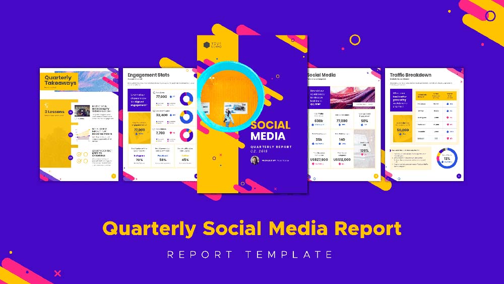
2. Social Media Report Template
3. Monthly Progress Report Template

4. Client Research Report Template

5. Monthly Sales Report Template

6. Social Media Audience Report Template

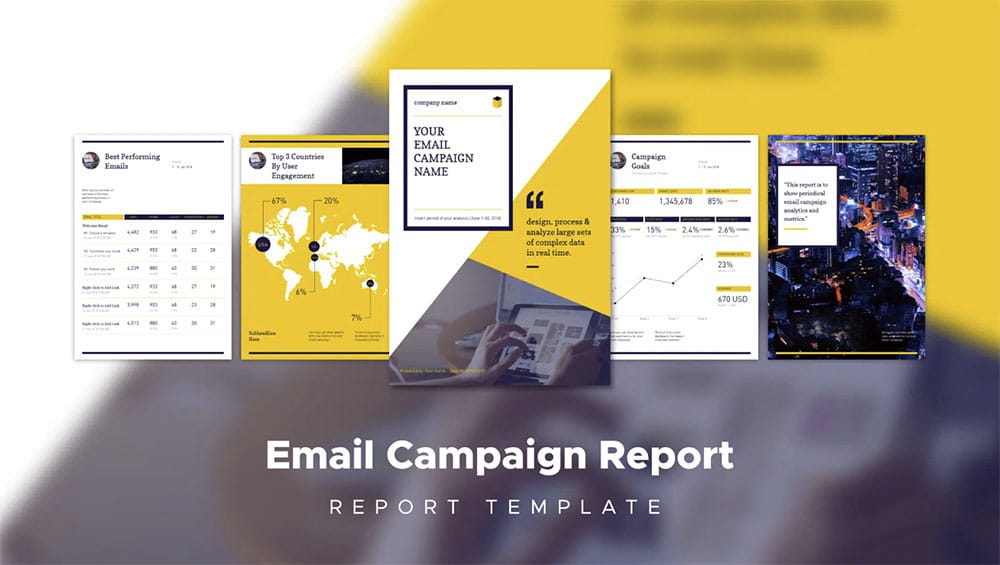
7. Email Campaign Report Template
Create a professional visual without graphic design experience.
Watch this free demo to learn about Piktochart.
Watch the demo