Have you ever found yourself stuck while trying to explain a complex concept to someone? Or struggling to put your idea into words?
This is where diagrams come in.
While simple text is best for highlighting figures or information, diagrams are handy for conveying complex ideas and loads of information without overwhelming your audience. They can visualize almost anything, from numerical data to qualitative relationships, making them versatile tools in numerous fields.
Whether you’re in the academe or enterprise setting, this guide is for you. We’ll explore the different types of diagrams with a brief explanation for each type, the best time to use a diagram type, and how you can use them to be a better visual storyteller and communicator. You’ll also find examples and templates for each type of diagram.
Let’s get on with it.
You can also follow along by creating a free account. Select a template to get started.
What exactly is a diagram?
A diagram is a visual snapshot of information. Think of diagrams as visual representations of data or information that communicate a concept, idea, or process in a simplified and easily understandable way. You can also use them to illustrate relationships, hierarchies, cycles, or workflows.
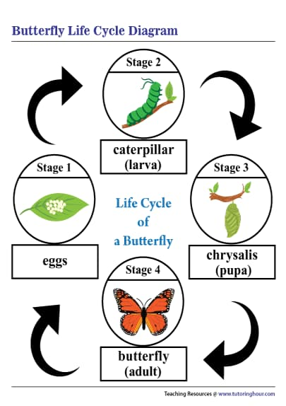
Diagrams aren’t just used to show quantitative data, such as sales earnings or satisfaction ratings with a diagram. They’re equally helpful if you want to share qualitative data. For example, a diagram could be used to illustrate the life cycle of a butterfly, showcasing each transformation stage.
Now, let’s jump into the various types of diagrams, ranging from simple flow charts to the more complex Unified Modeling Language (UML) diagrams.
18 diagram types and when to use each type
Whether you’re doing data analysis or need a simple visual representation of data, there is a wide array of diagrams at your fingertips. If you’re having a hard time choosing the right diagram for your data visualization needs, use the list below as a quick guide.
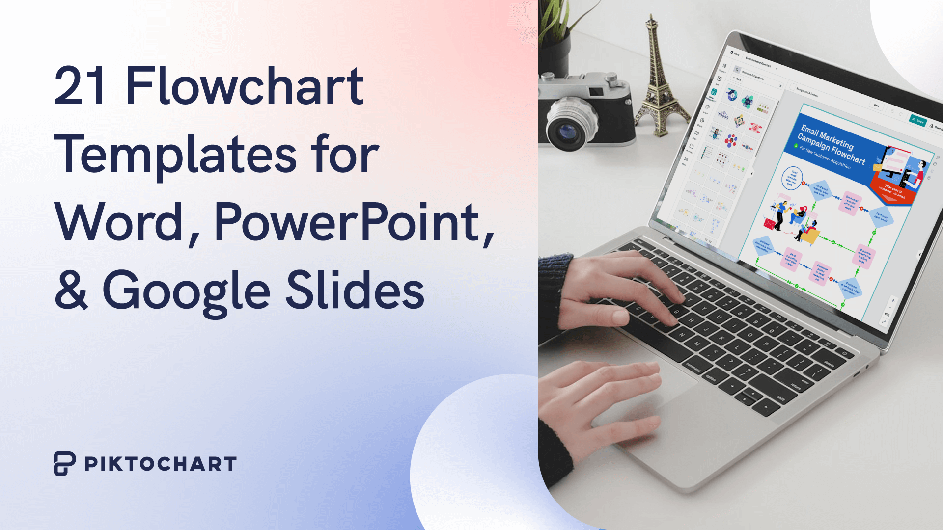
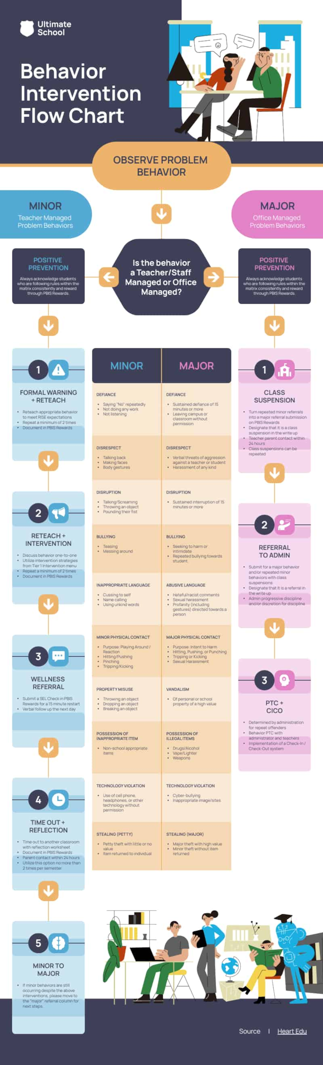
1. Flowchart
A flowchart is a type of diagram that acts as a roadmap for a process or workflow. It uses shapes and arrows to guide you through each step, making complex procedures simple to understand.
Flowcharts are best for: Simplifying complex processes into understandable stages, making it easier for your readers to follow along and see the ‘big picture”.
2. Line graph
Line graphs, sometimes called line charts, visualizes numerical data points connected by straight lines. In a line graph or line chart, data points representing different time periods are plotted and connected by a line. This helps with easy visualization of trends and patterns.
Line graphs are best for: Representing the change of one or more quantities over time, making them excellent for tracking the progression of data points.

3. Bar chart
A bar chart, often interchangeable with bar graphs, is a type of diagram used primarily to display and compare data. For this diagram type, rectangular bars of varying lengths represent data of different categories or groups. Each bar represents a category, and the length or height of the bar corresponds to the numeric data or quantity.
Variations of bar charts include stacked bar charts, grouped bar charts, and horizontal bar charts.
Bar charts are best for: Comparing the frequency, count, or other measures (such as average) for different categories or groups. A bar chart is particularly useful if you want to display data sets that can be grouped into categories.
4. Circle diagram or pie chart
A pie chart is a circular diagram that represents data in slices. Each slice of the pie chart represents a different category and its proportion to the whole.
Pie charts are best for: Displaying categorical data where you want to highlight each category’s percentage of the total.
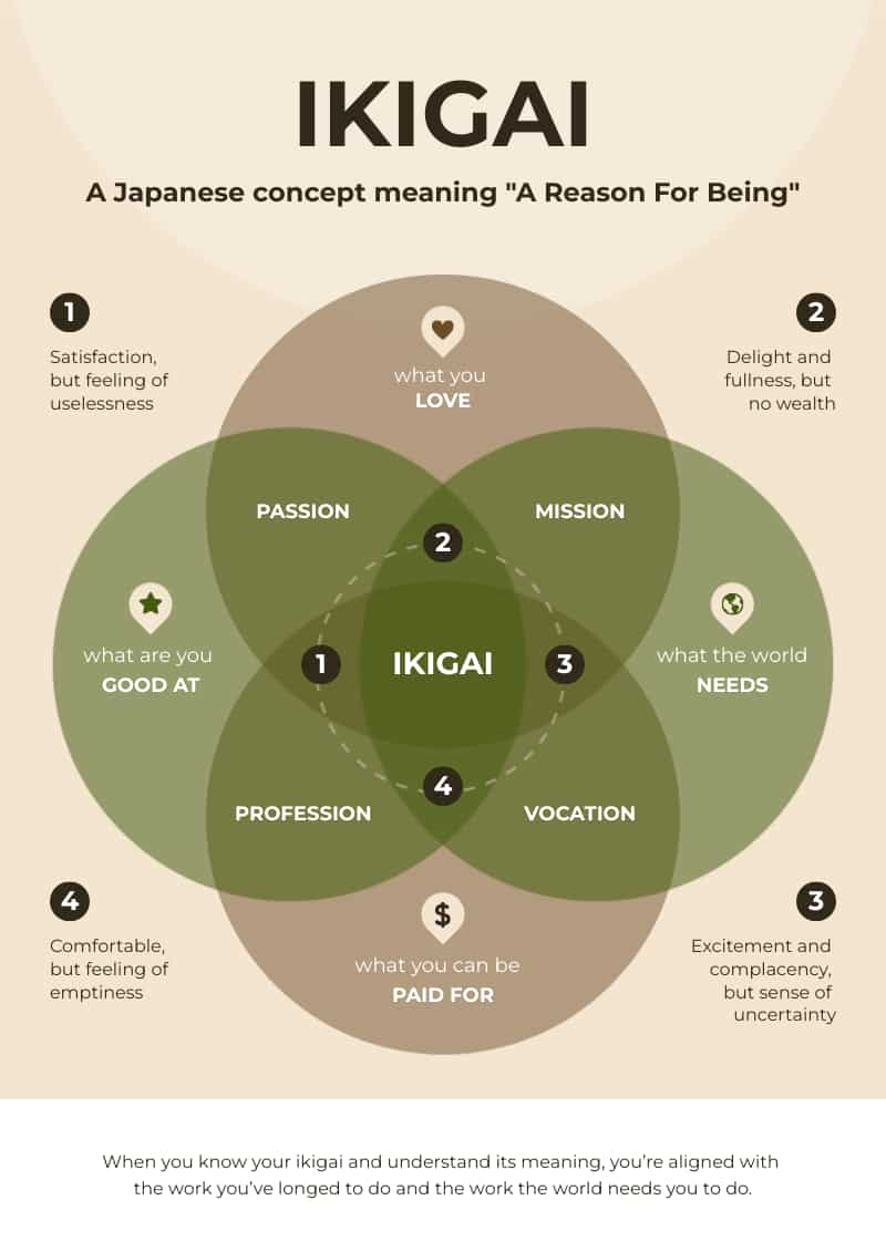
5.Venn diagrams
A Venn diagram compares the differences and similarities of groups of things. As a diagram based on overlapping circles, each circle in a Venn diagram represents a different set, and their overlap represents the intersection of the data sets.
Venn diagrams are best for: Visualizing the relationships between different groups of things. They are helpful when you want to show areas of overlap between elements. A good example is if you want to compare the features of different products or two overlapping concepts, like in the Ikigai Venn diagram template below. Easily create your Venn diagram with Piktochart’s online Venn diagram maker.
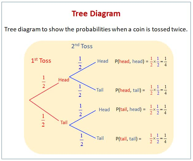
6. Tree diagrams
A tree diagram is a diagram that starts with one central idea and expands with branching lines to show multiple paths, all possible outcomes, decisions, or steps. Each ‘branch’ represents a possible outcome or decision in a tree diagram, moving from left to right.
Tree diagrams are best for: Representing hierarchy like organizational roles, evolutionary relationships, or possible outcomes of events like when a company launches a product.
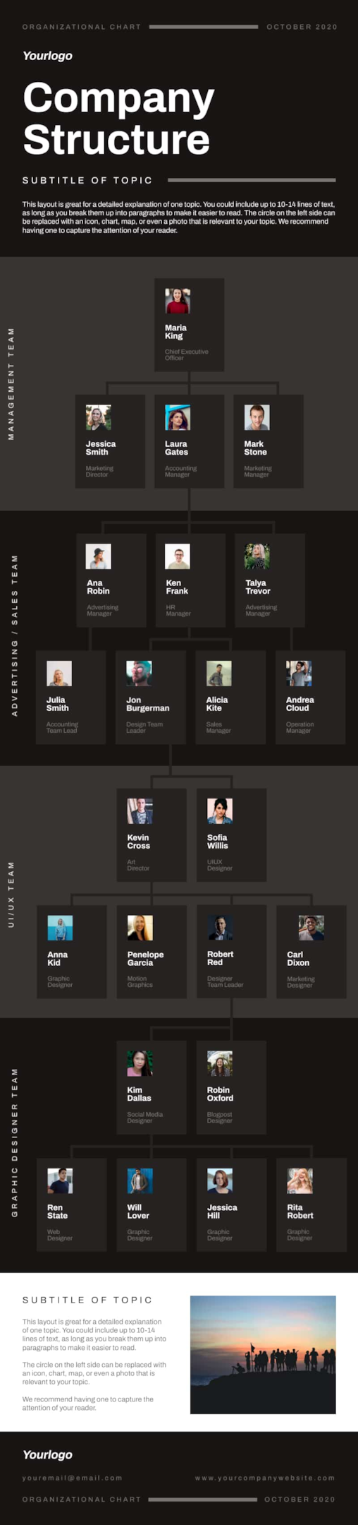
7. Organizational chart
Organizational charts are diagrams used to display the structure of an organization. In an organizational chart, each box or node represents a different role or department, and lines connecting the boxes illustrate the lines of authority, communication, and responsibility. The chart typically starts with the highest-ranking individual or body (like a CEO or Board of Directors) at the top and branches downwards to various levels of management and individual employees.
Organizational charts are best for: Showing relationships between different members and departments in a company or organization.
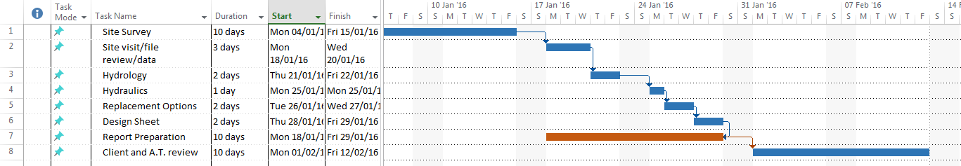
8. Gantt charts
Gantt charts are typically used in project management to represent the timeline of a project. They consist of horizontal bars, with each bar representing a task or activity.
For this type of diagram, each chart is represented by a horizontal bar spanning from its start date to its end date. The length of the bar corresponds to the duration of the task. Tasks are listed vertically, often in the order they need to be completed. In some projects, tasks are grouped under larger, overarching activities or phases.
Gantt charts are best for: Projects where you need to manage multiple tasks that occur over time, often in a specific sequence, and may depend on each other.
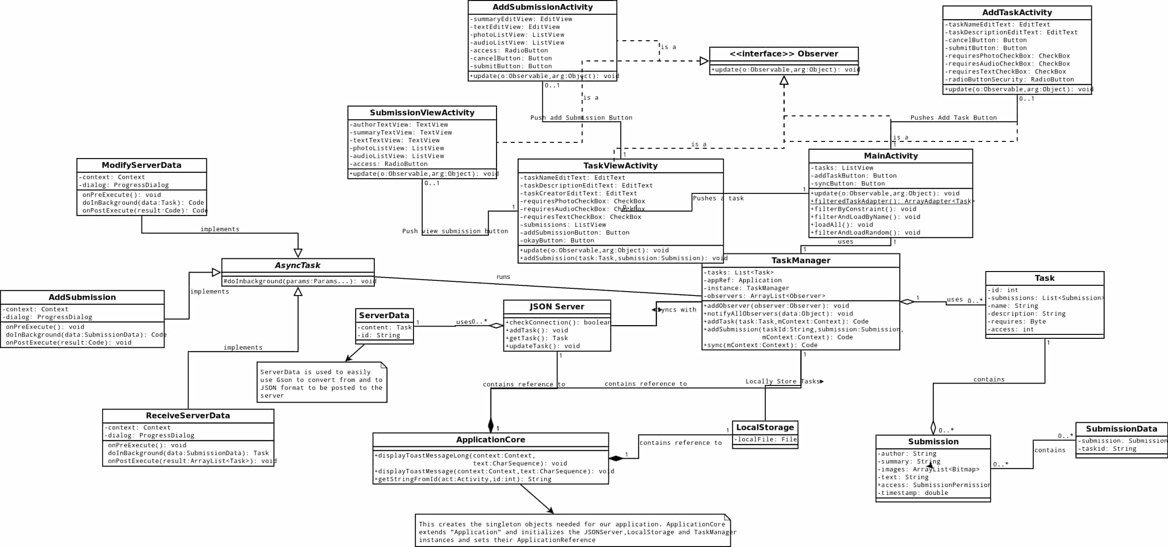
9. Unified Modeling Language (UML) diagram
Software engineers use Unified Modeling Language (UML) diagrams to create standardized diagrams that illustrate the building blocks of a software system.
UML diagrams, such as class diagrams, sequence diagrams, and state diagrams, provide different perspectives on complex systems. Class diagrams depict a system’s static structure, displaying classes, attributes, and relationships. Meanwhile, sequence diagrams illustrate interactions and communication between system entities, providing insight into system functionality.
UML diagrams are best for: Visualizing a software system’s architecture in software engineering.
10. SWOT analysis diagrams
A SWOT analysis diagram is used in business strategy for evaluating internal and external factors affecting the organization. The acronym stands for Strengths, Weaknesses, Opportunities, and Threats. Each category is represented in a quadrant chart, providing a comprehensive view of the business landscape.
SWOT diagrams are best for: Strategic planning and decision-making. They represent data that can help identify areas of competitive advantage and inform strategy development.
Piktochart offers professionally-designed templates to create diagrams, reports, presentations, brochures, and more. Sign up for a free account today to create impressive visuals within minutes.
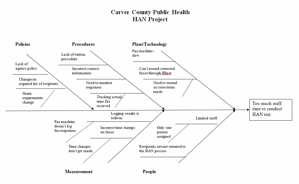
11. Fishbone diagram
Fishbone diagrams, sometimes called cause-and-effect diagrams, are used to represent the causes of a problem. They consist of a central idea, with different diagrams or branches representing the factors contributing to the problem.
Fishbone diagrams are best for: Brainstorming and problem-solving sessions.
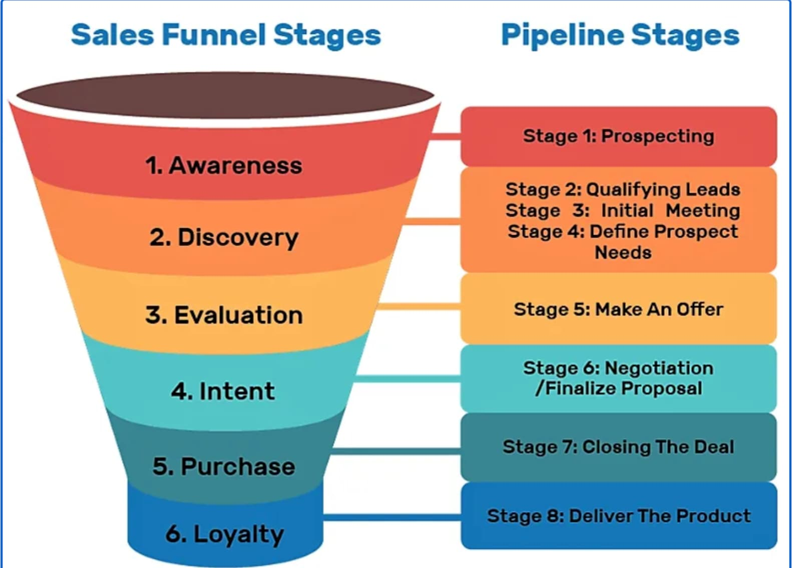
12. Funnel chart
A funnel chart is a type of diagram used to represent stages or progress. In a funnel chart, each stage is represented by a horizontal bar, and the length of the bar corresponds to the quantity or value at that stage. The chart is widest at the top, where the quantity or value is greatest, and narrows down to represent the decrease at each subsequent stage.
Funnel charts are best for: Visual representation of the sales pipeline or data visualization of how a broad market is narrowed down into potential leads and a select group of customers.
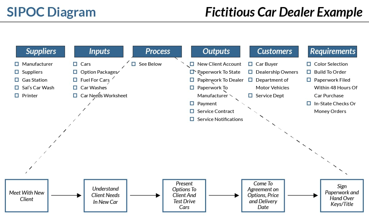
13. SIPOC diagrams
A SIPOC diagram is used in process improvement to represent the different components of a process. The acronym stands for Suppliers, Inputs, Process, Outputs, and Customers.
SIPOC diagrams are best for: Providing a high-level view of a process which helps visualize the sequence of events and their interconnections.
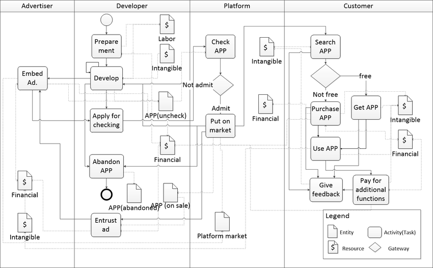
14. Swimlane diagrams
Swimlane diagrams are best for mapping out complex processes that involve multiple participants or groups.
Keep in mind that each lane (which can be either horizontal or vertical) in a swimlane diagram represents a different participant or group involved in the process. The steps or activities carried out by each participant are plotted within their respective lanes. This helps clarify roles and responsibilities as well as the sequence of events and points of interaction.
Swimlane diagrams are best for: Visualizing how different roles or departments interact and collaborate throughout a workflow or process.
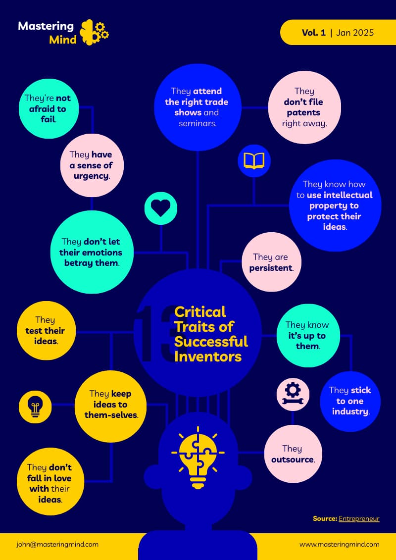
15. Mind maps
A mind map starts with a central idea and expands outward to include supporting ideas, related subtopics, concepts, or tasks, which can be further subdivided as needed. The branches radiating out from the central idea represent hierarchical relationships and connections between the different pieces of information in a mind map.
Mind maps are best for: Brainstorming, taking notes, organizing information, and visualizing complex concepts in a digestible format.
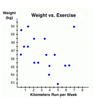
16. Scatter Plots
Scatter plots are used to compare data and represent the relationship between two variables. In a scatter plot, each dot represents a data point with its position along the x and y axes representing the values of two variables.
Scatter plots are best for: Observing relationships and trends between the two variables. These scatter plots are useful for regression analysis, hypothesis testing, and data exploration in various fields such as statistics, economics, and natural sciences.
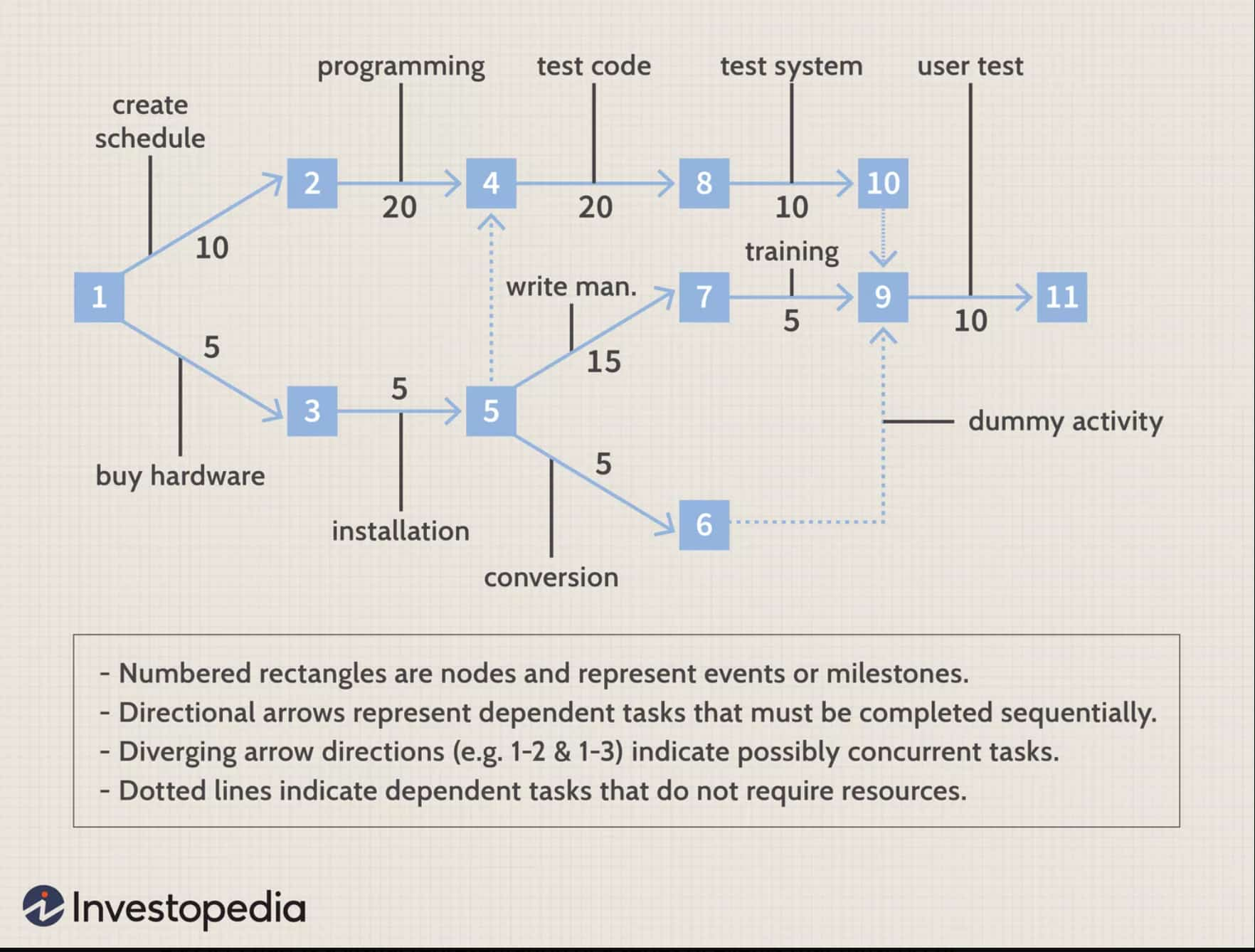
17. PERT chart
PERT (Project Evaluation Review Technique) charts are project management tools used to schedule tasks. Each node or arrow represents each task, while lines represent dependencies between tasks. The chart includes task duration and earliest/latest start/end times.
Construction project managers often use PERT charts to schedule tasks like design, site prep, construction, and inspection. Identifying the critical path helps focus resources on tasks that impact the project timeline.
PERT charts are best for: Visualizing the sequence of tasks, the time required for each task, and project timelines.
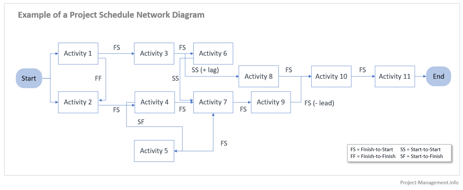
18. Network diagrams
A network diagram visually represents the relationships between elements in a system or project. In network diagrams, each node represents an element, such as a device in a computer network or a task in a project. The lines or arrows connecting the nodes represent the relationships or interactions between these elements.
Network diagrams are best for: Visually representing the relationships or connections between different elements in a system or a project. They are often used in telecommunications, computer networking, project management, and organization planning.
Choosing the right diagram starts with a good understanding of your audience
Understanding your audience’s needs, expectations, and context is necessary before designing diagrams. The best diagram is not the one that looks the most impressive but the one that communicates complex information most clearly and effectively to your intended audience.
Make professional diagrams for free with no design experience with Piktochart’s online diagram maker. Sign up for free.