
Like a seasoned artist painting with colors, you too can craft a compelling narrative with effective use of images. It’s not just about pretty pictures; it’s about stirring emotions that moves viewers to action.
Through this article, you’ll learn the elements of effective visual storytelling and how to use them to drive emotions.
Let’s dive into the exciting world of visual narration and discover how you can transform your content into an interactive masterpiece.
You can also jump right into creating visuals with Piktochart by accessing our template gallery. Sign up for free to get started.
Table of Contents
Key Takeaways
- Engagement and user experience should be prioritized in visual storytelling by aligning techniques with the target audience’s expectations and providing a clear narrative journey.
- Strategic use of interactive elements can elevate your visual stories, but it’s important to maintain a balance to avoid overwhelming viewers.
- Data can be effectively presented in visual stories through infographics, charts, and graphs, creating compelling and reader-friendly content.
What is Visual Storytelling: A Visual Journey
It’s the art of using images, graphics, and other visual elements to tell a story that engages and inspires whoever is attending your presentation.
The power of visual stories lies in their ability to immerse viewers into a different world while delivering a message effectively.
The core elements of any story include:
- plot
- characters
- conflict
- theme
- resolution
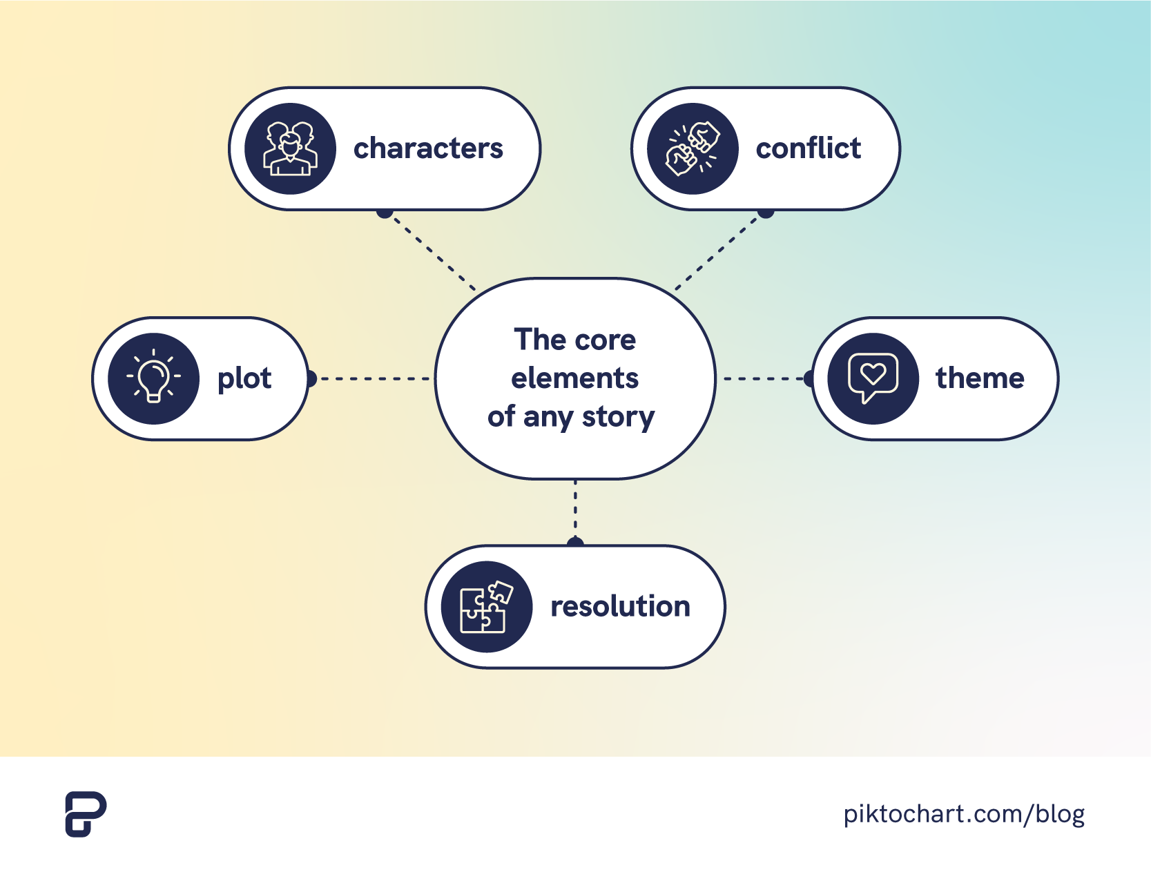
Balancing these elements can create compelling narratives that engage viewers. In films or series, you’re trying to create tension as viewers follow the hero’s journey.
Beyond consumer series, visual storytelling plays a large role in the workplace as well.
However, using the right image or employing enhanced graphics isn’t just nice-to-haves.
They’re an essential tool for learning and retaining information.
Why Visual Storytelling Matters
So why does visual storytelling matter?
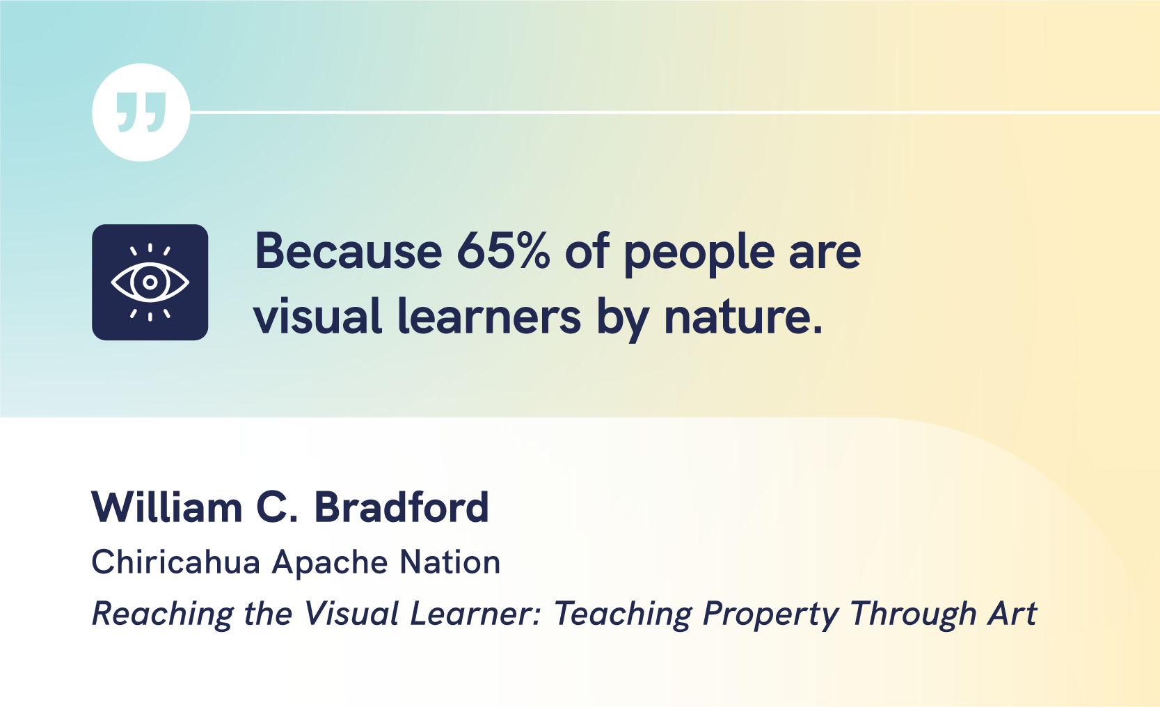
Because 65% of people are visual learners by nature.
An effective image can convey a complex idea instantly, sparking emotions or reactions that long-form content alone may fail to ignite.
In fact, we only have 10 minutes to get the audience’s attention and communicate our story. During that time, we need to keep it short and snappy while luring readers to become more invested in the core message.
One way to hold someone’s attention is using using the right images. They can change the entire experience and create lasting impressions by appealing directly to our senses.
The aspects of visual learning – seeing, interpreting, understanding – allow for deeper connections with the material presented.
Elements of Effective Visual Storytelling
Whether it’s children’s picture books or a brand’s content marketing strategy, the best narratives follow the same principles and employ the same elements.
Imagery, composition, colors, and typography are all essential components of this art form. Visual storytelling works when these elements are combined together.
Let’s dive deeper into each element so we understand how they work on their own and in tandem with each other.
Imagery
Using imagery in presentations or reports can simplify or enhance textual information, adding a layer of relatability and context.
Images can evoke emotions and drive engagement. It makes data-heavy presentations relatable, ensuring key messages resonate deeply with audiences.
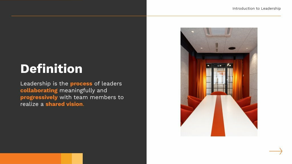
Consider you present a slide on diversity. Instead of a simple pie chart, it showcases diverse employee portraits surrounding the chart, instilling both an emotional connection and clearer understanding of the company’s demographic makeup.
Composition
Composition is basically how you structure your layout of visuals and text in an organized manner.
It’s the roadmap that guides an audience’s eyes through a slide or report, establishing a hierarchy of information.
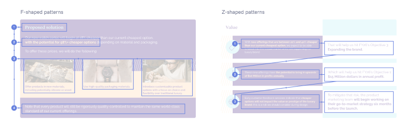
There’s a hierarchy in visual representation based on how we process information. It defines the order in which viewers perceive what they see. A well-organized composition offers clarity, reducing the time spent deciphering complex data, and makes communications more efficient.
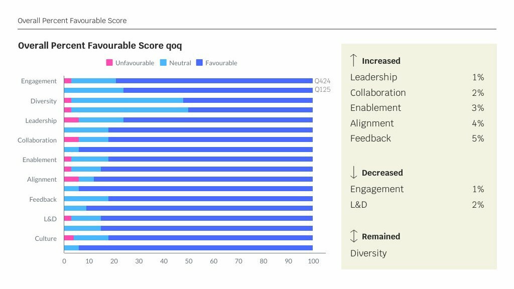
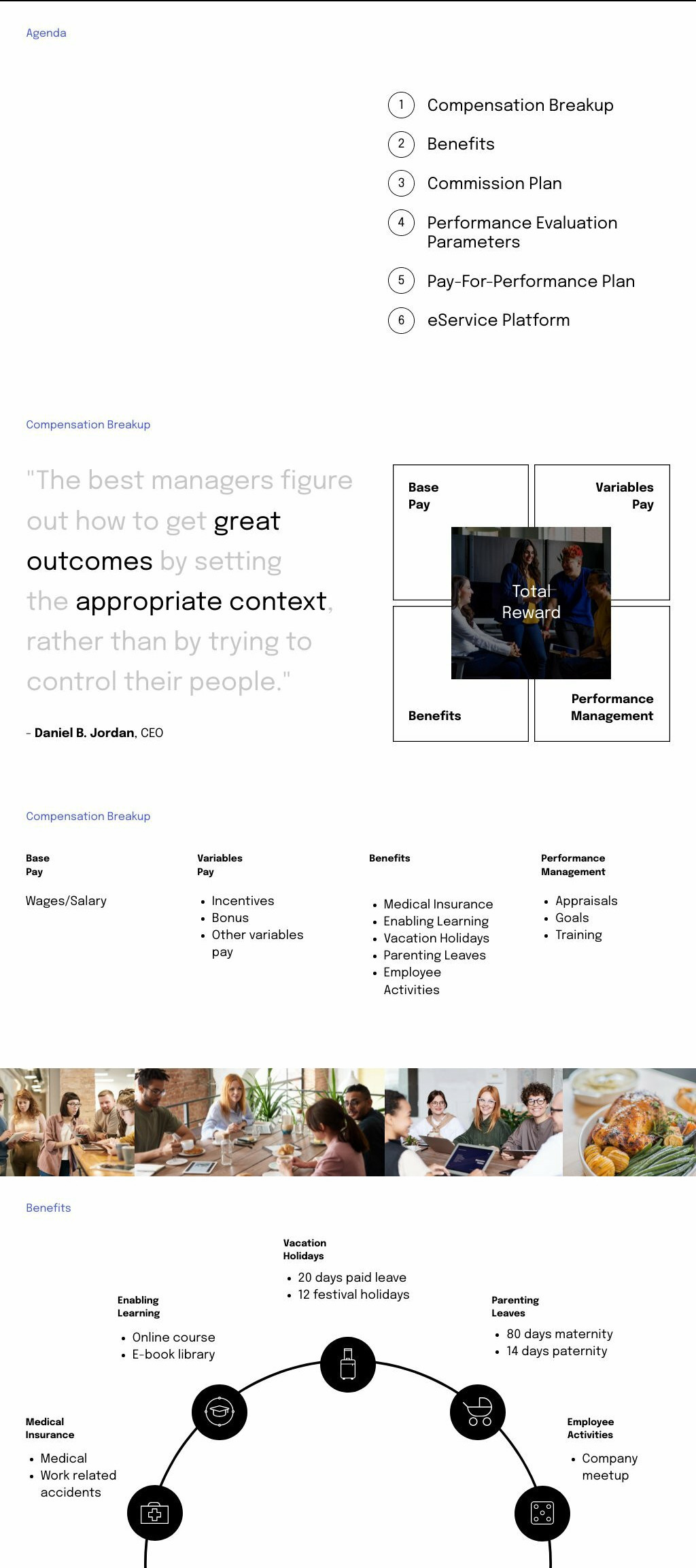
Imagine a slide showing quarterly turnover rates. A central, larger figure represents the company average, with smaller, peripheral figures showcasing departmental rates. This composition immediately emphasizes the overarching data while still providing a detailed breakdown.
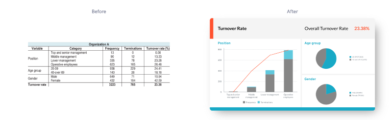
Image source
Colors
Colors act as silent narrators in visual storytelling.
Think of visual content as a symphony and colors as its melodies.
When presenting reports or sharing data, choosing the right colors can amplify your message. Picking the right color in your visual narrative can evoke emotions, highlight priorities, and segment information.
For example, a presentation detailing employee engagement using varying shades of blue and red can indicate the level of engagement. A deeper hue is a strong visual cue for senior leaders to see what’s working, while rows with a lighter one might indicate areas that require attention.
If you’re uncertain which colors to use, try applying the Rule of 3 Colors. Start with a primary color, then pick two more to compliment it.
This color palette can start as your foundation, and you can use additional colors as a contrast to accent certain statistics or points when needed.
Typography
Typography goes beyond just choosing a font. You also have to take into account font choice, spacing, size, and hierarchy.
Effective typography ensures clarity, sets tone, and emphasizes important messages, making reports and presentations more digestible. As part of brand storytelling, it conveys mood and tone, giving voice to your tale in ways words alone cannot.
To start, consider picking from one of seven main types of fonts:
- Serif
- Sans-serif
- Script
- Display
- Slab
They each have their own purpose and effect. Choosing the “best” font depends on your brand voice and style.
Let’s say you held a presentation on company values. A bold, large typeface could emphasize core values, while a refined script underneath provides a brief description, guiding eyes and emphasizing importance seamlessly.
Remember, graphic design is more than aesthetics. Typography is a powerful way to guide readers through your story visually.
Types of Visual Storytelling
From the concise clarity of infographics and the revealing patterns in various charts and graphs to the sequential coherence of timelines, storyboards, flowcharts, and diagrams, these visual mediums provide unique insights that can transform data into compelling narratives.
To give your visual narrative structure, there are several types of visual mediums, each with its own nuances.
For you to use visual storytelling effectively, it helps to know what formats you can use in different situations.
Let’s start with infographics.
Piktochart has hundreds of infographic templates for you to choose from. Get started with a free account.
Infographics
With infographics, you can present complex data in an easily digestible and visually appealing manner.
Infographics use visuals to simplify intricate details, making it easier for audiences to comprehend.
You can transform a large passage of text that might take 30 minutes to an hour to understand into an interesting story that maintains the central focus on a core topic but only takes 20 seconds to communicate.
As a staple of visual storytelling examples, infographics are versatile and can be used in many situations. We discovered there are ten types of infographics, and each can tell a different story.
Within the same infographic, you can seamlessly blend multiple types of images or data visualization diagrams to reorient your audience’s perception around your main message.
But when creating your own visual content, it doesn’t have to be complex. An infographic can be as simple as a “Men at Work” construction sign, indicating that a construction project is going on.
Different types of charts and graphs
There’s no better way to transform raw data into visual forms that make comparisons and spotting trends intuitive.
When it comes to data visualization, there’re various types of charts and graphs that can be used effectively, such as:
- Pie charts
- Bar graphs
- Line diagrams
These data visualization diagrams could become your best allies in visual storytelling efforts.
However, it’s worth keeping in mind that your goal is to convey a story or idea efficiently. To this end, including the right type of chart or graph can clearly and quickly share information.

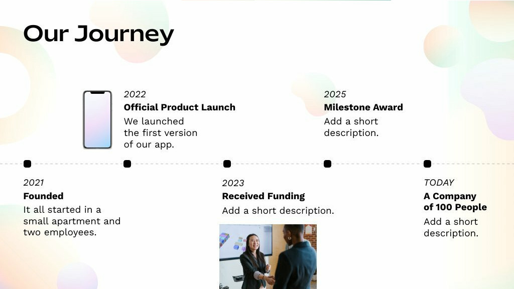
Timeline
In your next project, consider using a timeline to neatly arrange events in chronological order. It’s an effective way to present historical data or the progression of an idea.
For example, you might highlight key moments in a company’s history or illustrate the development of a groundbreaking product using visual media such as photos, videos, or infographics.
Try our timeline maker to access professionally designed templates for a variety of purposes for free.
Storyboards
Storyboards are exceptional for planning and organizing your presentation, offering a preview of how the story unfolds. They give you room for experimentation with different types of images, allowing you to perfect your tale before it reaches your audience. A presentation maker can help you cover all your bases and provide you with a variety of outlines to work with.
Storyboards are particularly effective for visual learners, helping them grasp complex ideas more easily. Remember, a good story isn’t just about words; it’s about creating a compelling visual media experience effectively too.

Flowcharts
Like a visual GPS, flowcharts guide audiences through complex information, making it easily digestible and memorable. The diagrams often use standardized symbols connected with arrows to signify flow or sequence.
Few diagrams beat flowcharts when you need to show how a system or process works.
The beauty of flowcharts is that they simplify complex processes.
By mapping out what the different steps in a process are and who is responsible for each step, they clarify responsibilities, improve efficiency, and identify potential bottlenecks or redundancies.
Consider onboarding procedures. A flowchart can visually outline the journey of a new employee, from initial orientation to various training sessions, ensuring no step is missed and clarifying the progression for all stakeholders involved.

Video storytelling
Videos are a flexible way of getting a viewer’s attention and sharing a story by using great visual metaphors and elements, staged with an emotional visual media experience.
The great thing about videos is that you don’t even need text or speech to communicate your message. From filming angles to color grading, every detail contributes to the narrative.
Consider silent films, commercials, or music videos where no words are spoken yet a story is told effectively.
How to Craft an Effective Visual Story
With all the tools in place, let’s explore how to craft a powerful visual narrative.
Once you’ve crafted the copy in your presentation, you might be at the juncture of adding some visual aids.
The best way to approach this is to think of your presentation or report as a jigsaw puzzle, with each piece of the overall image seamlessly fitting together.
Every element you add needs to help the story unfold.
Let’s start with making sure your target audience is at the heart of your story.
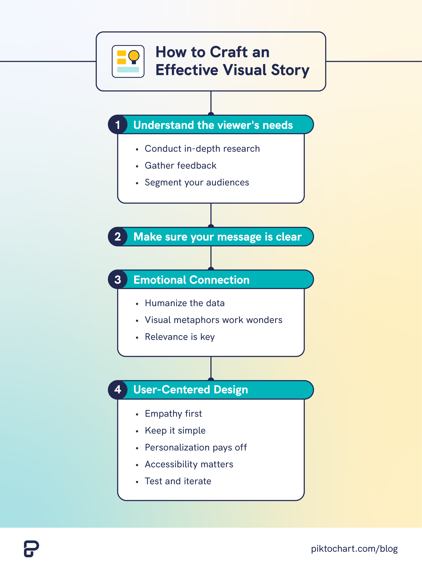
Understand the viewer’s needs
It’s not enough to just produce the raw stats and information in presentation slides. You must tailor the content that matches your audience’s needs.
As mentioned earlier, you only have 10 minutes to really capture your viewer’s attention and get the point across. To increase the odds of your message landing, reframe the presentation so the viewer understands what the problem is, how it affects them, and what the potential solutions are.
Creating a better presentation with effective visual storytelling starts with understanding your audience.
Here are four ways to prepare:
- Conduct in-depth research: Learn who the audience is, what their current challenges are, and what ideal outcome they’re looking for.
- Gather feedback: Use surveys or interviews to learn more about their situation and what expectations they have of your presentation.
- Segment your audiences: If you’re presenting to a larger demographic with a diverse range of participants, it could help to segment the groups and create separate presentations that address the needs of each segment based on their expectations and needs.
Make sure your message is clear
There’s nothing more frustrating than sitting in a presentation that you’ve tried to make sense of but struggle to understand.
To spare your attendees from this type of headache, ensure the main message of the presentation is clear. However, when you create your presentation, knowing what to include and what to cut can be tricky when you’re editing your content.
A good rule of thumb to keep the central focus clear is to ask yourself, “does this image/text help the audience understand the problem better?”
Crafting a clear message is crucial when conveying your story. It’s what’ll resonate with the viewer and prompt them to take action. You’re painting a picture with words, so make sure each sentence contributes to that image.
To that end, your text and images should guide the viewer along a narrative.
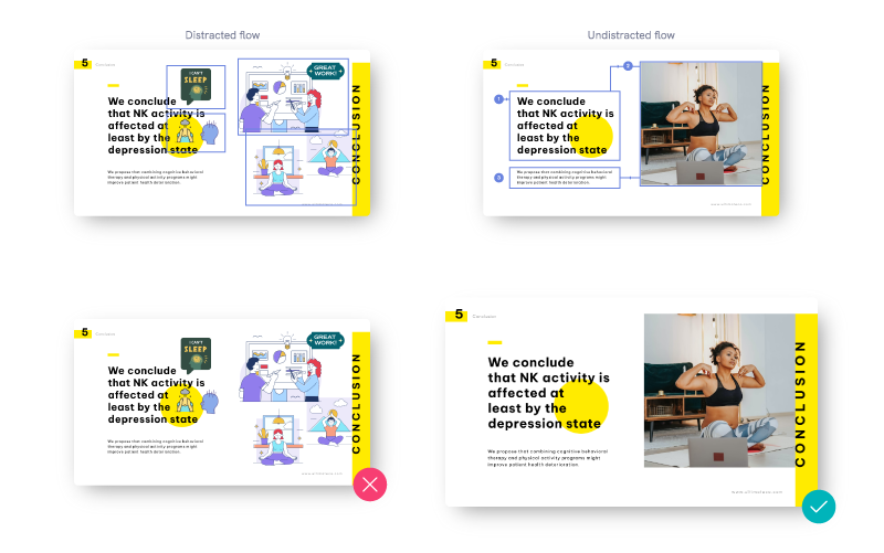
You don’t need to spell everything out—sometimes, you can let visual graphics or diagrams do some of the heavy lifting. But remember, every image should have purpose.
They’re not just there for decoration. They should enhance your story, add depth and context.
Emotional Connection
We’re all hardwired for stories that touch our emotions. It’s not just about sharing information; it’s about sharing it in a way that resonates. Here’s why and how:
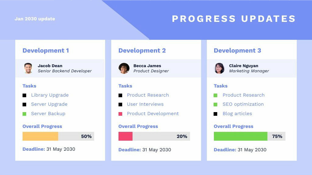
Humanize the data: Raw data can feel distant. Instead of writing out progress updates on various projects, consider pairing the numbers with images of real team members or anecdotes of personal growth and challenges. By doing so, you’re not just sharing numbers; you’re sharing human experiences.
Visual metaphors work wonders: Metaphors can bridge the gap between the abstract and the concrete. If you’re discussing the concept of team unity, an image of different instruments coming together in a symphony can be more evocative than mere words.

Relevance is key: Put yourself in the shoes of attendees and ask yourself, “Why should I care?”. When presenting to employees about a new policy or system, use images and stories that highlight how it directly impacts their daily lives. Instead of saying, “We have a new time-tracking system,” show an image of an employee enjoying more personal time, signifying efficient work hours.
You’re not just communicating policies or data. You’re interacting with people’s lives, aspirations, and concerns.
While conveying the right information is essential, doing it in a way that touches the heart ensures that the message is not just heard, but deeply felt and remembered.
User-Centered Design
As an HR professional, your role is pivotal in shaping an inclusive and effective workplace. When crafting presentations, a user-centered design isn’t just a buzzword; it’s a necessity. Here’s how you can make your presentations more intuitive:
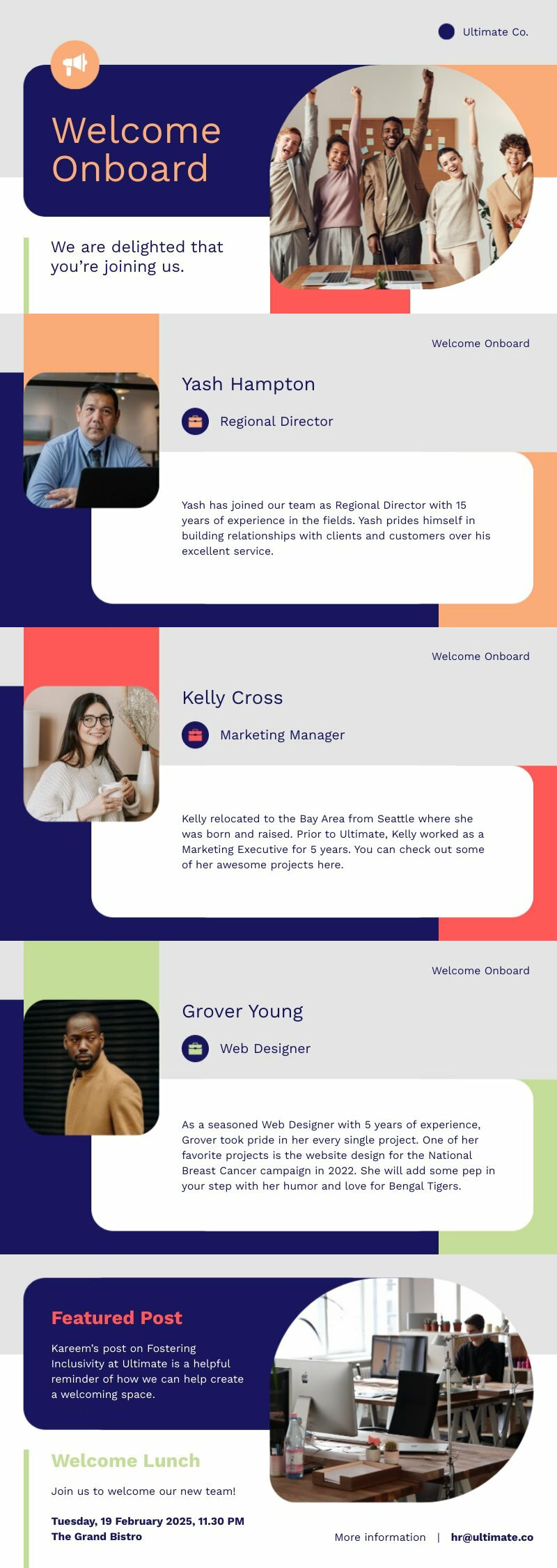
- Empathy first: Put yourself in the shoes of the viewer. Understand their needs, preferences, and pain points. If you’re presenting a new work-from-home policy, use an image or graphic that reflect an employee’s home setting—perhaps a kitchen table turned into a workspace, to make the connection real.
- Keep it simple: Complex layouts can be off-putting. Go for simple designs that guide the eye naturally from one point to another. Use arrows, lines, or contrasting colors to direct attention where you want it.
- Personalization pays off: People respond better when they feel the content is tailored for them. If presenting about career development, use real-world success stories of employees within your organization. Show their progression through simple visuals, like a ladder or growing plant.
- Accessibility matters: Ensure your visuals are inclusive. Use clear fonts, contrast-rich colors, and consider alternative text for images to ensure that the content is accessible to all employees, including those with disabilities.
- Test and iterate: Don’t assume what works; test it. Share your presentation with a small group first, collect feedback, and make necessary changes. Look for points where they seemed engaged or disengaged.
As an HR professional, you’re not just sharing information; you’re shaping an employee’s experience with the organization.
A user-centered design means creating presentations that resonate with your audience, making them feel seen, understood, and valued. In doing so, you’re not just conveying information, you’re building trust and fostering a positive work environment.
Tips to up Your Visual Storytelling Game
What makes visual storytelling important is that you can enhance your presentation by including a few tasteful graphics or images. Combined with basic storytelling techniques, viewers will buy into your story from the beginning.
That said, there are other ways you can level up your presentation or report beyond the basics.
You can jump right into using our presentation-maker and give the tips below a try for free.
Use different unordered list layouts
The beauty of presentations lies not just in the content, but also in its delivery.
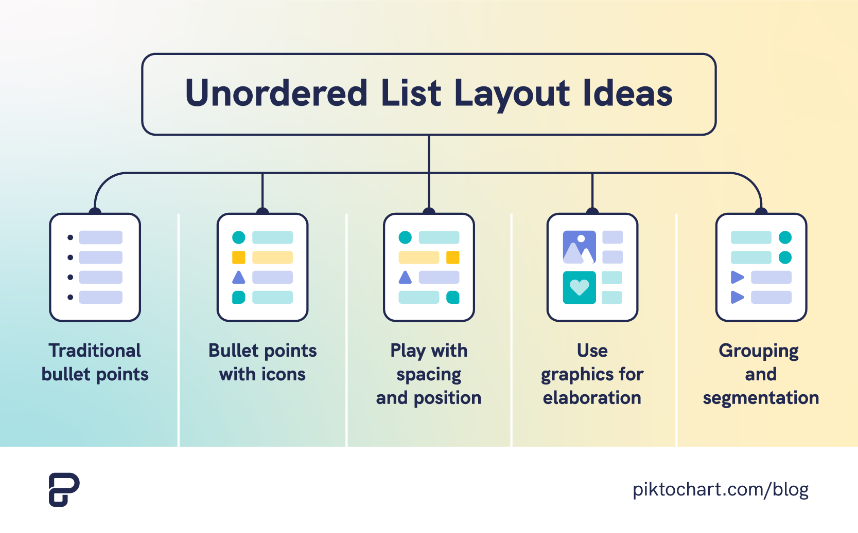
An unordered list, often represented by bullets or icons, breaks down complex information into digestible chunks. However, there’s more to these lists than mere dots. By experimenting with different unordered list layouts, you can add depth and variety to your slides.
- Understanding the basics: Traditional bullet points list information in a linear, top-to-bottom manner. It’s straightforward and serves most purposes. An unordered list layout, on the other hand, allows for creative variations, using icons, images, or varying indents to signify different types or levels of information.
- Choose meaningful icons: Instead of standard dots, opt for icons that reflect the content. Discussing benefits? Use a checkmark. Highlighting challenges? Consider an exclamation point. The visual cue adds another layer of understanding.
- Play with spacing and position: A centered list or one that zigzags across the slide can capture attention. This format can be particularly useful when you’re contrasting two sets of ideas or presenting a flow of thoughts.
- Use graphics for elaboration: Instead of just text, pair each bullet with a relevant image or a short infographic. This provides a dual layer of information, engaging both textual and visual learners.
- Grouping and segmentation: Use different shapes or color-coded bullets to group related points together. This helps viewers quickly grasp the structure and relationships between the points.
Presentations often involve sharing heaps of data, guidelines, and updates. Using varied unordered list layouts can break the monotony, making information absorption easier.
Remember, it’s not just about listing the facts, but doing so in a way that ensures clarity, engagement, and retention.
By varying list formats, you enhance comprehension while adding creativity to your presentation.
Use templates
Time is of the essence. But efficiency shouldn’t come at the cost of effectiveness.
This is where ready-to-use stickers and templates shine.
They not only save time but elevate the aesthetics and coherence of your presentations. Let’s delve deeper:
The power of familiarity: Using templates ensures a consistent visual theme across slides, fostering a sense of familiarity and cohesion. It sends a subliminal message of stability and organization to your audience.
Stickers and icons add personality: Think of stickers or icons as the emojis of presentations. They can convey emotions, emphasize points, or simply add a touch of flair. A sticker of a light bulb next to an innovative idea or a thumbs-up alongside a best practice can make your slide pop.

Tailored to suit the mood: Different presentations demand different vibes. A template designed for a festive company announcement will differ from one discussing quarterly reviews. By having a variety of templates at hand, you can easily match the tone of your message.
Remember that your aim is to ensure clear communication, but with an emotional touch. Stickers can provide that touch, making presentations feel more human and relatable.
Templates, on the other hand, ensure structure and consistency. In scenarios like onboarding sessions, policy updates, or team meetings, the use of these tools can enhance understanding, retention, and engagement.
A well-crafted presentation can inspire, motivate, and inform, and having the right tools at your disposal makes this task infinitely easier.
Elevate your presentations and leave a lasting impression
Browse Piktochart’s collection of professionally-designed presentation templates.
Browse Templates
Embrace negative space
An often-overlooked element, using negative space is where your creativity has room to stretch.
- Don’t fear emptiness: Negative space isn’t just empty space; it’s a powerful tool that can add depth and balance to your visual storytelling.
- Balance is key: Too much clutter can overwhelm your audience. Use negative space effectively to provide visual relief.
- Emphasize what matters: Strategically placed negative space can draw focus toward the most important elements of your story.
- Create intriguing shapes: Negative space isn’t always ‘negative’. It can form interesting shapes or patterns, adding another layer of intrigue.
Color psychology
Colors aren’t just about aesthetics; they speak a silent language, evoking emotions, driving actions, and setting the mood.
Harnessing the power of color psychology can amplify their visual storytelling and make presentations memorable.
Understanding color emotions: Different colors invoke different feelings. Blue conveys trust and calm, red signifies passion and urgency, while green often represents growth and peace. Recognizing these associations can help set the tone of your presentation.
Tailor to your viewers: Consider the cultural nuances of color when addressing diverse audiences. A color that’s considered positive in one culture might not have the same connotation in another.
Consistency is key: Maintaining a consistent color scheme not only looks professional but also aids in reinforcing brand identity and message continuity.
Creating focus: Use contrasting or bold colors to highlight key points or call-to-action elements. This can draw the audience’s attention to crucial areas of your slide. Using contrast can highlight key points when done well alongside your brand colors.
Maintain readability: While playing with colors can be fun, it’s vital to ensure text remains legible. Ensure there’s enough contrast between background and text colors.
Microinteractions
You’re likely to find microinteractions quite useful in enhancing user experience and building a connection with your audience. These little design elements, often unnoticed, add richness to the overall story you’re painting for your viewers.
Imagine sliding a toggle on a website or the satisfying click of a button—these are examples of microinteractions. They might not seem like much, but they can have an outsized impact on how users interact with your visual narrative.
Incorporate these subtle cues into your visual storytelling journey. Let them guide your audience through the narrative, providing feedback, direction, or simply delighting them along the way.
Data annotation
Incorporating data annotation in your content, you’ll be able to deliver a more comprehensive and detailed narrative. Think of it as the secret ingredient that adds depth and context to your visual storytelling.
It’s not just about presenting raw numbers or facts, but connecting those data points in a way that paints a vivid picture for your audience.
Imagine creating an interactive map on climate change. Through data annotation, you’re not only pinpointing areas most affected, but also weaving in compelling narratives about how it impacts local communities.
You’re giving life to otherwise static information, making your audience not just viewers but active participants in the story.
With data annotation, you turn complex concepts into relatable stories that inspire understanding and action.
The right tool to craft the best story
At the heart of every compelling presentation lies the art of visual storytelling. It’s not just about relaying facts but weaving them into a narrative that resonates deeply with your audience.
However, a story is only as powerful as its delivery. The right visual design tool can elevate your storytelling, transforming static data into dynamic narratives.
Want to craft presentations that captivate, communicate, and convert?
Consider giving Piktochart a try. Dive into a platform designed to breathe life into your stories, ensuring every slide leaves an indelible mark.
Join the Piktochart family today and see the difference firsthand. All you need is a free account to get started!
Tell your story like never before
Unleash your creativity and make your narrative come alive through compelling visual storytelling.
Sign up for Piktochart now