Customer Story

How a University Professor Uses Piktochart to Provide Mental Health Support in Schools

Dr Aaron Fischer

Dr. Aaron Fischer

Dee Endowed Professor of School Psychology | Adjunct Associate Professor of Child Psychiatry

How can visual communication play its part in disseminating information about psychology and mental health practices in schools?
As part of our #PiktoChat series, Wilson had a brief chat with Dr. Aaron Fischer, a psychology and psychiatry professor at the University of Utah. Aaron shares how Piktochart helps him and his team at the University of Utah to provide mental health support among schools in the state of Utah, United States.

WM (00:07):

Hi everyone, I hope you are well out there and thank you for tuning in to our #PiktoChat series. My name is Wilson and I’ll be your host for today’s #PiktoChat. If this is your first time listening to us, #PiktoChat is a series of chat with leaders and entrepreneurs to share their knowledge and experience in using Piktochart.

Today, I’m delighted to be joined by Dr. Aaron Fischer, a professor at University of Utah. Dr. Aaron Fischer has been using Piktochart since 2015 and I’m excited to be speaking with him today. Welcome to our #PiktoChat. How are you doing over there?

AF (00:36):

I’m doing great. Wilson, thanks so much for having me on.

WM (00:40):

Well, it’s a pleasure to be speaking with you today and it’s so good to have you here with us. So before we begin our #PiktoChat, Aaron, I’m sure our audience would love to know you better hearing from you yourself.

Would you like to introduce yourself further and let us know how you got started in the education field and what led to your role today with the University of Utah?

AF (00:57):

Yeah, thanks so much for that question. I am a faculty member in the school psychology program in the college education at the University of Utah. And really, the work that I get to do is really amazingly lucky. I feel very fortunate to do the work that I do. The work centers around the integration and the intersection of technology, behavior, and mental health, particularly mental health in schools.

And so for the past eight years and even before that, we’ve been really trying to look at ways that we could bring access to mental health services to folks in schools, whether that be through telehealth services, through really engaging materials like infographics that we’re able to create on Piktochart.

It has been a really amazing opportunity that we’ve had to really just get to know our community better because of the work that we’re doing. A lot of what our work has culminated to is providing mental health support to schools across the state of Utah and the kind of looks a little bit different depending on the school because we like to really customize our services and our efforts to really meet each school’s need.

I think that’s what’s been so special about the work that we get to do alongside my graduate students, the staff I get to work with, we really get to make meaningful change for not only the students, but also their caregivers and the educators who support them.

WM (02:14):

That’s impressive and sounds like an incredible work that you’re doing there. I’m excited to be hearing more about it and I’m sure our audience will do. It’s so good to hear from your story and you gave us a better insight into your journey, but let’s start by asking you this question. I’m curious to know, how did you first discover Piktochart?

AF (02:31):

When I first took the position here at the University of Utah, one of the really important things in my training as a school psychologist was trying to figure out ways that we could get people to pay attention to all these great practices that we know exist, but that aren’t necessarily being used.

And so we found Piktochart as a real legitimate way that we could take information that typically would be not very approachable. Maybe we hadn’t learned how to package it very pretty so that people would want to look at and engage with it. What I found was so helpful was having the ability for someone like me who is not a graphic designer. Maybe I would consider myself somewhat creative, but not necessarily having those technical skills.

And what I was really drawn to immediately was this ability to take my ideas and do that with pretty limited technical skills. And so being able to take those materials, share them with school districts, help convey information, talk about interventions or services that teachers or parents could use, put that in their hands and made it really clear, really salient.

“What I found was so helpful was having the ability for someone like me who is not a graphic designer. Maybe I would consider myself somewhat creative, but not necessarily having those technical skills. And what I was really drawn to immediately was this ability to take my ideas and do that with pretty limited technical skills.”

Dr. Aaron Fischer, Psychology and Psychiatry Professor at University of Utah

That’s what really happened for me as I stumbled upon a tool that saved me time and really I thought enhance my ability to communicate information. I think at the end of the day as someone who’s trying to disseminate information about psychology and mental health practices in schools, I really needed something that could do that for me.

WM (03:51):

That’s great and I’m so glad that Piktochart is the tool that has been helpful for you. You’ve been a Piktochart user since 2015, is that correct?

AF (04:00):

I have. Yeah, and I think when we were first talking about it, I couldn’t believe how long. It really has supported the work that I’ve done. I’ve been here at the University of Utah for eight years and it’s almost about the same amount of time that I’ve been using that software.

WM (04:15):

Thanks for being such a great advocate of our tool and we’re so glad to hear how it’s been helpful for you. Now, you are a professor in the education field and you mentioned a little bit about some of your work with mental health. Can you let us know why do you think visual communication is so important for your role as a professor?

AF (04:31):

Yeah, I think that people are busy and people don’t always have the time to digest information in the same way that maybe I do. I feel like really privileged that I have the chance to really consume research articles and content on a day-to-day. That’s part of my position as a faculty member.

But realizing that many people don’t have that courtesy, they don’t have that privilege. They are working jobs, especially if they are parents and caregivers who we’re trying to target. They may not have a lot of time to really spend, really digest anything unless it’s easy and so then we think about how do they and it’s through social media or it’s through images online.

And so I think what’s really important about that is we can take lessons learned from that and really try to emulate it. That’s what we really try to do through the work in my lab is we try to make things as visual as possible so people can see it, spend five seconds looking at it and be hooked or at least gather enough information that they can kind of take the next steps. And I think that’s really hard because what I found is when you’re trying to take 500 words and put it into one image with maybe a few words, it’s a pretty hard task.

But if you can execute that, then many people can then access that information and maybe that becomes more approachable. I think a perfect example of what we’re thinking of like mental health stigma for example. Being able to create an infographic with three icons and three of the main reasons why we have stigma and what we can do to disrupt those things. People can leave with that immediately. I think that’s why visual communication really should be on the forefront of anyone’s mind, for people who want to share information and influence people to do something with that information.

WM (06:08):

That’s a great sharing and I hear this similar theme that’s being shared by educators, for those who are using visual communication is that we’re tapping on the potential of visual storytelling and all of us are visual learners. We learn things faster when we see visuals. I like what you said about how you can turn a 500 words article into an infographic that condenses everything and people will be able to take something away very easily. I’m glad you shared about that and why it’s important.

You’ve been using Piktochart since 2015 and you mentioned that you’ve been in your career with the University of Utah for the past eight years, right? So, how has visual communication or Piktochart benefited you and your career or the university in general?

AF (06:47):

Yeah, I really appreciate that question. I’m a big proponent that I don’t show up to a meeting without having at least one infographic with me to convey the information that I want to convey to other people. And I can’t tell you how many times I’ve been in important meetings with administrators at school districts or foundations in the community and if I didn’t have visual communication to talk about the impact of the work or talk about why this investment was so important, I’m convinced that I would not be able to have secured funding to support the work that we do to have people maybe change their perspective and be more welcoming to mental health services in the school.

“I can’t tell you how many times I’ve been in important meetings with administrators at school districts or foundations in the community and if I didn’t have visual communication to talk about the impact of the work or talk about why this investment was so important, I’m convinced that I would not be able to have secured funding to support the work that we do to have people maybe change their perspective and be more welcoming to mental health services in the school.”

Dr. Aaron Fischer, Psychology and Psychiatry Professor at University of Utah

I’ve seen those in real-time. I’ve seen that happen where I think back and I’ll go back to my team and say, “Isn’t it great that we had that infographic with that information. What do you think would happen if we didn’t?” And I probably am maybe overly prepared in some of those meetings, but I think the proof is in the outcomes and so I can’t imagine myself showing up without having visual communication. Like you said, being able to tell the story so that people can just resonate with it.

WM (07:50):

This is amazing to hear how visual communication has benefited you and now it’s like a secret to success using visual communication for all of your meetings. That’s amazing.

Well, I’m sure you’ve created a lot of visuals using Piktochart as well over the years, but if you could narrow it down and let us know one of your most successful or one of your most proudest creations with Piktochart, what would that be?

AF (08:13):

We have hundreds of different documents that we’ve created, so I was really browsing through to really think which ones are. Rather than saying just one, I think I want to talk maybe about like an application that we’ve done with these that has really elevated the work.

So all of our programs that we run in schools, we’d like to create a program manual so that we can essentially maybe one day work ourselves out of the job, the school can be independent with our
program manual and hire their own staff.

One of the things that I think was a real game-changer and I think it really elevates the work in ways that I couldn’t imagine otherwise is being able to create our manuals within Piktochart. So we have, of course, there’s text. There’s the boring stuff maybe to gain the leads, but then we really have it threaded throughout with tons of visuals, tons of infographics, tons of figures that were all created on Piktochart.

“One of the things that I think was a real game-changer and I think it really elevates the work in ways that I couldn’t imagine otherwise is being able to create our manuals within Piktochart. So we have, of course, there’s text. There’s the boring stuff maybe to gain the leads, but then we really have it threaded throughout with tons of visuals, tons of infographics, tons of figures that were all created on Piktochart.”

Dr. Aaron Fischer, Psychology and Psychiatry Professor at University of Utah

And so, then we can use that so that when the school has this manual and a few years down the road, they say, “We need this summary that we can give the teachers to talk about this intervention they might use in their classroom.” It’s ready to go.

For me, it’s having this permanent product that has longevity that hopefully 30 years from now, people will still be able to take those and have some utility to it. It’s this package, a very professional manual that we’re able to create that I think I’m really proud of and like I said, we have them across all of our projects, and for folks who might be interested, they’re on our lab website. So if people are interested in learning more, they are very accessible and freely available.

WM (09:39):

That’s nice. It’s always interesting to hear how our users are using Piktochart and I love what you’re doing with the manual. I’ll be sure to also link that in the video description so that our audience can check that out.

You’ve been using Piktochart as an educator and a professor. If you’re speaking today with a fellow educator and you could offer them the three most important visual communication tips, what would that be?

AF (09:59):

This is great. I’m trying to still figure this out I think myself, but my top three tips are keep it as brief as possible. Limit the amount of text. If you don’t have to have text, that’s great.

Make sure that you pick icons or images that are really salient, that someone could see it and they don’t have to like infer anymore what it is. It just pops. That’s what it is when you see that image.

And then the last piece is to take an approach that empathizes with the user you want to share it with. So if you’re creating content, think about how they want to learn, think about how they want to perceive these things, or what might be a really clear, really engaging way for them to have the content.

I think if you keep those things in mind for the most part, you’re going to create a product that many people will enjoy. They’ll think that you’re an expert in graphic design and all these things. And so I think that those are really the top three for me.

WM (10:51):

Love those three tips. I think the third one really stand out to me is trying to make sure that the person on the other side actually get what you’re trying to say. That’s what communication essentially is all about. I’m glad to hear that just from a visual communication point of view.

Well, we’re at the last question now and as we’re going to wrap up this time, would you mind sharing with us what is your favorite feature about Piktochart?

AF (11:11):

My favorite feature about Piktochart is the drag and drop with all the grids that just pop up. Because I’m a person who when I’m editing all this content, I’m very meticulous. And as you can imagine, as someone who writes a lot and edits a lot, looking at all of those things. And so what I really appreciate is I don’t have to take a ruler out. I don’t have to do any of that. The grids that pop up really allowed me to move pretty swiftly in my process.

And I think I can do things in a way that just seems so easy, especially when I think back as a kid growing up trying to make presentations on PowerPoint. The features that are embedded in Piktochart take the sort of the grid locking to it for me to like a different level. So, I love that because I’m all about the symmetry as much as possible.

WM (11:52):

I’m so glad that our alignment feature is being appreciated by you as well. We definitely want to help people to be able to create better visual, taking away all the skills and technical abilities, and just allowing them to be creative. So, we’re glad to hear that Piktochart has been that for you.

Well, it was truly a pleasure to be speaking with you today, Aaron. Thank you for sharing your inspiring story with us in this #PiktoChat and we’re so grateful for you and your team at the University of Utah for being advocates of Piktochart and visual communication.

If you’d like to get connected with Dr. Aaron Fisher or myself, feel free to connect with us on LinkedIn, as you can see the link in the video description. If you enjoyed this #PiktoChat episode, we have many episodes where we speak with different leaders and entrepreneurs, so feel free to check out our playlist as well. That’s the end of our #PiktoChat today.

Infographic Templates Recommended for Educators

International Women’s Day Infographic Infographics International Women’s Day Infographic
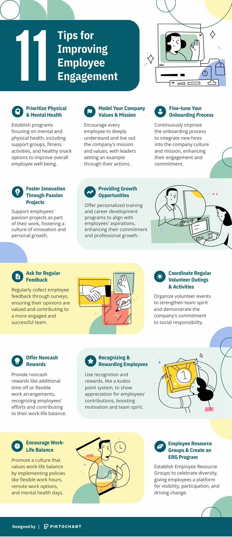
Tips for Improving Employee Engagement Infographics Tips for Improving Employee Engagement
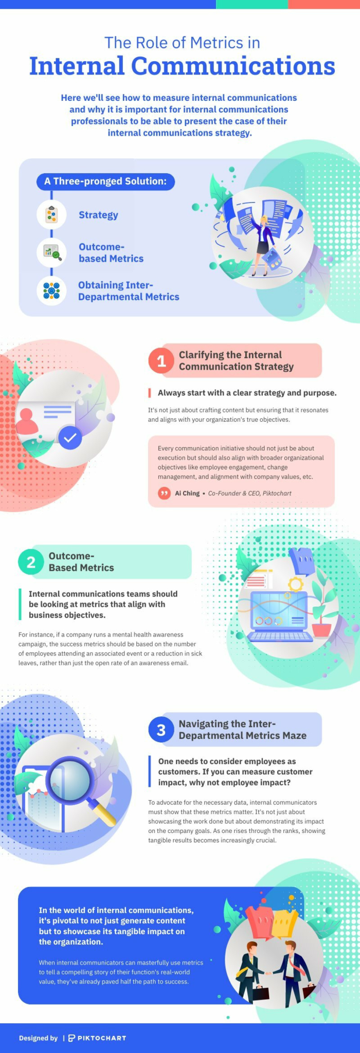
The Role Of Metrics In Internal Communications Infographics The Role Of Metrics In Internal Communications
Black Historical Figures Infographic Infographics Black Historical Figures Infographic
Facts About Women’s History Month Infographics Facts About Women’s History Month
History of Black History Month Infographic Infographics History of Black History Month Infographic
Explore more infographic templates

Ready to create an impressive infographic?

Join more than 11 million people who already use Piktochart to craft amazing visual stories.

More stories

Lorraine Thomas

Family Support Specialist at Holland Bloorview Kids Rehabilitation Hospital

As an advocate of health literacy, Lorraine shares how Piktochart helps her to educate her patients

Read Story

Deborah Tan-Pink

Senior Communications Manager at Revolut

A longtime customer of Piktochart since 2013 shares how she uses Piktochart throughout her career

Read Story

Theodore Paat

Instructional Designer at Affirm

Theo did a lot of research for various platforms ranging from Venngage to Canva. Find out why he decided for Piktochart.

Read Story