Experience the future of creating clear and compelling charts

Seamless Creation
Create beautiful, precise charts in seconds
Say goodbye to complicated design tools and tedious manual data entry. Our AI-powered chart generator takes care of the hard work, producing beautiful, precise charts in just seconds.
Simply describe the type of chart you need or upload your data, and our advanced AI will instantly transform your complex information into professional-quality charts. Designed for all skill levels, our intuitive platform makes chart creation both straightforward and enjoyable.
Start creating
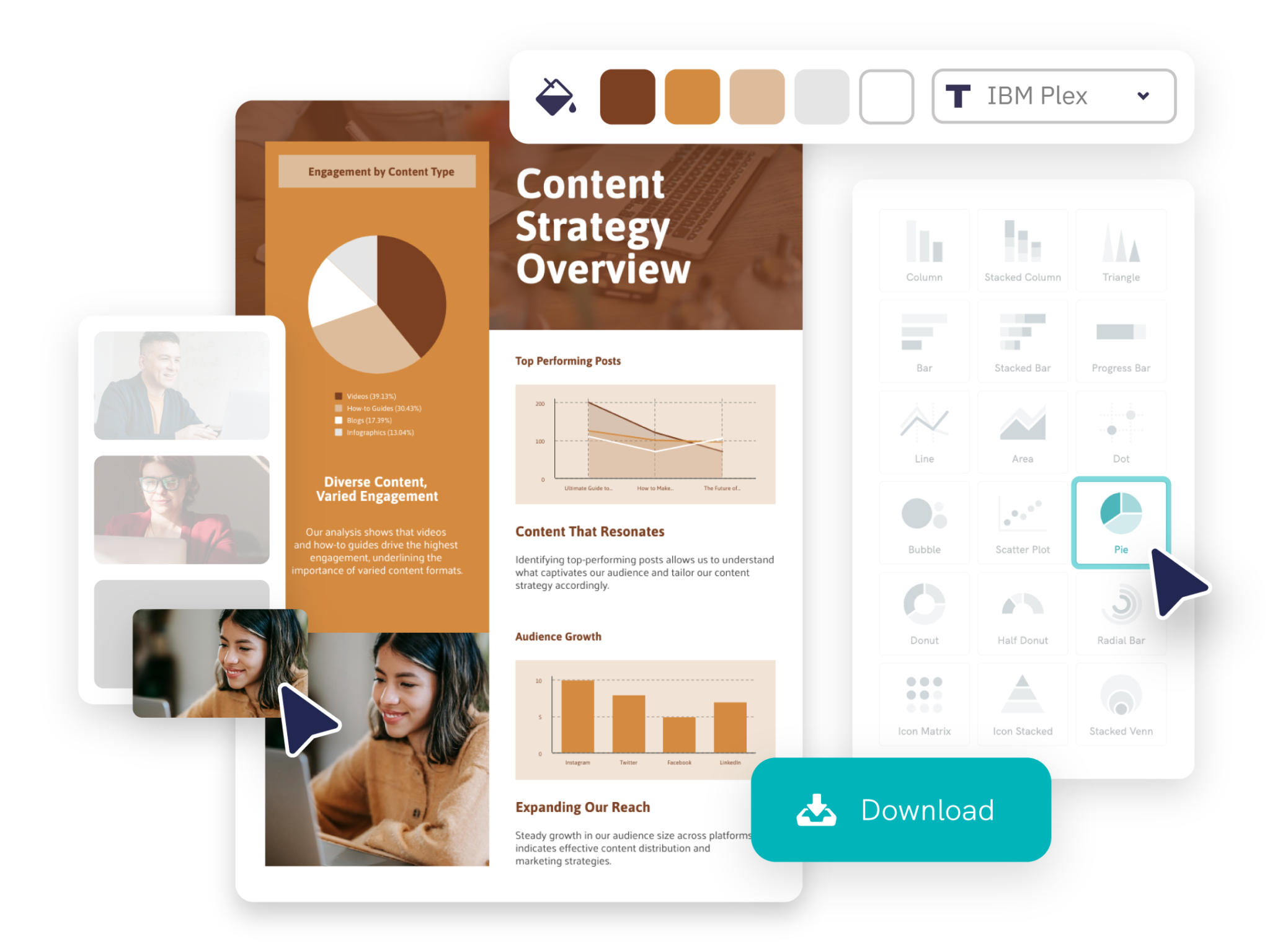
Full Customization
Communicate data that resonate with your audience
Our AI goes beyond creating charts—it helps you tell a compelling story. With our extensive selection of chart templates, you can effectively communicate your data.
Take full control by customizing every detail to suit your specific needs. Personalize your chart by adjusting colors, fonts, and design elements to perfectly align with your brand identity.
Start creating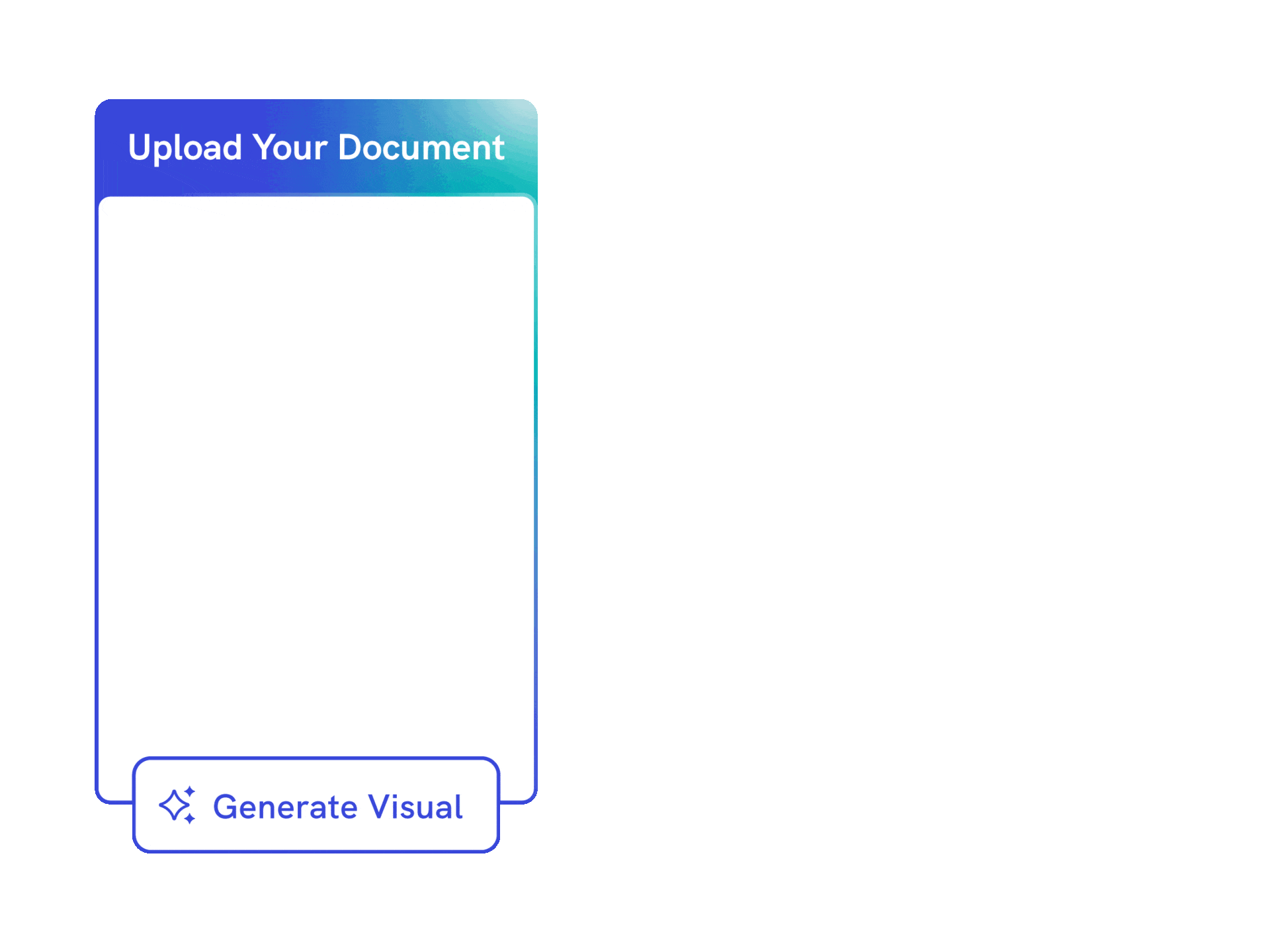
Effortless Design Process
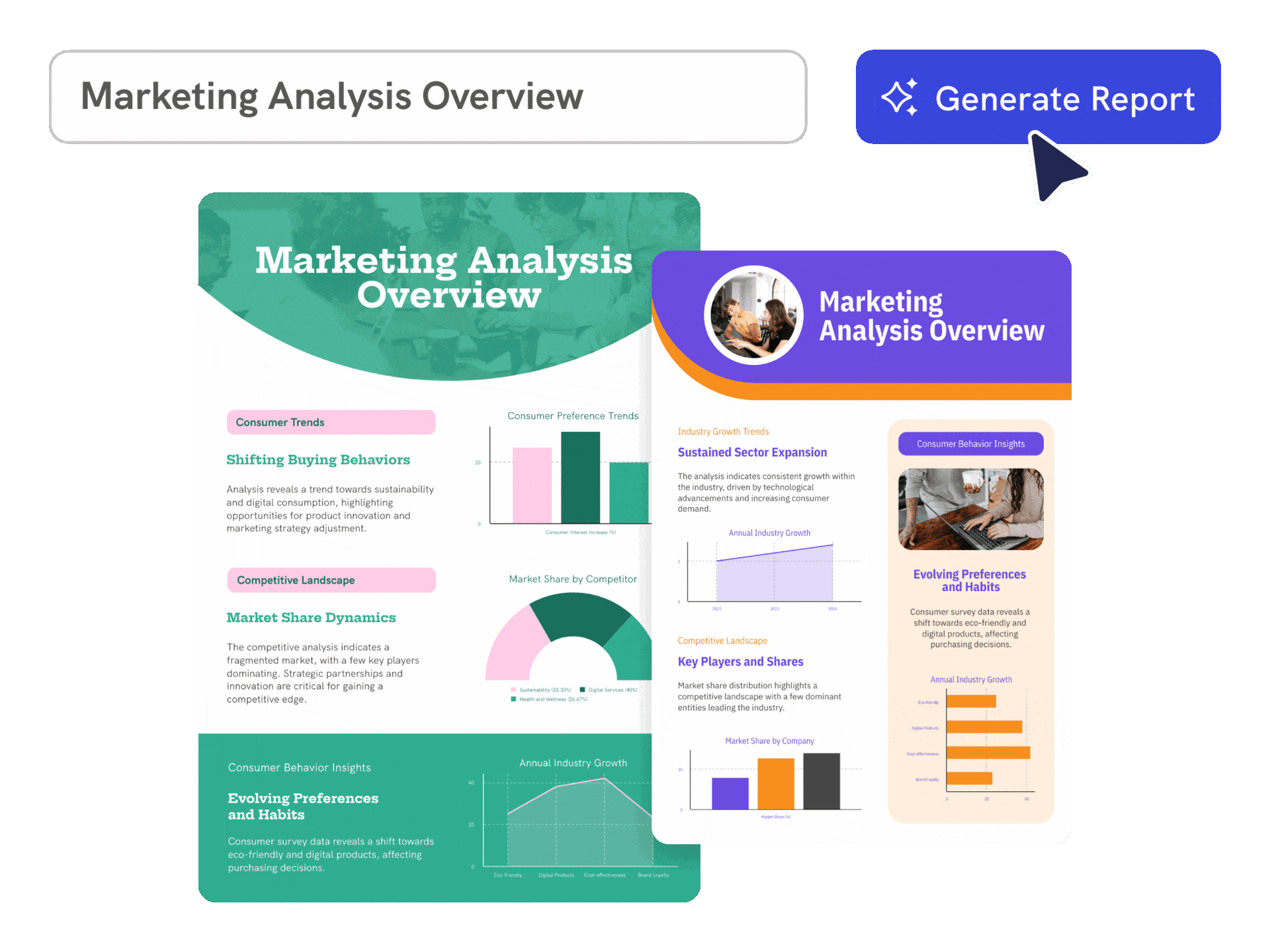
Instant chart creation with your data
Drowning in text-heavy data and unsure where to start? Simply paste your data or upload your document, and let Piktochart AI instantly generate professional-quality, customized charts tailored to your needs.
Piktochart AI supports PDF, DOCX, and TXT formats, offering unparalleled versatility. Save time and focus on what truly matters: making impactful decisions and telling your data’s story.
Generate visual from documentTrusted by Industry Leaders

Marketers
- Visualize marketing campaign results, customer demographics, and market trends, facilitating data-driven decision-making.
- Engaging, easy-to-understand reports for clients, showcasing campaign performance, ROI, and key marketing metrics.
- Identify emerging trends and forecasting future market movements.

HR and Learning and Development Reports
- Highlight progress, identify areas for improvement, and facilitate effective performance reviews.
- Visually represent the impact and effectiveness of training programs.
- Compile and interpret data on workforce diversity, employee satisfaction, and organizational culture.

NGOs and Government Organizations
- Illustrate impact on communities by showcasing progress on projects, beneficiary stories, and fund utilization, essential for donor reports and stakeholder updates.
- Reports on donation usage, program effectiveness, and organizational financial health.
- Analyze program data, helping to assess effectiveness, identify areas for improvement, and inform future project planning and resource allocation.

Researchers
- Transform complex datasets into clear, comprehensible visuals, aiding in the presentation of research findings.
- Easy sharing and editing of reports, essential for multi-author studies and publications.
- Prepare reports for academic journals or conferences, aligning with publication standards.
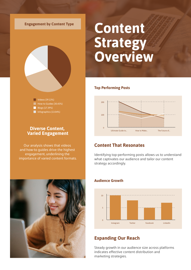
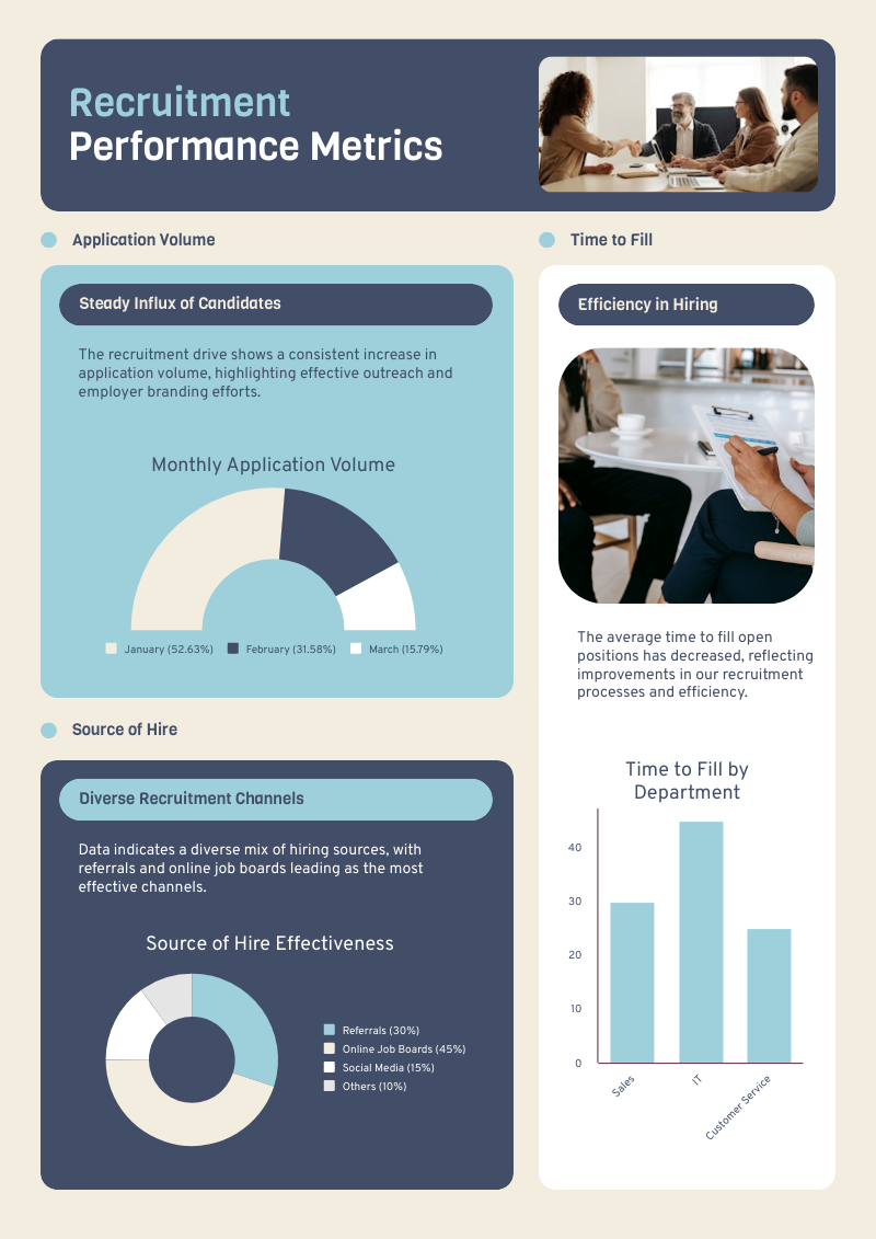
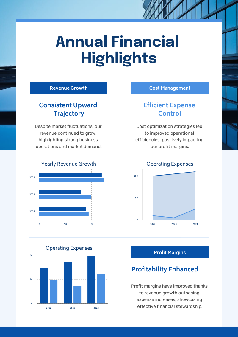
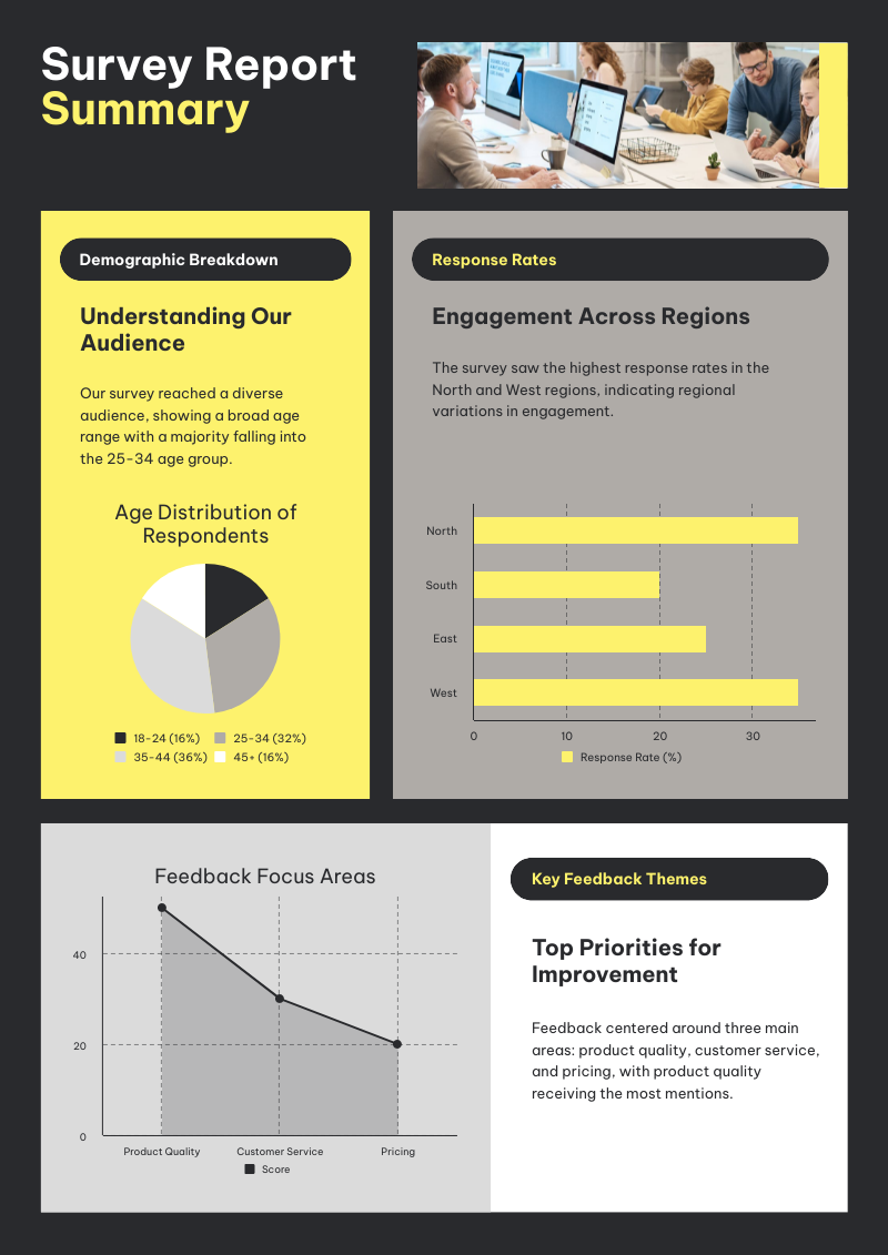
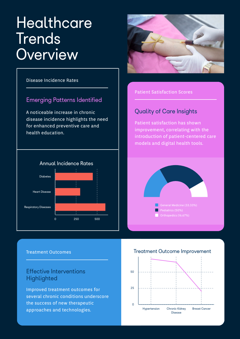
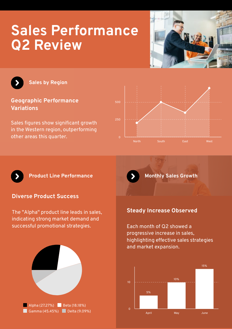
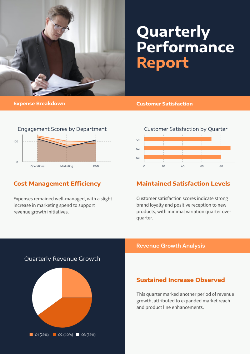
Charts created using Piktochart’s AI-powered chart generator


How to Generate AI Charts
1. Describe Your Chart
Provide a brief but detailed description of the chart type or data you wish to visualize. Alternatively, upload your data in PDF, DOCX, or TXT formats. Piktochart AI will analyze your input and generate a customized chart tailored to your needs.
2. Choose from Our Templates
In seconds, Piktochart AI will create a professional-quality chart from your data. Select from a range of templates to find the one that best fits your requirements.
3. Customize and Refine
Use Piktochart’s intuitive editor to tweak colors, fonts, and design elements. Personalize the chart to match your brand and style for a polished, cohesive look.
4. Download and Share
Once your chart is perfect, export it in high-resolution formats like PNG or PDF. Share your visually stunning charts with stakeholders, colleagues, or on social media with ease.
AI-Powered Visualization for Any Topic
What kinds of charts can be generated using this AI tool?
Bar Graphs
Perfect for comparing quantities across different categories. Vertical bars showcase trends over time, while horizontal bars handle longer labels effortlessly.
Line Graphs
Ideal for visualizing trends and patterns over time or continuous data. Multiple lines let you compare several datasets at once for a clearer picture.
Pie Charts
Illustrate proportions with stunning clarity, showing how various parts contribute to the whole. Donut charts enhance readability with a central cutout.
Scatter Plots
Reveal relationships between two variables and uncover hidden correlations. Bubble charts add depth by representing a third variable with bubble sizes.
Area Charts
Show cumulative totals over time, with stacked area charts highlighting how individual series contribute to the overall picture.
Ready to use AI to create beautiful and impactful charts?
Join more than 11 million people who already use Piktochart to craft amazing visual stories.